9 Product Onboarding Best Practices That Are Essential in 2026
Last updated on Tue May 19 2026
Most software products lose the majority of their users before they ever get a chance to prove their value. That's not a hypothesis. 90% of users churn if they don't understand a product's value within the first week, and 44% of subscription cancellations happen within the first 90 days. The window is narrow, and the stakes are high.
I've seen this play out firsthand. Teams spend months perfecting a product, then treat onboarding as an afterthought. They add a quick tooltip sequence bolted on before launch. The result is that users sign up, get confused, and quietly disappear.
The truth is that onboarding isn't a feature. It's the moment your product either earns trust or loses it permanently. Done well, it closes the gap between what a user expects and what they actually experience on day one.
These nine best practices are the ones that move the needle. Keep reading for practical, specific advice that's built for software teams who want to get this right.
1. Define your "Aha!" moment and engineer every onboarding decision around it
Before you design a single tooltip or write a single checklist item, you need to answer one question: what is the exact moment your user first feels the value of your product?
This is your Aha moment — the specific action that separates users who stick around from users who churn. Everything in your onboarding should exist to get users there as fast as possible. Steps that don't contribute to that moment are friction in disguise.
Slack is a great example of this in practice. Channels are Slack's most visible feature, but they're also its most confusing for new users. Rather than leading with them, Slack's onboarding deliberately steers users toward direct messages first — a familiar, low-barrier action that immediately demonstrates the product's core value: real-time communication with teammates.
The tooltip is deliberate:
"Send direct messages. Direct messages are private, 1-to-1 messages. You can chat with any member of Appcues."
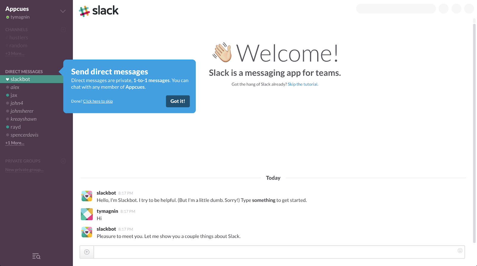
To find your own Aha moment, look at your highest-retained users and identify the one action they all completed in their first session. Then rebuild your onboarding around getting every new user to that same point.
2. Use surveys to customize the onboarding experience
A welcome survey acts as a routing mechanism. The moment a user tells you who they are and what they're trying to achieve, you have everything you need to show them a completely different onboarding path. Without that information, you're guessing.
In my experience, teams that skip the welcome survey end up building one generic flow that half-heartedly serves everyone and fully serves no one.
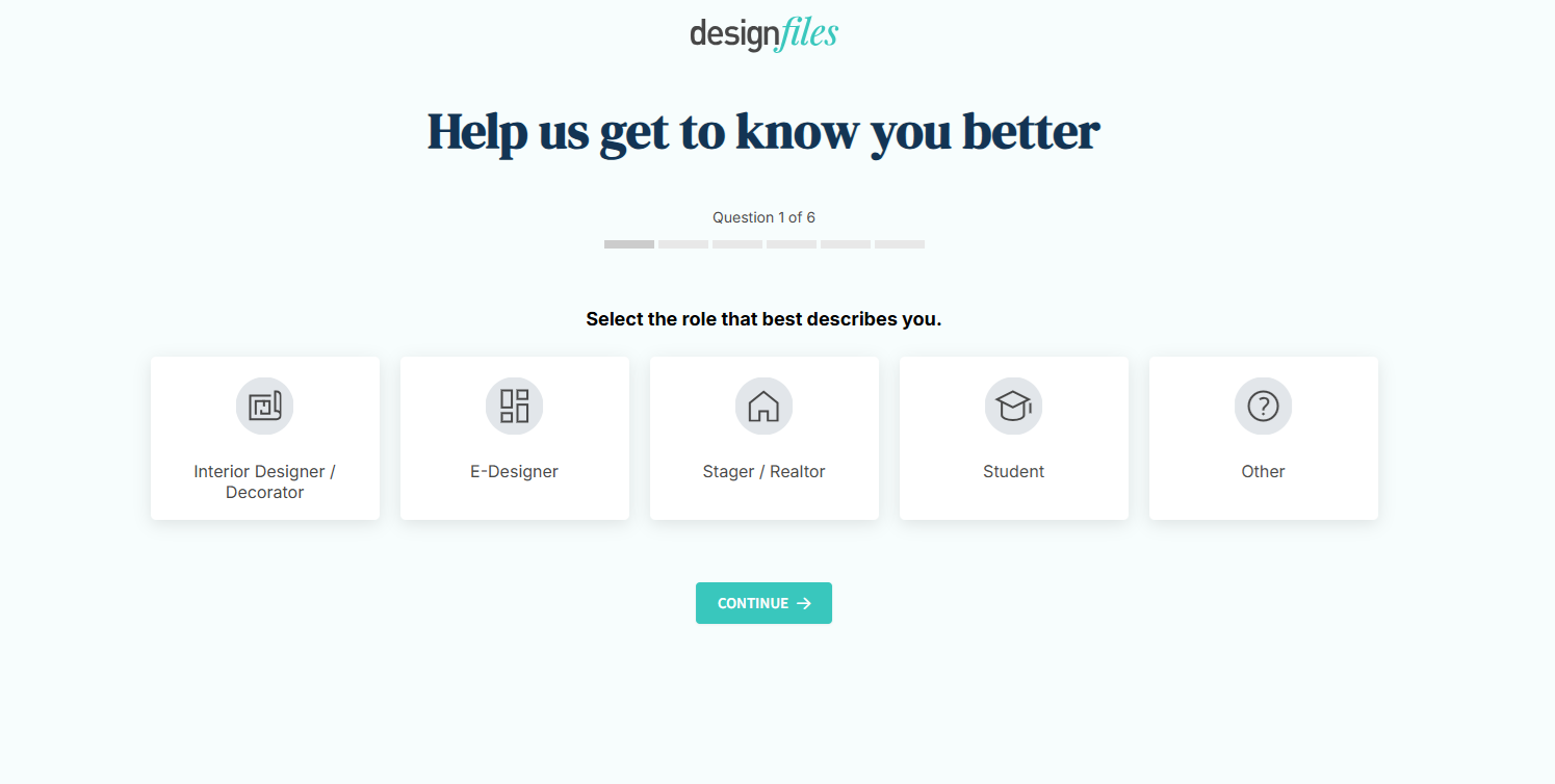
DesignFiles does this well. On signup, they ask users to select the role that best describes them: Interior Designer, E-Designer, Stager/Realtor, Student, or Other. That single answer changes everything that follows. The templates surfaced, the walkthroughs triggered, and the features highlighted.
A good welcome survey should:
Stay short. 2 to 4 questions maximum before the user sees the product
Ask about role or goal. "What are you trying to achieve?" beats "How big is your company?"
Feed directly into segmentation. Every answer should trigger a different flow, not just log data that nobody acts on
Feel like personalization. Visual selectors like DesignFiles uses convert better than dropdowns
The goal is to make the user feel like the product was built for them specifically, starting from the very first screen.
3. Help users visualize their progress
People don't abandon onboarding because it's too hard. They abandon it because they can't see how far they've come or how close they are to the finish line. Progress visibility turns a vague setup process into a series of completable steps, and that distinction matters more than most teams realize.
DesignFiles handles this with a horizontal step tracker pinned to the top of the dashboard. From the moment a new user lands, they can see exactly where they are across five setup tasks: brand your account, add product clipper, customize your questionnaire, set up payments, create your first project. Two are already checked off. The visual pull to complete the remaining three is immediate and intuitive.
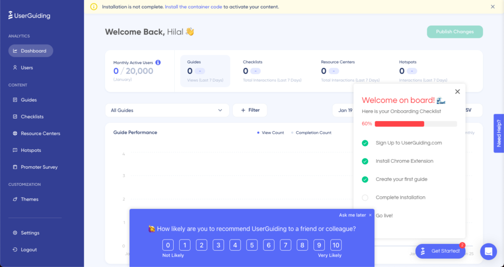
UserGuiding takes a slightly different approach with a floating checklist that appears directly on the dashboard, showing 60% completion with a progress bar and the remaining steps listed below. Crucially, it sits alongside the actual product interface rather than replacing it. The user can already see the tool they're learning while being guided through setup.
A well-designed progress indicator should do a few things:
Show completion state at a glance, not just a percentage
Make the next step obvious without explaining it
Stay dismissible, so power users aren't blocked
I've found that when users can see they're already halfway done, the question shifts from "should I finish this?" to "what's left?"
4. Include short and snappy video tutorials
Video works in onboarding when it respects the user's time and leads with the outcome. The mistake most teams make is recording a screencast that walks through every menu option. What they've built is a product demo, not a tutorial, and users can tell the difference.
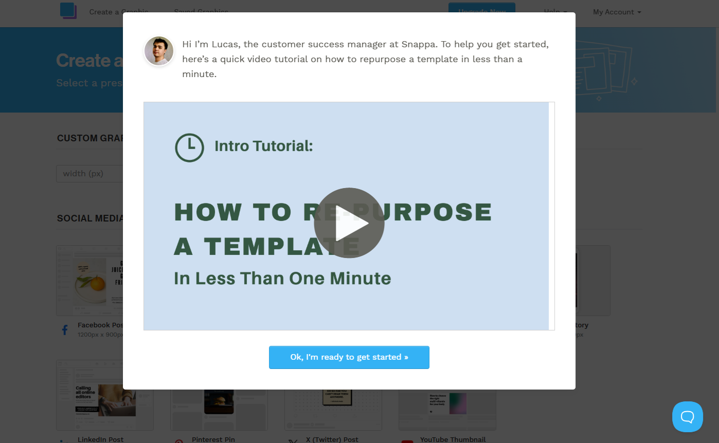
Snappa gets this right. When a new user lands on the canvas, an onboarding popup appears with a real person—Lucas, their customer success manager—introducing a sixty-second video on how to repurpose a template. The framing matters: it's not "here's how Snappa works," it's "here's how to get something done in under a minute." That specificity is what makes a user click play.
The human face adds something too. I've seen conversion lift consistently when onboarding video uses a real team member rather than a screen recording with a voiceover. It signals that there's a person behind the product who wants you to succeed, which builds trust at exactly the moment you need it most.
Keep onboarding video under ninety seconds, lead with the end result, and make it skippable. for those who feel confident in figuring it out for themselves.
5. Create interactive product tours
A product tour that asks nothing of the user teaches nothing. Clicking through a series of tooltips that say "this is your dashboard" and "this is your settings menu" is passive consumption, and passive consumption doesn't build the muscle memory that turns a new signup into a habitual user.
Interactive product tours work differently. They require the user to actually do something at each step, which means they're navigating the real product, making real decisions, and building genuine familiarity rather than just watching a walkthrough scroll by.
Supademo uses this approach on their own onboarding, and it's a strong example precisely because it's self-referential. They're demonstrating the value of interactive demos by making you experience one. Step 2 of 16 introduces dynamic variables, explaining that users can personalize demos for specific viewers. The tooltip is contextual, brief, and attached to real UI. There's no separate tutorial environment. The user is inside the product learning by doing.
The step counter matters too. Knowing you're on step 2 of 16 sets expectations upfront and removes the anxiety of not knowing how long this will take. I've found that users who know what's ahead are significantly less likely to abandon midway than those dropped into an open-ended flow with no visible end point.

6. Develop a long-term onboarding plan
The reason most onboarding fails long-term isn't poor execution on day one. It's that teams treat onboarding as a single event rather than a continuous strategy. Users churn at different points for different reasons, and a single linear flow can't address all of them. After working across multiple SaaS products, I've found it more useful to think about long-term onboarding through the lens of three distinct gaps that open up at different points in the user journey, each requiring a different response.
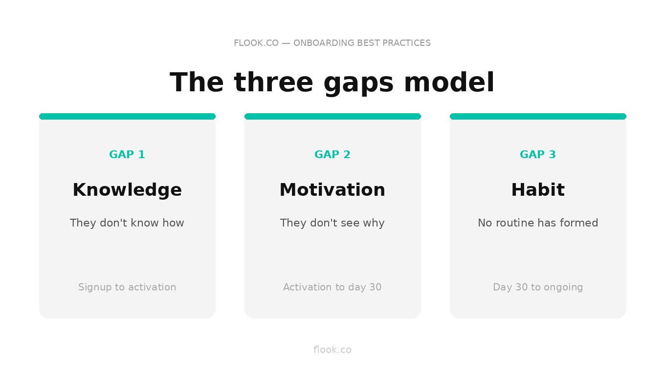
The knowledge gap: they don't know how
This is the gap most teams actually design for. It opens at signup and closes when the user can navigate the product confidently without guidance. Tooltips, walkthroughs, and onboarding checklists all belong here. Close it fast. The longer it stays open, the higher the abandonment rate.
The motivation gap: they don't see why
This gap is more dangerous because it's invisible. The user knows how to use the product but hasn't connected it to a meaningful outcome in their own work. They're logging in out of obligation, not habit. This is where most day-30 churn originates. Closing it requires showing users the value they've already generated. Usage summaries, milestone celebrations, and outcome-focused email sequences that reflect their specific activity back at them rather than generic feature promotion.
The habit gap: they haven't built a routine
Even motivated users churn if the product never becomes embedded in their daily workflow. The habit gap is a structural problem. The product isn't showing up at the right moment in the user's day. Closing it means shifting from reactive guidance to proactive prompts:
behavioral triggers that fire based on inactivity thresholds, not just feature interactions
integrations and notifications that bring the product into tools the user already lives in, rather than requiring them to remember to come back
Why all three gaps need their own strategy
Treating these as one continuous flow is the mistake. A tooltip that closes the knowledge gap does nothing for a user sitting in the motivation gap. An outcome summary email is useless to someone who hasn't finished setup. Long-term onboarding works when you can diagnose which gap a given user is in and deploy the right intervention at the right time, which is why behavioral data, not time-based sequences, should be driving every decision after day one.
7. Use tooltip explainers the first time a new feature is engaged with
The worst time to explain a feature is before the user has any reason to care about it. Front-loading your onboarding with explanations of every capability is a fast path to cognitive overload. By the time a user actually reaches that feature, they've forgotten everything you told them.
The better approach is just-in-time guidance: a tooltip that fires the first time a user engages with a feature, at the exact moment their curiosity is highest.
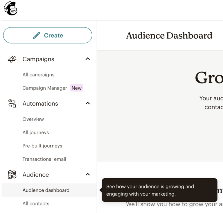
Mailchimp does this cleanly on their Audience Dashboard. When a user navigates there for the first time, a small tooltip appears anchored directly to the menu item: "See how your audience is growing and engaging with your marketing." No modal, no walkthrough, no interruption to the flow. Just a single sentence that confirms what this section does and why it matters, delivered at the precise moment the user is already looking at it.
I've found this approach outperforms any amount of upfront product education. The user is already oriented toward the feature. The tooltip simply gives their attention somewhere to land.
8. Consider creating a character to help with onboarding
There's a version of this idea that everyone remembers and nobody wants to repeat. Remeber Clippy, Microsoft's animated paperclip assistant that appeared unbidden in Office 97? He became a cautionary tale not because the concept was wrong, but because the execution was tone-deaf. Clippy interrupted constantly, ignored context, and prioritized Microsoft's agenda over the user's. It was a character designed to look helpful rather than actually be helpful, and users learned to close it on instinct.
The lesson wasn't "don't use characters." It was "don't use characters that serve themselves."
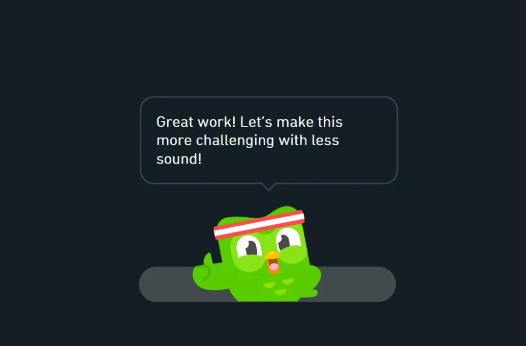
Duolingo understood this distinction completely. Duo the owl doesn't interrupt, he responds. It appears at moments of achievement, framing progress in an encouraging, slightly competitive voice: "Great work! Let's make this more challenging with less sound." The character adapts to what the user has just done, which makes it feel like a coach rather than a pop-up. That emotional consistency is what turned Duo into one of the most recognizable onboarding characters in software.
A well-designed character creates warmth at moments that would otherwise feel transactional, completing a step, hitting a milestone, returning after inactivity. It gives the product a personality that users can orient toward.
This approach works particularly well for:
B2C tools where emotional engagement drives daily habit formation, especially in productivity, fitness, finance, and learning categories
B2B tools with deliberately consumer-style branding that want to differentiate from the sterile enterprise aesthetic their competitors default to
The bar is high. A character that feels forced is worse than no character at all, but when it's right, it builds the kind of product affinity that no tooltip sequence ever could.
9. Setup popup carousels for simple onboarding or ongoing reminders
A popup carousel is one of the most versatile tools in onboarding, and one of the most abused. Done poorly, it's a wall of slides the user clicks through without reading. Done well, it's a focused, three-step sequence that orients a new user or reintroduces a returning one to something they need to know right now.
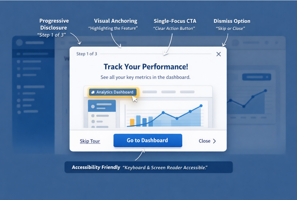
The example above annotates exactly what makes a carousel work. Progressive disclosure keeps the user anchored — "Step 1 of 3" sets expectations immediately and removes the anxiety of an unknown length. Visual anchoring highlights the specific feature being discussed rather than floating the popup over a generic background, so the user's eye goes exactly where you want it. A single-focus CTA—one button, one action— eliminates the decision paralysis that kills completion rates. And a dismiss option respects user autonomy, which paradoxically increases trust in the overall onboarding experience.
The accessibility note matters more than most teams realize. Keyboard navigation and screen reader compatibility aren't edge case considerations, they're table stakes for any product with enterprise ambitions.
Where carousels earn their keep beyond initial onboarding is in feature releases. Rather than sending an email announcement that gets ignored, a targeted carousel triggered for users who haven't discovered the new feature yet puts the message inside the product, at the moment of highest relevance. I've consistently seen better feature adoption rates from a well-timed three-step carousel than from any email campaign covering the same ground.
Frequently asked questions
What's the single biggest reason users churn during onboarding?
They reach a moment of confusion with no clear next step and nobody notices. Most churn is silent. A user closes the tab, never returns, and your analytics just shows a drop-off event with no explanation.
How do you onboard users who skip everything and just want to explore?
Let them. Build your onboarding around triggers, not sequences. Users who explore first can be re-engaged contextually when they hit a feature they don't understand. Forcing a linear flow on self-directed users creates friction that drives them out.
When should you redesign your onboarding versus just optimizing what you have?
When your activation metric is broken, not just low. If users are completing onboarding but still churning in week two, the flow isn't the problem. What's really going on is that your definition of activation is wrong.
How long should onboarding actually take?
As long as it takes to reach the first meaningful outcome, not one step longer. If you can't get a user to their Aha moment in under ten minutes, the problem is product complexity, not onboarding design.
How do you onboard different user types without building ten separate flows?
One welcome survey, three personas maximum. Most products over-segment at the start. Identify the two or three jobs users are actually hiring your product to do and build a flow for each. Everything else is edge cases.
Improve product engagement with Flook's next-generation onboarding tours, banners, and popups.