How to Setup a No-Code Onboarding Progress Bar [+ 4 Examples]
Last updated on Thu Feb 12 2026
Most SaaS products don’t lose users months down the line. They lose them in the first session. A new user signs up, clicks around for a few minutes, feels unsure what to do next, and leaves.
That’s where an onboarding progress bar makes a real difference. It’s a simple but powerful user onboarding UX pattern that shows people exactly where they are and what comes next. Instead of guessing how long setup will take, users can see their progress at a glance.
A clear onboarding progress indicator reduces friction. It sets expectations, builds momentum, and nudges users to finish what they started. When done well, it increases completion rates and helps users reach their “aha” moment faster.
In this guide, we’ll break down the psychology behind effective progress bars, share best practices and real examples, highlight common mistakes, and explore alternatives. We’ll also show you how to add an onboarding progress bar to your product without engineering effort using Flook.
What is an onboarding progress bar?
An onboarding progress bar is a visual onboarding progress indicator that shows users how far they’ve progressed in a setup or activation flow. It answers a simple question: “How much is left?” Instead of leaving users guessing, it makes progress visible.
You’ll usually see an onboarding progress bar during key moments in the user journey, such as:
Product setup flows
Profile completion steps
Onboarding checklists
Multi-step wizards
Email onboarding sequences
In each case, the goal is the same. Guide users forward and reduce uncertainty during those critical first interactions.
Onboarding progress indicators come in a few common formats. The design can vary, but the intent stays consistent.
Linear percentage bars (e.g., 60% complete)
Step indicators (e.g., Step 2 of 5)
Checklist-style progress
Circular progress indicators
Gamified completion meters, like LinkedIn’s profile strength bar
It’s also important to distinguish between two types of progress bars. A task completion progress bar shows advancement through onboarding steps. A time or loading progress bar shows how long a system process will take, such as uploading a file. It's similar to a SaaS onboarding checklist, but usually has a progress bar tracked, so that part of the bar will be filled in with an on-brand color, and part of it will be blank.
In onboarding, you’re not tracking load time. You’re guiding behavior. That’s what makes an onboarding progress bar a core part of effective user onboarding UX.
4 great examples of onboarding progress bars
Before we dive into the setup guide, let's take a look at some examples for inspiration.
1. DesignFiles
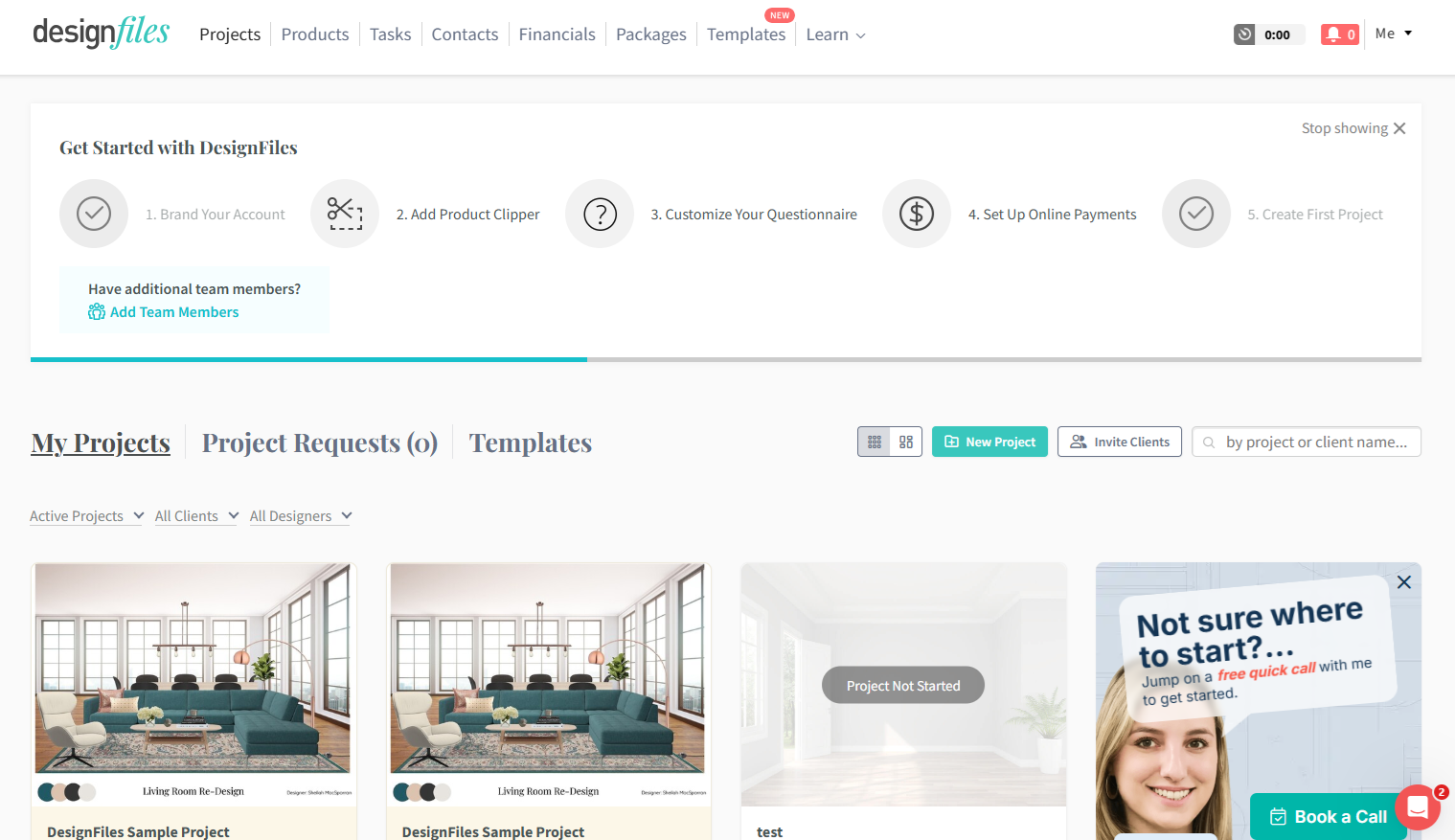
DesignFiles places its onboarding progress bar at the top of the dashboard, making it impossible to miss. It shows clearly labeled steps like “Brand Your Account” and “Set Up Online Payments,” with completed steps marked and upcoming ones visible.
What works well is persistence. The progress bar stays on the dashboard, so users see it every time they log in. That keeps onboarding top of mind and reinforces momentum across sessions.
The steps are meaningful. Each one connects to real setup actions that move users closer to activation. The horizontal layout also makes the journey feel structured and finite.
One potential improvement is perceived workload. Five large steps can feel heavy if each contains multiple tasks. Breaking them into smaller wins or adding more celebratory feedback after completion could increase motivation.
Overall, it’s a strong example of clear, structured, outcome-driven onboarding.
2. HoneyBook
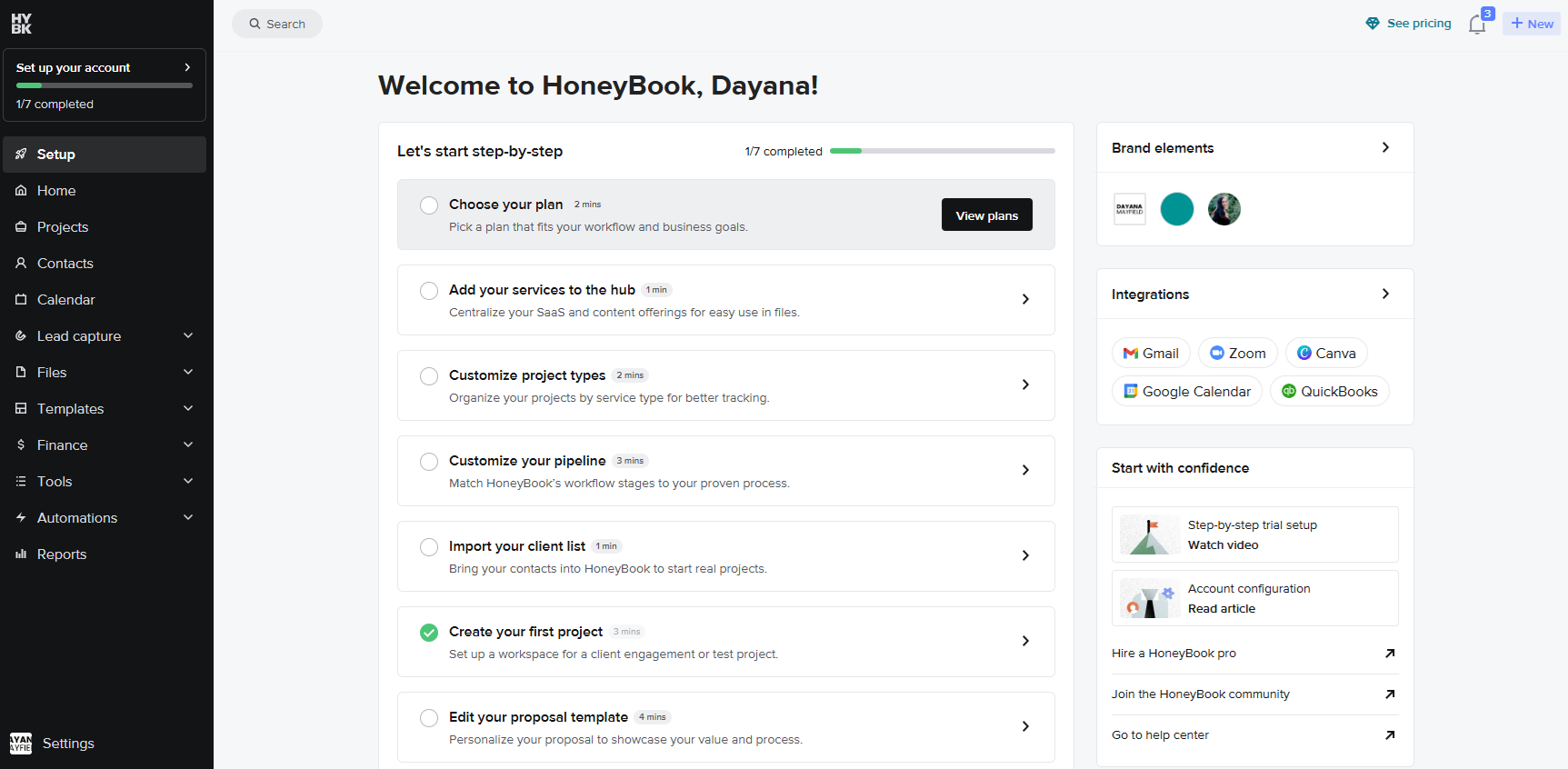
HoneyBook uses a checklist-style onboarding progress bar paired with a visible completion tracker at the top of the page. Users see “1/7 completed” along with a horizontal progress indicator. The structure feels simple and approachable.
What works well is clarity. Each task includes a short description and even an estimated time to complete, such as “2 mins” or “3 mins.” That small detail lowers resistance. Users can quickly judge the effort required and commit to finishing.
The checklist format also supports momentum. Completed tasks are clearly marked, while the remaining steps stay visible but manageable. It feels less overwhelming than a long form and more flexible than a rigid wizard.
Another strength is relevance. Tasks like choosing a plan, importing clients, and creating a first project tie directly to real business outcomes.
One improvement could be stronger celebration moments. While progress is visible, adding more reinforcement after key milestones could increase motivation. Overall, HoneyBook strikes a strong balance between structure and flexibility.
3. MailChimp
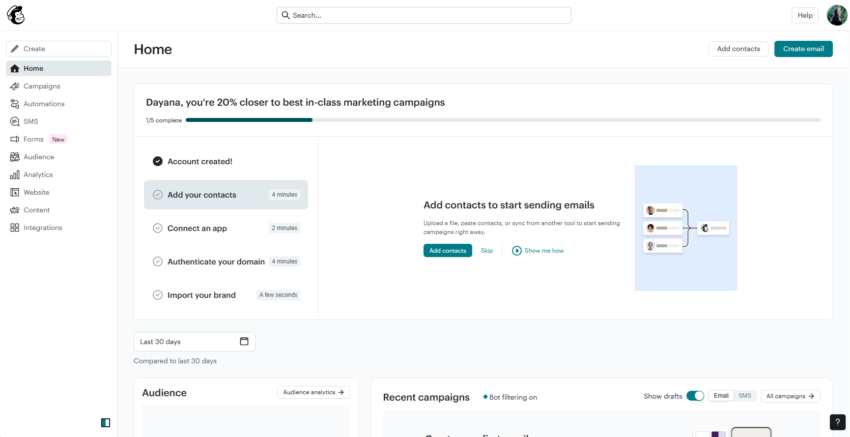
Mailchimp takes the onboarding progress bar a step further. It doesn’t just show “1/5 completed.” It also spells it out as a percentage and pairs it with results-driven messaging: “You’re 20% closer to best-in-class marketing campaigns.”
That combination works incredibly well. The fraction gives structure. The percentage makes progress feel measurable. And the headline reframes onboarding as movement toward a real outcome, not just task completion.
This is where Mailchimp stands out. The progress bar isn’t neutral. It’s motivational. Instead of saying “20% done,” it says “20% closer” to something aspirational. That subtle shift turns setup tasks into steps toward success.
The checklist items also include time estimates, which lower resistance and make the effort feel manageable. Users can quickly scan what’s left and commit to finishing.
If there’s room to improve, it might be adding stronger milestone celebrations at key completion points. Still, Mailchimp is a strong example of how progress indicators can reinforce value, not just track steps.
4. EveryDollar
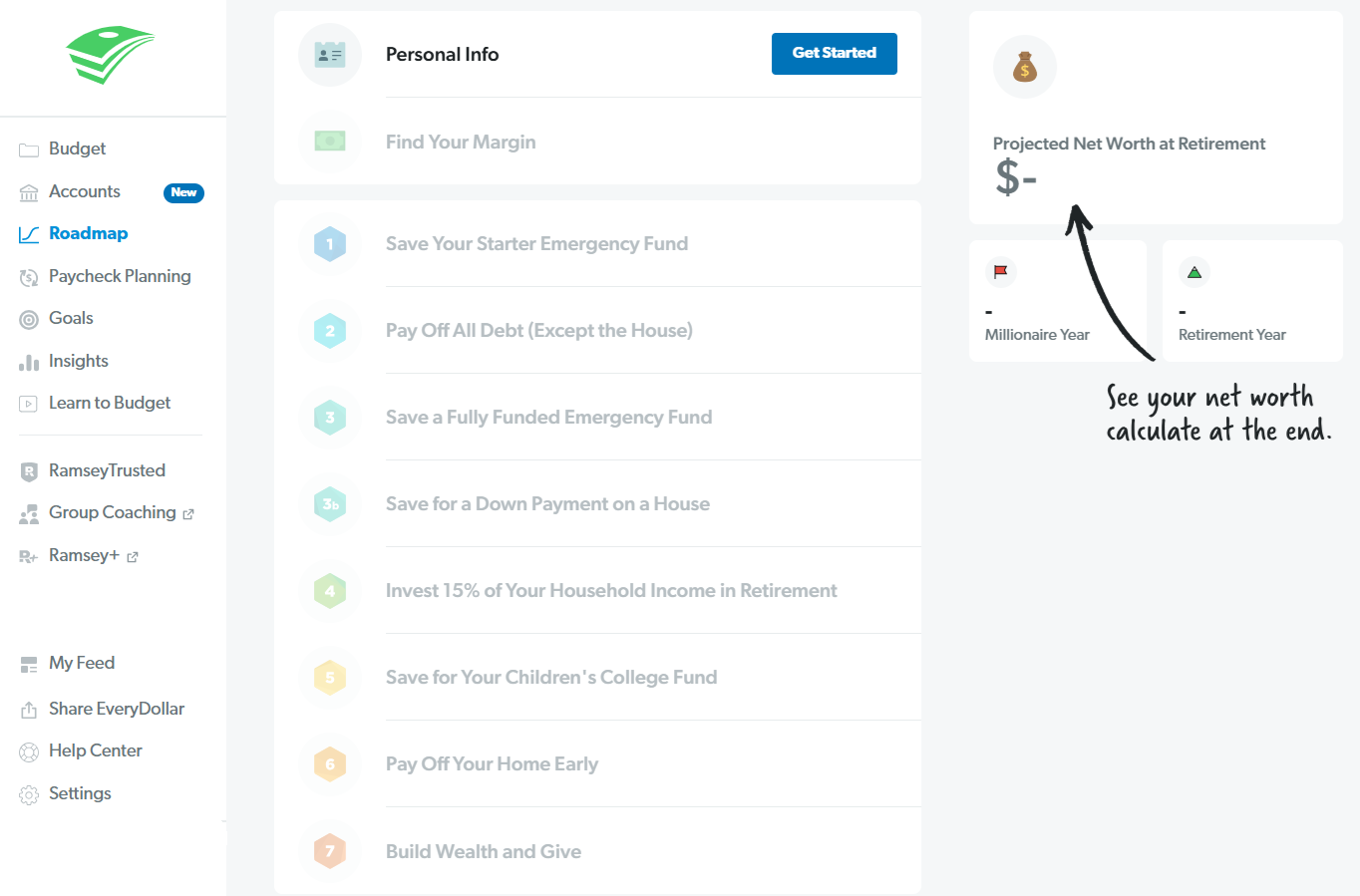
EveryDollar builds its onboarding progress around Dave Ramsey’s well-known “Baby Steps.” Instead of showing a percentage bar, it presents a clear, numbered roadmap. Each step represents a major financial milestone, from saving a starter emergency fund to building wealth and giving.What works well is clarity. The steps are sequential, clearly labeled, and rooted in a familiar framework. Users don’t just see progress, they see a long-term plan. That gives the experience meaning beyond basic setup.
The design also reinforces motivation. Each completed step feels significant because it connects to a real life outcome, not just an in-app action. The visual numbering and roadmap layout make progress feel tangible.
One improvement could be adding more visible micro-wins within each Baby Step. Since each step represents a large goal, users may benefit from smaller progress indicators inside them. That would create stronger short-term momentum while still honoring the bigger journey.
Overall, EveryDollar shows how a strong narrative framework can make onboarding progress feel purposeful and personal.
The psychology behind progress bar UX
One of the most important customer onboarding best practices is to personalize the experience with user data, and that's exactly what you get with progress bars.
Progress bars work because they tap into how our brains are wired. When we see visible progress toward a goal, we feel motivated to continue. That’s not design fluff—it’s behavioral science.
In user onboarding UX, small psychological cues can have a big impact. A simple onboarding progress indicator can shift a task from feeling overwhelming to feeling achievable. But the effect only works when it aligns with user expectations.Several psychological principles explain why progress bar UX is so powerful:
Goal-gradient effect – People accelerate their effort as they get closer to a goal. When users see they’re 70% complete, motivation increases naturally.
Zeigarnik effect – We remember unfinished tasks. A visible progress bar keeps onboarding “open” in the user’s mind, nudging them to come back and complete it.
Effort aversion & present bias – We avoid tasks that look long or painful. A clear progress indicator reduces perceived effort and makes the reward feel closer.
Early momentum principle – Fast initial progress builds confidence. Quick wins at the start increase the likelihood of finishing.
Gamification & dopamine loops – Checking off steps and seeing visual progress triggers small reward responses in the brain. It feels good to move forward.
Partially pre-filled bars – When users see they’ve already made progress, even if it’s small, they’re more likely to continue. Starting at 0% feels harder than starting at 20%.
There’s a catch. If early progress feels slow, or if onboarding drags on for too many steps, motivation collapses. When expectations aren’t met, progress bars can backfire. Design them to build momentum—not to highlight how much work is left.
Types of onboarding progress indicators
There isn’t one perfect onboarding progress bar for every SaaS product. The right format depends on how structured your onboarding is and how much flexibility users need. Below are five common types, with clear strengths and risks for each.
1. Linear percentage bars
A linear percentage bar fills from 0% to 100% as users move through onboarding. It’s clean, familiar, and easy to understand at a glance. This format works best for short, structured flows such as a simple 5-step setup process.
It keeps the interface minimal and avoids overwhelming users with too much detail. However, it can feel vague if users don’t know what actions drive progress.
You should use this option when your onboarding is short, sequential, and focused on getting users through a clearly defined setup path.
UX strengths:
Simple and intuitive
Minimal visual clutter
Works well across devices
UX risks:
Lacks detail about specific steps
Frustrating if progress moves slowly at the start
2. Step-based indicators
Step-based indicators show users exactly where they are in a defined sequence. You’ll often see labeled steps across the top of the screen or a clear “Step 2 of 6” message. This format works well when onboarding must follow a specific order.
It gives users clarity and structure. They know what’s required and how much remains. The main challenge is perception—too many visible steps can make onboarding feel heavy before it begins.
You should use this option when each step depends on the previous one and users need a strong sense of direction from start to finish.
UX strengths:
Clear structure and sequencing
Strong expectation setting
Reduces ambiguity
UX risks:
Overwhelming if too many steps
Rigid if users want flexibility
3. Checklist progress
Checklist-style onboarding shows a list of tasks with checkmarks and overall completion status. It’s common in SaaS dashboards where onboarding continues beyond the first session. Users can complete tasks at their own pace.
This format feels flexible and approachable. It encourages exploration while still guiding users toward activation.
You should use this option when onboarding includes multiple activation tasks that don’t need to be completed in a strict order.
UX strengths:
Supports non-linear completion
Easy to persist across sessions
Feels less intimidating
UX risks:
Users may skip critical steps
Progress can stall without clear priorities
4. Gamified completion meters
Gamified completion meters turn onboarding into a visible score or strength indicator. LinkedIn’s profile strength bar is a well-known example. This approach works well when deeper setup directly improves user outcomes.
It taps into motivation and reward psychology. Watching the meter grow feels satisfying and encourages continued engagement.
You should use this option when improving completeness or depth directly increases the value users get from your product.
UX strengths:
Highly motivating
Reinforces incremental improvement
Encourages deeper feature adoption
UX risks:
Can feel gimmicky if disconnected from value
May distract from core activation goals
5. Non-linear progress indicators
Non-linear progress indicators track overall completion without enforcing order. Users can complete steps in any sequence, and the onboarding progress bar updates accordingly. This works best for flexible products with different user goals.
It supports autonomy and reduces friction for experienced users. However, without guidance, it can create confusion about the next best step.
You should use this option when your users have varied goals and need freedom to prioritize the tasks most relevant to them.
UX strengths:
Flexible and user-driven
Adapts to different use cases
Reduces forced friction
UX risks:
Less clarity on what to do next
Higher chance of incomplete onboarding
How to add an onboarding progress bar to your app (no-code method)
Most teams build onboarding progress indicators directly into the product. That usually means:
Writing frontend code
Pushing changes through deployment cycles
Running QA before release
Waiting in the engineering backlog
Even small changes can take weeks. That makes experimentation harder. And when onboarding is one of the biggest drivers of retention, slow iteration costs you growth.
You don’t need a sprint cycle or a developer to add an onboarding progress bar to your product. With the right tool, you can build, launch, and improve your onboarding flow yourself. Here’s a practical step-by-step guide to doing it.
Step 1: Install the Chrome extension
Start by installing the Chrome extension. This lets you build directly on top of your live app.
Once installed, you can click into any page of your product and begin adding onboarding elements visually. No code changes. No staging environment required.
Step 2: Define your activation steps
Before building anything, decide what “progress” actually means in your product. Focus on actions that move users toward value.
For example:
Create first project
Invite a teammate
Connect an integration
Publish or launch something
Keep it tight. Three to five meaningful steps is usually enough.
Step 3: Create a checklist-based progress indicator
Use an onboarding checklist to turn those activation steps into a visible progress tracker. Add each task as a checklist item.
As users complete tasks, the checklist updates automatically. This becomes your onboarding progress indicator. It’s clear, persistent, and easy to understand.
You can position the checklist in a dashboard, as a slideout, or within a specific page. Choose wherever users naturally look first.
Step 4: Add tooltips to guide each step
Now guide users through each checklist item using tooltips. Click on the button, field, or feature you want to highlight and attach a tooltip to it.
Keep the copy short and action-focused. Tell users exactly what to do next.
If the flow spans multiple pages, stitch tooltips together into an onboarding tour. This creates a structured path while the checklist tracks overall progress.
Step 5: Reinforce momentum with slideouts or popups
When a user completes a step, reinforce it. Add a small slideout or popup that confirms success and introduces the next action.
This keeps momentum high. It also makes progress feel rewarding, not mechanical.
Step 6: Customize to match your product
Match colors, fonts, and styling to your app. The onboarding progress bar should feel native, not bolted on.
Adjust spacing and placement so it doesn’t block core workflows. The goal is guidance, not interruption.
Step 7: Publish instantly
When everything looks right, publish. There’s no deployment process and no engineering backlog.
Your onboarding progress bar goes live immediately. Users don’t need to install anything. Updates can be made anytime.
Step 8: Iterate and optimize
Watch how users interact with the flow. See where they drop off. Then adjust.
You can:
Remove unnecessary steps
Reorder checklist items
Rewrite tooltip copy
Add new milestones
Because you’re not dependent on engineering, experimentation becomes simple. You can continuously improve your user onboarding UX without slowing down your team.
Why onboarding progress bars matter in user onboarding UX
This is why you should consider this onboarding strategy:
1. They reduce uncertainty (goal gradient effect)
Starting a new product can feel overwhelming. Users don’t know how long setup will take or what’s expected of them. An onboarding progress bar removes that ambiguity in seconds.
When people can see progress, they’re more likely to keep going. This is known as the goal gradient effect. The closer we feel to finishing something, the more effort we’re willing to put in.
That’s why partially filled progress bars work so well. If a user logs in and sees they’re already 20% complete, momentum builds immediately. It feels achievable.
Instead of facing a blank slate, users see movement. That sense of progress lowers resistance and builds confidence. In user onboarding UX, that early confidence is everything.
2. They set clear expectations
A good onboarding progress indicator answers two important questions:
How many steps are there?
How many are left?
When users understand the scope of the task, they’re more willing to commit. A clear “Step 2 of 5” feels manageable. An undefined process does not.
Clear expectations reduce anxiety. Users don’t worry about hidden steps or endless forms. They can pace themselves and decide to continue.
This clarity also reduces abandonment. When people feel tricked into a longer process than expected, they leave. When they know the finish line is close, they push through.
Transparency builds trust. Trust keeps users moving.
3. They increase completion rates
Onboarding progress bars often improve completion rates—but only when designed thoughtfully. Research on survey completion shows that progress indicators can backfire if early progress feels too slow. If users invest effort and the bar barely moves, motivation drops fast.
That’s why early quick wins matter. When the first step takes seconds and the progress bar jumps forward, users feel rewarded. That small success creates momentum.
To increase completion rates:
Start with a simple, low-effort action
Avoid heavy data entry upfront
Make early progress feel meaningful
Each completed step reinforces commitment. Users think, “I’ve already started, I might as well finish.” The progress bar turns effort into visible achievement.
When designed well, it doesn’t just track progress. It drives it.
4. They accelerate time-to-value
The goal of onboarding isn’t completion. It’s activation. You want users to reach their “Aha!” moment as quickly as possible.
An onboarding progress bar keeps attention focused on the path to value. It signals that each step moves the user closer to a real outcome, not just another form field.
This aligns closely with product-led growth principles. The faster users experience value, the more likely they are to stick around and convert. Progress indicators create forward motion. Forward motion reduces friction.
Instead of wandering through features, users follow a clear path. They see progress. They stay engaged. And they reach value faster.
Onboarding progress bar best practices (UX checklist)
A great onboarding progress bar feels simple, motivating, and honest. Use this checklist to make sure your progress bar UX supports users instead of slowing them down.
1. Design for fast initial progress
Start strong. Early momentum sets the tone for the entire onboarding experience.
Quick, low-effort first action
Visible jump in progress after step one
Avoid long forms upfront
Defer complex configuration steps
2. Keep total steps reasonable
Long onboarding kills motivation. Keep it tight and focused.
Aim for 3–7 core steps
Group related actions into single steps
Split long flows into phases
Remove non-essential tasks
3. Be honest about time & effort
Users can tell when progress feels manipulated. Transparency builds trust.
Accurate step counts
Consistent progress increments
No artificial “fast start” deception
Realistic time expectations
4. Make steps meaningful, not arbitrary
Each step should move users closer to value, not just completion.
Tie steps to real product outcomes
Focus on activation milestones
Eliminate cosmetic setup tasks
Prioritize actions that unlock features
5. Combine with microcopy
A progress bar works better with the right words beside it.
Short encouragement messages
Clear step titles
Outcome-focused language
Subtle reinforcement cues
6. Make it persistent (when appropriate)
Onboarding doesn’t always finish in one session. Keep progress visible.
Dashboard completion reminders
Saved progress between sessions
Visible checklist in-app
Contextual nudges to resume
7. Don’t block exploration
Not every user wants a rigid path. Flexibility increases comfort.
Allow step skipping when possible
Optional advanced steps
Non-linear task completion
Easy return to unfinished steps
8. Optimize for mobile UX
Progress indicators must stay clear on smaller screens.
Compact step indicators
High-contrast visibility
Minimal text clutter
Responsive layout design
5 common mistakes that make progress bars backfire
An onboarding progress bar can increase completion and motivation—but only when designed well. When it creates friction or confusion, it does the opposite. Here are the most common mistakes to avoid.
1. Slow early progress
Users expect to see movement quickly. If they complete the first step and the bar barely shifts, motivation drops fast. Early effort should feel rewarded, not ignored.
Fast initial progress builds confidence. Slow initial progress creates doubt.
2. Too many steps
A progress bar that shows “Step 1 of 14” feels heavy before users even begin. The perceived workload alone can trigger abandonment. Even if each step is small, the total count matters.
Keep the number manageable. If onboarding is long, break it into phases instead of one long sequence.
3. Non-linear confusion
Non-linear onboarding can work, but only if it’s clear. When users can complete steps in any order without understanding what’s required, clarity suffers. The progress indicator starts to feel unreliable. If sequencing isn’t obvious, users hesitate.
4. Fake progress inflation
Some products artificially accelerate early progress to make users feel good. If the remaining steps then move painfully slowly, trust erodes. Users notice when progress feels manipulated.
5. Treating onboarding like a checklist instead of a value path
Completion is not the goal—activation is. If your onboarding progress bar tracks minor setup tasks instead of meaningful milestones, users may finish without experiencing real value.
Every step should move users closer to their “Aha!” moment. Focus on outcomes, not just checked boxes.
Onboarding progress bars vs popular alternatives
An onboarding progress bar is powerful, but it’s not always the right fit. Sometimes a different pattern guides users more naturally. The goal isn’t to force a bar into your product. It’s to help users move forward with clarity.
Here are common alternatives to progress bars—and when they make more sense.
Breadcrumb navigation
Breadcrumbs show users where they are inside your product. They’re helpful in apps with multiple layers or complex navigation.
Use breadcrumbs when location matters more than completion. They help users orient themselves, but they don’t push them toward finishing onboarding.
Milestone badges
Milestone badges highlight big achievements. Instead of tracking every step, they celebrate meaningful progress.
This works well when activation happens through key actions, not a fixed sequence. If your product has clear “wins,” badges can reinforce them.
Inline completion nudges
Inline nudges appear next to unfinished tasks. They quietly prompt users to complete setup without forcing a formal flow.
Use this approach when onboarding should feel lightweight. It works best when tasks are small and spread throughout the product.
Contextual tooltips
Tooltips guide users in the moment. They appear where action is needed and disappear once the task is done.
Choose tooltips when you want onboarding to feel embedded in the experience. They’re great for feature discovery without introducing a visible onboarding progress bar.
Interactive walkthroughs
Walkthroughs guide users step by step across screens. They highlight buttons, menus, and fields in a clear sequence.
Use walkthroughs when users need hands-on direction. They’re especially helpful for new or complex features that require explanation.
Empty state guidance
Empty states appear when there’s no data yet. Instead of showing progress, they focus on the next best action.
This works well when activation depends on creating something—like a first project, campaign, or report. It keeps the focus on action, not percentages.
Decision-tree flows
Decision-tree onboarding adapts based on user responses. Different users follow different paths.
Use this when your product serves multiple roles or use cases. A rigid progress bar may feel limiting in a personalized flow.
When to choose alternatives over a traditional progress bar
A traditional onboarding progress bar works best for structured flows with a clear start and finish. If onboarding is flexible, ongoing, or role-based, another approach may feel smoother.
Choose an alternative when:
users follow different activation paths
onboarding doesn’t have a clear endpoint
guidance should feel subtle and embedded
progress is milestone-driven, not step-driven
The best user onboarding UX isn’t about trends. It’s about clarity. Pick the pattern that helps your users reach value faster.
How to measure if your onboarding progress bar is working
Adding an onboarding progress bar is step one. Measuring its impact is what actually improves your user onboarding UX. You want to know if it’s helping users reach value faster—or just adding visual noise.Start with the metrics that tie directly to activation and retention:
Completion rate – What percentage of users finish onboarding?
Time to activation – How long does it take users to reach their first meaningful outcome?
Step drop-off rate – Where do users abandon the flow?
Feature adoption – Are users engaging with the features tied to onboarding steps?
Retention (Day 1, Day 7) – Are users coming back after initial setup?
A/B testing progress indicator types – Does a checklist outperform a linear bar?
Don’t assume your progress bar works just because it looks good. Track the numbers, test variations, and refine the flow until onboarding consistently moves users toward real value.
Frequently asked questions
What is an onboarding progress bar?
An onboarding progress bar is a visual indicator that shows users how far they’ve progressed through setup or activation. It makes progress visible and sets clear expectations. Instead of guessing what’s left, users can see their path to completion at a glance.
Why is an onboarding progress indicator important?
An onboarding progress indicator reduces uncertainty and builds momentum. Users are more likely to finish when they know how many steps remain. It creates clarity, lowers friction, and helps guide people toward meaningful actions inside your product.
How does a progress bar improve user retention?
A well-designed progress bar increases the chances that users complete onboarding and reach their first moment of value. When users experience value early, they are more likely to return. Better activation often leads directly to stronger short-term retention.
What are best practices for designing a progress bar in onboarding?
Keep steps clear, meaningful, and limited in number. Design for quick early wins so progress feels immediate. Be honest about time and effort. Make sure each step moves users closer to real value, not just checklist completion.
Can onboarding progress bars hurt conversion rates?
Yes, if poorly designed. Too many steps or slow early progress can overwhelm users. If expectations are unclear or progress feels manipulated, trust drops. A progress bar should motivate users, not highlight how much work remains.
What are alternatives to progress bars?
Alternatives include onboarding checklists, contextual tooltips, interactive walkthroughs, milestone badges, and empty state guidance. These patterns guide users without showing a traditional percentage bar. The right choice depends on whether your onboarding is structured, flexible, or ongoing.
How do I implement an onboarding progress bar in my SaaS app?
Define key activation steps first. Then use a no code onboarding tool to create a checklist or guided tour that tracks completion. Launch it without engineering work, monitor results, and refine the flow based on user behavior.
Should onboarding be linear or non-linear?
Linear onboarding works best when steps must follow a specific order. Non linear onboarding suits products with different user roles or flexible paths. Choose the structure that gets users to value fastest without adding unnecessary friction.
How many steps should onboarding have?
Most SaaS products perform best with three to seven meaningful steps. Fewer steps feel manageable and reduce drop off. If onboarding requires more actions, group them into phases so users do not feel overwhelmed at the start.
Looking for the easiest way to add an onboarding progress bar to your app? Get started with Flook's reliable, no-code solution.