The Complete Guide to Onboarding Popups: Strategy & Examples
Last updated on Wed Feb 25 2026
Popups have changed the onboarding game. Instead of leaving users to figure things out alone, smart in-app popups guide them toward value—faster. When timed and designed correctly, they reduce confusion, accelerate activation, and increase feature adoption. But when misused, they interrupt, frustrate, and drive churn.
The difference isn’t whether you use popups. It’s how you use them.
This guide breaks down exactly how to do onboarding popups right, from timing and trigger strategy to copy and design patterns. You’ll learn when to use modals, tooltips, or slide-in popups—and how to turn popups into progress, not pressure.
What are onboarding popups?
Onboarding popups are in-app messages that guide new or returning users toward key actions inside a product. Unlike generic popups designed for promotions or email capture, onboarding popups focus on helping users understand features, complete setup steps, and reach value faster. They appear contextually—often triggered by behavior, milestones, or first-time visits.
In SaaS and web apps, onboarding popups matter because users don’t read manuals. They explore. Well-timed guidance reduces confusion, shortens the learning curve, and helps users complete critical actions like creating a project, connecting an integration, or inviting teammates.
The key difference between onboarding popups and generic popups is intent. Generic popups interrupt for marketing goals. Onboarding popups guide for product success. According to one study, milestone celebrations, such as popups congratulating users for completing steps to set up software, increase progression by 40%.
In summary, when executed strategically, in-app onboarding popups can improve activation rates, increase feature adoption, and reduce churn. This ensures users experience value before they lose interest or abandon the product.
Why onboarding popups work
Onboarding popups work because they guide instead of interrupt. There’s a big psychological difference. When a message appears right after a user clicks something, it feels helpful. When it appears randomly, it feels annoying. A well-timed onboarding popup responds to intent, making in-app onboarding feel like assistance, and not advertising.
The first time someone uses your product, even small friction can cause drop-off. Too many buttons. Too many choices. No clear next step. Contextual onboarding popups reduce the risk of overwhelming users by simply showing what to do next.
When guidance adapts to user behavior, it becomes even more powerful. In fact, customized learning paths lead to 55% better product adoption because users aren’t forced through generic tours. Instead, they see what’s relevant based on their role, actions, or progress.
Onboarding popups also boost feature adoption. Many powerful features go unused simply because users don’t notice them. In-app onboarding surfaces those features at the right moment.
Most importantly, onboarding popups support self-serve growth. Users can learn by doing, inside the product, without booking a demo or contacting support. That faster path to value is what improves activation and reduces churn.
Types of onboarding popups (with strategic use cases)
Not all onboarding popups serve the same purpose. Choosing the right type based on user intent and context determines whether your guidance feels helpful or disruptive.
1. Modal popups
Modal popups (or modal dialogs/windows) appear on top of a website's main content, temporarily disabling it until the user interacts with the popup. They’re perfect for important moments, like welcoming someone for the first time, nudging them to complete setup, or highlighting a key feature.
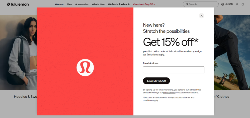
The biggest benefit is that they’re hard to miss, and you know your message will be seen. On the flip side, they can feel interruptive if used too often or at the wrong moment. An onboarding modal example you’ve likely frequently experienced are website popups asking you to subscribe or provide your email address to get a discount or access a page.
Some real-world examples include showing a setup checklist on first login, asking users to finish their profile before diving in, or spotlighting a new feature that needs attention. When timed and targeted thoughtfully, modal popups guide users exactly where they need to go without causing frustration.
2. Tooltips
Tooltips are small, subtle popups that appear next to specific elements in your app or website, offering guidance right where users need it. They’re great for showing how a feature works, giving tips during step-by-step tasks, or pointing out new tools without interrupting the user’s flow.
The advantage of tooltips is that they’re contextual and non-intrusive, so users get help exactly when they need it. The downside is they can be easy to miss if overused or not visually clear.
Examples include highlighting a button with a short tip, explaining a chart or data point in a dashboard, or walking users through a multi-step feature. Used thoughtfully, tooltips make in-app onboarding feel like a helpful hand guiding users through your product, instead of a distraction.
3. Slide-ins
Slide-ins are panels that slide into view from the side or bottom of your app or website, catching attention without completely blocking the interface. They’re ideal for reminders, gentle nudges, or re-engagement messages, helping users take action without feeling interrupted.
Many websites also use slide-ins to highlight customer support or cookie policies.
The advantage is that they’re noticeable but less disruptive than modals, though they can be overlooked if too subtle or overused.
Other examples include reminding users to finish setup steps, prompting them to try an unused feature, or showing a timer for a limited-time offer. When used thoughtfully, slide-ins keep users engaged, encourage progression, and re-engage users who might have drifted, all while supporting a smooth in-app onboarding experience.
4. Banners and inline prompts
Banners and inline prompts are subtle messages that appear at the top, bottom, or within a page or app section, offering guidance without blocking the user’s workflow.They’re ideal for announcing new features, sharing tips, or reminding users about important actions while keeping the interface fully usable.
Because they’re integrated into the page or app layout, users can absorb the information at their own pace. The trade-off is that they’re easy to miss if they blend in too much or aren’t positioned effectively. For example, a banner might announce a new integration at the top of a dashboard, an inline prompt could suggest the next step in completing setup, or a small note could highlight a feature within a workflow.
Modal vs. tooltip vs. slide-in vs. banners (comparison table)
Feature | Modal | Tooltip | Slide-In | Banner/Inline Prompt |
|---|---|---|---|---|
Intrusiveness | High – blocks interaction until dismissed | Low – appears next to element | Medium – slides over content but doesn’t block | Low – embedded in page, non-blocking |
Visibility | Very high – hard to miss | Medium – can be overlooked | Medium – noticeable but subtle | Low –Medium – easy to ignore if not prominent |
Best Use Cases | Critical actions, first-time setup, announcements | Feature guidance, step-by-step instructions | Reminders, upsells, re-engagement | Updates, tips, gentle nudges |
Impact on UX | Can feel interruptive if overused | Contextual and helpful | Less intrusive, keeps flow | Minimal disruption, seamless guidance |
Conversion Potential | High when timed well | Medium – effective for feature adoption | Medium – good for secondary actions | Low – Medium – supports engagement over time |
When to trigger onboarding popups
Knowing when to show onboarding popups can make the difference between guiding users and overwhelming them. The most effective triggers deliver the right message at the right moment, whether it’s on first visit, after specific actions, or at key milestones.
First-visit triggers
First-visit triggers appear the moment a user lands in your product for the first time, making them ideal for welcome messages, product introductions, or setup guidance. They help users understand the interface, highlight key features, and set the tone for the onboarding experience.
Examples include an onboarding modal greeting new users with a checklist, a tooltip pointing out the main dashboard menu, or a slide-in encouraging account setup. Avoid first-visit triggers when your product is complex and requires exploration first. Bombarding users immediately with instructions can feel overwhelming and reduce engagement rather than encourage it.
Behavior-based triggers
Behavior-based triggers appear in response to specific user actions, making guidance timely and relevant. They’re ideal for highlighting features as users interact with your product, nudging them toward completing important steps. However, avoid behavior-based triggers that feel forced or appear too frequently, as users may see them as interruptions rather than helpful guidance.
Examples include showing a tooltip when a user clicks a new button, prompting a modal if they haven’t filled out profile information after starting a task, or sliding in a reminder when a user tries to access an advanced feature.
Time-based triggers
Time-based triggers appear after a user has spent a set amount of time in your product, helping nudge them without relying on specific actions. Use them to remind users to complete setup, explore features, or engage with content. Examples include a slide-in after 60 seconds on a dashboard or a banner suggesting a next step.
Exit-intent triggers
Exit-intent triggers appear when a user is about to leave your site or app, offering one last chance to engage. They’re perfect for reminding users to complete onboarding, finish setup, or try a key feature. Examples include a modal asking to save progress or a tooltip highlighting unfinished steps.
Milestone-based triggers
Milestone-based triggers appear when a user reaches a specific point in their journey, celebrating progress or encouraging the next step. They’re great for boosting motivation and engagement.
However, don’t use them too frequently or for minor actions, as over-celebration can feel meaningless and lose impact. Examples include a pop-up congratulating users for completing setup, earning a badge, or finishing a tutorial.
How to write high-converting onboarding popup copy
Writing onboarding popup copy that actually drives action requires clarity, relevance, and a strong call-to-action. One effective approach is the Outcome-Relevance-Action formula: first show the benefit the user will get (Outcome), explain why it matters now (Relevance), then guide them to the next step (Action).
Keep your microcopy short and focused, avoid jargon, use simple verbs, and highlight one action per popup. CTA buttons should be direct and benefit-driven, like “Connect Now” or “Start Your Project.” Stick to as few words as possible for readability, and maintain a friendly, encouraging tone that makes guidance feel helpful rather than pushy. Well-crafted copy ensures users understand value quickly and take action confidently.
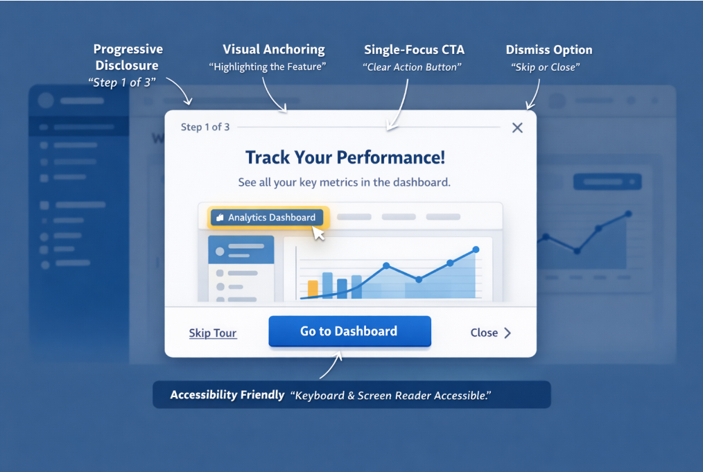
Onboarding pop up design patterns that convert
Design plays a huge role in whether onboarding popups guide users effectively or feel intrusive. Progressive disclosure works by revealing information step by step, preventing overwhelm and helping users focus on one task at a time. Visual anchoring highlights the element or feature being referenced, drawing attention naturally without confusion.
A single-focus CTA keeps the user’s next step clear, while dismiss options give users control, reducing frustration and improving trust. Don’t forget accessibility considerations that ensure popups are readable, navigable via keyboard, and screen-reader friendly so all users can engage with your guidance. Combining these patterns makes in-app onboarding intuitive, engaging, and more likely to drive completion and feature adoption.
Real-world user onboarding popup examples
For more inspiration, take a look at these effective examples.
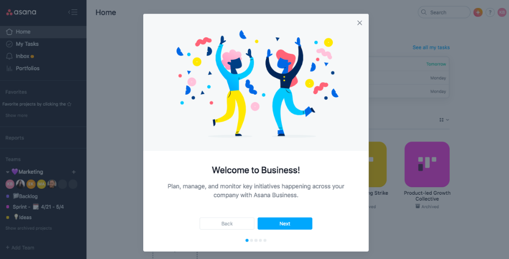
1. Modal pop-up example
This image shows a clear and engaging modal popup example. It immediately welcomes users and explains the purpose of Asana Business in a concise, friendly way. The visual illustration adds energy, while the prominent “Next” button guides users smoothly through the onboarding process.
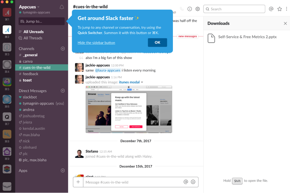
2. Tooltip popup example
This tooltip example provides concise, context-specific guidance directly where the user needs it, without interrupting their workflow. It uses clear language, highlights key actions, and includes a visual emphasis with color and an "OK" button for easy dismissal. This combination makes it both helpful and user-friendly.
3. Slide-In example
This example shows a slide-in popup anchored to the side of the screen, designed to grab attention without completely blocking the interface. The bold “25% Off” headline, large discount graphic, and single email field create a clear, focused conversion path. Because it’s less intrusive than a full-screen modal, it works well for promotional offers
Common onboarding popup mistakes to avoid
Even the best-designed onboarding popups can fail if they’re poorly timed or overused. Avoiding these common mistakes ensures your popups guide users forward instead of pushing them away:
Showing too many popups at once: Stacking popups overwhelms users and creates frustration instead of clarity.
Triggering popups too early in the user journey: Interrupting users before they explore makes guidance feel pushy, not helpful.
Using generic, one-size-fits-all messaging: Irrelevant messaging reduces engagement and lowers feature adoption.
Interrupting users during critical tasks: Blocking workflows during important actions damages trust and increases drop-off.
Overloading popups with too much text: Long explanations get ignored. Users scan, they don’t read essays.
Including multiple competing CTAs: Too many options create decision fatigue and reduce conversions.
Hiding or removing the dismiss option: Taking away control makes users feel trapped and irritated.
Failing to segment users by role or behavior: Beginners and advanced users need different guidance. Treating them the same weakens impact.
Repeating the same popup after dismissal: Ignoring user intent signals poor UX and creates annoyance.
Not tracking performance or optimizing based on data: Without measuring activation or completion rates, you can’t improve results.
Ignoring accessibility best practices: Popups that aren’t keyboard or screen-reader friendly exclude users.
Celebrating minor actions too frequently: Overusing milestone popups makes achievements feel meaningless and reduces motivation.
Measuring onboarding popup performance
To know whether your onboarding popups are working, you need to track the right metrics.
Activation rate shows how many users complete key first actions after seeing a popup.
Feature adoption measures whether guided features are actually being used.
Time-to-value tracks how quickly users reach their first meaningful outcome.
Completion rate reveals how many users finish onboarding flows or setup steps.
Retention impact helps you see whether guided users return and stay longer.
Finally, use an A/B testing strategy to compare different triggers, copy, designs, or popup types. Test one variable at a time to identify what truly improves engagement and reduces churn.
How Flook helps you create targeted onboarding popups without code
Flook makes it easy to create targeted onboarding popups without touching code. If you can use a Chrome extension, you can build tooltips, product tours, popups, banners, checklists, and slideouts in minutes. You decide when they appear—based on user actions, URLs, or events—so guidance feels timely, not random.
Everything can match your app’s design, and your product team can publish updates without waiting on developers. That means faster improvements, smoother in-app onboarding, and less back-and-forth with engineering.
FAQs
Are onboarding popups bad for UX?
Not if they’re relevant and well-timed. Poorly targeted popups feel intrusive, but contextual, behavior-based onboarding popups can guide users, reduce friction, and improve overall user experience.
What’s the best popup type for SaaS?
Slide-ins and tooltips usually work best for SaaS. They’re less disruptive than full-screen modals and feel contextual, helping users learn features without interrupting their workflow.
How many popups should I use?
Use as few as necessary. Focus on key activation moments instead of overwhelming users. One well-timed popup often performs better than multiple intrusive prompts.
Do popups increase activation?
Yes, when strategically placed. Targeted onboarding popups can highlight core features, guide first actions, and reduce confusion, leading to higher activation and faster time-to-value.
Can I create and launch in-app popups without developers?
Yes, you can. Tools like Flook make it easy to build and launch onboarding popups without touching code, so your product or marketing team can get things live quickly. No developers or coding skills required.
Looking for the easiest, most reliable way to create onboarding popups? Learn more about Flook.