31 Types of Tooltips Every UX Team Should Know
Last updated on Tue Mar 25 2025
If your product’s missing tooltips, you’re making users guess and that’s how you lose them. Tooltips are the fastest way to guide, teach, and nudge people without bloating your UI or slowing them down. T
hey help users get it without needing docs, support, or a product demo. This guide breaks down every single type of tooltip that actually matters, when to use them, how they work, and why your team should stop overthinking it. Whether you’re onboarding new users or highlighting advanced features, tooltips are the silent MVP of great UX. Use them right and users move faster.
What are tooltips?
Tooltips are small UI elements that show up when users hover, click, or tap something. They give quick info without taking you out of the flow. You’ll see them used for explaining features, guiding users during onboarding, or clarifying form fields. No fluff, just fast answers in the right place at the right time.
Tooltip vs popups vs modals (quick comparison)
Tooltips are lightweight. Popups are louder and demand attention. Modals stop everything until you deal with them. Tooltips help users keep moving. Popups push messages. Modals block the road. Use tooltips when you want clarity without killing momentum.
The ultimate list of tooltip types
Tooltips come in all shapes and functions, each designed to guide, inform, or enhance user experience. Below is a breakdown of the most common types and how they serve different moments in your UI.
1. Instructional tooltips
Instructional tooltips provide quick, helpful guidance on how to use a feature or complete a task. They're ideal for onboarding new users, reducing friction, and making complex workflows easier to understand and follow.
2. Contextual tooltips
Contextual tooltips appear when users hover over or click a specific element, offering relevant information tied to that spot. They keep interfaces clean while delivering just-in-time clarity and direction.
3. Validation tooltips
Validation tooltips alert users when they’ve entered invalid information or skipped a required field. They appear in context, guiding users to fix errors quickly and continue their task without confusion or delay.
4. Progress tooltips
Progress tooltips help users understand their current step within a multi-step process, such as a form or setup flow. They provide clarity, reduce drop-off, and make longer tasks feel more manageable and guided.
5. Onboarding tooltips
Onboarding tooltips guide new users through product features with step-by-step instructions. They simplify learning curves, speed up activation, and ensure users feel confident exploring your app from the start.
6. Feature discovery tooltips
Feature discovery tooltips shine a spotlight on new, hidden, or underused functionality within your product. They’re great for boosting engagement, promoting adoption, and helping users get more value without needing a major redesign or announcement.
7. Microcopy tooltips
Microcopy tooltips offer concise, supportive text that clarifies specific UI elements or actions. They’re subtle yet powerful, helping users understand labels, icons, or settings without overwhelming them with too much information at once.
8. Interactive tooltips
Tooltips with interactive elements go beyond static text, allowing users to click buttons, follow links, or select from dropdowns directly within the tooltip. They’re ideal for walkthroughs, in-app help, or guiding users through multi-step tasks.
9. Hover tooltips
Hover tooltips appear when a user hovers over an element with their mouse, revealing extra context without clicking. They’re commonly used for icons, buttons, or labels that need brief clarification.
10. Click-to-open tooltips
Click-to-open tooltips are triggered by a user click, making them more intentional and persistent than hover-based versions. They’re great for mobile interfaces or situations where users need more time to read and interact with the content.
11. Sticky tooltips
These tooltips stay visible on the screen until the user actively closes them, making them perfect for delivering detailed guidance or multi-step instructions. They reduce accidental dismissals and ensure users have enough time to absorb the information.
12. Delayed tooltips
Designed to prevent accidental triggers, these tooltips appear only after a short pause. The slight delay improves usability by ensuring the tooltip shows up intentionally, reducing distraction and enhancing the overall user experience.
13. Icon tooltips
Icon tooltips are linked to small info or help icons, offering quick explanations when hovered or clicked. They keep interfaces clean while providing users with optional, easily accessible clarification on specific elements.
14. Mobile-optimized tooltips
Mobile-optimized tooltips are designed specifically for touch interfaces, with larger tap targets, smart positioning, and swipe-friendly behavior. They ensure tooltips remain functional, readable, and user-friendly across various screen sizes and mobile usage scenarios.
15. Accessibility-focused tooltips
Built with inclusivity in mind, these tooltips support screen readers, keyboard navigation, and proper ARIA roles. They ensure that all users—including those with disabilities—can access, understand, and interact with tooltip content seamlessly and independently.
16. Error tooltips
Error tooltips appear alongside form fields when users enter invalid data or skip required inputs. They provide clear, immediate feedback to help users understand and fix mistakes without interrupting their workflow.
17. Confirmation tooltips
Confirmation tooltips prompt users to verify an action before proceeding, like deleting data or submitting a form. They reduce accidental clicks, add a layer of safety, and give users a final moment to review their choice.
18. Smart tooltips
Smart tooltips adapt based on user actions, roles, or engagement history. They deliver context-aware guidance tailored to each user’s journey, making the experience more relevant, efficient, and personalized in real time.
19. Multilingual tooltips
These tooltips automatically display content in the user’s preferred language or region settings. They’re essential for global products, helping ensure clarity, accessibility, and a seamless experience for users across different languages and cultural contexts.
20. Form field tooltips
Form field tooltips offer targeted guidance next to individual input fields, explaining what’s required or giving formatting tips. They reduce errors, improve data quality, and help users complete forms confidently without second-guessing what each field means.
21. Keyboard tooltip hints
Keyboard tooltip hints display shortcut keys when users hover over or focus on interactive elements. They help power users navigate faster, encourage keyboard efficiency, and improve accessibility by revealing hidden functionality without cluttering the main interface.
22. Tooltip carousels
Used in product tours and onboarding flows, this type links multiple tooltips in sequence. Each step highlights a new feature or area, guiding users through complex interfaces one piece at a time.
23. Slide-in tooltips
These tooltips animate into view from the side of the screen, drawing attention without being intrusive. They’re great for announcements, onboarding steps, or feature highlights that need to catch the user’s eye in a subtle way.
24. Bottom bar tooltips
Positioned near the bottom navigation or footer, these tooltips deliver subtle guidance or updates without interrupting the main content. They’re ideal for mobile apps or dashboards where top-screen real estate is limited or already crowded.
25. Highlight tooltips
Highlight tooltips pair a visual spotlight effect with a tooltip message to draw attention to a specific UI element. This combo is perfect for onboarding, feature announcements, or nudging users toward actions they might otherwise overlook.
26. Animated tooltips
Using motion to grab attention, these tooltips fade, slide, or bounce into view. The subtle animation helps guide users’ focus to important messages or features without overwhelming the overall design or user experience.
27. Persistent tooltips
Persistent tooltips remain visible as users work through a task, like filling out a form or completing a multi-step action. They provide ongoing guidance, reducing confusion and eliminating the need to repeatedly trigger the same information.
28. Tooltip callouts
Tooltip callouts enhance messaging by combining visuals—like images, GIFs, or videos—with brief text. They’re useful for demonstrating actions, showing examples, or adding rich context without redirecting users elsewhere.
29. Auto-dismiss tooltips
These tooltips automatically fade out after a short time, offering quick guidance without requiring user action to close. They’re ideal for low-priority tips or temporary hints that shouldn’t interrupt the user’s flow or focus.
30. Custom-styled tooltips
Custom-styled tooltips are fully tailored to match your brand’s visual identity, including colors, fonts, and animations. They blend seamlessly into your product’s design system, enhancing UX while maintaining a consistent and polished aesthetic across the interface.
31. Tooltip chains
Tooltip chains guide users through a series of steps by linking multiple tooltips together. Ideal for onboarding, they create a smooth, structured flow that helps users learn key features or complete tasks without getting overwhelmed or lost.
Tooltip examples in the wild
Here are some examples to help you see how different tooltips can be.
Mailchimp
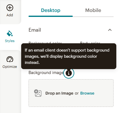
Not every email client plays nice with background images, and that’s exactly why this contextual tooltip from Mailchimp is so handy. It quietly steps in next to the “Background image” upload area and lets users know that if the image doesn’t load, a fallback background color will show instead. It’s short, clear, and confidence-boosting. No technical jargon, just a friendly heads-up that keeps your design looking polished across the board, even when email clients misbehave.
Ahrefs
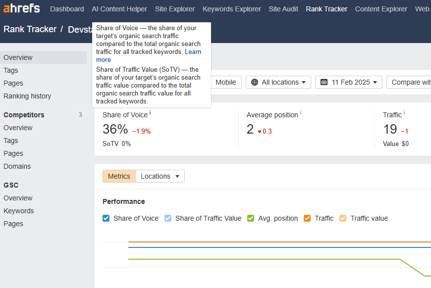
Ahrefs nails it with this microcopy tooltip for Share of Voice and Share of Traffic Value (SoTV). In just a few lines, it breaks down what percentage of search traffic and traffic value your target site controls across tracked keywords. It's the kind of tooltip that turns intimidating SEO metrics into bite-sized, actionable info. Whether you're optimizing client reports or sizing up a competitor, this quick definition gives you just enough clarity without overwhelming. And if you need to go deeper? The "Learn more" link is right there, ready when you are.
Contentful
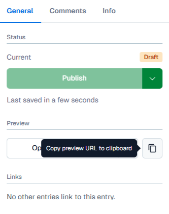
This hover tooltip in Contentful makes sharing draft content super intuitive. When users hover over the copy icon, a quick message appears: “Copy preview URL to clipboard.” It’s a small touch that adds big value, instantly letting collaborators know how to grab a shareable preview link. Whether you're getting feedback from stakeholders or aligning with your team, this tooltip streamlines the workflow without giving people full CMS access. No need for clunky workarounds—just a clean, clickable link to keep the content review process moving smoothly.
ChatGPT
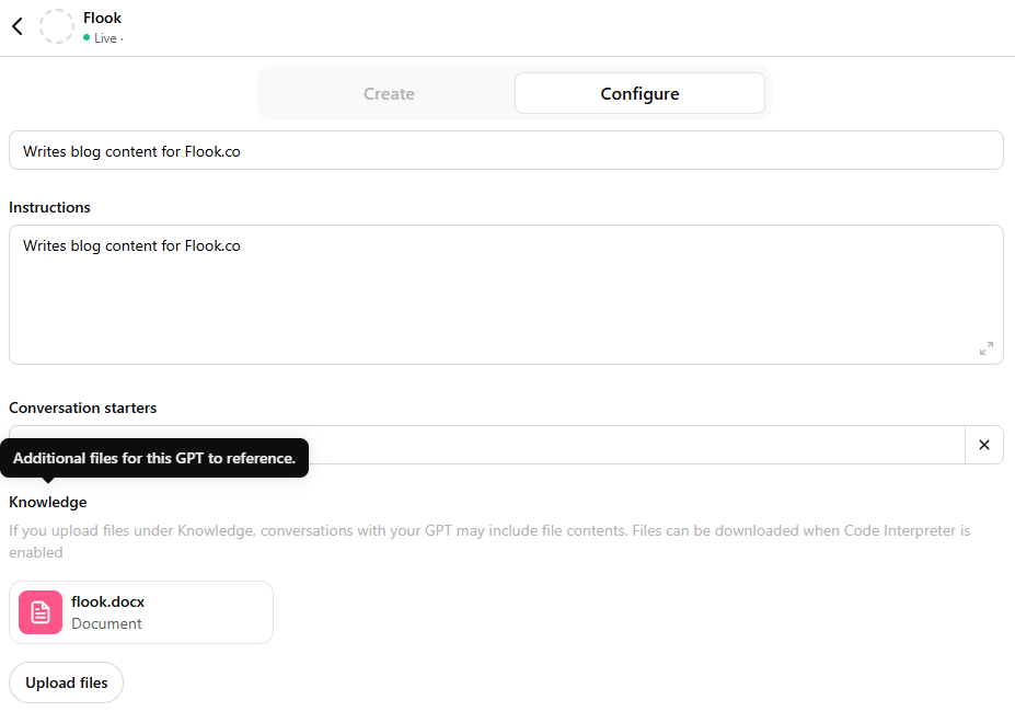
Want your GPT to deliver answers that actually get your content? This instructional tooltip in ChatGPT shows you how to upload reference files—like docs, FAQs, or internal notes—so your AI responses are tailored and spot-on. The tooltip clearly explains how to drag and drop files into the knowledge section, making setup a breeze. No dev skills required, just a simple UI nudge that levels up your GPT from generic to genius. It’s the shortcut to smarter outputs, deeper context, and way less back-and-forth.
QuickBooks
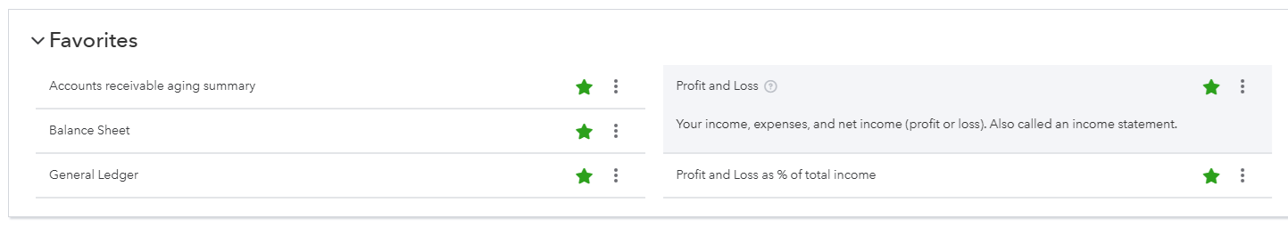
QuickBooks takes the guesswork out of small business reporting with clear, contextual tooltips. Click the question mark next to a report name, and a short, plain-language description appears right where you need it. These tooltips explain what the report covers, any alternate names it might go by, and how it’s commonly used. The Profit and Loss tooltip, for instance, breaks down that it’s also called an income statement and outlines income, expenses, and net earnings. It’s perfect for non-accountants who want to make sense of their books—without falling down a Google rabbit hole.
How to choose the right tooltip
Not every tooltip fits every use case. Here's how to pick the right one based on your users, goals, and platform.
Know your user stage: New users need more guidance. Use onboarding, instructional, or tooltip chains. Power users prefer subtle reminders like keyboard hints or microcopy.
Define your UX goal: Are you educating, warning, or promoting something? Pick tooltips that match the intent—confirmation for risk, feature discovery for promotion, validation for fixing errors.
Consider device type: Mobile users need larger, tap-friendly tooltips with smart placement. Hover tooltips will not work, so go with click-to-open or mobile-optimized styles.
Think about accessibility: Use screen reader support, keyboard focus, and clear contrast. Accessibility-focused tooltips make sure everyone gets the info, not just mouse users.
Create no-code tooltips with Flook
Build tooltips without writing a single line of code. Flook lets you create, customize, and deploy tooltips in minutes—perfect for onboarding, feature callouts, and in-app guidance. No devs, no drama, just clean UX that ships fast.