How to Use Onboarding Banners to Activate Users [With Examples]
Last updated on Wed May 27 2026
A new user just signed up. They land on your dashboard, look around for two seconds, and close the tab. You never see them again. This happens more than most teams want to admit, and it rarely comes down to the product itself. It comes down to that first moment, whether the user understood where to go and what to do next.
An onboarding banner is one of the lightest tools you have for solving this. It sits at the top of your interface, delivers a short message, and points the user toward their first action. No setup wizard, no forced walkthrough. Just a clear, calm nudge at exactly the right time. Used well, it can meaningfully close the gap between signup and activation, especially for products where users need a gentle push to reach the moment they see value.
What is an onboarding banner?
An onboarding banner is a slim, persistent strip of content that appears at the top of your app. It typically shows up when a user first logs in, or at a specific moment in their journey, and delivers a short message with a single call to action.
The format is deliberately understated. Unlike a modal, it doesn't block the interface. Unlike a tooltip, it isn't anchored to a specific element. It sits above your product quietly, giving the user something to act on without demanding their full attention.
The best onboarding banners do one thing well: they orient the user. They answer the unspoken question every new signup has: "Okay, I'm here, now what?" The answer should be obvious. That might be a link to a short tutorial, a prompt to complete their profile, or a reminder that they can paste a recipe link to get started. The message changes depending on your product, but the goal is always the same: reduce friction at the moment it matters most.
Use cases for an onboarding banner
Banners are flexible enough to serve a few different purposes across the user journey. Here are the situations where they tend to work best.
First touch or first impression
The first time a user logs in is the highest-stakes moment in your onboarding. They've signed up, which means they're interested, but interest fades fast if the product doesn't give them a clear next step. A welcome banner is your chance to acknowledge them personally ("Thanks for signing up, Sarah!") and hand them a thread to pull. Keep it warm, keep it specific, and make the action obvious. This is not the moment for feature lists or marketing copy.
Simple onboarding
For products where getting started only takes one or two actions, a banner is often all you need. If a user can reach their first "aha moment" by watching a short video, connecting an account, or pasting a single link, a banner that surfaces that action will outperform a multi-step tour. The lighter the lift you're asking for, the better a banner performs.
Feature announcements
Onboarding doesn't stop after the first session. When you ship something meaningful, a banner is the cleanest way to make sure existing users see it in context, right inside the product. It beats relying on email open rates, and it reaches users at the moment they're actually using the thing you just improved.
Time-sensitive alerts
Planned maintenance, trial expiry countdowns, limited-time offers. Banners handle these well because they're visible without being disruptive. The user can acknowledge and dismiss, or they can ignore it and carry on. Either way, the information was there.
Banners for simple onboarding announcements
The most common use of an onboarding banner is also the most straightforward: you have one thing to tell a new user, and you want to tell it to them the moment they arrive. No branching logic, no progress tracking, no conditions to meet. Just a clean message at the top of the screen that orients them and points them somewhere useful.
This type of banner works because it matches the mental state of a brand-new user. They don't know your product yet. They don't need a comprehensive tour. They need one clear next step. A simple announcement banner gives them that without adding cognitive load or blocking the interface they're about to explore.
The message itself can take a few different shapes. It might be a personal welcome that links to a short tutorial video. It might explain the core concept of the product in a single sentence and prompt the user to take their first action. It might acknowledge that they just signed up and tell them exactly how to get value straight away. What all of these have in common is restraint: one idea, one action, one moment.
Examples
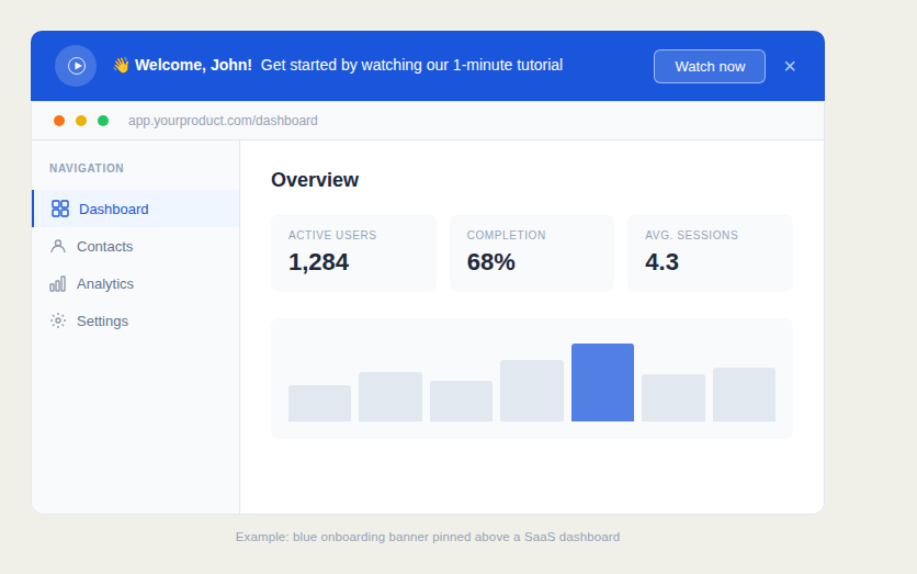
This example shows a welcome banner sitting above a standard SaaS analytics dashboard. The message is personal and direct. It greets the user by name and offers a single next step via a video tutorial. The play icon signals that the ask is small (one minute of their time), and the "Watch now" button makes acting on it effortless. It's a strong pattern for any product where a short video can explain the core value faster than any written walkthrough.
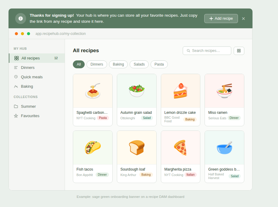
Our next example takes a warmer, more conversational tone suited to a consumer-style product. Rather than prompting the user to watch something, it explains what the product is for in plain language and tells them exactly how to use it. Copy a link, paste it here. The "Add recipe" button gives them an immediate action. There's no jargon, no assumed knowledge, just a friendly orientation that gets out of the way.
When to use this type of onboarding banner
A simple announcement banner is the right call when:
Your product has a clear first action. If there's one thing a new user should do before anything else—watch a video, connect an account, paste a link, invite a teammate—a banner is the fastest way to surface it.
Your onboarding ask is small. The lower the friction of the first step, the better a banner performs. If you're asking for one click or one minute, this format handles it well.
You want onboarding that doesn't interrupt. For products where users arrive ready to explore, a banner lets them do that while keeping the nudge visible. They can act on it when it suits them, or dismiss it if they already know what they're doing.
You're welcoming users who came through self-serve signup. These users have already made a decision to try your product. A banner that acknowledges that and moves them forward quickly tends to outperform a forced walkthrough that assumes they need their hand held.
How to set up an onboarding announcement banner with Flook
Before you configure anything, spend a moment on the message. Write one sentence that tells the user what to do next, and one sentence (or fewer) of context if it's needed. If you find yourself writing three sentences, cut one. The banner is not the place to explain your product. It's the place to start the relationship.
Once your copy is ready, setting it up in Flook takes a few minutes:
Create a new banner widget. In the Flook builder, select Banner as your widget type. You'll see options for position. Choose top for onboarding banners. Top placement catches the eye on arrival and feels like a natural part of the interface rather than an interruption.
Write your message. Keep the main text under 20 words if you can. Use the user's first name if you have it. Flook supports dynamic variables so the banner can greet each person individually. Tone matters here: match the voice of your product, whether that's warm and conversational or clean and professional.
Add your call to action. Insert a button or a link that takes the user to their first step. If you're pointing to a video, consider adding a small play icon alongside the button text. It signals a low time commitment and tends to lift click-through. You can also embed images or rich media directly in the banner if your first action is visual.
Set your trigger. For a first-login welcome, trigger the banner on the URL of your main dashboard and set it to show only once per user. If you want it to persist across a few sessions until dismissed, you can configure that too.
Publish and test it yourself. Log in as a new user and read the banner cold. If the message makes sense and the action is obvious within two seconds, you're done.
Banners with personalized onboarding progress
A simple welcome banner works well when you have one thing to ask of a new user. But some products have more involved setup processes. Five steps instead of one, each unlocking more value than the last. For these situations, a banner that tracks and displays the user's progress does something a static message can't: it makes onboarding feel personal, and it keeps the momentum going across multiple sessions.
A progress banner typically shows the user's name, how far along they are ("You're 40% set up" or "3 of 5 steps complete"), and what to do next. That combination of personalization and forward motion taps into something straightforward about human behavior. People are more likely to finish something once they've started it, especially when they can see how close they are to being done. Showing someone they're already 20% complete is more motivating than showing them a list of five things left to do.
The other thing a progress banner does well is give users a reason to return. A new user who dismisses a standard welcome banner and closes the tab may not come back. A user who has completed two of five setup steps and can see that progress waiting for them has a reason to pick up where they left off.
Examples
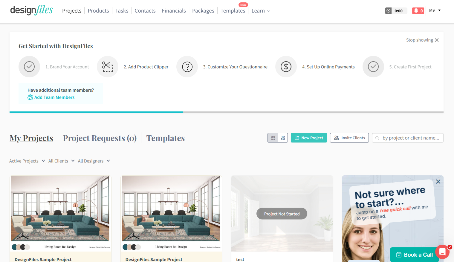
DesignFiles uses an in-dashboard progress tracker to guide new users through five setup steps, from branding their account to creating their first project. Each step is visible across the top of the screen with a progress bar running beneath them. Completed steps are checked off, so returning users can see exactly where they left off. It keeps setup visible without interrupting the rest of the interface.
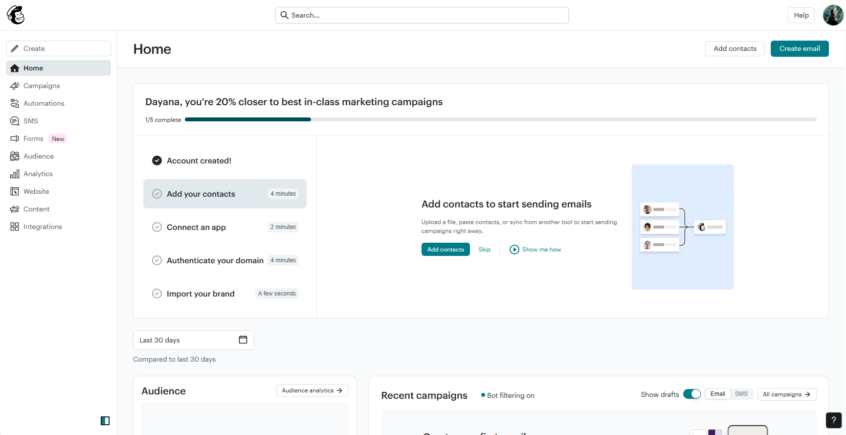
In the next example, we can see that Mailchimp's onboarding banner takes a more personal angle. It greets the user by name, states their exact percentage to completion, and presents the remaining steps as an onboarding checklist with estimated time per task. Selecting a step expands a panel that explains the action and gives them a direct way to complete it without navigating away. The result is an onboarding experience that feels guided rather than generic.
When to use this type of onboarding banner
This format makes sense in a few specific circumstances:
Your onboarding involves multiple steps. If getting full value from your product requires three or more distinct actions—connecting a tool, completing a profile, creating a first item—a progress banner holds those steps together and keeps the user oriented across sessions.
Each step unlocks something meaningful. Progress banners work best when completing a step has a visible payoff. If users can feel the product getting more useful with each action they take, the banner becomes a map to value, not just a task list.
You want to reduce drop-off between sessions. A user who completed step two yesterday and sees "You're 40% there" when they log in today has a stronger reason to continue than a user starting fresh from a static message.
You're trying to optimise activation rates. Personifying the onboarding process—using the user's name, showing their specific progress—consistently outperforms generic messaging. If you're iterating on onboarding to improve activation, a progress banner gives you something concrete to test and improve.
How to set up an onboarding progress banner with Flook
The most important work here happens before you open Flook. You need a clear picture of which steps matter, what order they should happen in, and how to describe each one in plain language. A progress banner built on a vague or bloated step list will create more confusion than clarity.
Once your structure is solid, here's how to bring it to life:
Map your critical path. Write down every action a new user needs to take to reach their first meaningful outcome. Then cut anything that isn't essential. The ideal number of steps is three to five. It should be enough to feel like genuine progress, few enough that completion feels achievable. Give each step a name short enough to fit in a banner without truncating.
Write the progress copy. Decide how you'll communicate where the user stands. Percentage ("You're 60% set up"), fraction ("3 of 5 steps complete"), or a named milestone ("Almost there — one step left") all work. Use the user's first name if you have it. Personalized progress messaging consistently outperforms generic versions.
Build the banner in Flook. Create a new banner widget and select your position. The top of the dashboard is the right call here, since you want progress visible the moment the user arrives. Add your progress message, the name of the next step, and a button or link that takes them directly to the action. Keep the banner focused on the single next step rather than listing everything at once.
Set up your trigger conditions. Configure the banner to appear on the user's main dashboard and to update based on completed actions. In Flook, you can use API calls or event triggers to mark steps as done, so when a user connects their first integration, for example, the banner automatically reflects that progress the next time they log in.
Test the full sequence yourself. Go through every step as a new user and check that the banner updates correctly at each stage. Pay particular attention to the final step. The banner should either disappear cleanly or deliver a clear completion message once the user finishes, rather than lingering awkwardly after the job is done.
Other formats for onboarding to consider
Banners are one piece of a broader onboarding toolkit. Depending on your product and the complexity of your user journey, you may want to combine them with other formats or swap them out entirely for something that fits the moment better. Here are the most useful ones to know.
Product tours
For products with a genuine learning curve, sometimes a single nudge isn't enough. A product onboarding tour walks users through your interface step by step, highlighting key features and explaining what each one does before letting them loose. They're more involved than a banner, but when orientation genuinely requires more than one touchpoint, a tour gives you the structure to deliver it.
Onboarding tooltips
Rather than explaining the whole product at once, onboarding tooltips surface the right information exactly where the user needs it, anchored to a specific button, section, or action. They're contextual, unobtrusive, and one of the least disruptive formats in the onboarding toolkit. They pair well with banners and tours, filling in the gaps without adding noise.
Popups
When you need the user's full attention, a popup earns it by overlaying the interface entirely. That makes them better suited to high-importance moments than everyday onboarding nudges, announcing a major update, sharing a short video that demonstrates a key feature, or capturing a response before the user moves on.
Slideouts
Sitting somewhere between a banner and a popup, a slideout panel appears from the edge of the screen without fully blocking what's beneath it. The extra space makes them well suited to feature announcements, contextual help, and prompts that need a little more room than a banner allows, without demanding the user stop what they're doing.
Onboarding checklist in the main dashboard
Embedded directly in the page layout rather than overlaid on top of it, a dashboard checklist gives users a structured path through setup that stays visible as a reference point. Unlike a banner, it doesn't disappear when dismissed. It sits within the interface and lets users return to it at their own pace as they work through the product.
Frequently asked questions about onboarding banners
How do I decide what to put in an onboarding banner?
Start with one question: what's the single most important thing a new user should do in their first session? The answer to that is your banner. If you can't narrow it down to one action, you need to make a decision before you write a word of copy.
How long should an onboarding banner stay visible?
For first-login welcome banners, showing it once until dismissed is usually the right call. For progress banners tied to setup steps, keeping it visible until onboarding is complete makes sense. The guiding principle is simple: the banner should disappear when the information is no longer useful to the user.
Should I use a banner or a popup for onboarding?
It depends on how much is at stake. Banners work well when the action is optional or low-friction — the user can engage when ready. Popups make sense when the moment genuinely demands attention before the user moves on. If you're unsure, default to the banner and upgrade to a popup only if engagement is low.
How do I know if my onboarding banner is actually working?
Track two things: click-through rate on the call to action, and activation rate for users who saw the banner versus those who didn't. If click-through is low, the problem is usually the copy or the ask. If activation isn't improving, the banner may be pointing users to the wrong first step.
Flook lets you create and publish banners, tooltips, checklists, and more directly on your live product, with no developers and no waiting. Get started with a one-time $49 lifetime deal during beta, and have your first banner live in minutes. Get started with Flook.