How to Create Onboarding Tooltips Without Coding [7 Steps]
Last updated on Wed Jul 22 2026
Six tooltips fired the moment a user opened a settings page. Every one got dismissed before anyone read a word.
That's the version of onboarding tooltips that gives the pattern a bad name. Done right, an onboarding tooltip gets someone unstuck without a dev ticket.
In the SaaS onboarding flows I've reviewed, the tooltips that get read are tied to a single, specific action, not ones narrating the whole product. Here's how to build onboarding tooltips that hold up once real users touch them.
What onboarding tooltips actually do
A new user lands on your dashboard and freezes. Reading a help doc isn't happening. An in-app onboarding tooltip solves that moment: a small, contextual message anchored to one button, field, or icon, shown only when it's relevant.
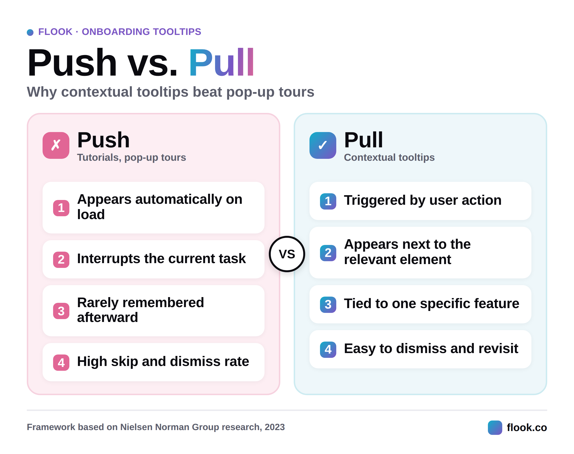
Nielsen Norman Group splits onboarding content into two types: push content, like tutorials that interrupt users on load, and pull content, like tooltips triggered by what someone is doing. Push content gets skipped and forgotten. Pull content sticks, because it appears exactly when needed.
Ship faster, and you can afford to be more contextual. For the full breakdown of formats, see this rundown of tooltip types.
How teams actually build onboarding tooltips
You've got three ways to build tooltips. The right one depends on how often you need to change them.
Custom code (HTML and JavaScript)
Developers write tooltips in HTML, CSS, and JavaScript for full control, but every tweak means a new ticket and deploy. If you're building it yourselves, this HTML tooltips guide covers the full implementation. Otherwise, custom code usually just slows your team down.
No-code tools
For most SaaS teams, a no-code tool is faster. With Flook's browser extension, anyone can click the element, write the copy, and publish, no developer or redeploy required. Change the wording, move the placement, or rework it entirely, live in minutes.
Matt Stone, who runs engineering at Juuno, put it plainly:
"Non-technical founders underestimate how much activation they leave on the table by skipping contextual help. A tooltip on the right feature at the right moment is worth more than another onboarding email." — Matt Stone, Co-founder of Engineering, Juuno
That gap between "we should add a tooltip there" and it actually going live is what a no-code tool closes.
Product experience platforms
Platforms like Appcues or Userpilot bundle tooltips with tours, checklists, and analytics. They suit teams that need deep targeting and reporting. The tradeoff is price and setup time, which makes them overkill if tooltips are all you need right now.
How to make tooltips people notice
A tooltip at the wrong moment does more harm than none. Getting this right comes down to timing, copy, and how tooltips connect to each other.
Time tooltips to real behavior, not sign-up day
Trigger a tooltip off what someone just did, not a fixed step in a script. A pause after clicking a button is the moment for a nudge, not five seconds after landing on the page. Tooltips that respond to behavior get read. Tooltips on a timer get dismissed.
Write copy people actually read
One sentence, one action. If a tooltip needs a paragraph, the button needs fixing, not the tooltip.
One SaaS team I worked with had six tooltips live on one settings page, all firing the moment it loaded. Users dismissed every one within seconds, unread. We cut it to two, tied to the two lowest-adoption features, triggered only on hover. Dismiss-without-reading dropped noticeably within a month, mostly because there was finally something worth reading.
Chain tooltips into flows, then test them
Chain related tooltips into a short sequence for multi-step tasks (the same idea behind onboarding tours, just narrower), but always give an easy way to skip. Then treat the sequence like any other feature: watch how people move through it, and test the copy and timing instead of setting it once and moving on.
Building tooltips with a no-code tool, step by step
Here's exactly how that looks inside Flook, from your first tooltip to a tested, working flow.
When I audit a tooltip rollout, the first thing I check is whether anyone is actually tracking dismissal rates once the tooltips go live. Most teams ship them once and never look again.
Step 1. Plan your onboarding tooltips
Before adding tooltips, map out where they should appear and why. Each tooltip should guide users toward an action that leads to success with your product. Identify key areas where users may need clarification or encouragement, such as buttons, forms, or new features. Avoid overwhelming users with too many tooltips—focus on the essential ones that drive engagement.
Consider the user’s journey and place tooltips where they naturally encounter challenges or questions. Highlight features that deliver quick wins, like setting up a profile or using a core tool. Timing is crucial: tooltips should appear when users need them most, not before or after.
Keep your tooltips short, clear, and actionable. Use language that aligns with your brand voice, and make sure the design fits seamlessly with your interface. Avoid jargon and provide concise explanations that help users move forward without confusion.
Step 2. Add your first tooltip
To add your first tooltip using Flook, start by installing the Chrome extension and adding the script to your app’s header tag. Once set up, navigate to your website or app and open the Chrome extension.
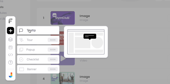
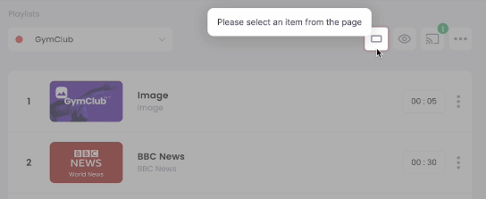
Click Add Tooltip and select the element you want to attach the tooltip to. For example, if you’re adding a tooltip to a button labeled “Preview Playlist,” click the button to anchor the tooltip. Adjust the tooltip’s position manually so it appears above the button without blocking nearby elements. Turn off the launcher icon if it's unnecessary, as tooltips for buttons typically don’t need extra indicators.
Step 3. Edit the tooltip's text
Clear, concise content is key. The tooltip should explain the button’s purpose in a single sentence, like “Preview your playlist in a different orientation.” Use straightforward language and maintain a helpful, friendly tone. Avoid long-winded descriptions—users need quick, actionable information.
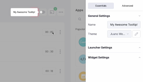
With Flook, editing text is simple. Select the tooltip and type directly into the text box within the Chrome extension. Review your copy to ensure it aligns with your brand’s voice and enhances the user experience.
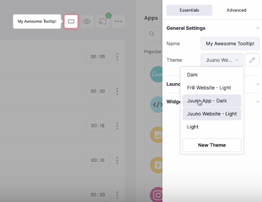
Step 4. Choose the color scheme
Your tooltip’s design should match your product’s aesthetic. With Flook, you can create and apply custom themes for a consistent look. Choose colors that contrast well with the background, ensuring readability. For example, if your app uses a dark theme, select white text on a dark gray tooltip. Rounded corners and subtle shadows create a modern, polished appearance.
In the Chrome extension’s settings, select the appropriate theme for your tooltip. If your app uses multiple color schemes, apply the correct one to maintain consistency across different sections.
Step 5. Adjust the placement and timing as needed
Placement and timing can make or break a tooltip’s effectiveness. Position the tooltip close to the element it describes without covering critical information. Use manual positioning to fine-tune its location, ensuring it doesn’t overlap with nearby text or buttons.
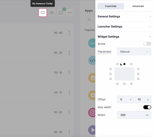
Adjust the tooltip’s offset to align it perfectly. For example, lowering the tooltip by five pixels might make it feel more natural. Decide whether to include an arrow pointing to the element—it helps users associate the tooltip with the correct feature.
Timing matters, too. Set the tooltip to appear instantly when users hover, click, or focus on the element. For persistent tooltips, keep them visible until the user dismisses them or clicks away. Avoid tooltips that linger too long or disappear too quickly, as both can frustrate users.
Step 6. Repeat steps 2 through 5 for all onboarding tooltips
Consistency is key when adding multiple tooltips. Each one should follow the same design and tone, creating a cohesive user experience. Use Flook’s duplication feature to speed up the process—copy an existing tooltip, then adjust the text and position for the new element.
Group related tooltips into onboarding flows, guiding users through key tasks step by step. For example, a series of tooltips might help users create a playlist, customize its settings, and share it with others. Ensure the sequence feels logical and intuitive.
Step 7. Conduct user testing and adjust where needed
Once your tooltips are live, test them with real users to see how they perform. Gather feedback on clarity, timing, and placement. Are users finding the information helpful? Are tooltips appearing at the right moments? Watch for signs of frustration, like users closing tooltips immediately or ignoring them altogether.
Use analytics tools to track engagement and identify tooltips that need improvement. Low interaction rates may indicate that a tooltip appears too early, contains irrelevant information, or overlaps with other content. Make adjustments based on user behavior, ensuring each tooltip provides value without disrupting the experience.
Continuous testing and optimization ensure your onboarding tooltips stay effective as your product evolves. By guiding users through key actions and helping them achieve quick wins, you’ll boost engagement, reduce churn, and create a more intuitive experience.
Where onboarding tooltips usually go wrong
Even good tooltips fail for predictable reasons.
Tooltip overload and vague copy
Nobody wants five tooltips fighting for attention on one screen. Use only the ones guiding someone toward a real action, and space them out. Vague copy causes the same problem differently: if a tooltip could apply to any button anywhere, rewrite it.
Bad placement, timing, and mobile blind spots
A tooltip covering the exact thing it explains defeats the purpose. Test placement in a real user flow, not just the design file, and default to positioning above or beside an element. What works on desktop often breaks on mobile.
Frill co-founder Chris Gillespie has a rule for it:
"Tooltip placement should start with your drop-off data, not your design instincts. Put them where users stop, not where the UI feels unfinished." — Chris Gillespie, Co-founder, Frill.co
Placement isn't a decision made once. It's something you check against real usage.
Skipping feedback, accessibility, and the dismiss button
A tooltip users can't close becomes the interruption it was meant to prevent, so give every one a dismiss option. Build with screen readers and keyboard navigation in mind from the start. If you're leaning on tooltips to explain a confusing interface, fix the UI instead.
How you can tell if your tooltips are working
Simple methods
Watch real users interact with your product and note exactly where they hesitate. Anecdotal feedback from your best customers matters too: if the accounts you'd hate to lose love the onboarding flow, that's a signal worth trusting over a general survey.
Advanced methods
Track activation rate, feature adoption, and how often people engage with a tooltip instead of dismissing it. Watch drop-off inside multi-step flows, and A/B test different versions. Pair that data with support tickets and surveys. For real examples, see these tooltip examples.
Looking for an easy way to manage tooltips, onboarding tours, pop-ups, and banners? Check out Flook, a simple and affordable user experience platform.
Onboarding tooltips FAQs
What's the difference between an onboarding tooltip and a full product tour?
A tooltip is a single, contextual message tied to one element on the screen. A product tour chains several tooltips into a guided sequence that walks a user through multiple steps in order. Use a tooltip for one-off guidance and a tour for a connected workflow.
When should you use a tooltip instead of a walkthrough?
Reach for a tooltip when a user only needs help with one specific action, not the whole product. Walkthroughs suit brand-new users who need orientation across several features at once. If you're only explaining one button or field, a full walkthrough is overkill.
Do onboarding tooltips need a dismiss option?
Yes, always. A tooltip a user can't close becomes the exact interruption it was meant to prevent. Give every tooltip a clear way to dismiss it, and make sure it doesn't reappear once someone has already closed it.
Looking for an easy way to manage tooltips, onboarding tours, pop-ups, and banners? Check out Flook, a simple and affordable user experience platform.