Hover Tooltip UI Best Practices & Design Tips for SaaS Products
Last updated on Thu Jan 22 2026
A hover tooltip is a simple UI element that shows extra guidance when your mouse pauses over something. Tooltips might look small, but when used well, they can make a big impact. They reduce confusion, speed up onboarding, and give users the right info at the right time, without cluttering your interface.
For SaaS products, that kind of clarity can lead to smoother user experiences, fewer support tickets, and better engagement. But not all tooltips are created equal. Poorly timed or badly placed tooltips can frustrate users or even break accessibility.
In this guide, we’ll walk through what makes a great tooltip (with visual examples), how to build them the right way (including accessibility and performance tips), and how to deploy them without code using Flook. Whether you're a dev or a product manager, this post is for you.
What is a hover tooltip UI?
A hover tooltip UI is a small text box that appears when someone moves their mouse over an element—like an icon, button, or label. It’s a subtle but powerful way to give users extra information without cluttering your screen.
These are part of a broader concept called microinteractions, the tiny details in your UI that guide users, give feedback, or help them take the next step. Tooltips are one of the most useful microinteractions in SaaS, especially for onboarding or explaining less obvious features.There are a few types of tooltips:
Hover tooltips appear when you move your mouse over something.
Click tooltips show up after a click, often used for persistent or interactive tips.
Focus tooltips are triggered by keyboard navigation—great for accessibility.
Tooltips have been around for decades (remember those old yellow pop-ups in Microsoft Office?), but they’ve evolved. Today’s best SaaS products use clean, well-placed tooltips to reduce confusion and improve user confidence.When designed with care, hover tooltips can make your product feel more intuitive. They’re small details that add up to a better, smoother experience, especially in complex, feature-rich apps where users need guidance without disruption.
Why hover tooltips matter in SaaS UI
Hover tooltips might seem like a small design detail, but in SaaS products, they can have an outsized impact. They quietly guide users, reduce friction, and help your interface feel more thoughtful, especially when your product has a lot of features or advanced settings.
Here’s why they matter:
Aid user onboarding & feature discoverability
First-time users can feel overwhelmed when faced with a new tool. Tooltips act like helpful little signposts, offering context without interrupting the flow. A well-placed tooltip can highlight a feature, explain what it does, or even suggest the next step—all without a full-blown tutorial.
Reduce clutter in complex dashboards
You don’t always have room for long labels or explanations. Tooltips let you keep your interface clean while still offering clarity when it’s needed. It’s a great way to keep things simple for experienced users, while supporting those who are still learning.
Improve conversion by explaining confusing features
If users don’t understand a feature, they won’t use it. Tooltips help clear up confusion at the moment of hesitation, whether it’s a billing option, a settings toggle, or a new call-to-action. That little nudge can directly impact engagement and conversions.
Influence perceived product quality and support effort
Thoughtful tooltips show that you care about the user experience. They make your product feel more polished and reduce the need for support tickets. To a user, they say, “We anticipated your question, and here’s the answer.”
Anatomy of an effective tooltip
A great tooltip might seem simple, but there’s a lot going on behind the scenes. When designed thoughtfully, tooltips feel invisible. They deliver just enough context at just the right time without getting in the way. To make that happen, each part of a tooltip needs to work together: the trigger, the content, the positioning, and how the tooltip appears and disappears. Whether you're building tooltips from scratch or using a no-code solution, understanding the anatomy of an effective tooltip will help you design better user experiences.Here are the core components to get right:
Trigger: This is the element users hover over to activate the tooltip. Triggers are often small UI elements like icons, buttons, or short labels. Make sure they’re clearly connected to an action or feature that might need explanation.
Placement: Where the tooltip appears matters. Top and right placements are common, but the best tooltips use smart positioning that adapts to screen space. A tooltip should never block the element it’s describing.
Content: Tooltip copy should be short, clear, and helpful. This is not the place for a paragraph—aim for one sentence max. You can also include light formatting, icons, or links if it helps the message.
Dismissal Logic: Tooltips should disappear when no longer needed. That might be on hover-out, a short delay, or after a click elsewhere. Avoid tooltips that linger too long or disappear too fast.
Visual Structure: While this is often overlooked, a good tooltip includes subtle design details like padding, shadows, and arrows that point to the trigger. If you’re using a tool like Flook, you can add visuals or animations to make tooltips even more intuitive.
Consider adding a simple diagram or animation here to show how these parts fit together.
Good vs. bad tooltip UI
Not all tooltips are created equal. Some quietly enhance the user experience, while others frustrate users or get ignored entirely. When you're designing tooltips for a SaaS product, the difference between helpful and harmful often comes down to small details, like timing, clarity, and positioning. In this section, we’ll break down the core traits that separate good tooltip UI from bad, so you can design interactions that feel seamless instead of distracting.
What makes a tooltip UI “bad”
A poorly designed tooltip doesn’t just fail to help, it can actively harm the user experience. Common issues include being too slow to appear, covering up important content, or offering information that’s vague or unnecessary. Worse, some tooltips aren’t accessible at all, leaving out keyboard and screen reader users entirely.
What makes a tooltip UI “good”
Great tooltips feel like a natural part of the interface. They appear quickly, stay out of the way, and provide clear, relevant guidance. They're also built with accessibility in mind, supporting keyboard navigation and assistive technology. When done right, tooltips reduce confusion, save time, and build trust with users.
How to visually compare tooltip quality
To help product teams spot the difference, this section will include a side-by-side visual comparison of tooltip UI examples. We’ll highlight areas like:
Placement (smart vs. obstructive)
Copy clarity (helpful vs. vague)
Speed and responsiveness (delayed vs. instant)
Accessibility support (inclusive vs. exclusive)
Annotated visuals will demonstrate what works, what doesn’t, and why it matters. You’ll be able to see exactly how small design choices can create a smoother experience, or cause user friction.
Tooltip UI design best practices
Designing tooltips might seem straightforward, but getting the details right can make a big difference. The best tooltips are helpful without being annoying, informative without being overwhelming. Below are key best practices to keep in mind when designing tooltips for your SaaS product, organized by what matters most: content, design, timing, and interaction.
Content
Keep it short and helpful. The goal is to add clarity, not confusion.
Use plain language your users will understand
Focus on why the feature matters, not just what it does
Avoid filler words or restating what's already obvious
Limit to one clear sentence, two max
Include links sparingly, and only if they truly add value
Design
A good tooltip should feel like a natural part of the UI, not a popup ad.
Use legible font sizes that are easy to read at a glance
Avoid drop shadows that make tooltips look clickable
Keep padding consistent for visual comfort
Use subtle directional arrows to clearly anchor the tooltip
Stick to your brand colors, but maintain good contrast
Timing
Speed matters, but so does subtlety.
Tooltips should appear within 300–500ms
Avoid long delays that make users think it’s broken
Don’t flash the tooltip on quick hovers
Ensure tooltips disappear smoothly when no longer needed
Avoid stacking
Too many tooltips create noise, not clarity.
Only one tooltip should be active at a time
Disable tooltips near each other to prevent overlap
Avoid chaining multiple tooltips in a row
Don’t use for essential info
Tooltips are great for optional help—but never rely on them for critical content.
Never hide required instructions in a tooltip
Don’t assume mobile users will ever see a hover
Always provide key info elsewhere in the UI
Use tooltips to enhance your UI—not to patch over poor layout or labeling. When designed with care, they feel effortless and invisible—but your users will thank you for them.
Performance considerations
Performance might not be the first thing you think about when adding tooltips—but it should be. Even small UI elements can affect how smooth your app feels, especially in complex dashboards or large-scale SaaS platforms. If tooltips are causing layout shifts, adding unnecessary DOM nodes, or not cleaning up after themselves, they can quietly drag down the user experience over time.Here are a few things to watch for:
Dom complexity – keep tooltip components lightweight and avoid nesting deeply
Lazy rendering – only render tooltips when needed, not on initial load
Event listeners – attach and remove listeners properly to prevent memory leaks
Z-index chaos – manage layering so tooltips don’t conflict with modals or overlays
Debouncing – prevent rapid show/hide flicker on fast hover events
In single-page apps (SPAs), where routes change without a full reload, it’s especially important to clean up any listeners or timers that tooltips rely on. Failing to do so can cause memory bloat or lingering UI glitches. Keeping your tooltip logic lean, scoped, and tidy ensures performance stays smooth, even as your app scales.
Accessibility (a11y) checklist for tooltips
All tooltips should be accessible. Tooltips, while helpful for many users, can become a barrier if they’re not built with accessibility in mind. Many tooltips are still designed to work only on hover, which makes them completely unusable for people navigating with a keyboard or screen reader. That’s a major issue in any SaaS product where clarity and guidance are crucial.
A good rule of thumb: if your tooltip delivers useful information, everyone should be able to access it. That means designing with semantic HTML, screen reader compatibility, and keyboard interactions in mind. It also means thinking carefully about things like color contrast, font legibility, and dismiss behaviors that don’t rely solely on mouse interaction.
Here are some key things to get right:
Aria-describedby – connects a tooltip to its trigger for screen readers
Aria-label – provides a custom label when no visible text is available
Focus and focus-within – make sure tooltips appear for keyboard users too
Visible focus states – users should clearly see which element is selected
Sufficient contrast – text should meet WCAG minimums for readability
No hover-only info – any important content should also be accessible by keyboard
Here’s a simple example of an accessible tooltip using aria-describedby:
<button aria-describedby="tooltip-1">Plan Options</button> <div id="tooltip-1" role="tooltip"> Choose your billing frequency and user count here. </div>
Implementing tooltips: code vs no-code approaches
Implementing tooltips can be done in several ways depending on your team’s resources and how flexible you want your tooltips to be. Below, we’ll compare traditional developer-led methods with a faster, no-code approach using Flook, and explore where tooltips deliver the most value in real SaaS environments.
Dev route
If you have engineering resources available, building tooltips with code gives you full control over behavior, styling, and performance. The simplest approach is using CSS-only tooltips with the :hover selector. These are lightweight and fast, but they’re limited. They don’t handle edge cases well, struggle with accessibility, and break down on touch devices or complex layouts. For more robust needs, JavaScript-based solutions are the norm. Frameworks like React and Vue offer tooltip components that handle positioning, animation, and lifecycle management more reliably. Libraries such as Floating UI focus on smart positioning and collision detection, making sure tooltips stay visible even near screen edges. Tippy.js builds on top of these ideas with polished defaults and animations, while component libraries like MUI Tooltip offer tight integration if you’re already using their design system. The tradeoff is maintenance. Custom or library-based tooltips require developer time to implement, test, and update—especially as your product evolves. For small to medium teams, that ongoing effort can add up quickly.
No-code tooltip deployment using Flook
Flook is a no-code tooltip and UI guidance tool designed for teams that want flexibility without engineering overhead. Instead of writing code, you can visually add, edit, and manage tooltips directly on your product. It integrates smoothly with Juuno, allowing teams to deploy contextual help across screens without touching the codebase. With Flook, product managers and designers can move faster. Tooltips can be added or updated in minutes, making it easy to respond to user feedback or support questions without waiting on a release cycle. Here’s what the no-code process typically looks like:
Connect flook to your app through juuno
Select an element visually to attach a tooltip
Write and style the tooltip content
Set trigger and dismissal behavior
Publish changes instantly
Because Flook operates outside your core code, it’s ideal for onboarding tips, lightweight product tours, and live help content that changes often. You can test messaging, iterate quickly, and remove tooltips once users no longer need them—all without slowing down your dev team. If you want to ship faster and stay flexible, trying Flook’s free trial is an easy next step.
Real-world hover tooltip UI examples
In real SaaS products, tooltips shine when they reduce friction at moments of confusion. They’re especially effective in feature-dense interfaces where labels alone aren’t enough. Well-placed tooltips can guide users forward without overwhelming them or forcing them to leave the page for documentation.
Seeing hover tooltips in action makes it much easier to understand what “good” looks like. The best examples don’t interrupt users—they quietly remove friction at exactly the right moment. Below are several real-world hover tooltip UI examples from modern SaaS products, each solving a specific usability problem without adding clutter.
Juuno’s playlist preview helper
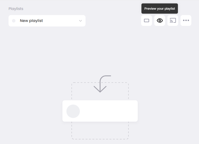
Juuno uses hover tooltips to explain how users can preview their content playlists before publishing them to a live screen. When users hover over the preview icon, the tooltip clarifies what the preview does and why it’s useful. This prevents uncertainty and gives users confidence before deploying content, without forcing them into a separate help flow.
Frase’s usage reset tooltip
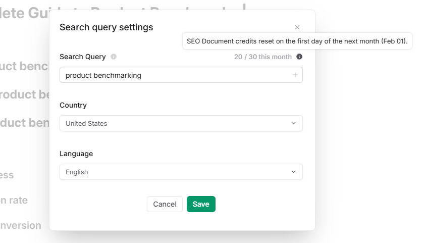
Frase includes a hover tooltip next to usage limits that explains how many document credits remain and when they reset. The tooltip updates dynamically based on the current billing cycle, so users always see accurate information. This is a great example of a tooltip reducing support questions around pricing and limits.
Mailchimp’s alternate content explanation
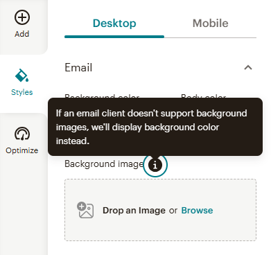
Mailchimp uses hover tooltips to explain fallback behavior for email designs. When users hover over the alternate content option, the tooltip reassures them that a background color will appear if images don’t load. It’s short, calming, and removes anxiety around edge cases users might not fully understand.
Contentful’s link preview tooltip
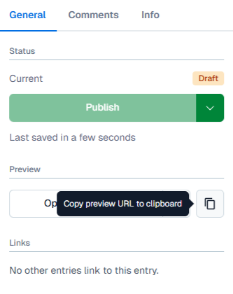
In Contentful, hovering over the copy icon reveals a tooltip explaining that users can copy a preview link to share unpublished content. This tooltip supports collaboration without exposing complex permissions logic, making it easier for teams to share drafts without extra documentation.
Ahrefs’ share of voice tooltip
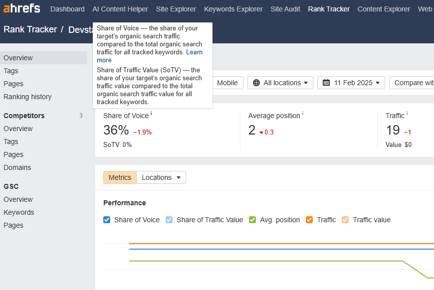
Ahrefs uses hover tooltips to explain advanced SEO metrics like Share of Voice. Instead of forcing users to leave the dashboard, the tooltip breaks down what the metric means in plain language, with an optional link for deeper learning. It’s a strong example of simplifying complex data without oversimplifying it.
When NOT to use tooltips
Tooltips can be helpful, but they’re not always the right solution. In some cases, using a tooltip can actually create more confusion or lead to a poor user experience. Here are a few situations where it’s better to skip the tooltip and consider a different approach:
Redundant info – avoid tooltips that state the obvious, like “Click here to submit” on a button labeled “Submit”
Mobile-first design – hover tooltips don’t work on touchscreens, so don’t rely on them as the only way to show important info
Replacing proper labeling – tooltips should support clear UI, not stand in for it; if something needs a label, add a visible one
Security and compliance concerns – never use tooltips to expose sensitive logic, internal notes, or hidden functionality that shouldn’t be public
When in doubt, ask: “Is this tooltip solving a problem, or just filling space?” If it’s the latter, it may be best to leave it out.
FAQ
What's the difference between hover, click, and focus tooltips?
Hover tooltips appear when a user moves their mouse over an element. Click tooltips are shown after clicking, often used for interactive content. Focus tooltips trigger when a user tabs into an element using a keyboard, making them more accessible for non-mouse users.
Are hover tooltips bad for mobile-first design?
Hover tooltips aren’t ideal for mobile because touchscreens don’t support hover behavior. If your product is mobile-first, tooltips should either be focus or tap-based, or replaced entirely with visible inline help to ensure all users get the same guidance.
Do screen readers detect hover tooltips?
Not by default. To make tooltips accessible to screen readers, you need to use ARIA attributes like aria-describedby and ensure the tooltip is tied to an element’s focus state. Otherwise, the content may be completely missed by assistive technologies.
Can I build tooltips without a developer?
Yes. With no-code tools like Flook, you can add, edit, and manage tooltips visually without writing any code. It’s ideal for product managers, marketers, or designers who want to guide users or test onboarding content without involving engineering.
What are the most common tooltip mistakes?
The most common issues include showing tooltips too slowly, hiding essential information inside them, using vague or redundant language, and failing to support keyboard or screen reader access. These problems reduce clarity and create frustration for users.
How does Flook compare to Hotjar or WalkMe for tooltips?
Flook is simpler and more focused. While Hotjar and WalkMe offer full user behavior tracking or complex tours, Flook specializes in lightweight, no-code tooltip deployment. It’s better suited for teams who want to add tooltips quickly without bloated features or high pricing.
Well-designed tooltips make your product easier to use, reduce confusion, and create a smoother experience for everyone.
If you want to add tooltips without writing code, give Flook a try. It’s fast, flexible, and built for teams who want to move quickly.