What Are Tool Tips? + How to Create Them in 5 Easy Steps
Last updated on Mon Jan 27 2025
In the SaaS industry, user expectations are high and attention spans are short, tooltips are the unsung heroes of modern UI/UX design. They’re those small but mighty elements that guide users through your product, improve usability, and boost engagement—all without breaking their flow. Think of tooltips as your product’s whisperer, delivering just-in-time insights that drive clarity and action. Whether it’s onboarding new users, showcasing hidden features, or reducing support tickets, tooltips are shaping the way we interact with software.
The demand for smarter, faster onboarding experiences has never been greater. As digital transformation sweeps across industries, tooltips have emerged as a key player in user adoption and retention strategies. They simplify the complex, enabling businesses to onboard users with precision and efficiency. If your product isn’t leveraging tooltips to create seamless user journeys, you’re already behind.
Create tooltips in minutes with Flook, or keep reading for our complete guide!
What are tooltips?
Tooltips are small, interactive popups that provide users with contextual information about a feature, element, or action within an interface. In the context of UI/UX design, they act as on-demand guides, offering clarity and reducing friction without overwhelming the user. Typically triggered by hover, click, or focus actions, tooltips deliver concise explanations or helpful tips exactly when and where they’re needed. Their purpose is simple: to make user experiences intuitive and seamless, whether guiding new users or helping experienced ones navigate advanced features.
Tooltips have their roots in early desktop applications, where they served as basic hover text to explain buttons or icons. As software evolved, so did tooltips, transitioning from static text labels in legacy apps to dynamic, context-aware components in modern SaaS platforms. Tooltips are designed to be visually appealing, accessible, and deeply integrated into user onboarding and feature discovery strategies. Their evolution reflects the shift toward user-centric design, where simplicity and efficiency are paramount.
Types of tooltips
Tooltips come in various forms, each tailored to serve specific user needs and contexts. Understanding these types helps you choose the right tooltip for your design goals.
Transient: Brief, disappearing hints that appear when users hover or focus on an element. Ideal for quick explanations or minimal guidance.
Paired: Tooltips that combine with a direct user action, such as clicking or tapping, to provide additional context or prompt. Often used for walkthroughs or guided interactions.
Persistent: Fixed labels or popups that remain visible until dismissed. Perfect for offering in-depth information or ensuring critical details are always accessible.
Tooltip anatomy
A well-designed tooltip is more than just a floating box with text—it’s a finely-tuned piece of UI magic. Let’s dissect what makes a tooltip tick:
🔑 Key Properties
Content: Keep it concise, relevant, and actionable. Every word matters.
Placement: Strategic positioning is non-negotiable—top, bottom, left, or right, but always intuitive.
Interactivity: Tooltips should respond seamlessly to user actions (hover, click, or focus) without disrupting the workflow.
🔍 Core Elements
Text: The heart of the tooltip—clear, direct, and helpful.
Icons: Optional but powerful. Use symbols to complement or visually anchor the message.
Hover Effects: Smooth transitions and subtle animations make tooltips feel polished and engaging.
In short, great tooltips are like great wingmen—they show up at the right moment, deliver exactly what’s needed, and then step out of the way.
4 main benefits of tooltips
Tooltips are the secret weapon in the arsenal of any high-performing SaaS product. Their value extends far beyond aesthetics, offering real, measurable impact on user experience and engagement.
1. Simplify User Onboarding
First and foremost, tooltips simplify user onboarding by breaking down complex workflows into manageable, digestible steps. Instead of overwhelming new users with dense tutorials or endless documentation, tooltips provide guidance exactly where and when it’s needed. They turn potentially intimidating processes into seamless experiences. For example, SaaS platforms often leverage tooltips to walk users through initial setup, highlighting key features in an intuitive, step-by-step flow. This not only boosts first-time adoption but also accelerates time-to-value, ensuring users see the benefits of your product faster.
Each tooltip is a small investment in clarity, leading to exponential returns in user satisfaction and retention.
2. Make Feature Discovery Easy
Tooltips are a game-changer when it comes to driving feature discovery. By strategically highlighting new or hidden functionalities, they ensure users can fully leverage your product’s value without needing to dig through menus or documentation. Whether it’s a recently launched feature or an overlooked gem, tooltips provide the perfect spotlight, guiding users directly to the action.
Case in point: SaaS platforms often use tooltips during feature rollouts to announce updates in a non-intrusive way. Instead of relying solely on emails or release notes, a well-placed tooltip can instantly draw attention to what’s new and why it matters. This approach not only improves feature adoption rates but also reinforces the product’s ongoing innovation.
3. Provide In-Depth Guidance
Tooltips excel at providing in-depth guidance by offering process explanations in a way that feels natural and non-intrusive. Unlike long-form instructions or bulky help menus, tooltips deliver just enough information to keep users moving forward without breaking their flow. This makes them an ideal solution for complex, task-oriented scenarios.
For instance, task-oriented tooltips are often used in software workflows to guide users through multi-step processes. Whether it’s setting up integrations, configuring advanced settings, or completing a complicated form, tooltips provide contextual insights at each step. By delivering help in small, actionable chunks, they ensure users feel supported rather than overwhelmed—paving the way for success without frustration.
4. Drive Support & Sales
Tooltips are not just about usability—they’re also a powerful tool for driving support efficiency and increasing sales. By offering contextual assistance, tooltips help users resolve issues independently, reducing reliance on support teams and minimizing frustration. For instance, troubleshooting tooltips can guide users through common problems step by step, providing solutions in real-time without the need to submit a ticket.
On the sales side, tooltips can seamlessly promote upgrades or premium features without coming across as pushy. Contextual messages like “Unlock this feature with a Pro Plan” or “Upgrade to gain access” strategically nudge users toward higher-tier plans. Case studies have shown that well-placed tooltips can significantly boost conversions by presenting relevant offers at the perfect moment in the user journey. It’s a win-win: users feel supported, and your product drives more value.
How to create tooltips in 5 steps
Ready to get started making your own tooltips? Here's how.
Step 1. Understand the core principles for effective tooltips
Before diving into design or implementation, start by nailing the fundamentals. Effective tooltips are all about clarity, accessibility, and alignment with your brand. Here’s the playbook:
🚀 Keep It Succinct No one wants to read an essay mid-task. Keep your tooltips short, sharp, and straight to the point—just enough to inform without overwhelming.
♿ Prioritize Accessibility Tooltips should work for everyone. Ensure compatibility with screen readers and support keyboard navigation. Accessibility isn’t optional; it’s essential.
🎨 Stay On-Brand Your tooltips should feel like an extension of your product, not an afterthought. Match your brand’s tone, typography, and color palette for a seamless user experience.
When you get these principles right, you’re laying the foundation for tooltips that are not just functional, but impactful.
Step 2. Design tooltips for visual and functional appeal
Great tooltips don’t just inform—they impress. Visual design and usability go hand in hand, so it’s crucial to get both right. Here’s how to level up your tooltip design game:
🎨 Nail the Visuals
Typography: Go for readability. Use a font size that’s easy on the eyes and matches your product’s UI. Avoid clutter—focus on clarity.
Color: Contrast is king. Make sure your tooltip stands out against the background while staying consistent with your brand colors.
Shape: Rounded corners, subtle shadows, and clean edges scream modern design. Keep it sleek but functional.
🎥 Make It Smooth
Transitions & Animations: Add subtle fade-ins or slides to make your tooltips feel polished. Avoid over-the-top animations—keep it professional yet engaging.
🚫 Avoid Blocking Actions The golden rule: tooltips should never get in the way of the user. Position them thoughtfully—hovering near the element they’re explaining without obscuring key actions or content.
When your tooltips look good and work flawlessly, you’re not just helping users—you’re making them love your product even more.
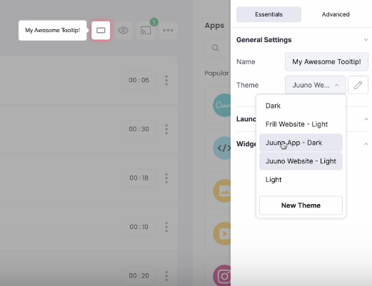
With Flook, you can create color and style themes, and then select the correct theme when adding a tooltip to your website or web app.
Step 3. Expertly craft the content of your tooltips
The heart of any great tooltip lies in its content. Whether it’s a transient hint that disappears after a hover or a paired tooltip triggered by a specific action, the key is to make every word count. Focus on delivering value by balancing brevity with clarity—short doesn’t mean vague, and detailed doesn’t mean verbose. Your goal is to provide just enough context to guide users without disrupting their flow.
Steer clear of jargon or overly technical language, even if your audience is advanced. Simplicity always wins. A tooltip should feel like advice from a helpful colleague, not a lecture from a manual. By keeping the tone approachable and the content actionable, you’ll craft tooltips that resonate with users and drive engagement.
With Flook, it's easy to edit the text of your tooltips using our Chrome extension.
Step 4. Use JavaScript or try a no-code platform
When it comes to building tooltips, you’ve got two main paths: rolling up your sleeves with JavaScript or opting for a no-code platform. Both approaches have their merits, and the choice largely depends on your technical expertise, timeline, and specific project needs.
JavaScript: Full Control, Full Customization
Using JavaScript gives you complete freedom to design tooltips exactly how you want them. You can tailor every detail—from behavior to appearance—ensuring a perfect fit for your product. A simple example of a JavaScript tooltip involves adding event listeners for mouse hover or focus to display a small text box dynamically. It’s flexible and powerful but requires a solid understanding of coding, and keeping tooltips scalable across your product can be a challenge.
Pros of JavaScript:
Total customization over functionality and styling.
No reliance on third-party platforms.
Infinite scalability with your existing codebase.
Cons of JavaScript:
Time-intensive to implement and maintain.
Requires developer resources.
Potential for bugs or inconsistencies across browsers.
No-Code Platforms: Speed and Ease of Use
No-code platforms are the go-to option for teams who want to move fast without relying heavily on developers. These tools offer pre-built templates, drag-and-drop editors, and easy integration—making it possible to deploy polished tooltips in minutes. Many SaaS tools for tooltips also come with advanced features like analytics, multi-language support, and responsive design, all wrapped up in an intuitive interface.
Ready to get started? Easily create tooltips with Flook.
Pros of No-Code Platforms:
Quick deployment with minimal technical skills.
Built-in features like analytics and A/B testing.
Consistency across browsers and devices.
Cons of No-Code Platforms:
Limited customization compared to JavaScript.
Dependence on third-party platforms.
Whether you choose JavaScript for ultimate control or a no-code platform for speed and simplicity, the right approach will depend on your team’s resources and product goals. Either way, well-executed tooltips are a win for your users.
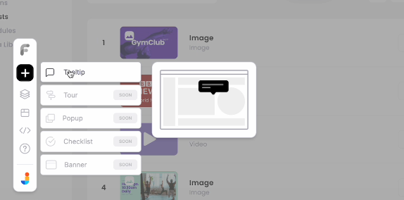
Here's an example of our no-code Chrome extension for adding tooltips:
Step 5. Master the art of tooltip placement and timing
A tooltip is only as effective as its placement and timing. Where it appears and how long it stays visible can make or break the user experience. The ideal placement ensures the tooltip is intuitive, unobtrusive, and contextually tied to the element it’s describing. Common triggers include hover (for desktop), click (for mobile or interactive elements), and focus (for accessibility and keyboard navigation). Choosing the right trigger depends on your user base and how they interact with your product.
Timing is equally critical. Tooltips should appear instantly to keep up with user actions, but they shouldn’t linger unnecessarily. Transient tooltips should disappear after a few seconds, while persistent ones should remain visible until the user takes an action, such as clicking away. The balance lies in being helpful without overstaying their welcome. By mastering both placement and timing, you’ll create tooltips that feel natural and guide users exactly when they need assistance.
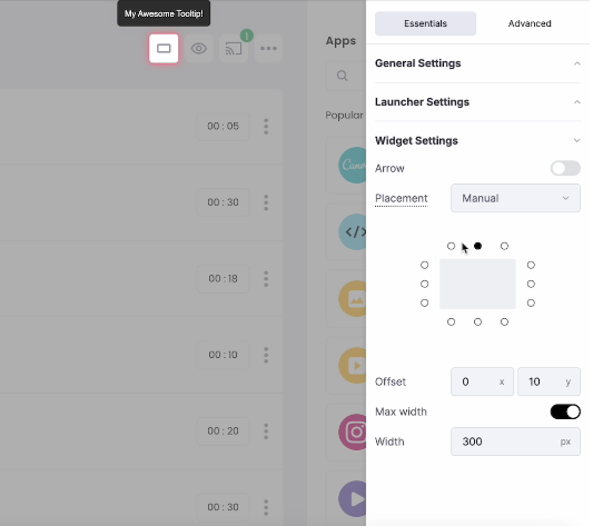
Your no-code platform should have various placement and timing settings to make adjustments easy.
Examples of tooltips
Check out these helpful examples, each of which has a different lesson to teach us about tooltips.
1. QuickBooks reports explanations
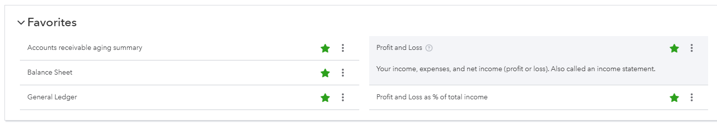
In QuickBooks, you can click on the question mark tool tip next to every report to read a description. The report description clarifies what's included in the report, any other names for the report, and how the report is used. This is instrumental for helping small business owners do their own bookkeeping. Rather than a typical pop-up style, this tooltip expands the report box.
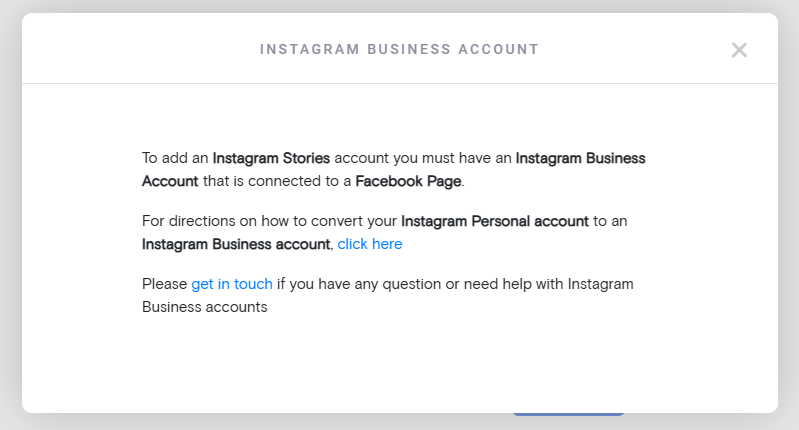
2. Curator's integration helper
Our sister company, Curator, offers a social media aggregator so anyone can add their social media feed to their website. For some integrations, it's necessary to have a business account with the social media platform.
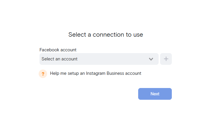
The tooltip includes the copy, "Help me setup an Instagram Business account," so users don't get stuck at that stage. When users click on this tooltip, they see a pop-up with thorough instructions on how to set up the right kind of account so they can properly integrate with Curator.
3. Frase's unit reset tooltip
Frase is an SEO optimization platform. Their pricing offers a specific number of documents per month. In this tooltip example, we see that users can click to get more information on the remaining number of docs. The tooltip states that SEO document credits reset on the first day of the next month.
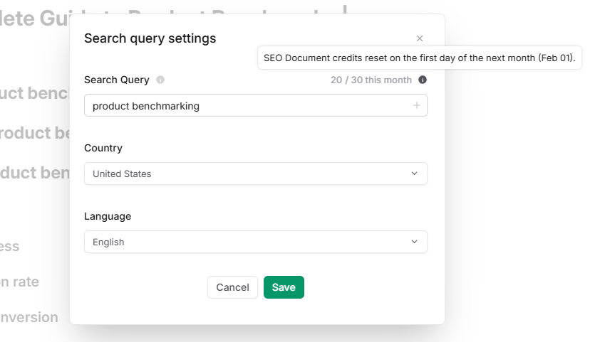
This tooltip even includes dynamic text, so that the month is constantly updating. It currently states February, but it will automatically switch to the appropriate month. This eliminates confusion and helps reduce incoming support tickets for this common question.
Accessibility and best practices
Accessibility should be a priority, not an afterthought, when designing tooltips. To ensure inclusivity, tooltips must support ARIA roles and be fully compatible with screen readers, allowing visually impaired users to access the same information. Additionally, tooltips should be navigable using a keyboard alone, ensuring users who rely on alternative input methods can interact with your interface effortlessly. By embedding accessibility into your tooltip strategy, you create a more inclusive experience that benefits all users.
Key best practices for accessibility:
Avoid cluttering your interface with too many tooltips, as it can overwhelm users and hinder navigation.
Test your tooltips across multiple devices, screen sizes, and browsers to ensure consistency and usability.
Strike a balance between helpfulness and obtrusiveness—tooltips should enhance the experience, not disrupt it.
Challenges with tooltips
Tooltips are powerful, but when overused or poorly executed, they can quickly frustrate users. Bombarding the interface with excessive tooltips creates visual clutter and interrupts the user’s flow. Worse, irrelevant or redundant tooltips can make your product feel intrusive rather than helpful. A classic example is tooltips stating the obvious, like “Click here to submit” on a button already labeled “Submit.” The key is to deploy tooltips selectively, ensuring they provide real value without overwhelming the user experience. Only use them when you need them.
Besides overuse, there can be other challenges. From cross-browser inconsistencies to performance hits, technical challenges can make or break your tooltip implementation. Issues like misaligned placement or lagging animations often stem from poorly optimized code or outdated libraries. To overcome these pitfalls, test your tooltips rigorously across different browsers and devices. Use lightweight, modern libraries or no-code platforms that account for performance and compatibility, ensuring a smooth and consistent experience for all users.
Tooltips are essential for driving user engagement and simplifying complex workflows. When designed thoughtfully, they not only improve usability but also enhance the overall user experience, keeping your audience loyal and satisfied.
Ready to elevate your product experience? Start crafting smarter, faster, and more effective tooltips today with Flook—your ultimate no-code solution.