Tooltips UX: 9 Design Rules for a Better User Experience
Last updated on Fri May 23 2025
Tooltips are tiny, but their impact on your user experience (UX) is massive. 88% of online users say they wouldn’t return to a website after a poor UX experience. In SaaS products, where clarity drives conversion, tooltips can make or break your onboarding, reduce support requests, and even boost product adoption.
And here’s the kicker—89% of companies compete primarily on UX, yet many overlook microinteractions like tooltips that help users complete actions smoothly. Meanwhile, research from the Baymard Institute shows that form errors and confusion account for 22% of cart abandonments—often solvable with a well-placed tooltip.
In this guide, we’ll break down what a tooltip is, why it matters, and how to design effective, accessible, and purpose-driven tooltips that actually improve UX across web apps, interactive elements, and mobile devices.
Let’s dive into the details that most teams miss.
What is a tooltip in UX?
A tooltip is a compact, contextual UI element that appears when a user hovers over, focuses on, or taps a specific interface component. Its primary function is to offer brief, relevant guidance without disrupting the user’s current workflow. In SaaS products, tooltips are essential for clarifying unfamiliar features, reducing onboarding friction, and increasing user confidence in complex environments.
While they may seem minor, tooltips play a critical role in UX. Done well, they act as seamless microinteractions that enhance usability. But when poorly executed (too wordy, poorly placed, or inaccessible), they create confusion, break trust, and add friction to the user journey.
Common tooltip use cases for improving UX
Tooltips are used widely across SaaS platforms, including:
Onboarding flows using interactive elements
Tooltips are especially powerful during user onboarding. By layering helpful prompts over your interface, you can guide new users through key actions in a low-friction, self-serve way. When combined with checklists or progress bars, tooltips transform into interactive walkthroughs that accelerate time to value.
This reduces reliance on support and decreases early churn, a critical factor for SaaS products with short trial periods or freemium models.
Form field guidance (validation tooltips)
Validation tooltips help prevent user errors before they happen. These appear dynamically next to form fields, offering real-time tips on formatting, required fields, or value ranges. Rather than forcing users to guess, tooltips make forms feel intuitive and less error-prone.
They’re a simple fix for one of the most common UX pain points in B2B platforms.
Progress tooltips to indicate task completion
In complex workflows, like configuring a product, setting up integrations, or completing onboarding, progress tooltips give users the confidence to continue. They explain steps, show what’s next, and reduce cognitive load.
Even simple copy like "Step 2 of 4" can dramatically boost task completion rates.
Button descriptions and icon explanations
Tooltips clarify the purpose of unlabeled buttons, icons, or toggles. This is especially useful for interfaces that rely on iconography or condensed layouts.
It keeps the UI clean without sacrificing usability.
Contextual education for advanced features
As users grow, tooltips can evolve with them. Contextual tooltips highlight lesser-known features or advanced use cases, increasing feature adoption without disrupting workflow.
This supports product-led growth by delivering value exactly when (and where) the user needs it.
The impact of tooltips on user experience
When thoughtfully designed, tooltips do far more than explain an icon. They streamline UX, reduce friction, and drive meaningful outcomes for SaaS businesses. Here’s how great tooltip UX impacts your bottom line (and your support team’s sanity):
Task completion: Tooltips provide just-in-time guidance, helping users confidently navigate forms, dashboards, and workflows—no guessing required.
Reduced support requests: Every tooltip is a mini support ticket that never had to happen. Instead of "Where do I click?" your users get subtle nudges that keep them moving forward.
Improved accessibility: With proper ARIA attributes, tooltips become screen-reader friendly—because clarity shouldn’t depend on eyesight.
Product-led growth enablement: Want to upsell a premium feature? A contextual tooltip can highlight its value right when the user needs it. It’s like your product whispering, “Hey... there’s more where that came from.”
Pro tip: If users are rage-clicking, your tooltip strategy might need a refresh.
But bad tooltip UX can lead to:
Cluttered interfaces
Overwhelm or distraction
Missed information (especially on mobile devices)
Accessibility violations
How to design effective tooltips that enhance UX
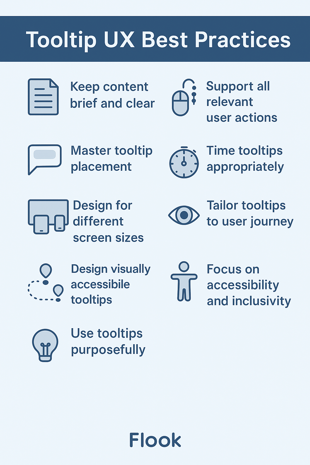
Tooltip design is all about creating frictionless microinteractions that empower your users. Great tooltips support discoverability, reduce confusion, and build trust. Here are 9 essential principles for designing tooltips that actually improve the user experience.
1. Prioritize clarity in tooltip content
Tooltip content should be brief, helpful, and instantly understandable. Think of it as answering your user’s unspoken question in real time. A single, user-friendly sentence is ideal.
Do: Explain what an action or feature does.
Don't: Use jargon, internal terminology, or tech speak.
Example ❌ "Initiates a batch cron task to sync records" ✅ "Syncs your customer data with external tools"
Great tooltip UX begins with great writing. Test your microcopy with real users, not just internal teams.
2. Support all relevant user actions
Users interact with products in a variety of ways: mouse, keyboard, touch, and even assistive tech. Tooltips must be designed to accommodate these different inputs to deliver a truly inclusive and intuitive experience.
Ensure they can be triggered via:
Mouse hover (desktop)
Keyboard focus (accessibility)
Tap or long-press (mobile)
Contextual tooltips based on user actions—like clicking an unfamiliar button or pausing too long on a page—can enhance UX without overwhelming.
3. Master tooltip placement for seamless UX
Tooltip placement is as important as the message itself. Poor placement can cause overlap, cover important content, or feel jarring.
Best practices include:
Using pointer arrows to clearly indicate the related UI element.
Avoiding placement over CTAs, form fields, or content users need to see.
Using smart positioning logic that adapts to screen sizes and avoids the tooltip "jump."
Modern platforms like Flook do this automatically, reducing guesswork for your team.
4. Make tooltips responsive across devices and screen sizes
In today’s multi-device world, designing tooltips that only work well on desktop is a costly oversight. Mobile and tablet users interact with interfaces differently, and tooltip behavior must adapt accordingly to avoid introducing friction. A responsive tooltip strategy ensures that guidance remains clear, accessible, and usable no matter how or where your product is being accessed.
For strong cross-device UX:
On desktop: Hover triggers, mouse-optimized placement, and dismiss-on-mouse-out behavior.
On mobile devices: Tap triggers or long-press, clear exit methods, and no overlap with interactive elements.
Test your tooltips at different breakpoints and orientations to ensure a seamless experience.
5. Time it right: delay, duration, and dismissal
Timing can make or break the effectiveness of a tooltip. If a tooltip appears too quickly or sticks around too long, it can frustrate users rather than help them. The goal is to create a smooth, intuitive experience that feels natural and non-disruptive.
UX-friendly timing considerations include:
Hover delay (150–300ms) to avoid accidental triggers.
Duration: Allow users enough time to read without feeling rushed.
Dismissal methods: Esc key, clicking outside, or auto-dismiss on scroll.
Avoid tooltips that pop up too eagerly or linger too long. Subtle transitions (fade-in/fade-out) help with perceived performance and polish.
6. Tailor tooltip UX to the user journey
Users need different guidance depending on their experience level and context. Adapting tooltip content and behavior to match the user journey leads to a more personalized and effective experience.
Customize the experience based on where users are in their journey:
New users: Use onboarding tooltips to guide their first actions.
Power users: Provide shortcuts, hidden features, or optional enhancements.
Returning users: Use contextual tooltips to highlight new functionality without disrupting flow.
Pair tooltips with progress bars during onboarding or multi-step processes to improve completion rates and transparency.
7. Design visually accessible tooltips
Great visual design enhances tooltip effectiveness. If users can’t easily read or visually locate a tooltip, it fails, regardless of how helpful the content might be. Strong design choices ensure tooltips feel like a natural extension of your interface rather than intrusive or confusing elements.
Aim for:
High contrast between text and background
Clear typography (legible, consistent font sizes)
Adequate white space to reduce cognitive load
Tooltip shapes or outlines that stand apart from the interface
Avoid overly styled tooltips that feel like ads or error messages. Keep them consistent with your app’s design system.
8. Focus on accessibility and inclusivity
Tooltips must be usable by everyone, including people who rely on assistive technologies like screen readers or navigate interfaces via keyboard. If a tooltip can’t be accessed without a mouse or disappears too quickly, it creates a barrier that excludes a significant portion of users. Designing for inclusivity ensures that your product experience is equitable, compliant, and truly user-first.
Key guidelines:
Use
aria-describedbyoraria-labelattributesEnsure keyboard users can trigger and dismiss tooltips
Avoid hiding essential information in tooltips alone
Tooltips should supplement, not replace, accessible interface design. Inclusive UX means everyone benefits, not just mouse users.
9. Use tooltips purposefully, not everywhere
Tooltips are a strategic UX tool, not a crutch for bad UI. Overusing them creates clutter and distracts from the core experience.
Use tooltips to:
Clarify non-obvious actions
Offer optional tips
Provide secondary information
Don’t use tooltips for:
Critical instructions
Core navigation
Repeating what's already visible
Ask yourself: Does this tooltip reduce friction or just fill space?
Accessibility considerations for tooltips
Designing tooltips for accessibility isn’t just a nice-to-have—it’s essential. If a tooltip is invisible to a portion of your users, it's a usability failure. Inclusive UX ensures that all users, regardless of ability or assistive tech, get the same information and guidance.
To make your tooltips accessible, they must be:
Keyboard-navigable: Tooltips should appear on keyboard focus (e.g., using the Tab key) and be dismissible with Esc or by moving focus. Don’t trap users in tooltip limbo.
Announced by screen readers: Use
aria-describedby,aria-label, or live regions to ensure screen readers pick up the tooltip’s message. Otherwise, your helpful hint might as well be invisible.Not reliant on hover only: Hover doesn’t exist on touchscreens, and it's not reliable for screen reader users. Support tap, focus, and other user actions.
Persistent long enough to be read: Avoid tooltips that vanish too quickly. Users with cognitive or motor delays may need a few extra seconds.
Also, never use tooltips to convey critical information, such as error messages, password rules, or required actions. These need to be fully accessible in-line, not hidden in a floating box. Think of tooltips as supportive sidekicks—not mission-critical narrators.
Common pitfalls in tooltip UX
Even the most helpful tooltip can backfire if it’s poorly implemented. These common pitfalls can quickly turn guidance into frustration.
Too much info
Tooltips should deliver quick clarity—not overwhelm. When a tooltip starts looking like a help center article, you’ve gone too far. Stick to one sentence that answers a specific question: What does this do?
Stacking tooltips
Showing more than one tooltip at a time clutters the interface and fragments user focus. Tooltips should feel like helpful nudges, not a swarm of pop-ups. Guide users step-by-step, not all at once.
Poor contrast
If your tooltip blends into the background, it won’t matter how helpful it is. Ensure high contrast between the text and background to support visual accessibility and fast readability.
Overuse
Not every element needs a tooltip. When overused, tooltips lose their effectiveness and users start to ignore them. Use tooltips selectively—for moments when clarity truly matters.
Unclear trigger
Users should never wonder what triggered this tooltip? Tooltips must be clearly anchored to a recognizable UI element. Vague or floating triggers create confusion and break trust.
Enhancing tooltips with progress indicators
When users are working through a process (especially one that spans multiple steps), clarity is everything. Embedding progress indicators into your tooltip strategy adds structure, sets expectations, and reduces the anxiety of the unknown. Whether you're onboarding a new user or guiding someone through a complex workflow, showing them where they are (and what’s left) is a simple yet powerful UX upgrade.
Tooltips paired with a progress bar or step count give users immediate feedback and a sense of momentum. Instead of feeling lost, they see clear next steps—keeping engagement high and abandonment low.
Use progress indicators within tooltips for:
Multi-step onboarding
Form completion
Gamified education flows
Even a small visual cue like “Step 2 of 5” can make a big impact on task completion and user confidence.
Flook’s approach to UX-first tooltips
Flook makes it incredibly easy for SaaS teams to launch interactive elements like tooltips, checklists, and walkthroughs—without code. With built-in responsive design, accessibility support, and smart positioning, Flook helps you implement tooltip UX best practices out of the box.
Product and marketing teams can add and manage tooltips directly, freeing up dev time and ensuring tooltip content stays aligned with evolving user needs.
Tooltip UX FAQs
Read on for answers to important questions.
What is the best tooltip position?
Top-right or bottom-center typically works best because they feel intuitive and avoid overlapping with most content. However, expert UX designers recommend using dynamic positioning logic that accounts for viewport size, scroll state, and proximity to the screen edge. Many modern tooltip libraries and tools (like Flook) handle this automatically, adjusting placement in real time to avoid cutoff or UI collisions. Consistency in placement also plays a role in reinforcing trust and predictability.
Should tooltips be on hover or click?
Ideally, support both. Use hover and focus triggers for desktop and keyboard users, and tap or long-press for mobile users. Relying solely on hover makes your tooltips inaccessible on touch devices, while click-only models often disrupt workflow. Designers we interviewed emphasized ensuring intuitive, non-intrusive activation methods across devices. This is especially important in SaaS platforms where multi-device usage is common, and users expect continuity across their interactions.
What’s the difference between a tooltip and a pop-up?
Tooltips are lightweight, contextual hints that appear near a specific UI element, think of them as whispers. Pop-ups, on the other hand, are more assertive—they interrupt the flow, demand attention, and often include multiple actions (e.g. close, submit). While pop-ups are appropriate for alerts or consent, tooltips support on-the-go learning. One UX lead noted: “Pop-ups grab attention. Tooltips lend it.” Use each intentionally depending on whether you’re guiding or requiring.
How do you make tooltips accessible for screen reader users?
To be screen-reader friendly, tooltips must use semantic HTML and ARIA attributes like aria-describedby, linked to the input or element. Avoid hiding critical information in tooltips, as screen reader users might never encounter them. Experts also recommend testing with real assistive tech (not just dev tools) to verify expected behavior. Accessibility is not a feature; it’s foundational to good UX, and inclusive tooltips are a small but impactful part of that equation.
When should you avoid using tooltips altogether?
Avoid tooltips when the information is critical to user success, such as required form instructions, error messages, or anything essential for task completion. Tooltip content should always be supplemental, not essential. Multiple UX designers noted that misuse often stems from bad UI design being “patched” with tooltips. If you find yourself writing a paragraph in a tooltip, that’s a sign the underlying UI or copy needs to be reworked.
Designing tooltips with UX in mind requires that you think about accessibility and drive meaningful user actions.
If you're ready to create beautifully designed tooltips without writing a line of code, try Flook today.