Tooltips are one of those sneaky little UX elements that pack a serious punch. They’re small, unobtrusive, and when done right, genuinely useful. Whether you’re guiding new users, explaining advanced features, or just giving a quick heads-up, a well-placed tooltip can transform a confusing experience into a seamless one.
But not all tooltips are created equal. Some are perfectly timed lifesavers. Others are just annoying interruptions. I’ve worked with a lot of SaaS teams on their onboarding, and the ones that get tooltips right share one habit: they study what great looks like before they build anything.
That’s exactly what this article is for. We’ve rounded up 10 of the most effective tooltip examples from apps like Juuno, Mailchimp, and QuickBooks. Each one solves a different problem, from onboarding friction to feature adoption. You’ll see how they work, why they land, and what you can steal for your own product.
1. Juuno’s playlist helper
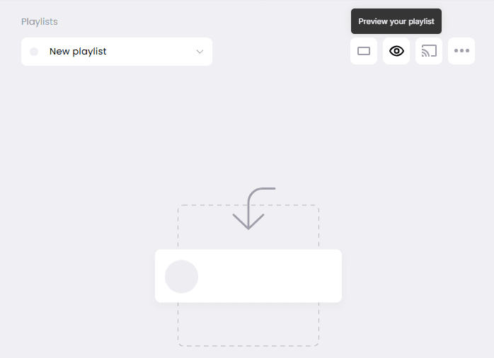
Juuno is a digital signage app that turns any smart TV into a display screen. Their team uses Flook to add contextual tooltips throughout the app without any developer involvement.
This particular tooltip appears near the playlist preview feature. It explains how users can check exactly what their digital sign will look like before pushing it live to a screen. The copy is short. The placement is precise. It shows up right when a user would naturally pause and wonder what to do next.
The lesson here is timing. A tooltip that explains a feature before anyone needs it is easy to ignore. This one appears at the moment of hesitation, which is when it actually helps.
2. Curator’s content moderation tooltip
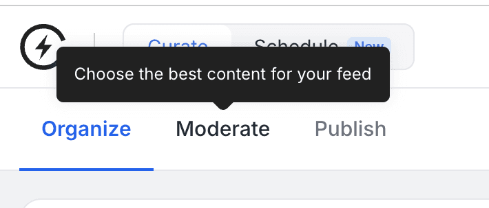
Curator is a social media aggregator that pulls content from multiple networks into a single feed. The moderation workflow sits at the center of the product, but the word “moderate” means different things in different contexts.
This tooltip appears on the Moderate tab and reads: “Choose the best content for your feed.” Six words that reframe a potentially ambiguous action into something immediately clear. Users do not need to wonder whether moderation means approving, filtering, or flagging. The tooltip answers that before they click.
I’ve watched this pattern reduce support tickets significantly across our own products. When you name what something does in plain language, at the exact moment a user encounters it, you remove a question they did not even know they were about to ask.
“We cut Instagram setup support tickets by around 40% just by adding a tooltip at the exact step where users got stuck. No help doc, no email sequence. One tooltip at the right moment.” - Thomas Garrood, Co-founder and Head of Engineering at Curator
3. Frase’s unit reset tooltip
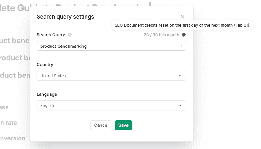
Frase is an SEO platform with usage-based pricing. Users have a monthly document credit limit, and running out mid-project is frustrating.
This tooltip surfaces two pieces of information at once: how many credits remain and when they reset. The reset date updates automatically, so the tooltip is always accurate without any manual maintenance.
This is a good example of a tooltip that prevents a support question rather than answering one. Users who understand their limits don’t email asking about them. That’s a real operational win, not just a UX nicety.
4. QuickBooks’ report explanations

Financial reporting is intimidating for most small business owners. QuickBooks uses tooltips to bridge the gap between accounting terminology and plain language.
Click the question mark next to any report name and a short description expands inline. It explains what the report includes, what it’s sometimes called, and how it’s typically used. The Profit and Loss tooltip, for example, notes that it’s also known as an income statement and covers income, expenses, and net profit.
What works here is the placement. The tooltip lives exactly where the confusion happens, next to the unfamiliar term. It doesn’t redirect users to a help center. It answers the question without breaking the workflow.
5. ChatGPT’s model training helper
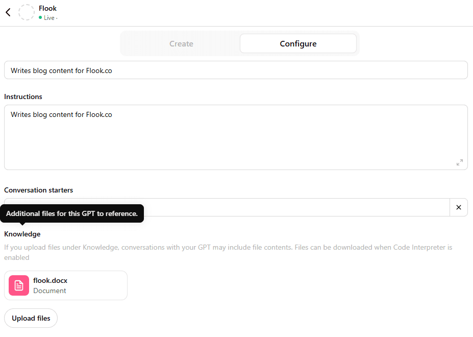
This tooltip appears in the GPT builder when you’re setting up a custom model. It explains how to upload reference files so your GPT can draw on them when generating responses.
The instructions are simple: drag and drop files directly into the setup panel. The tooltip removes what could be a significant technical barrier for non-developers building their first GPT.
What’s interesting here is the use case. This tooltip isn’t explaining a standard feature. It’s introducing a capability that many users didn’t know existed. That’s a slightly different job. It’s closer to a feature announcement than a help prompt, and the copy reflects that.
6. Mailchimp’s alternate content tooltip
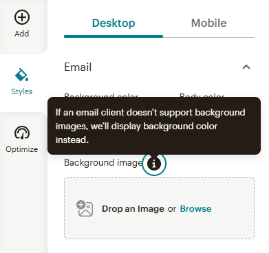
Not every email client renders background images. Mailchimp handles this with a fallback system, and this tooltip explains it.
The message is simple: if your header image doesn’t load, a solid background color appears instead. The tooltip reassures users that the fallback is already handled. They don’t need to do anything extra.
Short, specific, and focused on reducing anxiety rather than explaining a process. That’s a different job than most tooltips do, and Mailchimp executes it well. If your product has a feature that works automatically, a tooltip like this can build trust just by confirming it.
“The tooltips that do the most work are the ones that say ‘don’t worry, this is handled.’ Users do not need to understand how a fallback works. They need confidence that something will not break. That reassurance is worth more than any feature explanation.” — Mike Hill, Co-founder and CEO at Flook
7. Contentful’s link preview tooltip
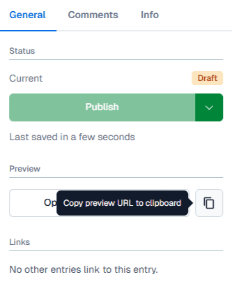
Contentful is a headless CMS used by content teams who often need to share drafts with stakeholders before publishing.
This tooltip appears on the copy icon next to a piece of content. It explains that clicking will copy a shareable preview URL to the clipboard. That link gives stakeholders a view of the draft without needing CMS access.
The tooltip solves a real workflow problem. Content teams constantly need external feedback. Without this, the workaround is screenshots, email threads, or giving stakeholders logins they don’t need. One tooltip eliminates all of that.
8. Ahref’s share of voice explanation
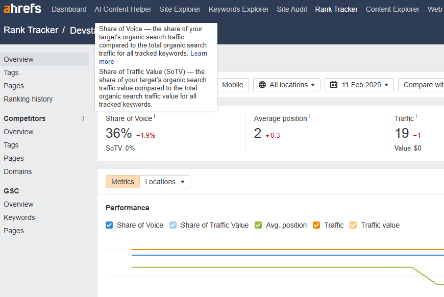
Share of voice is a metric that confuses even experienced SEOs the first time they see it. Ahrefs surfaces it prominently, so they need to explain it clearly.
The tooltip breaks down two related metrics: Share of Voice (how much of total organic traffic a site captures for tracked keywords) and Share of Traffic Value (the percentage of traffic value that site owns versus the total). Both are explained in one compact tooltip with a “Learn more” link for anyone who wants the full picture.
This is a good model for any product that uses proprietary or non-standard metrics. Don’t assume familiarity. Put the definition exactly where the metric appears, and link out for the deeper explanation.
9. Vanguard’s contribution limits tooltip
Financial products carry real stakes. Vanguard’s tooltip on IRA contribution limits reflects that.
The tooltip explains the annual IRS contribution limit in plain language. It notes that a user’s personal limit may be lower depending on income. It also flags the April 15 tax filing deadline as the cutoff for contributions. A link to detailed rules sits at the bottom for users who need more.
What stands out here is the tone. It’s calm, specific, and complete without being overwhelming. Vanguard isn’t trying to be clever. They’re trying to make sure users don’t make an expensive mistake. That’s the right priority for a high-stakes financial decision.
10. Mailchimp’s new feature tooltip
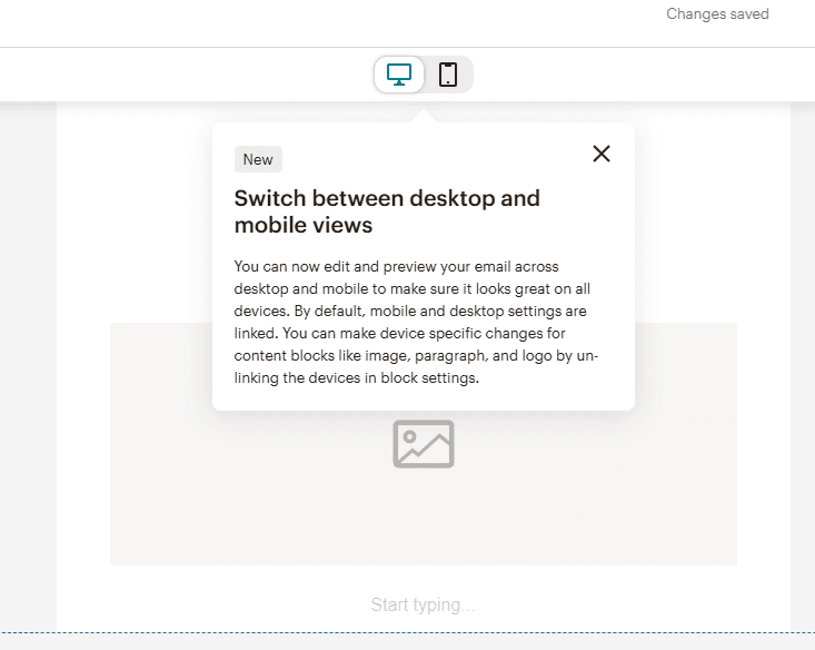
This tooltip introduces a feature update. Mailchimp added the ability to customize desktop and mobile email views independently, and this tooltip explains the change on first encounter.
Previously, settings for both views were linked. Now they can be adjusted separately, which gives designers more control over how an email looks across different devices. The tooltip explains the new behavior and shows users where to find the toggle.
New feature tooltips are one of the most underused formats in SaaS. Most teams announce updates in changelogs nobody reads. A tooltip that appears in context, at the moment the user would actually use the new feature, is far more effective.
“We launched a reporting update and put a tooltip on it instead of a changelog entry. Adoption in the first week was three times higher than our previous release. The feature was similar in complexity. The delivery method was the difference.” — Mike Hill, Co-founder and CEO at Frill
Frequently asked questions about tooltips
Tooltips are tiny but mighty. Get them right, and your users will love you for it. Check out important answers to common questions.
What are tooltips?
Tooltips are like tiny hints that pop up to explain something on a webpage or app. Think of them as a friendly nudge that tells you what a button does or gives context to a feature without overwhelming the screen. They usually appear when you hover over or click an icon (like a question mark) and disappear when you move away. A well-placed tooltip can save users from confusion and help them navigate with confidence.
What is the best way to create tooltips?
The best tooltips are simple, helpful, and straight to the point. Focus on solving a user’s problem—don’t add fluff or repeat what’s obvious. Keep the text short and clear, and pair it with a clean design that blends into your app’s style. Oh, and timing is everything! Tooltips should appear when needed, not too soon, not too late. Nobody likes popups getting in their way.
When should UX designers add a tooltip?
Add tooltips when users might need a little extra help, but don’t overdo it. They’re perfect for explaining complex features, offering pro tips, or clarifying uncommon terms. Got a fancy settings page or an icon-heavy toolbar? That’s prime tooltip real estate. Just remember—if you’re relying on tooltips for every step, your UI might need a bigger rethink. You shouldn’t create tooltips that are necessary for task completion. Rather, users should be able to understand your UX without having to click on tooltips. Tooltips are better reserved for advanced options.
What are some important best practices when making tooltips?
When creating tooltips, follow these essential guidelines:
Be concise. Users want quick help, not an essay.
Keep it actionable. Focus on what the user can do.
Design for clarity. Make sure tooltips don’t cover essential content.
Test them. See how real users interact with your tooltips and tweak as needed.
How do tooltips affect activation and retention metrics?
Tooltips placed at key activation steps reduce drop-off by surfacing the right information before a user gives up. Teams that instrument tooltips alongside product analytics can identify exactly which friction points tooltips resolve and which require a deeper UX fix.
When should a tooltip be replaced with something else entirely?
If users repeatedly click a tooltip and still fail to complete the action, the problem is the feature design, not the explanation. Replace the tooltip with a redesigned flow, an onboarding checklist step, or a guided tour. Tooltips explain. They do not fix broken UX.
How should tooltip strategy differ between new and experienced users?
New users need orientation. Experienced users need efficiency. Segment by lifecycle stage and suppress tooltips for users who have already completed the relevant action. Showing activation-focused tooltips to power users creates friction. Behavioral triggers let you serve the right message to the right user at the right time.
Looking for the easiest way to create tooltips? Flook’s no-code builder operates within a browser extension, allowing you to effortlessly add tooltips, onboarding prompts, and more directly to your app.
Previous post: