A product tour is a short series of in-app steps that walks a signed-in user through one task. Each step uses a tooltip, highlight, or modal to point at a real button, menu, or field.
If someone asked you to "add a product tour," two decisions matter more than the copy. First, decide which kind of tour you mean. The same phrase also describes clickable demos on marketing sites. Second, decide how the tour starts. Intercom's benchmark data shows the steepest drop comes between a tour's first and second steps.
This guide covers both decisions. You'll see the three kinds of product tours and step-by-step completion data. You'll also get real examples sorted by type, and a three-step tour you can build without a developer.
Product tour vs. interactive demo vs. onboarding tour
Search "product tour" and you'll find two different things described with the same words. Some pages mean guidance inside a live app. Others mean a clickable demo on a marketing site. Here's how the terms you'll run into differ:
Product tour: in-app steps for people who already have an account. Each step points at your real interface.
Interactive demo: a captured copy of your product that prospects click through before they sign up. Arcade, Navattic, and Supademo build these. You'll also see them called "interactive product tours," which adds to the confusion.
Onboarding tour: a product tour aimed at a new user's first sessions. Our guide to onboarding tours covers that use case in depth.
Product walkthrough: usually another name for a product tour. Some vendors draw a line between the two, but they don't agree on where it sits.
When a client asks me to fix their product tour, my first question is which one they mean. The answer changes who the tour is for, where it lives, and what success looks like.
Where it runs | Who sees it | What success looks like | |
|---|---|---|---|
Product tour | Inside your app | Signed-in users | The user finishes a task |
Interactive demo | Your website, emails, or sales decks | Prospects | The prospect signs up or books a call |
Onboarding tour | Inside your app | New users | The user reaches their first meaningful action |
The rest of this guide is about in-app product tours.

Why product tours earn a place in your onboarding
A product tour is more than just a guided walkthrough. Done well, it acts as an onboarding framework, an education layer, and a feature discovery engine, all rolled into one. It's designed to help users understand not just how your product works, but how to succeed with it. That's why product tours have become a core part of the user experience for modern SaaS and digital tools.
As products become more complex and users demand quicker outcomes, a thoughtful product tour can bridge the gap between sign-up and value. It's not just about showing users around. It's about helping them make meaningful progress from day one.

Here's what makes product tours such a critical part of the modern onboarding stack:
Simplifying onboarding. A strong product tour removes ambiguity from the onboarding process by showing users exactly where to start, what to do next, and how each step connects to their broader goals. Instead of throwing users into a new interface with no direction, a guided experience walks them through key flows in a way that feels intuitive and manageable.
Accelerating time-to-value. When users quickly understand how to achieve results, they're more likely to engage, activate, and convert.
Reducing support burden. A clear onboarding experience reduces confusion, leading to fewer tickets and faster time to resolution.
Increasing feature adoption. Many users never discover a product's most powerful features simply because they're hidden behind clicks or unfamiliar terminology. Product tours bring these features to the surface at just the right moment. By surfacing relevant functionality in context, tours help users unlock more value and turn casual users into power users.
Driving customer success. A well-crafted tour sets users up for long-term success by reinforcing core use cases and helping them build confidence early.
Nearly every successful SaaS company uses product tours to drive adoption. The simpler tool, the simpler the tour. More complex tools often combine checklists alongside tours to keep new users on track.
Three kinds of product tours: linear, branching, and contextual
Product tours differ in two ways: what starts them, and whether every user follows the same path. Those two choices give you three kinds of tour.
Linear tours
A linear tour shows every user the same steps in the same order. It usually starts from a welcome modal the first time someone logs in.
Use a linear tour when your product has one main job and one kind of user. A scheduling tool where everyone needs to book a first meeting is a good fit. The downside is that anyone with a different goal sits through steps that don't apply to them.
Branching tours
A branching tour asks one question up front, or reads something you already know, like role or plan. Then it sends each person down a different path. A design tool might ask whether you're creating designs or reviewing someone else's.
Branching makes each step more relevant. It also adds upkeep, because every branch is a separate tour to update when your UI changes. Start with two branches. Add a third only when one group of users keeps getting stuck. You'll usually spot this as a run of support tickets from the same type of user.
Contextual tours
A contextual tour starts when someone reaches the screen it explains or clicks a help launcher. Nothing fires at login.
This is the type the research favors. Nielsen Norman Group found that tutorials shown at launch interrupt people and aren't memorable. They also don't reliably improve task performance. Help that appears when the user signals a need avoids those problems.
Use contextual tours for anything beyond the first session. Think new features, advanced settings, and screens people rarely visit. Contextual tooltips apply the same idea to a single step.

15 UI patterns you can build a product tour from
Modern product tours are built from modular UX patterns that guide users without overwhelming them. These patterns work together to shape how users move through onboarding, explore features, and build habits inside your product. When used well, they feel like part of the product, not an add-on.
You don't need to use all of them. The key is choosing the right patterns for your product's complexity, your users' goals, and the timing of each message or action.
Welcome modals: First impressions and orientation
In-app walkthroughs: Step-by-step feature guidance
Tooltips: Inline hints tied to UI elements
Hotspots: Passive cues that invite interaction
Checklists: Track progress through onboarding tasks
Progress bars: Visual indicators of completion
Slideouts: Lightweight announcements or nudges
Banners: Alerts for system-wide or important updates
Popups: Attention-grabbing overlays for key actions
Contextual tours: Triggered based on user behavior
Launchers: Reopen or restart the tour anytime
Surveys: Collect feedback during or post-tour
Help center triggers: Link users to deeper support
Gamification: Add fun, rewards, or competition
Multistep flows: Guide users through multi-screen tasks
How many steps users actually finish
Short tours finish better than long ones. That part of the usual advice holds up. The data adds something the advice misses, though: when people leave a tour, they mostly leave right after the first step.
Intercom publishes median results for product tours across its customers. For tours with five steps, the median completion rate is 34%.
Here's the median share of users who saw each step of those five-step tours:
Step | Users who saw it |
|---|---|
Step 1 | 100% |
Step 2 | 47% |
Step 3 | 40% |
Step 4 | 37% |
Step 5 | 34% |
Read the table from top to bottom. More than half of users never see step two. Of the people who do, nearly three in four make it to the end. Intercom's figures cover active tours of two to five steps that reached at least 100 users.
In the tours I've audited, the first step is almost always where the trouble starts. Teams spend weeks trimming steps four and five, when the people they lost never got past the welcome.
Shortening a tour helps, but it won't fix a weak first step. Two changes do more:
Make step one about what the user came to do. "Let's send your first invoice" gives people a reason to click Next. "Welcome to Acme!" doesn't.
Start the tour when the user already wants help. Launch it from the relevant screen or a "Show me how" button. Then it reaches people who are ready for step two.

When you don't need a product tour
A tour fixes one problem: something in your product is hard to find or hard to understand. Sometimes the better fix is to change the product.
Skip the tour, or keep it to a single step, when:
Your product follows familiar patterns. People already know what a gear icon or a search bar does, so you don't need to explain them.
The core task takes one or two actions. If the tour takes longer than the task, it slows people down.
The same question keeps coming up about one confusing control. Renaming or moving that control usually beats a tooltip explaining it.
The Nielsen Norman Group research in the contextual tours section points the same way. Instructions given before someone starts working tend to be skipped or forgotten. Snappa, in the examples below, swaps the tour for a one-minute video because its main task is simple.

How to build a product tour in seven steps
Here's the seven-step process product managers use to create product tours that work.
Step 1. Define your onboarding goal
Step one is deceptively simple. Before building anything, you need to define exactly what success looks like for your onboarding experience. Too many teams jump into building tooltips and walkthroughs without a clear outcome in mind. The result is often a disconnected tour that checks boxes but doesn't move the needle.
Think of onboarding like a conversion funnel. Your tour should be designed to guide users toward a meaningful outcome that directly aligns with product value.
Start by asking: what is the first successful action a new user should take?
Here are examples of onboarding goals:
activate a free trial user
get to first template created
complete core setup steps
connect a key integration
publish a live workspace
Each of these goals ties directly to product retention. You're not just teaching users how the interface works. You're helping them reach the point where they start to see the value of the product firsthand.
When the goal is clear, every tooltip, popup, and checklist item has a purpose.
Step 2. Map the ideal path to value
Once you've defined the onboarding goal, the next step is to reverse-engineer the user journey that leads there. This means identifying the exact sequence of actions that reliably moves a new user from account creation to meaningful engagement. Mapping this path forces clarity. It reveals what matters in the first session and what can wait until later.
Start by logging into your product with fresh eyes. Follow the steps a new user would take to complete the core task. Identify what clicks, screens, and decisions are involved. Eliminate anything that adds complexity without contributing to the end goal.
A strong path to value is linear, logical, and tightly scoped. It prioritizes early actions that build confidence and reinforce user motivation. Every screen and step should serve as a bridge toward the first outcome. The cleaner the path, the more likely users are to stay engaged long enough to reach value.
Step 3. Choose UI patterns based on user intent
User intent should dictate the structure of the tour. New users who are exploring need different guidance than users who are trying to complete a task quickly. Choosing the right UI patterns based on intent ensures your onboarding experience feels natural instead of forced. The goal is to support flow without adding friction. Each pattern plays a specific role, and when used intentionally, they create a seamless journey from entry point to activation. Use this as a starting point:
tooltips for lightweight guidance during interaction
modals for framing key decisions or welcoming users
checklists for multi-step setup or self-paced onboarding
slideouts for highlighting features during exploration
contextual triggers for in-the-moment assistance
The best product tours do not rely on a single pattern. They combine multiple formats to match both the mindset and behavior of the user. When someone needs clarity, give them tooltips. When someone needs momentum, use a checklist. It's not about showing everything. It's about showing the right thing at the right time.
Step 4. Write copy that's helpful, not annoying
Tour copy should guide, not distract. The goal is to help users make confident decisions without forcing them to stop and think about what you mean. Clear, benefit-focused language works best. Say what the user can do, why it matters, and what happens next. Keep instructions short and actionable. The tone should match your product's voice, but the clarity should come first.
Avoid filler and focus on outcomes. Users are not reading your tour for entertainment. They are trying to accomplish something. Give them the information they need to keep moving. Write in plain language, avoid jargon, and make sure every line adds value. Great onboarding copy removes hesitation, reinforces purpose, and creates momentum, one tooltip at a time.
Step 5. Decide what starts the tour
Timing determines impact. Even a well-designed product tour can fall flat if it appears too early, too late, or in the wrong context. The best product teams use strategic triggers to launch onboarding elements when they're most likely to help. Instead of dropping users into a tour at login, triggers align the experience with real user behavior.
Here are common trigger types to work with:
time-based triggers for delayed messages or reminders
action-based triggers for moments like first login or form submission
contextual triggers for specific pages, features, or segments
Use these triggers to meet users where they are. If someone lands on a feature for the first time, that is the right moment to introduce a tooltip or offer a short walkthrough. If a user has stalled mid-checklist, a timed nudge can bring them back on track. Smart triggers increase relevance, reduce noise, and turn product tours into dynamic, responsive experiences.
Step 6. Test it as a brand-new user
A tour can work perfectly in your test account and still break for real users. Their data, screen sizes, and permissions differ from yours. Before launch, run three checks:
Walk through the tour as a new user in an incognito window, with no saved settings.
Check every step on the smallest screen your users have, so no tooltip covers the button it points at.
Confirm each step's target element still exists after your latest release.
In the first week, watch two numbers. The first is the step where people leave. The second is how many tour finishers then complete the task it taught.
One SaaS team I worked with redesigned their settings page and forgot the tour pointed at it. Step two still highlighted the old "Connect your calendar" button, which had moved into a new menu. For three weeks, new users saw a tooltip pointing at empty space. They now review every tour in the same sprint as any UI change.
Step 7. Optimize continuously with analytics
A product tour is not finished once it's live. The best teams treat it as a living asset that improves over time. Analytics reveal what users engage with, where they drop off, and which parts of the tour move the needle on activation. This data is essential. Without it, you are guessing. With it, you can improve clarity, reduce friction, and boost adoption through focused iteration. Every tooltip, modal, and checklist step should earn its place.
Key metrics to track include:
tour completion rate to measure engagement
step drop-off rate to identify friction points
time on step to understand hesitation
feature usage before and after the tour
retention lift from tour-exposed users
Use these insights to refine messaging, reorder steps, or test alternative flows. Small changes can compound over time. Optimization is where a good tour becomes a great one.
Build a three-step tour in Flook
You can build the kind of tour this guide recommends in Flook without writing code. Here's how:
Install the free Flook Chrome extension and open your live app in Chrome.
Click the element you want step one to point at, then write the copy for that step.
Add steps two and three. They can sit on different pages, and Flook matches pages even when the URL contains an ID, like
/projects/4821.Pick a theme so the tour matches your product's design, then publish.
The only developer task is adding one script tag to the <head> of your site, once. After that, you can change copy and steps and publish them without a deploy.
Keep it to three steps, and make step one about what the user came to do. Want tooltips and a checklist alongside the tour? Our guide shows you how to build your first full onboarding flow.
Every step in a Flook tour is built in the same editor you use for a single tooltip, shown here inside a live app.

Product tour examples, sorted by type
Each example below is labeled with the kind of tour it uses. Jump to the one closest to what you're building. Pay attention to step one in each: what it asks the user to do, and what the user gets for doing it.
1. Mailchimp
Type: contextual. One tooltip appears where the user is already looking.

Mailchimp nails the art of subtle guidance with a small, well-timed tooltip inside its navigation. Instead of launching a full tour, it draws the user's attention to the "Audience dashboard" with a short message: "See how your audience is growing and engaging with your marketing."
There's no disruption, no overlay. Just a focused nudge that surfaces a valuable but often overlooked feature.
Why it works:
It's elegantly contextual: The tooltip appears right where the user is likely to hover or click, making the guidance feel native instead of bolted on.
It unlocks hidden value: Without this nudge, many users might ignore the Audience Dashboard. This small highlight ensures they explore it.
Outcome-focused messaging: Rather than instructing users to "click here," it explains why the section matters. That shift turns a UI element into a clear benefit.
It respects user flow: No interruption, no modal, no forced tour. Users stay in control, and the tooltip simply supports their journey.
Takeaway for product teams:
Small, smart tooltips can go a long way. Instead of overwhelming new users with a heavy onboarding flow, try layering in lightweight prompts that appear just-in-time. You'll improve feature discovery and user satisfaction.
2. DesignFiles
Type: branching. A short role survey decides what the setup checklist shows.

DesignFiles takes a smart, adaptive approach to onboarding. Instead of diving straight into a one-size-fits-all tour, the experience begins with a quick profiling step that asks about your role and business maturity. Whether you're a freelance interior designer or part of a larger team, this initial survey helps tailor the experience to your needs.
Once complete, users land on a clean, visual checklist guiding them through the key setup steps, like branding their account, adding a product clipper, and launching their first project. No forced sequence and no lengthy modals, just a clear starting point and the freedom to move at your own pace.
Why it works:
Captures user intent up front: A few simple questions unlock a more relevant onboarding flow without overwhelming the user.
Checklist over tour: By presenting steps in a checklist format, DesignFiles offers structure without rigidity. Users can skip, reorder, or revisit steps as needed.
Feels approachable and flexible: Each step is clearly labeled and visually grouped, making it feel like a guided workspace rather than a forced tutorial.
Supports multiple personas: The experience adapts whether you're a student, a solopreneur, or a growing team, so everyone feels seen.
Takeaway for product teams:
When your product serves diverse users with different goals, a single onboarding path won't cut it. Pairing a short personalization survey with a flexible checklist can make the experience feel more relevant and more empowering from the start.
3. Slack
Type: linear. Every new user gets the same first task, sending a message.

Slack's onboarding skips the fluff and dives straight into real interaction. Instead of walking new users through a lengthy UI tour, it highlights a single, high-value action: sending a direct message.
A tooltip anchored to the sidebar explains what direct messages are and invites users to try it. Meanwhile, Slackbot, the built-in assistant, greets the user in a friendly tone and encourages them to respond. As a result, new users learn what Slack does by doing it right away.
Why it works:
It's all about action: Messaging is Slack's core utility, so the onboarding kicks off with exactly that. No theory, just practice.
It blends product and onboarding: Slackbot functions as both a feature and a guide, making the learning experience feel like real usage.
It's conversational and casual: The friendly tone lowers barriers, making new users feel welcome rather than instructed.
It gives users the wheel: There's a clear option to skip the tutorial. No forced clicks, just optional nudges.
Takeaway for product teams:
If your product's value comes from doing, not just seeing, focus your onboarding on one key interaction. Let users engage with a core feature early on, ideally within their first 60 seconds. That quick win builds confidence, momentum, and trust.
4. UserGuiding
Not a tour: a self-paced setup checklist. It's here to show what a checklist does that a linear tour can't. Users pick their own order.

UserGuiding showcases a clear, multi-touch onboarding experience built around a dynamic checklist and smart engagement triggers.
When new users land in the dashboard, they're immediately greeted with a checklist card titled "Welcome on board!", complete with progress tracking and clear action items like signing up, installing the Chrome extension, and creating a first guide. The checklist updates in real time as each step is completed, giving users a sense of momentum.
At the same time, an in-app NPS survey appears at the bottom, offering a quick feedback touchpoint without blocking the main onboarding flow.
Why it works:
Visual progress drives action: The progress bar at the top of the checklist motivates users to complete the setup, tapping into goal psychology.
Tasks are bite-sized and sequential: The steps are simple, clearly worded, and arranged in a logical order, which makes them easier to follow through.
It's layered, but not overwhelming: While both a checklist and survey are present, they're visually separated and non-intrusive. Users can focus on the core experience without feeling bombarded.
Built-in interactivity: As users complete each step, they get immediate feedback. That small reinforcement loop builds confidence.
Takeaway for product teams:
Effective onboarding doesn't have to mean "either/or." UserGuiding combines checklists, surveys, and subtle nudges in a cohesive way that respects the user's pace. If you want to boost activation without resorting to a rigid product tour, a well-structured checklist paired with in-context engagement can deliver results without creating friction.
5. Supademo
Not an in-app tour: an interactive demo used to announce a feature. It shows how the two formats from the start of this guide can overlap.
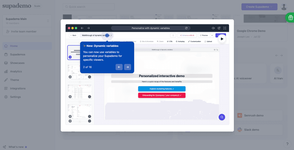
Supademo offers a highly visual, slide-based onboarding experience that mimics a guided product walkthrough without feeling like a rigid tour. In this example, the user is taken through a "Personalize with dynamic variables" flow that highlights new functionality in a focused and engaging way.
Each step is presented in a clean overlay, with a bold tooltip explaining the feature, and navigation controls that let the user proceed at their own pace. Notably, this tour is personalized. Supademo shows how variables like {company} can be dynamically inserted into the experience, making each demo feel tailored.
Why it works:
It's truly interactive: Unlike passive videos or static tooltips, users click through a demo that mirrors real product usage, which boosts engagement.
Personalization is front and center: Dynamic variables demonstrate how the product adapts to the end viewer, reinforcing its value in real time.
Navigation is flexible: Users can move forward or backward through steps, giving them control while still guiding them along a curated path.
It's great for new features: This tour specifically spotlights an update ("Dynamic variables"), making it a perfect example of how to introduce changes post-onboarding.
Takeaway for product teams:
If your product has layered functionality or frequent updates, consider using interactive demos to spotlight new capabilities. Supademo's approach blends storytelling and hands-on learning, making it ideal for guiding users through complex concepts without live training or dense documentation.
6. Figma
Type: contextual. The tip appears only while you're doing the thing it explains.

When Figma changed how it renders text by default, it didn't announce the change at login. The tip shows up only when you're working with text, like right after you add a text box. Nielsen Norman Group cites it as help triggered by what the user is doing.
Why it works:
The right person sees it. Anyone who never touches text never sees the tip.
It arrives at the right moment. The explanation shows up while the change is affecting your work.
It costs almost nothing to ignore. The tip sits beside the task instead of blocking it.
Takeaway for product teams:
When you change something existing users rely on, attach the explanation to the feature, not the login screen.
7. Snappa
Not a tour: a one-minute video in a welcome modal. It's here to show when a tour is more than you need.

Snappa's main task is simple: pick a template and edit it. So instead of a step-by-step tour, new users see a welcome modal. A named customer success manager offers a one-minute tutorial video. Users can skip it and go straight to designing.
Why it works:
The promise is small and specific. One minute is an easy yes.
A real person is attached to it. A named team member makes the offer feel like help, not a hurdle.
Skipping costs nothing. People who already know what to do lose no time.
Takeaway for product teams:
If your core task is simple, a short video may do more than a tour. Save tours for tasks with several steps across different screens.
Best practices for tours people finish
Once your product tour is live, the real work begins. These best practices help you fine-tune the experience so it feels natural, drives action, and leads users toward real outcomes.
Personalize by role, behavior, or plan
Personalization makes a product tour feel relevant from the first click. When users see guidance tailored to their role, use case, or account type, they are more likely to engage and complete the journey. Start by segmenting users based on what you already know, such as their selected role during signup, plan type, or early behavior in the product. Then, trigger specific tours or onboarding paths that align with those attributes. The more aligned the experience, the faster users move toward value.
Break up the tour into digestible steps
A long, uninterrupted product tour can overwhelm even the most motivated users. Instead of trying to explain everything in one flow, break the experience into smaller, focused steps that align with the user's current context. This approach helps users absorb information more effectively and reduces friction during onboarding. Each step should deliver one clear takeaway, then move the user forward with purpose. To structure your tour more effectively:
focus on one action per step
group related steps into short sequences
trigger steps contextually based on behavior
use clear progress indicators
Segmenting the tour this way creates momentum. It gives users space to explore, absorb, and act without pressure, which leads to higher completion rates and a smoother learning curve.
Let users skip or relaunch
Users should always feel in control of their onboarding experience. Giving them the option to skip a tour or return to it later respects their time and decision-making. Not every user needs the same level of guidance. Some prefer to explore on their own, while others want structure. Adding a persistent launcher or checklist ensures the tour is available when they need it. This flexibility improves the overall experience and increases the likelihood that users engage with the tour when it's most relevant.
Keep the tone friendly and helpful
Tone sets the emotional baseline for your entire onboarding experience. A warm, helpful tone builds trust and lowers the cognitive load for new users who may feel uncertain or overwhelmed. It makes the product feel more approachable and the guidance more human. When users feel supported instead of instructed, they are more likely to stay engaged, complete key actions, and form a positive early impression of your brand and product.
Stay consistent with your brand's visual style
Every element of your product tour should feel like it belongs inside your product. That includes colors, typography, iconography, and spacing. Getting this right is easier when you define it early.
Consistency builds credibility. When the design of your tour matches your brand's visual language, users experience it as part of the product, not as a layer on top of it. This level of detail reinforces trust, improves clarity, and helps new users stay focused on the task at hand rather than questioning what is native and what is not.
Use data to decide what to show
Effective product tours are informed by real usage patterns, not assumptions. Analytics can reveal where users drop off, which features are underutilized, and what actions correlate with long-term retention. Use this data to decide what guidance to include and when to deliver it. The goal is not to show everything but to surface what matters most for each segment of your audience.
Look at signals like:
high-friction areas in onboarding flows
features with low adoption but high impact
common actions taken before conversion
behavioral differences across user types
When data shapes the content of your tour, the result is a more focused, relevant experience. You guide users toward what they actually need instead of what you think they might need.
Track drop-offs and completion
Understanding how users interact with your product tour is essential for improving its effectiveness. Drop-off points reveal where users lose interest or get stuck, while completion data shows which flows drive engagement and lead to activation. These insights help you prioritize what to refine, remove, or expand. You're not measuring clicks. You're measuring momentum.
Key things to track include:
number of users who start each tour
percentage who complete all steps
step-by-step abandonment rates
average time spent per step
return rates for skipped or re-launched tours
With the right tracking in place, optimization becomes a data-backed process, not guesswork.
Choosing product tour software
You don't need software for a single tour that rarely changes. A developer can build that into your product, or use an open-source JavaScript library. Software starts paying for itself when any of these are true:
You're running more than one or two tours.
People outside engineering need to edit tour copy.
Your UI changes often, and tours keep breaking.
When you compare tools, ask each vendor three questions:
Does the builder work on your live product, or on screenshots of it?
What will it cost at your current number of monthly active users?
Can someone who doesn't code change a step and publish it without a deploy?
For a side-by-side look at the main options, see our roundup of product onboarding tools.
What product tours do for your support and CS teams
Product tours can have a huge impact on customer success metrics.
Reduces support tickets
Guided product tours help users find answers and complete tasks without needing to contact support. When the path to success is visible and accessible, users encounter fewer blockers. That translates directly into lower ticket volume for your support team.
Helps CS teams scale
As your user base grows, so does the demand for onboarding and guidance. Product tours allow customer success teams to scale without sacrificing quality. Instead of relying on 1:1 walkthroughs, you can guide hundreds of users simultaneously.
Acts as a proactive support layer
Tours catch questions before they become problems. By surfacing tooltips, onboarding flows, and checklists at key friction points, product teams can prevent confusion before it escalates into frustration.
Increases NPS and retention
First impressions matter. A thoughtful, effective product tour builds confidence, accelerates time to value, and sets the tone for long-term success. That early momentum often leads to higher engagement, improved NPS, and stronger retention.
Tips on using product tours for feature launches and upsells
Product tours are not limited to onboarding. They are also one of the most effective ways to surface new functionality and drive upsell opportunities. Instead of announcing features through static emails or blog posts, teams can launch contextual, in-product guidance tied to user behavior. This keeps users engaged inside the product and improves the likelihood they act on what you show them.
Announcing new features in-app. Make updates visible where they matter most.
Cross-selling via contextual walkthroughs. Highlight upgrade-only features to drive expansion.
Personalization by plan or segment. Show relevant upsell paths based on account type or usage.
Real-world use case examples. Showcase how new features solve specific user problems.
Product tour FAQs
What is a product tour?
How many steps should a product tour have?
What is the difference between a product tour and an interactive demo?
Is a product walkthrough the same as a product tour?
Can I build a product tour without a developer?
How do I measure product tour success?
Ready to build reliable product tours the easy way? Get started with Flook.
Previous post: