Your signup numbers look fine, and your activation numbers do not. Someone has told you to fix onboarding, and you are now staring at a word that means six different things.
That vagueness is the real problem. Onboarding stretches from the welcome survey at signup to the email that lands four days after someone stops logging in. Tooltips, tours, checklists, banners, and help docs all sit somewhere in between. Nobody has told you which of those you own, or in what order to build them.
Perspective AI's 2026 Customer Onboarding Benchmark Report tracked roughly 1,400 product organizations. It found a median B2B SaaS activation rate of 38%, against a top quartile of 61%.
So nearly two-thirds of your signups never reach the moment your product was built for. That gap is not a traffic problem. It sits inside the first few sessions.
When I audit a SaaS onboarding flow, I check one thing first. Was it built around what the user needs, or around what the product team wanted to show off? Most of the flows I see are the second one, and the drop-off numbers say so.
This guide covers what product onboarding includes and the six patterns you will use. Then it covers how to pick between them. Then you build one. Every example is a screenshot from a real product.
What product onboarding actually covers
Product onboarding is everything you build once and show to everyone. The welcome survey. The tooltips. The checklist. The help centre. The nudge that arrives on day four.
It sits at the systems level. You design it, ship it, and maintain it. Every new account meets the same version.
The boundary is narrower than you might expect. Your signup form is account setup, not onboarding. A live call where you configure someone's workspace is customer success. Both sit next to onboarding without being part of it.
What counts is anything that teaches someone to get value from your product without a human in the room. That definition does real work. It tells you what to measure later, and it tells you what to stop paying for. Every hour your team spends walking one customer through setup is an hour the system should have covered.
Product onboarding vs user onboarding, settled
Search this question and you get three different answers on the first page. Some sources treat the terms as identical. Others insist they are separate disciplines with separate owners. Here is the version that survives contact with a real product.
Product onboarding is the system. User onboarding is what that system does for one specific person.
A welcome banner every new account sees is product onboarding. A flow that branches because someone told you they are a designer is user onboarding. Same infrastructure, different resolution.
For a team your size, this distinction is mostly academic. You will build one system first. You will personalise it later, once you have enough signal to personalise with. Nobody has ever lost an activation point to vocabulary.
Stop worrying about which word to use. Go look at where people stop.
Why the distinction changes what you build
The systems framing has one real consequence. Onboarding gets designed deliberately and maintained on purpose. It stops being handled case by case by whoever is covering support that afternoon.
That is the whole argument for building it. A system scales with your signups. A person answering the same question forty times does not. Product led onboarding only works when the product does the teaching.
It also settles the ownership question, which comes up faster than you would like. Onboarding belongs with the people who own the product experience. The fixes are usually product changes, and support cannot ship those.
The four moments where onboarding either works or fails
Forget the linear diagram. The product onboarding process happens at four distinct moments, and each one fails in its own way.
You are probably building for the second one and ignoring the other three. That is the usual shape of a broken onboarding program. Check which moments you already cover before building anything new. The gap is rarely where you expect it.

1. Signup, where you lose people before they start
Long forms cost you people. So does mandatory email confirmation before anyone has seen the product work. Single sign-on removes both problems in an afternoon.
Then comes the part that sounds wrong. Asking questions at signup is not friction. It is leverage.
If you know what someone came to do, every screen after that can be relevant. Skip the question and you are guessing for the rest of the relationship. Capturing stated intent is what the 2026 benchmark data keeps landing on, and small teams skip it first.
DesignFiles does this properly, with one question per screen and preset options instead of open text fields.
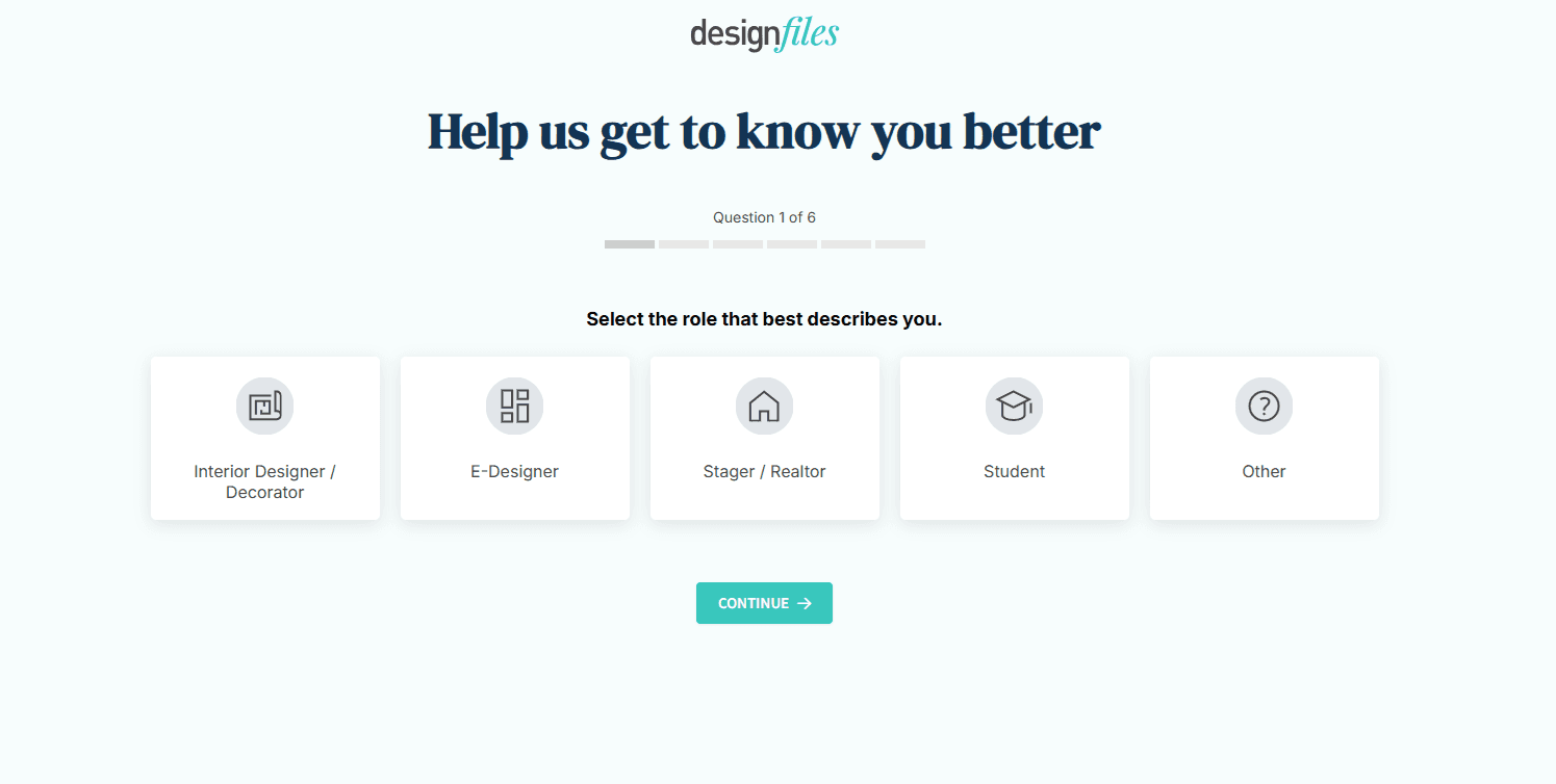
The second question narrows on experience rather than role, and the progress bar keeps six questions feeling finite rather than endless.

2. The first session, where activation is won
This is the moment you already care about. You get roughly one session to show someone something useful.
The goal is a completed action. Not a completed tour. Those are different outcomes and they are easy to confuse on a dashboard.
One SaaS team I worked with had a seven-step tour with 91% completion and flat activation. People clicked through it politely and then left. We cut it to three steps that ended on the user creating something real. Completion dropped to 68% and week-two retention went up.
The tour got worse on paper. The product got better. That trade is available to almost every team reading this.
3. The first week, where habits form
Session one buys you attention. The following week decides whether your product becomes routine or becomes a tab someone closes.
Checklists and follow-up messaging do their work here. Onboarding does not stop at first login, which is why so many activated users still churn in month two.
EveryDollar belongs in this section rather than in the pattern list below. The point is not that it built a checklist. The point is that step two only makes sense after step one, so the order carries the motivation. Our onboarding checklist guide covers how to sequence one properly.

4. Every release after that
Your product keeps changing, so onboarding never finishes.
Banners, slideouts and feature announcements are onboarding for people who already use your product. Almost nobody files them under that heading, which is why good features ship to silence.
Treat every release as a small onboarding problem. Someone who signed up eight months ago has no idea the new thing exists. They are as new to that feature as a first-day user is to your dashboard.
This moment is also the cheapest to fix. You already have the audience, the trust, and their attention. All you need is one banner pointing at the thing you just built.
The six onboarding patterns you will actually use
Six patterns cover almost everything you will build. These are screenshots from real products, not mockups or vendor renders.
Your job in this section is recognition. Once you can name a pattern on sight, choosing between them stops being guesswork. More examples appear later where they prove a specific point, so this section stays deliberately tight.
As you read, notice how few of these products use more than two patterns at once. That restraint is not an accident.
1. Tooltips that explain one thing
A tooltip is one explanation anchored to one element. That constraint is the whole pattern.
Slack does the obvious version well, explaining a navigation concept at the moment you are looking at it. The skip link sits right there in the corner, which matters more than the copy does.

Mailchimp does the quieter version, where one sentence appears on hover and nothing gets blocked. Nobody has to dismiss anything, which is why hover tooltips age well in a product people use daily. Read our guide to onboarding tooltips for placement, triggers and copy.

2. Tours that connect steps across pages
A tour is a sequence of tooltips that survives navigation. Step two can live on a different page from step one.
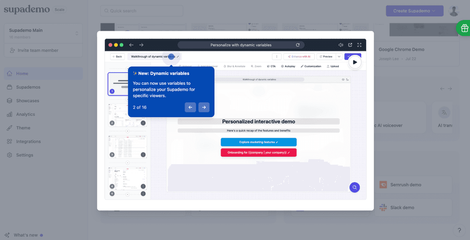
Supademo shows the honest version, with a visible step counter. Sixteen steps is a lot to ask of anyone. At least you know what you signed up for before you start.
Step count is the whole game here. Three-step tours complete at 72%, while seven-step tours drop to 16%, per Chameleon data.
Our walkthrough on onboarding tours covers structure in depth.
3. Checklists that make progress visible
People finish things they have already started. The progress bar is the entire mechanism.
Mailchimp runs five steps with a time estimate attached to each one.
HoneyBook runs seven steps with one already ticked, which is the same trick at a larger scale.

DesignFiles pins five across the top of the workspace instead of tucking them into a panel.

Three products, three levels of ambition, identical psychology. Notice that all three show the number complete rather than the number remaining. Framing matters here. Telling someone they are one of five done reads as progress, while four to go reads as work.
4. Banners that carry one message
A banner is the lightest interruption available. Persistent, dismissible, one message.
Use it for announcements and for pointing somewhere specific. A welcome banner offering one tutorial and one dismiss is the whole pattern working as intended.

Change the palette and the copy and you get something that looks unrelated but behaves identically. A banner is a container, not a style, and it takes whatever tone your product already has.

The constraint worth respecting is the message count. One banner, one message, one link. Two competing asks in the same strip and people read neither. Our guide to the onboarding banner covers when it beats a tour.
5. Popups and modals that interrupt on purpose
A modal stops everything. It had better carry something worth stopping for.
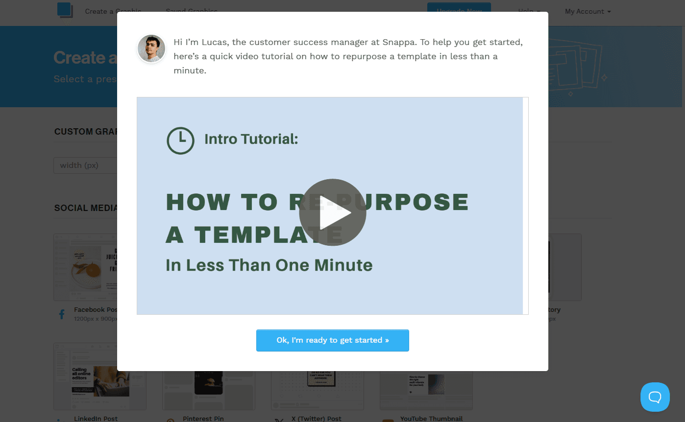
Snappa clears that bar. It trades the interruption for a named person and a specific one-minute promise. That is roughly the minimum a modal should offer before it earns the screen. For targeting and triggers, see our guide to onboarding popups.
6. Slideouts, surveys, and the quieter patterns
Four more worth naming. Slideouts announce features without blocking anything. In-app surveys and NPS collect sentiment at a moment you choose. Self-serve documentation catches people who would rather solve it themselves. Out-of-product messaging reaches people who have already gone.
The last two get proper treatment further down, where they do more useful work than a definition can.
You do not need all six patterns. Pick two or three, run them well, and leave the rest alone until you have a reason.
"I stopped thinking about tooltips and tours as different features. They are the same thing at different lengths. Once I framed it that way, deciding what to build got a lot faster." - Elliott Risby, Co-Founder of Design, Frill

How to choose the right pattern for the moment
You now have six patterns and no way to pick between them. Here is the rule.
Match the interruption to what the user loses by missing the information. Everything below follows from that one line.
Match interruption level to stakes
Picture a ladder. Hints and tooltips sit at the bottom. Banners and slideouts sit in the middle. Checklists run alongside the workflow rather than on top of it. Modals and tours sit at the top, because they stop everything.
A modal announcing a minor feature is overspending. A quiet hover tooltip on a destructive action is underspending, and eventually someone deletes the wrong thing.
DesignFiles shows overspending clearly. A coaching-call offer covers the workspace on first login, blocking the interface underneath it.
The tactic is defensible as a sales prompt. As onboarding it fails, and the reason is specific. The same product already runs a perfectly good five-step checklist behind that popup. The modal is not filling a gap. It is competing with the thing that was already working.
Run this test on your own product. For every interruption you ship, ask what the user loses by missing it. If the answer is nothing much, move it down a rung.
The ladder also works in reverse. If something genuinely matters and people keep missing it, move it up. A hint that nobody reads is not a light touch. It is a wasted one.

Show less than you think you should
You want to explain everything on day one. That instinct is normal, and it is the most expensive mistake available to you.
In the onboarding flows I've reviewed, the teams that map one clear "aha" moment beat the ones trying to explain every feature on day one. It is not close, and it is not a matter of taste.
UserGuiding makes the case better than any sentence can. A checklist, an NPS survey and an install banner all fire on the same screen.
Three asks, one decision. Watch what happens next. The user picks none of them and closes the tab. Your completion data records a dismissal rather than a reason. This is an onboarding tool's own onboarding, which should tell you how easy the mistake is to make.

Always give people a way out
Skip links. Dismiss buttons. The ability to come back tomorrow and pick up where you stopped.
A flow with no exit reads as a trap, and people treat it like one. Give them the door and most will stay anyway. The users most likely to skip your tour are often the ones most likely to convert. They already know what they are doing and you are slowing them down.
Look again at the skip link in the Slack screenshot. Then look at the Snappa modal, which names a person and promises one minute. An exit and a stated cost are what make an interruption tolerable.
Build backward from one activation moment
Pick the single action that correlates with people sticking around. Then work backward to the shortest path that gets someone there.
Everything that does not serve that path is a candidate for cutting. Not a candidate for a tooltip explaining it better.
This is the part teams skip, because picking one action feels like giving something up. It is. Do it anyway.
Picking the right action is easier than it sounds. Look at the customers who stayed longest and find what they all did early. That behaviour is your activation moment, and it is usually more specific than you expected.
If you take one thing from this article, take that. One activation moment, shortest possible path, cut the rest.
Build your first onboarding flow with Flook
Enough theory. Open a second tab and build something.
I am using Flook here because it is the tool I know. The beta pricing also makes it a reasonable place to start. If you want to compare options first, our roundup of product onboarding tools covers the alternatives and their pricing.
The whole build below takes an afternoon. You will not need a developer for any of it except one line of code.
Build in this order. Tooltip first, tour second, checklist last. Reversing that order is the most common way this goes wrong. You end up designing a path before you know where it leads.
Install the extension and point Flook at your app
Install the Flook Chrome extension, then tell Flook which domain your widgets will run on.
Wildcards are accepted and you can change the domain later. This is not a decision worth agonising over.
Your users install nothing. That is usually the first question, so it is worth answering immediately. They open your app exactly as they always have, and the widgets are already there.
Setup asks for one thing, which is the domain your widgets will run on.

From there the install is three steps, and only the last one involves code.

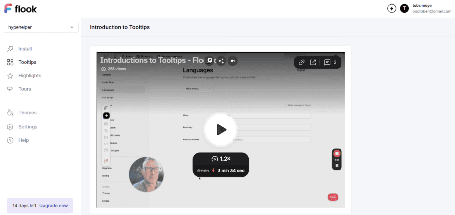
The builder runs on top of your live product rather than a screenshot. What you see while building is what your users see. That removes an entire category of surprise at publish time.
Build one tooltip on the thing people miss
Pick the single UI element that generates the most support questions. Not the feature you are proudest of. The one people ask about.
Write the copy before you open the builder. Copy written inside a widget editor is always worse. You write to fit a box instead of answering a question.
Then click the element, paste your sentence, and choose a trigger. Hover works for passive help. Click works for something people genuinely need to read. Persistent works when the information matters more than the tidiness of your interface.
One tooltip is a real deliverable. Ship it before you plan the next four.
Give it a week, then check your support inbox. If the questions about that element drop, you have your answer and a repeatable method. If they do not, the copy is wrong or the element is.
"The whole reason we built it as a Chrome extension is that you should be able to point at the thing on screen and say 'explain this one.' If it needs a spec and a sprint, nobody does it." - Chris Gillespie, Co-founder, Frill.co
Stitch tooltips into a tour
Add a second tooltip. Add a third. You now have a tour.
The useful part is that it survives navigation. Step one can sit on your dashboard and step two on your settings page, and the sequence holds together. That is what separates a tour from three unrelated tooltips that happen to exist.
Stop at three steps. You already know why from the completion numbers above. The temptation to add a fourth arrives immediately. The honest test is whether that step moves someone closer to your activation moment.
If it does not, it belongs somewhere else in the product.
Branching is worth knowing about, though it can wait. You can point different tours at different user types once your signup questions tell you who is who. Build the single-path version first and see whether it holds.
Add a checklist and publish
Build the checklist last, once you know which actions actually matter. Building it first means guessing at your own activation path.
Then paste one script into your head tag. That is the only moment a developer touches this.
Everything after that gets managed from the Flook dashboard. Change copy, move a tooltip, reorder your checklist, and none of it needs a deploy or a ticket.
That is the entire reason for building it this way rather than in your codebase. Onboarding copy is never right first time. Anything that makes the second version cost a sprint means there will not be a third.

How to tell if it is working
Someone told you to fix onboarding. They will ask whether it worked.
Here is what to pull, and what each number quietly hides from you.
The four numbers worth watching
Time to first value. How fast someone reached something useful.
Activation rate. What share of signups got there at all.
Onboarding completion rate. Who finished the flow you built.
Support tickets. Whether the guidance actually landed.
Completion rate is the one that will mislead you. A high completion rate on a flow ending in nothing looks identical to a successful one. The seven-step tour above showed exactly that.
Time to value deserves more attention than it usually gets. Perspective AI's 2026 benchmarks put median time to value at 11 minutes for accounts under $5,000 ARR. For accounts between $5,000 and $25,000 it runs to 2.4 days.
That first band is where you live. If a self-serve user has not hit value in their first session, the number is already bad.
That reframes the metric usefully. Time to value is a session-one problem, not something you review each quarter. Measure it in minutes and the fixes become obvious.
What to do when people stall
At some point your numbers will show people stopping. There are three responses, in this order.
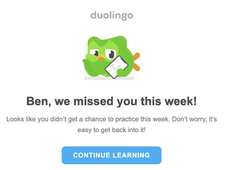
First, reach the ones who already left. Duolingo does this well by leading with the absence rather than with a feature. The email is about you not being there, which is harder to ignore than a product update.
Second, catch the ones still there and stuck. Self-serve documentation handles this without costing anyone a support ticket, and it works at three in the morning.

Third, and this is the important one, consider changing the product instead of adding more guidance.
A tooltip explaining a confusing button is often a confusing button that should have been fixed. Guidance is cheaper than a redesign, which is exactly why it becomes the default answer to everything. Every tooltip you add is a small permanent tax on your interface.
Before you ship the next one, check whether you are patching a UI problem wearing a costume. Sometimes you are, and the fix is a better button.
Where to go from here
Do one thing this week. Find the element that generates the most support questions and put a single tooltip on it.
Onboarding gets built in pieces. The first widget teaches you more than a month of planning. It puts real copy in front of real users and shows you what they do with it.
Then pick your activation moment and work backward from it. Everything in this guide sits downstream of that one decision, and you can make it this afternoon.
You will get the copy wrong at first. Everyone does. The advantage of building it this way is that fixing it costs you five minutes rather than a sprint.
Start building with Flook if you want something live today.
Product onboarding FAQs
What is the difference between product onboarding and user onboarding?
Product onboarding is the system every new user sees. User onboarding is what that system does for one specific person. A welcome banner shown to everyone is product onboarding. A flow that branches on someone's stated role is user onboarding. They run on the same infrastructure at different levels of resolution. For a small team, the distinction rarely changes what you build first.
How long should a product onboarding flow be?
Shorter than you want it to be. Three-step tours complete at 72% while seven-step tours drop to 16%, so every extra step costs you people. Pick the single action that correlates with retention, then build the shortest path to it. If a step does not move someone toward that action, cut it rather than trimming its copy.
Do you need a developer to build product onboarding?
For the initial script, briefly. Tools like Flook install through a Chrome extension plus one snippet in your head tag. That is the only moment engineering gets involved. After that, a product marketer can build tooltips, tours, checklists and banners without a deploy. Your saas onboarding process stops being a backlog item and becomes something you change on a Tuesday.
How do you measure whether product onboarding is working?
Track four numbers. Time to first value, activation rate, onboarding completion rate, and support tickets on topics your onboarding covers. Treat completion rate with suspicion, because a finished flow ending in nothing looks identical to a successful one. Median B2B SaaS activation sits at 38%. That gives you a reference point for whether your number is a problem or simply normal.
Previous post: