13 Mobile Tooltip Best Practices for Better UX [+ Examples]
Last updated on Tue May 27 2025
When it comes to improving mobile UX, few tools are as underutilized yet powerful as mobile tooltips. And with 88% of users unlikely to return after a poor experience, getting it right on mobile is critical. These small, contextual messages guide users through apps and mobile websites, offering bite-sized help, highlighting new features, and reducing friction during onboarding. Unlike desktop tooltips, which often appear on hover, mobile tooltips must be designed for tap, swipe, and scroll interactions, with placement and timing tailored to smaller screens and touch navigation.
Because of this, brands need to follow tooltips mobile best practice guidelines to make sure their tooltips are both functional and intuitive. An effective tooltip on mobile doesn’t just inform; it prevents confusion, reduces user drop-off, and supports seamless engagement with interactive elements. Whether you're designing onboarding flows or introducing advanced features, the right tooltip can reduce friction and boost retention, especially considering 74% of users are more likely to stay after a smooth onboarding experience.
In this guide, we’ll break down mobile-specific strategies to help you build mobile tooltips that improve UX and drive long-term user satisfaction.
What Makes Mobile Tooltips Unique? (200–250 words)
Mobile tooltips require a distinct design approach tailored to the unique constraints of mobile devices. With limited screen space and touch-based interaction, mobile tooltips must be concise, gesture-optimized, and carefully placed to avoid obstructing the user experience.
Designing for mobile devices means embracing simplicity and speed. The right tooltip appears exactly when and where the user needs it, helping them complete tasks quickly, reducing friction, and enhancing the overall mobile UX.
Desktop tooltips versus mobile tooltips
On desktop, tooltips appear on hover, allowing for more generous content and flexible positioning. Mobile users, however, navigate with their fingers, and hover interactions don’t exist. Tooltips must be triggered by taps, swipes, or specific behaviors, making timing and context far more important. A tooltip that appears too early or covers essential interactive elements can frustrate users instead of guiding them.
Desktop tooltips:
Rely on hover interactions (mouse-over)
Can use larger text blocks due to more screen space
Allow for more flexible positioning
Mobile tooltips:
Must be triggered by tap, swipe, or scroll with no hover support
Should be minimal and non-intrusive to avoid blocking UI
Need to be precise and responsive to finger input and smaller screens
Since people often use mobile apps and websites on the go, tooltips need to deliver immediate value without breaking their flow. Strategic placement, persistent visibility when necessary, and intuitive dismissal options all contribute to effectiveness.
13 mobile tooltip best practices
To create seamless, user-friendly experiences on mobile, tooltips must be designed with intention, not just added as an afterthought. Below are 13 mobile tooltip best practices to help you guide users, highlight key features, and improve UX without overwhelming the screen.
1. Anchor tooltips to tap-ready interactive elements
On mobile, tooltips should always be attached to interactive elements that users can easily tap, like buttons, toggles, and icons. These elements must have clear visual affordance, meaning users can intuitively recognize them as clickable. Tooltips should appear after a user taps or hovers near these elements (e.g., after a long press or when an action button is in focus). Anchoring tooltips to non-interactive content leads to confusion and poor UX. For example, a tooltip explaining an “Upload” action button should be triggered by tapping or pausing on that button, not floating randomly.
Ideal anchor targets:
Action buttons
Toggle switches
Feature icons
Menu items
Inline form labels
This approach ensures users receive help right when and where they need it, enhancing usability and reducing guesswork.
2. Use full-screen or modal tooltips for complex explanations
When you need to explain something in more detail, like during onboarding or when introducing a new feature, small tooltip bubbles aren’t enough. On mobile devices, the screen is small, and tiny popups can be hard to read or easy to close by mistake. Instead, use full-screen overlays or modal-style tooltips that pause the experience and give users a clear focus. These formats give you more space for short visuals, a few lines of text, or step-by-step guidance without crowding the screen.
This works especially well in onboarding flows, where users need clear and focused help. A modal tooltip can walk them through several steps with helpful visuals and clear instructions, which leads to better understanding and fewer drop-offs.
3. Make tooltips dismissible with clear tap targets
For mobile users, dismissing a tooltip should be quick and effortless. Small “x” buttons tucked into corners can lead to accidental taps or user frustration, especially on smaller screens.
Design dismiss buttons that are large enough to tap easily and clearly visible against the tooltip background. You can also allow users to tap outside the tooltip area to close it, which feels intuitive on touch devices.
Clear dismissal options help prevent friction and keep the experience smooth. If users struggle to close a tooltip, it can break their flow and lead to frustration, damaging your overall mobile UX.
4. Avoid covering essential UI elements
One of the biggest mistakes in designing mobile app tooltips is letting them cover key interface elements. If a tooltip blocks a button, input field, or navigation control, it interrupts the user’s task and creates friction. Instead, use smart positioning logic that automatically repositions tooltips based on screen space and the surrounding UI. Tooltips should always enhance clarity, not create confusion or obstacles.
For example, if a tooltip appears above a “Submit” button, it should move or fade away before the user tries to tap it. Tooltip logic should adjust dynamically for screen size, orientation, and element layout.
Key elements to avoid blocking:
Action buttons
Navigation menus
Form inputs
Confirmation prompts
Key feature icons
Designing with these rules in mind ensures a smooth, frustration-free experience across all devices.
“Mobile tooltips should feel like helpful whispers, not pop-up interruptions. The best ones guide users without getting in their way.” - Mike Hill, Co-founder of Frill
5. Use smart timing—trigger tooltips based on behavior, not just load
Showing a tooltip as soon as a page loads can feel intrusive, especially on mobile. A better approach is to trigger tooltips based on user behavior. For example, show a hint after a few seconds of inactivity or when someone taps the same element twice without success. These moments signal that help is needed.
Flook makes this easy with behavior-based triggers that respond to real user actions. Smart timing helps tooltips feel helpful, not annoying, making the experience smoother and more intuitive for mobile users.
6. Don’t rely on hover-only paradigms
Mobile users can’t hover—so if your tooltip strategy depends on mouse-over actions, it won’t work on phones or tablets. Tooltips must be triggered through interactions that actually exist on touchscreens. This includes taps, scrolls, gestures, or behavior-based logic like pauses or repeated actions. Designing for hover on mobile leads to tooltips that never appear, confusing users and leaving them without the help they need.
Instead, use clear and mobile-friendly triggers that match how users naturally interact on small screens.
Effective mobile tooltip triggers:
Tap
Long press
Scroll into view
Inactivity pause
Repeated failed actions
This ensures tooltips are both accessible and useful in real scenarios.
7. Keep tooltip copy ultra-concise
On mobile, attention spans are short and screen space is limited. That’s why effective tooltips rely on short, scannable copy, ideally no more than one or two lines. Long blocks of text don’t work well on small screens and are likely to be ignored or closed before the message is understood.
Each tooltip should deliver just one clear idea: what the feature is, what it does, or what the user should do next. Avoid jargon, filler words, and explanations that belong in a help center.
Short copy makes tooltips faster to read, easier to design, and more helpful in fast-moving mobile UX flows.
8. Support onboarding tours across multiple screens
For mobile apps, onboarding often spans several screens or steps, so your tooltips need to move with the user. Instead of isolated tips, create multi-step onboarding tours that guide users through core features as they explore the app. Flook makes this easy by linking tooltips across pages, ensuring a smooth, connected experience.
Apps like Mindbody use this approach to walk users through key actions, like booking a class or managing a schedule. This kind of guided flow reduces confusion, builds confidence, and helps users reach success faster within your mobile product.
9. Use stickiness or persistence for key feature highlights
Some features are too important to risk being missed. In these cases, persistent tooltips (those that stay visible until the user dismisses them) are more effective than tooltips that disappear automatically. This approach is especially useful when introducing powerful features that users might overlook or hesitate to try.
For example, Yahoo Sports uses sticky tooltips to highlight new or underused features, making sure users actually see and interact with them. Persistence gives users the time they need to read, understand, and take action.
Great use cases for persistent tooltips:
New feature announcements
Upsells or upgrades
Critical navigation changes
Account setup steps
Feature walkthroughs
Persistent tooltips increase visibility and drive engagement without relying on perfect timing.
10. Style tooltips to match app aesthetics
Tooltips that feel out of place can break the user’s trust and make your app look unpolished. To maintain a seamless experience, tooltips should match your app’s color palette, fonts, and component shapes. This consistency helps users feel confident that the tooltip is part of the product, not a third-party interruption.
With Flook, you can fully customize tooltip styling to align with your brand, no developers required. When tooltips look native, users are more likely to engage with them and follow the guidance provided.
Good design is all about creating a cohesive, trustworthy experience across every touchpoint.
11. Use contextual help icons sparingly but effectively
Not every element on a mobile screen needs a tooltip. Too many can overwhelm the user and clutter the interface. Instead, use small “?” icons or help buttons near complex or non-obvious features. These icons should trigger tooltips only when the user taps them, giving them control over when and where they get help.
Use this strategy to offer optional guidance without interrupting the experience.
Best places for contextual help icons:
Pricing calculators
Advanced settings
Form fields with unusual requirements
New or unfamiliar features
Complex dashboards
Less clutter means better focus and a cleaner mobile UX.
12. Adapt tooltip behavior for scrolling views
On mobile, users scroll often and fast. If your tooltip doesn’t adapt to mobile user behavior, it might disappear mid-swipe or float awkwardly offscreen. To create a smooth experience, tooltips should be scroll-aware and either stick to their associated element or adjust position as the user moves through the content.
For example, if a tooltip is tied to a product image or form field, it should follow that element or reappear when the user scrolls back. This ensures the guidance stays visible and relevant, preventing confusion and keeping your mobile tooltips helpful throughout the user journey.
13. Test across devices and screen sizes
A tooltip that looks perfect on one phone might break on another. That’s why it’s essential to test your tooltips on a wide range of devices, screen sizes, and operating systems. Differences between Android and iOS, screen resolutions, and orientations (portrait vs. landscape) can all affect how tooltips appear and behave.
Cross-device testing ensures that tooltips remain readable, well-positioned, and functional for all users—not just some.
What to test for:
Tooltip placement and visibility
Tap target size and responsiveness
Text readability on small screens
Orientation changes
iOS vs. Android behaviors
Mobile tooltip examples
Well-designed mobile tooltips enhance usability and drive action. Below are three standout examples from major apps that use tooltips to guide users, deliver contextual help, and support feature adoption.
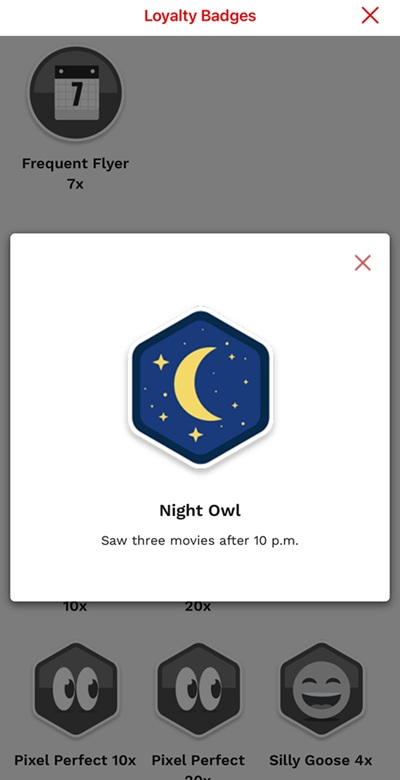
1. Cinemark
The Cinemark app uses gamification to engage users, awarding badges for actions like purchasing tickets or visiting new theaters. Each badge has a small tooltip icon users can tap to view a brief description of how it's earned. These mobile tooltips add clarity to the gamified experience and keep users motivated to engage more with the app.
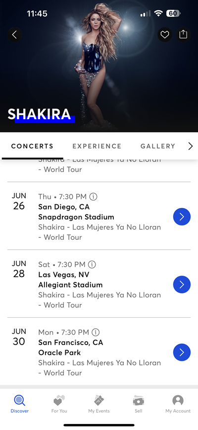
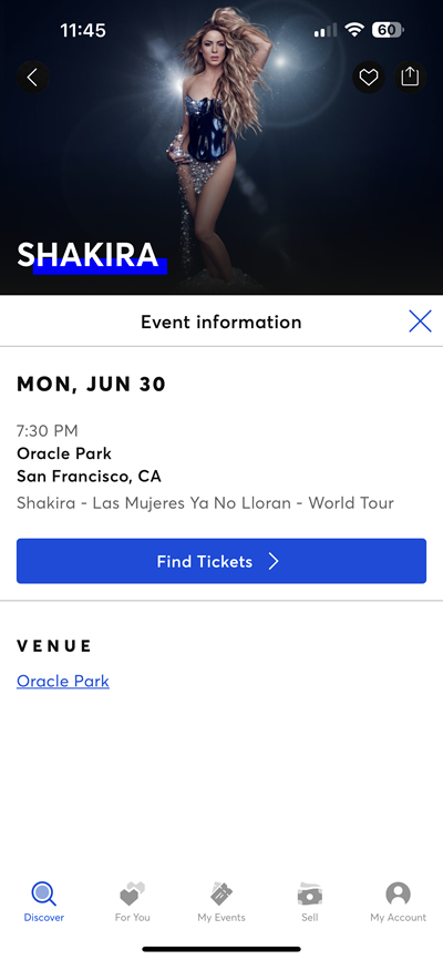
2. Ticketmaster
In the Ticketmaster app, users browsing an artist’s page see a list of upcoming shows. Each event includes a small “i” tooltip icon. Tapping it opens a clean pop-up showing the event’s time, venue, and ticket tiers. From there, users can click a CTA button to buy tickets. This is a great example of using effective tooltips to deliver key info without crowding the screen.
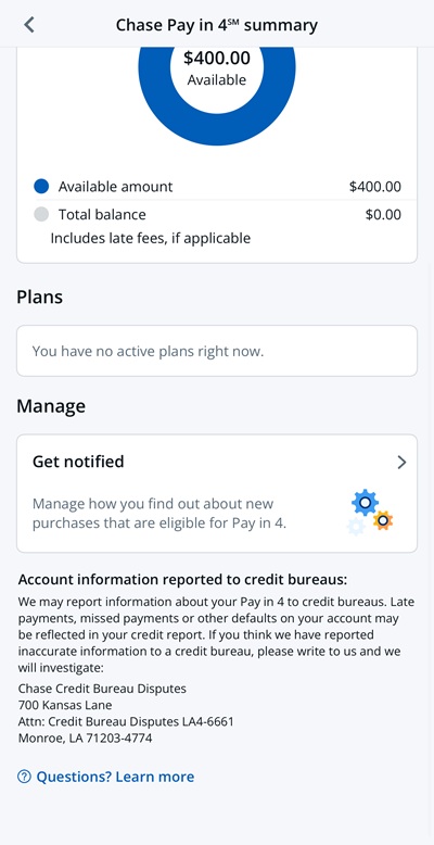
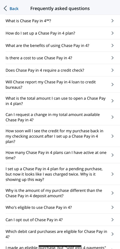
3. Chase
The Chase banking app includes a discreet “?” tooltip under its Pay in 4 feature. Tapping it opens a pop-up with several frequently asked questions, helping users understand how installment payments work. It also addresses compliance topics like fees and repayment schedules. These contextual tooltips ensure users are informed while keeping the main interface clean and compliant.
Web vs. mobile tooltips
Tooltip UX on the web typically rely on hover interactions, allowing users to reveal extra information without clicking. On mobile, however, hover isn’t an option, tooltips must be tap, scroll, or behavior-triggered. Limited screen space also means mobile tooltips must be shorter and more strategically placed to avoid covering critical elements. Mobile users often have shorter attention spans, so tooltips need to deliver value fast. Accessibility also differs: mobile tooltips must be screen reader-friendly and easy to dismiss. Google’s Material Design guidelines recommend concise, tappable, and well-timed mobile tooltips that fit the smaller, touch-driven experience.
By following these best practices, you can design mobile tooltips that enhance UX, boost engagement, and support user success without friction.
With Flook, you can create and launch beautifully branded tooltips—no developers needed—directly into your app or mobile site in minutes. Try it free today.