The 2026 Guide to Tooltip Design: Examples & Best Practices
Last updated on Wed Feb 04 2026
Tooltips are small, contextual popups that appear when users hover, click, or focus on an element—providing helpful, non-intrusive guidance.
They play a powerful role in improving user experience (UX), reducing confusion, and increasing task completion rates by offering just-in-time information. Thoughtful tooltip design enhances usability and can directly impact conversion rates by making digital products easier to understand and navigate.
This guide is designed for SaaS product teams, designers, and developers who want to leverage tooltips more strategically. Whether you’re simplifying onboarding, clarifying features, or streamlining workflows, smart tooltip design is a must-have in your UX toolkit.
What is a tooltip?
A tooltip is a brief, informative message that appears when users interact with an element, typically by hovering, clicking, or focusing. Its purpose is to provide additional context without cluttering the interface. Commonly used to explain icons, settings, or form fields, tooltips enhance usability. Unlike popups or modals, tooltips are lightweight and unobtrusive, offering help exactly where it’s needed without disrupting the user’s workflow
Types of tooltips
Tooltips come in several forms, each tailored to different user interactions and interface needs. Understanding the types of tooltips can help you choose the right format for each use case and optimize the user experience.
Static (hover-based): These appear when users hover over an element, offering brief explanations or labels. Ideal for desktop interfaces and tool icons.
Interactive (clickable or actionable): These tooltips allow user interaction, such as clicking links or buttons within the tooltip. Great for expanding options without leaving the page.
Contextual (appear based on user actions): Triggered by specific behaviors—like typing in a form or hovering too long—these provide relevant, moment-specific guidance.
Guided/onboarding: Used in walkthroughs and product tours, these tooltips lead users through features step by step to improve activation and engagement.
Mobile tooltips: Designed for touch interfaces, these are activated by tapping or long-pressing and often stay visible longer to accommodate mobile user behavior.
10 tooltip design best practices
Designing tooltips goes far beyond slapping on a question mark icon and calling it a day. When done right, tooltips are like microcopy meets UI wizardry. They guide, reassure, and educate without stealing the spotlight.
Here are 10 battle-tested tooltip design best practices that will make your product feel smarter, smoother, and downright delightful.
1. Keep copy succinct and contextual
Tooltips aren’t mini blog posts—they’re quick hits of clarity. Keep the copy sharp, snappy, and hyper-relevant to the moment. You’re not writing help docs here—you’re delivering instant context. Only include info the user needs to make a decision or take action. Repeating button labels or stating the obvious just adds noise. Every word should earn its place.
Keep in mind:
Stay under 20 words if possible
Use verbs to drive action ("Click to preview")
Avoid technical jargon unless your audience expects it
Your tooltip should feel like a quick DM from a savvy teammate, not an essay.
2. Design for consistency across UI
Consistency isn’t just a vibe—it’s a trust signal. Your tooltips should look and feel like a natural extension of your product, not a random pop-in from another app. Match your brand’s style guide down to the pixel: same font family, consistent background colors, familiar corner radii. If the rest of your UI uses soft shadows and rounded edges, your tooltip should too. This kind of visual alignment builds confidence and keeps users focused on the message, not the messenger.
Style-sync checklist:
Use your product’s font and type scale
Align background and border colors with your palette
Maintain spacing rules (padding, margins, alignment)
3. Use clear and strategic placement
Where you place your tooltip can make or break the experience. Slapping it on without thought might cover important content or confuse users about what the tooltip refers to. Placement should feel intentional and intuitive—close enough to the element it’s tied to, but never obstructive.
The most common positions are top, right, bottom, and left. Each has its pros and cons, but the golden rule is simple: choose the side with the most available space. When real estate is tight, your tooltip should adapt—either flip to another side or reposition itself to stay visible.
Arrows are your best friend when multiple elements are stacked closely together. They anchor the tooltip visually and make it crystal clear what it's referencing.
Don’t forget about responsiveness. What works beautifully on a desktop could break on a mobile screen. Your tooltips should adjust dynamically based on screen size and layout shifts, ensuring a seamless experience across devices.
4. Trigger tooltips based on user actions
The way a tooltip is triggered has a massive impact on usability. Your goal is to deliver information at the right moment, with the least friction. The trigger should match the context of the interaction and the platform (desktop vs. mobile).
Hover: Great for desktop UIs, especially when tooltips are passive and don’t require action.
Focus: Perfect for accessibility—screen readers and keyboard users rely on it.
Click: Best for interactive tooltips with links or buttons that need user input.
Scroll-based or event-based: Ideal for tooltips that appear during onboarding or product tours.
Choose wisely—an annoying or poorly timed trigger kills trust fast.
5. Avoid interrupting the user journey
Tooltips should slide in quietly, offer value, and get out of the way. The moment they start feeling like a speed bump, you’ve lost the plot. Avoid interrupting users during high-focus workflows like checkout, form submissions, or complex data entry. Instead, position tooltips as optional helpers—there when needed, invisible when not. A well-timed tooltip enhances flow; a poorly placed one derails it. Remember, users are on a mission. Your tooltip should support that mission, not hijack it. Subtlety and timing are everything in keeping the user journey friction-free.
6. Optimize for mobile tooltip design
Mobile tooltips are a different beast. You don’t have hover, screen space is limited, and fat-finger taps are very real. That means every tooltip interaction has to be intentional, fast, and unobtrusive. Use clear, simple triggers and ensure the design adapts seamlessly to smaller screens. Prioritize touch-friendly targets and avoid blocking essential content.
Key mobile considerations:
Trigger: Use tap or long-press, depending on the context and audience behavior
Layout: Responsive sizing and positioning is non-negotiable
Behavior: Decide if the tooltip should be sticky (persistent) or dismissible with a tap
Mobile users deserve smooth, on-the-go clarity—not clutter.
7. Make tooltips accessible
Accessibility isn’t optional—it’s a core part of great tooltip design. Tooltips should work seamlessly for all users, including those using screen readers or navigating by keyboard. That means using proper ARIA roles and labels to ensure tooltips are announced clearly and tied to the right elements. Keyboard users should be able to trigger tooltips via focus, not just hover, and navigate away without getting trapped. Visually, your tooltip must meet WCAG contrast requirements—especially if it's overlaid on complex UI elements. Also, ensure that timing and animations don't interfere with assistive technologies. A tooltip that looks sleek but isn't accessible is broken by default. True polish comes from building experiences that everyone can interact with, regardless of ability or device.
8. Use subtle timing and transitions
Tooltips should feel smooth, not jarring. The way they appear and disappear plays a huge role in perceived polish. A slight delay on hover prevents accidental triggers, while click-based tooltips can stay persistent until dismissed. Transitions should be soft—think fade-ins and gentle fades out—so they don't distract from the core UI. Avoid tooltips that snap open or vanish abruptly.
Best practices for transitions:
Delay on hover
Smooth fade-in
Smooth fade-out
Persistent on click
No abrupt snapping
Nailing these micro-interactions keeps your tooltips elegant and unobtrusive.
9. Test for performance and positioning
A tooltip might be small, but it can cause big problems if it's not tested properly. Performance and positioning aren’t afterthoughts—they’re core to the tooltip experience. A poorly placed tooltip can block essential UI elements like buttons, form fields, or CTAs, frustrating users at the worst possible moment. Similarly, slow-loading tooltips can drag down your interface and make your product feel clunky.
To keep things running smoothly, follow these optimization tips:
Performance and positioning checklist:
Lazy-load tooltips: Only load them when needed to improve initial page speed
Async rendering: Prevent layout shifts by rendering tooltips after core content
Collision detection: Ensure tooltips don’t block key interface elements
Scroll awareness: Avoid positioning tooltips that misalign when users scroll
Flicker prevention: Test on hover and mobile to eliminate jittery interactions
Stress test tooltips on different screen sizes and speeds. Great UX is fast, fluid, and frictionless.
10. Track usage and iterate based on data
Tooltips aren’t “set it and forget it” features—they’re dynamic tools that should evolve alongside your product. Once deployed, it’s essential to track how users interact with them. Are they opening them? Ignoring them? Closing them too quickly? These signals can tell you a lot about what’s working and what’s falling flat.
A/B testing different tooltip copy, placement, or timing can reveal surprising insights. Sometimes a one-word tweak or a faster trigger can lead to major lifts in engagement and comprehension. Use data to drive these decisions, not gut feelings.
As your product grows, user behaviors change. New features are added, old ones get deprecated. Your tooltips should reflect that. Keep an eye on analytics and user feedback, and treat tooltip design as a living part of your UX strategy—not a one-and-done task.
Tooltips examples in action
1. Juuno's playlist helper
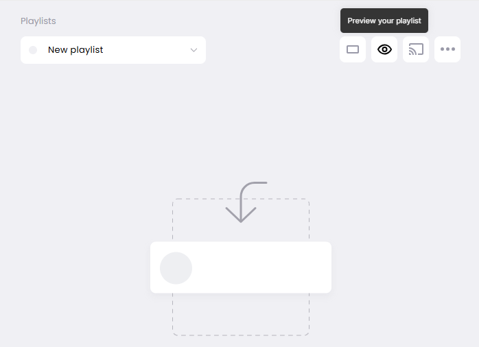
One standout example of great tooltip design comes from Juuno, a digital signage platform that transforms any smart TV into a customizable display. To enhance clarity during onboarding and routine tasks, Juuno uses Flook to embed context-sensitive tooltips throughout their user interface.
In one key instance, a tooltip appears beside the "Preview Playlist" button. Its purpose? To reassure users that they can review their digital sign’s content exactly as it will appear on-screen—before publishing it live. The copy is short, informative, and confidence-boosting: it explains that users can do a quick visual check to catch formatting issues or typos, reducing friction and preventing mistakes.
This tooltip hits all the right design notes:
Strategic placement next to the action button
Succinct and reassuring content that adds value without clutter
Triggered on hover for desktop users and tap for mobile, ensuring accessibility
By guiding users in-the-moment without interrupting their workflow, Juuno’s tooltip delivers both utility and delight—a textbook example of effective tooltip design.
2. Frase's unit reset tooltip
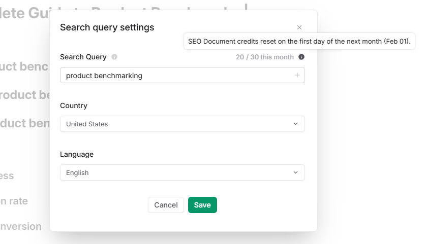
Frase, a leading SEO content optimization platform, offers tiered pricing plans that limit the number of documents users can create each month. To help users stay on top of their usage—and avoid running into unexpected limits—Frase uses a clever, dynamic tooltip powered by Flook.
This tooltip appears near the document counter in the dashboard and displays real-time information about how many document credits are left and the exact date when they’ll reset. The text updates automatically, so if the reset date is February 1 this month, it will adjust to March 1 next month—no manual updates required.
Here’s what makes this tooltip shine:
Live, personalized content that changes dynamically
Strategic placement right where users monitor their usage
Simple, helpful language that eliminates confusion and reduces support inquiries
By proactively answering a common user question—“When do my credits reset?”—Frase’s tooltip reduces friction, builds trust, and saves time for both users and support teams. It’s a great example of using tooltips as informative, self-serve UI elements.
3. QuickBooks' report explanations
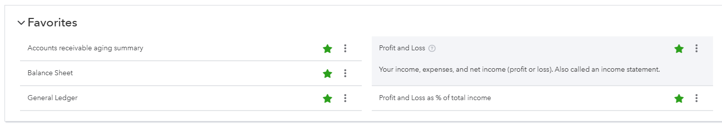
QuickBooks, the go-to accounting tool for small businesses, uses smart, contextual tooltips to help users make sense of financial reports—no accounting background required.
Next to every report title, a question mark icon invites users to click for a tooltip that expands with clear, concise explanations. For instance, the "Profit and Loss" report tooltip clarifies that it’s also called an income statement, and breaks down what’s included: income, expenses, and net profit. It even includes usage tips and alternative names, reducing confusion for first-time or non-financial users.
This tooltip design does several things right:
Click-triggered expansion to allow full control over the interaction
Inline placement within the report interface, so help appears exactly where it’s needed
Educational copy written in plain language, boosting user confidence and independence
By embedding tooltips directly into core workflows, QuickBooks transforms potentially overwhelming financial data into something approachable. It’s a prime example of how well-designed tooltips can double as built-in documentation, making software smarter and more human-friendly.
4. Mailchimp's alternate content tooltip
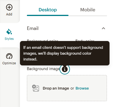
Mailchimp, the email marketing platform trusted by millions, uses tooltips to address one of email design’s biggest quirks: inconsistent background image support across email clients.
To prevent user confusion, Mailchimp includes a tooltip next to the “Alternate Content” setting, which explains what happens if a background image fails to load. The message is clear and comforting: a solid background color will display instead—no broken layouts, no unexpected gaps.
This tooltip delivers value in a tiny space:
Concise copy that reassures users without overwhelming them
Context-aware placement right where fallback options are configured
Design-focused explanation that speaks directly to marketers and designers
By addressing a common edge case before it becomes a problem, Mailchimp shows how tooltips can proactively manage user expectations and uphold design integrity. It’s the kind of small, thoughtful UI detail that keeps perfectionists happy—and emails looking sharp.
5. Ahref's share of voice explanation
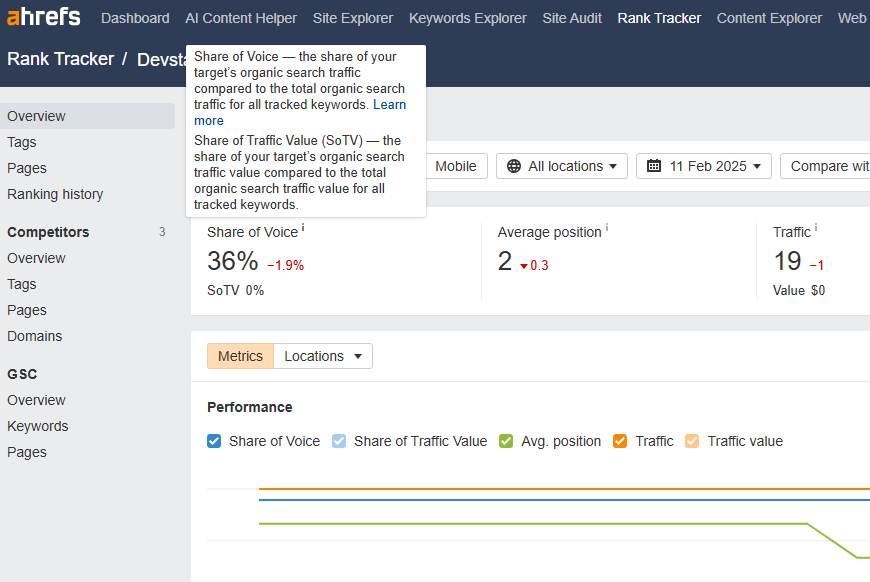
Ahrefs, a powerhouse in the SEO analytics space, uses well-crafted tooltips to make complex data instantly understandable—even for marketers who aren’t deep into search metrics.
One standout example is the tooltip next to “Share of Voice”, a metric that reveals how much of the total organic search traffic your target site captures for its tracked keywords. Right beside it, you’ll also find a tooltip for “Share of Traffic Value (SoTV)”, which breaks down what percentage of the total traffic value belongs to your site.
These tooltips do a lot in a little space:
Simplify advanced metrics into bite-sized explanations
Support strategy decisions with just-in-time insights
Include a helpful “Learn more” link for users who want to explore the full methodology
By giving users just enough context without overwhelming them, Ahrefs shows how tooltips can bridge the gap between raw data and confident action. Whether you're tracking client performance or sizing up the competition, these tooltips empower you to make smarter SEO decisions fast.
Technical implementation
Read on for some important details about setting up tooltips.
Libraries, frameworks, and tools
Setting up tooltips typically involves using lightweight libraries like Tippy.js, Popper.js, or Bootstrap’s native tooltip support. Most modern frameworks—React, Vue, and Angular—also offer customizable tooltip components that integrate easily into your UI, allowing precise control over behavior, styling, and placement for both basic and advanced use cases.
Custom vs. no-code
When deciding between custom code and a no-code solution like Flook, it comes down to speed and ownership. Coding offers full control, but tools like Flook let product teams and marketers deploy tooltips instantly—no dev time needed. With Flook’s Chrome plugin and visual widget builder, non-developers can create and update tooltips across your app, keeping onboarding and UX guidance flexible, fast, and fully aligned with user needs.
Common tooltip mistakes
Even well-intentioned tooltips can cause friction if they’re misused. Here are some common mistakes to watch out for—and how to avoid them.
Using tooltips for essential info: Tooltips are great for nice-to-know details, not need-to-know. If the content is critical for completing a task or understanding a core feature, it shouldn’t be hidden in a tooltip. Make that information visible in the primary UI.
Obstructing core UI: A tooltip that covers buttons, form fields, or navigation elements instantly becomes a blocker. Always test placement on different screen sizes to make sure nothing important gets hidden.
Poor timing or too many tooltips: Bombarding users with multiple tooltips at once or showing them too early in the user journey is overwhelming. Timing matters—show tooltips when they’re relevant, not all at once on page load.
Inconsistent design or placement: Tooltips that vary wildly in style, size, or positioning across your app break visual continuity and confuse users. Create a design system for your tooltips and stick to it. Consistency builds trust—and makes tooltips feel like a seamless part of the interface rather than a bolt-on.
Accessibility deep dive
If your tooltip doesn’t work for everyone, it’s broken. Start with screen readers—tooltips need aria-describedby or aria-label to announce content, and they must be programmatically tied to the triggering element. For keyboard users, tooltips should trigger on focus, not just hover. If users can tab to it, they should get the same context a mouse user does. Don’t trap focus inside a tooltip and make sure pressing Escape closes it cleanly. Visually, meet WCAG 2.1 AA standards: maintain at least 4.5:1 contrast ratio between text and background, avoid hover-only content for critical info, and ensure tooltips don’t disappear too fast for assistive tech to catch them. Bonus: delay fade-outs slightly for screen reader timing. Test with NVDA, VoiceOver, and real keyboards, not just your mouse.
Alternatives to tooltips
Too many tooltips can really clutter your UX. Make sure to use them sparingly and replace with alternatives wherever possible.
Inline hints: Great for always-visible guidance. These are short pieces of text placed directly within or near form fields, settings, or buttons. They don’t require user interaction and are ideal for explaining complex inputs or formats.
Modals or slideouts: Best for multi-step instructions, detailed onboarding, or content that needs more real estate. Unlike tooltips, these can include images, buttons, and even videos—great when you need to teach, not just nudge.
When to skip tooltips entirely: If users can figure something out naturally through intuitive design, skip the tooltip. Over-explaining is just as bad as under-explaining. Tooltips should solve friction, not create more.
Well-designed tooltips are the unsung heroes of great UX—subtle, smart, and incredibly powerful when done right. Keep them clear, consistent, and contextual, and you’ll turn confusion into confidence across your entire product.
If you're interested in creating no-code tooltips with an easy Chrome extension, check out Flook.