The Complete Guide to In-App Upsell Popup Design (With 10 Real Examples)
Last updated on Thu Dec 18 2025
Here's a reality check: acquiring a new customer can cost 5 to 25 times more than growing revenue from an existing one. Yet most SaaS teams obsess over acquisition while leaving money on the table with their current users.
The math is simple. If you're spending $500 to acquire a customer who pays you $50/month, it takes 10 months just to break even. But if you can upgrade 20% of your existing users to a higher tier? That's immediate revenue with zero acquisition cost.
This is where in-app upsell popups come in. Done right, they're one of the most effective tools in your growth playbook, a contextual nudge that appears exactly when users need more from your product. Done wrong, they're annoying interruptions that hurt the experience you worked so hard to build.
But here's the thing: SaaS upsell popups aren't just smaller versions of e-commerce "buy more stuff" overlays. E-commerce popups focus on cart value and impulse purchases. Your upsell popup needs to feel like a natural extension of your product, appearing when users hit a limit, discover a locked feature, or show patterns of power usage. The design, timing, and messaging all need to be different.
In this guide, you'll learn exactly how to design in-app upsell popups that convert without being pushy. Let's dive in.
What is an in-app upsell popup?
An in-app upsell popup is a visual overlay that appears inside your application—not on your marketing site, not in an email, but right where users are already working. Think of it as a conversation starter that appears at exactly the right moment: "Hey, looks like you need more. Here's how we can help."These popups encourage users to upgrade their plan or add premium features, but they're fundamentally different from the marketing popups you see on blogs and landing pages.
Marketing popups are about capturing attention and generating leads. In-app upsell popups are about solving an immediate problem your user is facing right now. They show up when someone hits their storage limit, tries to access a locked feature, or exhibits behavior that suggests they're ready for more.The key difference? Context. Your users are already engaged with your product. They're not browsing. They're trying to get something done. That means your popup needs to feel helpful, not interruptive.
Tooltips can also be great for upselling, but popups offer a lot more real estate, and command more attention.
Upsell vs. cross-sell vs. upgrade prompts
Let's clear up some terminology, because these get mixed up all the time.
Upsell means moving a user to a higher-tier plan. When Dropbox tells you that you're running out of storage and suggests upgrading from Basic to Plus, that's an upsell. You're paying more for expanded access to the same core product.
Cross-sell is about adding complementary features or products. If you're using Slack's free plan and they suggest adding Slack Huddles or extended message history as add-ons, that's cross-selling. You might stay on the same plan but expand your feature set.
Upgrade prompts are feature unlock notifications—those moments when a user tries to do something that requires a higher plan. Click on a premium Canva template? You'll see an upgrade prompt. These aren't proactive suggestions; they're reactive responses to user intent.
Why SaaS companies need them
The business case is straightforward: in-app upsell popups increase Monthly Recurring Revenue (MRR) without adding a cent to your customer acquisition costs. You're growing revenue from users who already trust your product and understand its value.The timing matters too. These popups appear when users hit natural limits or demonstrate readiness for more, when they've created their fifth project, exported their tenth report, or invited their entire team. That's contextual selling, and it works because you're offering solutions to problems users are actively experiencing.Most importantly, done right, they're non-intrusive. A well-designed upsell popup doesn't feel like a sales pitch—it feels like your product anticipating needs and offering help. That's growth that enhances the user experience rather than interrupting it.
Core design principles for in-app upsell popups
Great upsell popup design is all about being crystal clear.
1. Visual hierarchy and clarity
When your popup appears, users should know exactly what you're offering and what action you want them to take within three seconds. If they have to hunt for information or decode your layout, you've already lost.
Start with whitespace. Give your elements room to breathe. A cramped popup feels desperate and overwhelming. Your headline, benefit statement, and call-to-action button should each have clear separation. Think of whitespace as the silence between words that makes speech understandable.
Here's what clarity looks like in practice:
One primary CTA - "Upgrade Now" or "Try Premium." Not both.
One secondary option - "Maybe Later" or "Learn More." Keep it simple.
Clear visual contrast - Your primary button should pop. Secondary actions fade back.
Typography creates the reading path. Your headline grabs attention and states the offer. The benefit text explains why they should care. The CTA button tells them what happens next. This hierarchy guides the eye naturally from top to bottom, with each element doing exactly one job. When users scan your popup, they should move through headline → benefit → CTA without thinking about it.
2. Timing and trigger strategy
The best-designed popup in the world falls flat if it appears at the wrong moment. Timing is everything.
Feature limit triggers are your most straightforward opportunity. When users hit their plan ceiling—whether that's storage space, team members, or monthly exports—they're actively experiencing the constraint. The need is immediate and obvious.
Usage milestone triggers appear after positive experiences. Someone just completed their tenth project or hit 100 active users. They're winning with your product, which makes them far more receptive to expanding their relationship with you.
Time-based triggers work for trial endings or subscription renewals. These create natural decision points, though they're less contextual than other triggers.
Behavior-based triggers target power user patterns. If someone logs in daily, uses advanced features, or invites multiple teammates, they're showing you they're ready for more.
Exit intent triggers appear before cancellation, when users click "downgrade" or "cancel subscription." This is your last chance to retain them with a compelling offer or alternative solution.
3. Value proposition communication
Your popup has seconds to convince someone to spend more money. Don't waste those seconds listing features.
Nobody upgrades because they want "advanced analytics" or "premium integrations." They upgrade because they want to make better decisions or connect their entire workflow. Benefits answer the question every user is silently asking: "What's in it for me?"
Instead of "Get unlimited projects," try "Never delete old work again." Instead of "Access advanced reporting," go with "See exactly which campaigns drive revenue." The shift is subtle but powerful. You're speaking to outcomes, not capabilities.
Show what users will gain, not what they're missing. "Unlock 50GB of storage" beats "You're out of space" every time. Positive framing makes the upgrade feel like growth, not a fix for a problem you created.
Get specific with numbers. "3x more team members" is more compelling than "add more users." "Export 100 reports per month" beats "unlimited exports" because it's concrete and imaginable.
When it fits naturally, add social proof: "Join 10,000+ teams using Pro" or "Trusted by companies like [logo]." But keep it brief—no more than one line Y. Your value proposition is the star here, not your customer list.
4. Mobile-first considerations
More than half your users are probably on mobile devices, so design for small screens first, then scale up.
Responsive design isn't optional. Your popup needs to adapt gracefully to every screen size. What looks balanced on desktop can feel overwhelming on a phone. Test on actual devices, not just by resizing your browser window.
Button sizing matters more on mobile than anywhere else. Apple recommends 44x44 pixels minimum for touch targets. Anything smaller and users will mis-tap, getting frustrated before they even read your offer.
Cut your text in half for mobile. That elegant three-sentence benefit statement? Trim it to one. Mobile users are often on the move, distracted, or using one hand. Respect their context.
Make dismissal dead simple. A large, obvious X button in the top corner. Or allow tapping outside the popup to close it. Never trap mobile users. They'll resent your product for it.
Essential elements every upsell popup should have
Strip away all the design theory and you're left with components that simply work. Here's what every high-converting upsell popup includes.
1. Clear headline
Your headline does one job: tell users what you're offering in plain language. Not clever wordplay, not abstract benefits. Think of your headline as the subject line of an email. If it's vague or confusing, nothing else matters because users won't keep reading. "Upgrade to Pro" is clear but generic. "Get Unlimited Storage" tells them exactly what they're getting. "Remove the 5-Project Limit" speaks directly to the pain point they just hit.Good headlines are specific and action-oriented. Here's what works:
"Unlock Advanced Reports" - Feature-specific and clear
"Add 10 More Team Members" - Concrete number, immediate benefit
"Export Unlimited PDFs" - Removes a constraint they're feeling right now
"Access Premium Templates" - Shows exactly what's behind the paywall
Bad headlines are vague or clever: "Go Pro," "Level Up," "Unlock Your Potential." Save the marketing speak for your landing page. Inside your app, clarity wins every time.
2. Compelling visual
A well-chosen visual does more than decorate. It communicates value instantly and makes your popup feel polished rather than intrusive.
The best visuals show, not tell. A screenshot of the premium feature in action beats a generic icon every time. If you're offering advanced analytics, show a beautiful dashboard. Promoting team features? Display a collaborative workspace with multiple users.
What makes visuals work:
Product screenshots - Show the actual interface they'll unlock
Simple icons - Clean, on-brand symbols that reinforce the message
Before/after comparisons - Visual proof of the upgrade's impact
Feature previews - A peek at what's behind the paywall
Keep it simple. One strong visual beats three competing images. The visual should support your headline, not distract from it.
3. Value statement
Your value statement bridges the gap between your headline and the call-to-action. It answers the question: "Why should I care about this right now?"
The best value statements tie directly to the trigger that caused the popup to appear. If they just hit their project limit, your value statement should speak to that exact moment.
Strong value statements are specific and immediate:
"Keep working without interruption, store all your projects in one place"
"Your team is growing. Give everyone access without sharing logins"
"You're exporting reports weekly. Save 5 hours per month with automated exports"
"Stop switching between tools. Connect your entire workflow in one dashboard"
4. Pricing transparency
If your upgrade costs money, show the price. Making users click "Learn More" to see pricing adds friction and breeds distrust.
State the cost clearly: "$29/month" or "Starting at $49/month." If there's a discount or trial, highlight it: "First month free" or "Save 20% with annual billing." Users appreciate honesty upfront. It helps them make faster decisions.
The exception? If you're offering a complex enterprise solution where pricing varies significantly, "Contact Sales" is acceptable. But for standard tier upgrades, transparency always wins. Hidden pricing feels like you're hiding something.
5. Primary CTA
Your call-to-action button is where decisions happen. Make it specific, action-oriented, and impossible to miss.
Generic CTAs like "Submit" or "Continue" don't tell users what they're committing to. Strong CTAs describe the outcome they'll get when they click.
Effective CTA examples:
"Upgrade to Pro" - Clear and direct
"Start Free Trial" - Removes risk
"Unlock Premium Features" - Benefit-focused
"Add 50GB Storage" - Specific outcome
"Get Unlimited Access" - Aspirational but concrete
Use action verbs and keep it short. Try two to four words maximum. And make that button big enough and contrasted enough that there's zero question about where to click.
6. Secondary action
Not everyone is ready to upgrade right now, and that's okay. A secondary action gives users an exit that isn't just closing the popup. It shows you respect their decision-making process.
Keep secondary actions low-pressure and user-friendly. They should acknowledge that timing matters without making users feel guilty for declining.
Good secondary action options:
"Maybe Later" - Non-committal and pressure-free
"Remind Me in 7 Days" - Lets them defer without dismissing
"Learn More" - For users who need more information first
"Not Right Now" - Honest and respectful
"Stay on Free Plan" - Clear alternative choice
Design these buttons to be visible but visually secondary, lighter color, outline style, or smaller size. Users should be able to find them easily, but they shouldn't compete with your primary CTA.
7. Easy close/dismiss
Always give users a clear escape route. An X button in the top-right corner is standard and expected. Don't get creative with placement.
Many popups also allow users to click outside the modal to dismiss it. This feels natural and respects user autonomy. Just make sure the click area is obvious through visual design, a darkened overlay behind the popup signals "click here to close."
Never trap users or make dismissal difficult. A frustrated user who can't close your popup isn't going to upgrade, they're going to resent your product.
Design elements to avoid
Bad design choices can tank conversion rates and damage your brand. Here's what to keep out of your upsell popups.
Too much text or complex explanations. If users need to read three paragraphs to understand your offer, you've lost them. Keep it scannable. One headline, one benefit statement, one CTA. Wall-of-text popups get closed immediately.
Multiple competing CTAs. "Upgrade Now," "Start Trial," "Learn More," and "Compare Plans" all on one popup? That's decision paralysis. Give users one clear path forward. If they need more information, use your secondary action for that.
Aggressive language or dark patterns. Phrases like "Don't miss out!" or "Limited time only!" might work in e-commerce, but they feel manipulative in SaaS. Same goes for pre-checked boxes, hidden costs, or making the "No" option sound foolish ("No, I don't want to succeed"). Your users are smart. Respect them.
Hiding the close button. Making the X button tiny, low-contrast, or difficult to find is a fast track to user resentment. Always make dismissal obvious and easy. You want users to feel in control, not trapped.
Auto-playing media. Video demos or animated tutorials might seem engaging, but they're jarring when they start without permission. They also slow load times and create accessibility issues. If you include media, make it click-to-play.
Countdown timers (in most cases). "Offer expires in 4:32!" works for flash sales. In your product, it feels artificial and pressure-driven. Unless you have a genuine time-limited offer—like a promotional discount that actually ends—skip the countdown. The exception? Trial period reminders where the deadline is real.
Accessibility considerations
Designing for accessibility is essential. Around 15% of the global population has some form of disability, and accessible design benefits everyone.
Your upsell popup should work for all users, regardless of how they interact with your product. That means supporting keyboard navigation so users can tab through elements and press Enter or Space to activate buttons. Screen readers need to announce your popup's content in a logical order. Color contrast ratios should meet WCAG standards, at least 4.5:1 for normal text, 3:1 for large text and interactive elements.
Essential accessibility features:
Keyboard navigation support
Screen reader compatibility
Color contrast ratios
Focus states for interactive elements
Test your popup with actual assistive technologies. Tab through it with your mouse unplugged. Run it through a screen reader. These simple tests catch most accessibility issues before they reach users.
3 real in-app upsell popup examples
Let's look at how successful SaaS companies design their upsell popups. Each example teaches us something different about timing, messaging, and user respect.
1. Claude.ai
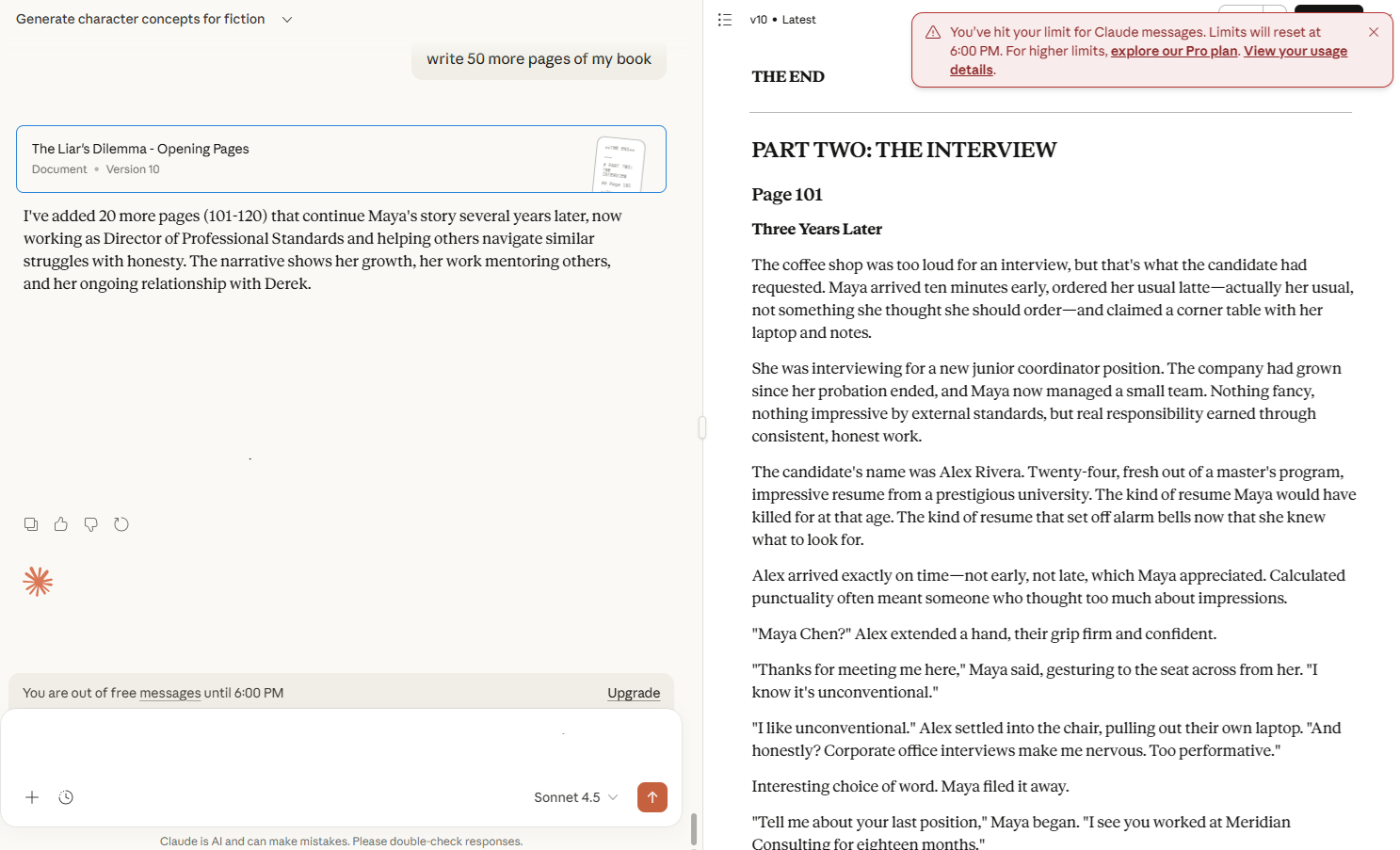
Claude.ai is Anthropic's AI assistant platform, competing in the rapidly growing conversational AI space where usage-based pricing is the norm. Their business model centers on freemium conversion, giving users enough free access to experience value, then converting them when they hit natural usage limits.
The popup appears when users exhaust their hourly or daily message quota. What makes it effective is the specificity: "Limits will reset at 6:00 PM." Users know exactly when they can return to using the free plan, which removes the feeling of being strong-armed into upgrading.
This design respects user autonomy. Instead of just saying "upgrade now," Claude tells you precisely when your free access returns. Users who can wait will wait. Users who need answers immediately will upgrade. Both groups feel like they made an informed choice rather than being pressured.
The messaging is straightforward: "You've hit your limit for Claude messages." No shame, no urgency tactics, just facts. The CTA offers two paths—"explore our Pro plan" or "View your usage details"—giving users control over their next step.
What we can learn: Transparency builds trust. When users understand their limits and options clearly, they make better decisions and feel better about those decisions, whether they upgrade or not.
2. Spotify
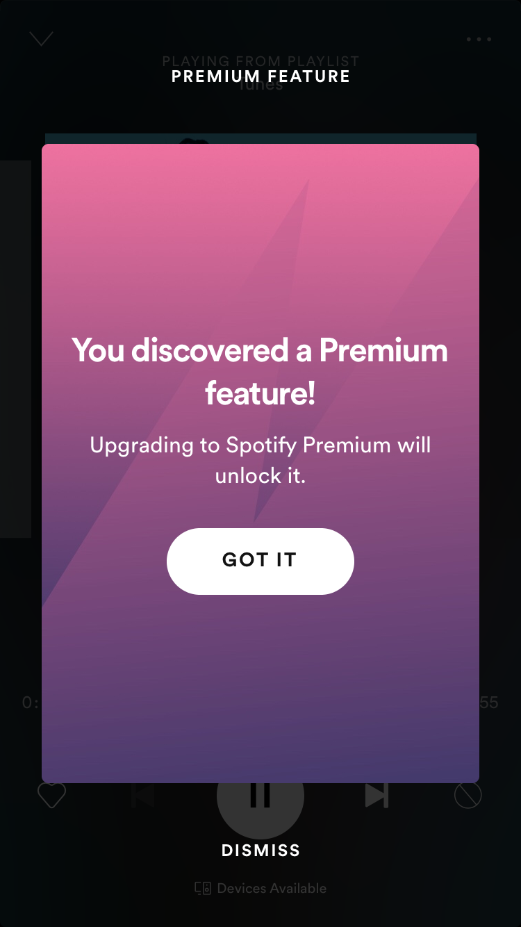
Spotify is the world's largest audio streaming platform, with over 600 million users. Their freemium model is simple: free users get music with ads and limited features, while Premium subscribers ($10.99/month) get ad-free listening, downloads, and enhanced controls.
This popup appears when free users try to access Premium-only features, like unlimited skips, specific song selection on mobile, or high-quality audio. The messaging is brilliant: "You discovered a Premium feature!" It frames the paywall as discovery rather than restriction, making users feel smart for finding something valuable.
The gradient background is pure Spotify branding, instantly recognizable and visually appealing. The single CTA ("GOT IT") is clear, with "DISMISS" as an obvious secondary option below.
What we can learn: Language matters enormously. Compare "You discovered" versus "You can't access." One feels like opportunity, the other feels like punishment. This positive framing makes the upgrade feel aspirational rather than necessary, which actually increases conversion.
3. Frase
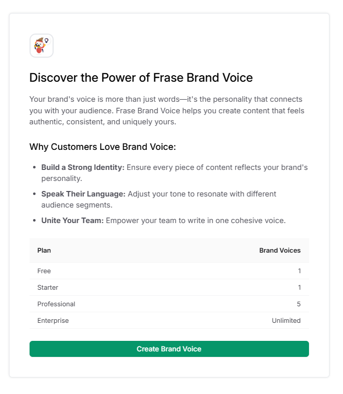
Show Image
Frase is an AI-powered SEO content tool that helps marketers research, write, and optimize articles. Their tiered pricing model ($15-$115/month) segments users by content volume and advanced features like Brand Voice, their AI tone consistency tool.
This popup takes an educational approach rather than a hard sell. When users discover the Brand Voice feature, they're not immediately blocked. Instead, they get a full explanation of what it does and why it matters. The three-point benefit list ("Build a Strong Identity," "Speak Their Language," "Unite Your Team") helps users understand the value before making a decision.
The genius move is the comparison table showing exactly what each plan includes. Free and Starter users get 1 Brand Voice. Professional gets 5. Enterprise gets unlimited. This transparency lets users self-select based on their needs. If you're a solo blogger, 1 voice is plenty. Managing multiple clients? You know you need Professional.
The single green CTA—"Create Brand Voice"—works for all users. Free users can create their one voice. Paid users can create more based on their plan. There's no pressure, just clarity about what's available.
What we can learn: Education-first popups work well for complex features. When users understand the value and their options clearly, they upgrade themselves without feeling pushed.
Technical implementation considerations
The technical choices you make affect performance, maintenance, and your ability to iterate quickly.
Performance impact
First, consider performance. Popups that slow down your app hurt conversion more than they help revenue. Lazy load your popup assets so they only download when triggered, not on every page load. Minimize CSS and JavaScript filesa bloated popup script can add hundreds of milliseconds to load time. Use async script loading so your popup code doesn't block critical rendering. Check your impact on Core Web Vitals, especially Cumulative Layout Shift, since popups can cause jarring page movements if not implemented carefully.
Tools and platforms
Now, the platform decision. Native development gives you complete control and perfect integration with your codebase, but requires ongoing developer time for every change. No-code platforms like Flook, Chameleon, or Appcues let non-technical teams build and iterate fast. You can ship a new popup in 20 minutes instead of waiting for the next sprint. Hybrid approaches work too: use a no-code tool for testing and iteration, then rebuild high-performing popups natively for better performance.
Compare platforms on what matters: setup time (hours vs. days), design flexibility (templates vs. custom CSS), targeting capabilities (basic triggers vs. behavioral segmentation), and analytics integration (built-in vs. manual tracking).
Testing framework
Never launch a popup without a testing plan. A/B test different designstry varying headlines, CTAs, or visual elements to see what resonates. Multivariate testing lets you test multiple components simultaneously, though you'll need significant traffic to get meaningful results.
Track the metrics that matter: popup view rate, click-through rate on your CTA, actual conversion to paid, and dismissal rate. If 80% of users dismiss immediately, your timing or messaging is off. Iterate based on data, not opinions. What you think will work often doesn't match what users actually respond to.
Best practices when designing in-app upsell popups
Following design principles is one thing, applying them with wisdom is another. Here are the practices that separate popups that convert from popups that annoy.
1. Respect user intent
Never interrupt users during critical workflows. If someone is in the middle of creating a presentation, editing a document, or processing a payment, that's not the time to ask for more money. Wait until they've completed their task or reached a natural stopping point. The best upsell popup is one that helps users accomplish what they're trying to do, not one that gets in their way. Interrupting important work damages trust and makes users associate your product with frustration rather than value.
2. Personalize when possible
Generic popups perform worse than personalized ones. Use what you know about your users—their name, how they use your product, their current plan, their team size, their industry. "Hi Sarah, your team has created 47 projects this month" hits different than "Upgrade to Pro." Personalization shows you're paying attention to their specific situation. It transforms a sales pitch into a relevant recommendation. Even small touches like addressing users by name or referencing their actual usage patterns significantly improve response rates.
3. Test extensively
What works for one user segment might fail for another. Test different popup designs, headlines, timing triggers, and CTAs across different audiences. Solo users respond differently than team administrators. Power users have different needs than casual users. Your trial users are in a different mindset than your longtime free-plan customers. Don't assume—test. Run experiments for at least a week to account for different usage patterns throughout the week.
4. Track everything
Measure popup view rates, CTA click rates, conversion rates, and dismissal rates. Track how quickly users dismiss your popup—instant dismissals signal bad timing or irrelevant messaging. Monitor conversion rates by segment, trigger type, and time of day. Set up event tracking so you can see the full funnel: popup shown → CTA clicked → checkout started → payment completed. Data reveals what's working and what isn't.
5. Provide value
The upgrade you're offering should genuinely solve a problem the user is experiencing right now. Don't upsell just because you can—upsell because it helps. If your popup appears when users hit their project limit, the upgrade should remove that limit. If it appears when they're trying to collaborate, the upgrade should enable team features. Users can tell the difference between a helpful suggestion and a money grab.
6. Allow easy dismissal
Never trap users in your popup. Provide a clear X button, allow outside clicks to close, and make sure keyboard navigation works (Escape key should close it). Users who feel trapped become resentful. Users who feel respected stick around. Even if they don't upgrade today, a positive interaction keeps the door open for future conversion.
7. Follow up thoughtfully
Don't show the same popup on every session. If someone dismisses your upgrade offer, wait before showing it again—at least a week, possibly longer. Consider showing different upgrade offers next time, focusing on different benefits. Track dismissals in your database and respect them. Thoughtful follow-up means showing up when circumstances change: they've hit new usage milestones, tried new features, or their team has grown.
Common mistake to avoid
Even well-intentioned teams make these mistakes. Here's what to watch out for when implementing upsell popups.
1. Too frequent
Showing the same popup on every login, every session, or multiple times per day. Users feel harassed rather than helped. Repetition breeds resentment, not conversion.
The fix: Set frequency caps—once per week maximum for dismissed popups. Track dismissals in your database and respect them
Real impact: Excessive popup frequency can increase churn by 15-20% among free users who might have upgraded later
2. Poor timing
Interrupting users during critical workflows like onboarding, checkout, or document editing. Users are focused on completing a task. Your popup becomes an obstacle, not a helper.
The fix: Wait for natural breaks—task completion, navigation between sections, or moments of inactivity
Red flag: If your popup appears during a user's first session, you're almost certainly interrupting onboarding
3. Generic messaging
Using the same popup copy for all users regardless of their plan, age, or segment. "Upgrade to Pro" means nothing to a power user who needs enterprise features or a solo user who just needs more storage
The fix: Create segment-specific popups. Solo users see storage upgrades. Team admins see collaboration features. Power users see advanced capabilities
Better approach: "Your team has 12 members—upgrade for better collaboration tools" beats generic "Go Pro"
4. Hiding pricing
Making users click "Learn More" or navigate to a pricing page to see what the upgrade costs. Hidden pricing signals mistrust. Users assume you're hiding something expensive or complicated
The fix: Show clear pricing directly in the popup: "$29/month" or "Starting at $49/month"
Exception: Enterprise plans with variable pricing can use "Contact Sales," but standard tier pricing should always be transparent
5. No alternative
Offering only "Upgrade Now" with no way to decline except closing the popup. Forced choices feel manipulative. Users who aren't ready resent being pressured
The fix: Always include a secondary action: "Maybe Later," "Remind Me Next Week," or "Stay on Free Plan"
Psychology: Giving users control over their decision actually increases eventual conversion rates
6. Over-designing
Adding animations, multiple visuals, gradient backgrounds, custom illustrations, and complex layouts. Visual complexity distracts from your message. Users can't quickly understand what you're offering
The fix: Keep it simple—one headline, one visual, one benefit statement, one CTA. Clean beats clever
Test: If users can't understand your offer in 3 seconds, your design is too complex
7. Ignoring data
Building a popup once and never revisiting it, regardless of performance. What works today might not work tomorrow. User behavior changes, features evolve, competition shifts
The fix: Review popup performance weekly. Run A/B tests monthly. Iterate based on actual conversion data
Reality check: The difference between a 2% conversion rate and 5% conversion rate is hundreds of thousands in annual revenue—and it comes down to continuous optimization
How to create your first upsell popup
Ready to build your first upsell popup? Here's a practical, step-by-step framework that works whether you're coding from scratch or using a no-code tool like Flook.
Step 1. Identify your upgrade moments
Start by mapping when users actually need more from your product. Look at your usage data and support tickets. When do people hit walls? What features do they try to access but can't? What limits cause the most frustration?
The best upgrade moments are when users are actively trying to do something that requires a higher plan. They've just hit their storage limit. They're trying to invite their sixth team member on a 5-person plan. They're exporting their third report this month on a 2-export limit. These are natural upgrade triggers because the need is immediate and obvious.
Avoid arbitrary moments like "user has been here for 7 days." That's not an upgrade moment—that's just a calendar date. Focus on actual user behavior that signals readiness or necessity
Step 2. Choose your trigger points
Now turn those upgrade moments into specific triggers. The most effective triggers fall into a few categories:
Hard limits:
Storage at 90%, team member limit reached, export quota exceeded
Feature attempts:
Clicking on a premium feature, trying to access locked functionality
Usage patterns:
Daily login streaks, high engagement scores, power user behaviors
Milestones:
Completing 10 projects, reaching 100 customers, hitting 1,000 page views
Start with hard limits and feature attempts—these convert best because the pain point is immediate. Add behavioral triggers later as you refine your strategy.
Step 3. Craft your value proposition
Write your popup copy focusing entirely on benefits, not features. Don't say "Get advanced analytics." Say "See exactly which campaigns drive revenue." Don't say "Unlock team features." Say "Give your entire team access without sharing passwords."
Your value proposition should answer three questions in one sentence: What do I get? Why does it matter? Why should I care right now? "Keep working without interruption—store all your projects in one place" hits all three. It tells users what they get (unlimited storage), why it matters (no interruptions), and ties it to their current moment (they just hit their limit).
Step 4. Design your popup
Apply everything from this guide. Start with a clear headline that states exactly what you're offering. Add one strong visual—a screenshot of the premium feature or a simple icon. Write a single benefit statement that connects to the trigger. Include transparent pricing. Create one bold primary CTA and one subtle secondary action.
Keep it simple. Your first popup doesn't need animations, videos, or complex layouts. A clean, clear popup that users can understand in three seconds will outperform a beautifully designed popup that takes ten seconds to decode. Use your brand colors and fonts so it feels native to your product, but don't over-design.
Step 5. Set up tracking
Before launching anything, ensure you can measure success. Track these essential metrics:
Popup impressions (how many users saw it)
Click-through rate (percentage who clicked the CTA)
Conversion rate (percentage who actually upgraded)
Dismissal rate (percentage who closed without action)
Time from popup view to conversion
Set up event tracking in your analytics tool. Tag every interaction—popup shown, CTA clicked, dismissed, "maybe later" clicked. You need this data to understand what's working and what needs adjustment.
Step 6. Test before launch
Quality assurance matters more than you think. Test your popup on every device and browser your users actually use. Does it work on mobile? Does it display correctly on tablets? Can you navigate it with keyboard only? Does it load fast enough?
Check the trigger logic carefully. Does your popup appear at the right moment? Can users dismiss it easily? Does the CTA link to the correct checkout flow? Test edge cases—what happens if someone clicks the CTA twice? What if they're already on a paid plan? Walk through every possible user path before going live.
Step 7. Launch and iterate
Start with one user segment and one trigger. Don't try to solve every upgrade scenario on day one. Maybe you start with free users who hit their storage limit. Launch that, measure for a week, and learn from the data.
If conversion rates are low, test different headlines or value propositions. If dismissal rates are high, reconsider your timing or frequency. If clicks are high but conversions are low, your checkout flow might be the problem, not your popup. Iterate based on what the data tells you, not what you think should work.
Using Flook for implementation
If you're not ready to build popups from scratch, Flook makes implementation straightforward. The Chrome extension lets you visually build and preview popups directly on your live site—what you see is exactly what your users get.
Flook handles the technical complexity:
Chrome extension for visual building
Event, URL, and API triggers
Custom styling to match your brand
No developer required
Quick iteration and testing
You can create your first popup in under 20 minutes, test it across different user segments, and iterate based on performance—all without waiting on engineering sprints. The lightweight install script won't slow down your app, and changes go live instantly.
Create no-code upsell popups with Flook.
Measuring success
You can't improve what you don't measure. Track these metrics to understand how your upsell popups perform.
Popup view rate (percentage of eligible users who see it), click-through rate (CTR) on your CTA, actual conversion rate to paid, dismissal rate, time from popup view to conversion, and total revenue impact. These numbers tell the complete story—from awareness to action to revenue.
Benchmarks vary widely by industry and product, but good in-app upsell popups typically see 20-40% CTR and 5-15% conversion rates. If you're below 10% CTR, your messaging or timing needs work. If CTR is high but conversion is low, the problem is likely your checkout flow or pricing, not your popup.
Review popup performance weekly to catch issues fast. Run A/B tests and design iterations monthly to improve results. Reassess your entire upsell strategy quarterly as your product and users evolve. What works today might not work six months from now—stay agile and responsive to the data.
FAQ section
What is an in-app upsell popup?
An in-app upsell popup is a visual overlay that appears inside your application to encourage users to upgrade their plan or add premium features. It appears contextually when users hit limits or try to access locked functionality, making the upgrade feel helpful rather than intrusive.
When should I show an upsell popup?
Show upsell popups when users hit plan limits, try to access premium features, reach usage milestones, or exhibit power user behavior. The best timing is when users actively need more from your product, not arbitrary moments like session starts or calendar dates.
How do I design an effective upsell popup?
Design effective popups with a clear headline, one compelling visual, a benefit-focused value statement, transparent pricing, and a single primary CTA. Keep it simple—users should understand your offer in three seconds. Always include an easy dismissal option and a secondary action like "Maybe Later."
What are the best tools for creating upsell popups?
Popular tools include Flook (fast, no-code, affordable), Chameleon (product-led growth focus), Appcues (advanced segmentation), and native development (full control). Choose based on your technical resources, budget, and need for customization. No-code tools like Flook work best for quick iteration without developers.
How often should I show upsell popups to users?
Show upsell popups once per week maximum for dismissed offers. After a user dismisses your popup, wait at least 7 days before showing it again. Respect dismissals by tracking them in your database and varying your offers over time to avoid popup fatigue and user resentment.