App Onboarding Done Right: Steps, Tools & Examples
Last updated on Wed Jul 23 2025
App onboarding sets the tone for the entire user experience. That first interaction determines whether someone sticks around or disappears. 90% of users churn if onboarding doesn’t deliver immediate value (UserGuiding). This stage isn all about helping users succeed, fast.
So what exactly is app onboarding? It’s the structured experience that introduces users to your app, walks them through its value, and encourages early engagement. It’s also one of the most overlooked levers for growth. 63% of users say onboarding is a critical factor in their decision to subscribe, not pricing, not support, not even product depth.
A great onboarding flow boosts retention, reduces support tickets, and lays the groundwork for real product adoption. A bad one? It silently kills growth. This guide breaks down what great onboarding looks like and how to build it right.
The goals of great user onboarding
Effective user onboarding sets the foundation for product adoption, long-term engagement, and customer success. Each element of the flow should serve a clear purpose:
Communicate value early: The sooner users understand what the product helps them achieve, the more likely they are to stay. Lead with outcomes, not explanations.
Familiarize users with core features: Introduce the tools that matter most to the user’s goals. Guide them through actions they’ll take often—not every option in the menu.
Reduce friction: Simplify sign-up, streamline permissions, and remove distractions. Every unnecessary step risks losing the user.
Set up for long-term retention and success: Establish productive habits from day one. Use onboarding to help users build momentum and reach meaningful milestones.
Adapt to the platform: Mobile users move faster and expect minimal taps. Web users may explore more deeply. Tailor onboarding to match those patterns.
Types of app onboarding (with examples)
There’s no single “best” way to onboard users—but there are proven patterns that match different product types, user needs, and activation goals. Here are five of the most effective app onboarding styles, along with real-world examples to show how they work.
Self-select onboarding
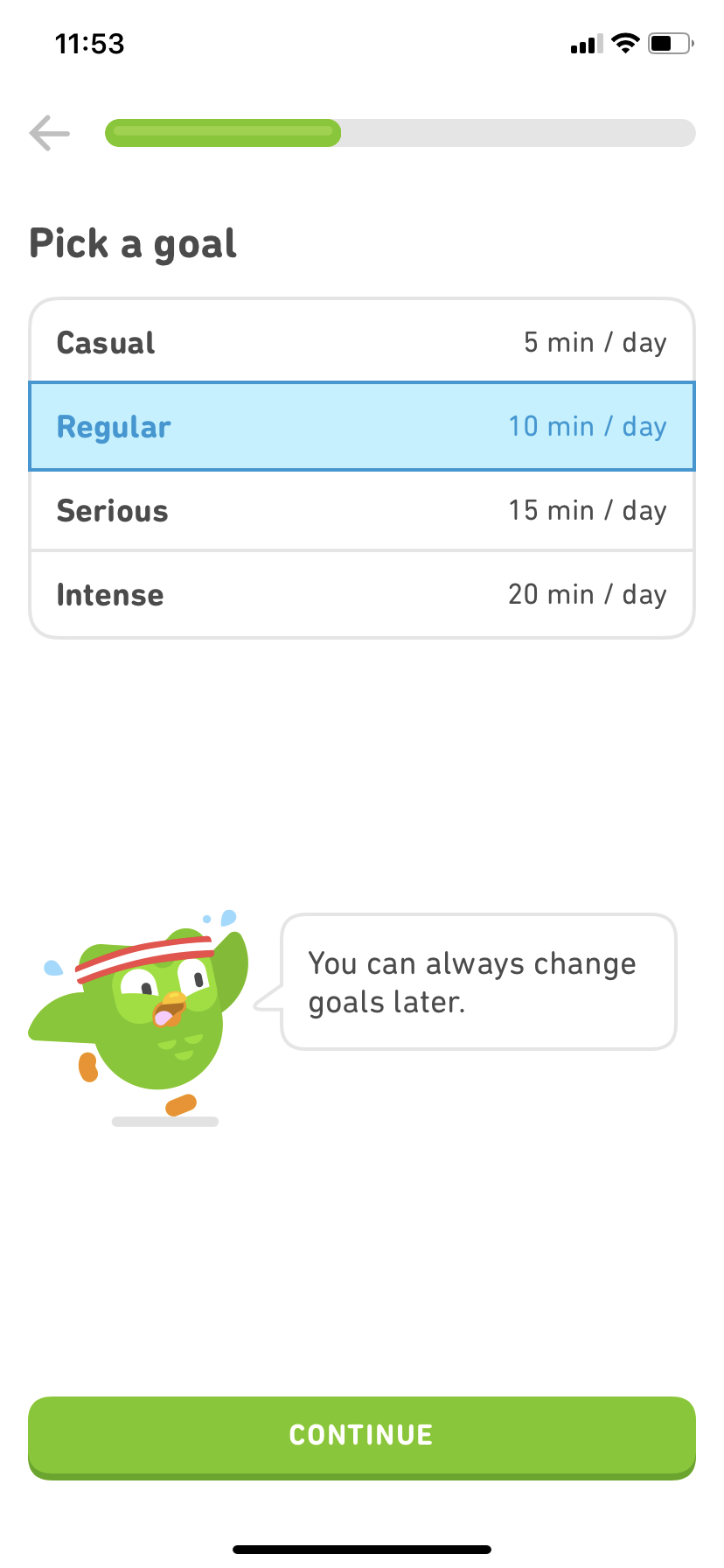
Example: Duolingo
Duolingo starts by asking what language you want to learn, your current skill level, and your personal goals. This onboarding type puts users in the driver’s seat right away, making the experience feel personalized from the first tap.
Self-select flows work well when:
You serve multiple personas
Your product has different modes or goals
Early customization improves long-term relevance
Quickstart onboarding
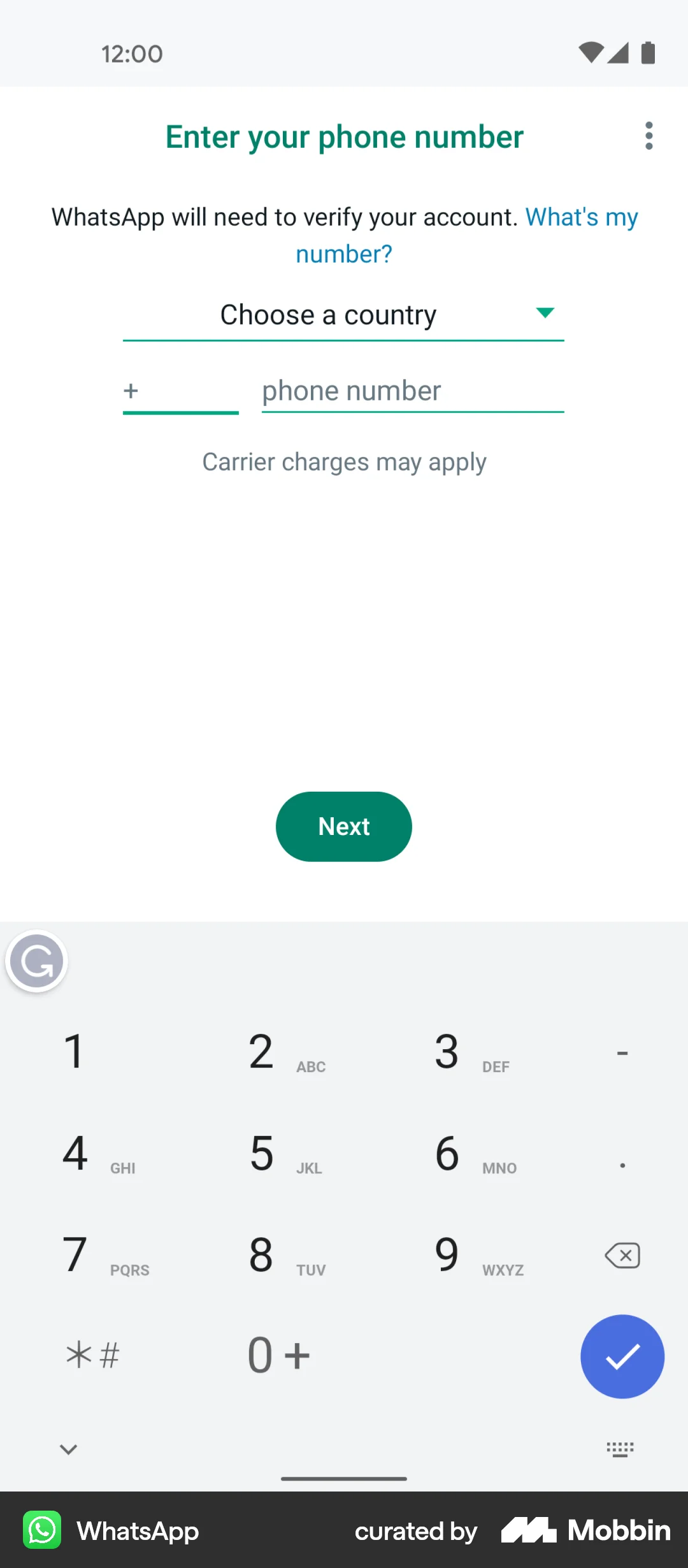
Example: WhatsApp
WhatsApp skips the fluff. After verifying your phone number, you’re inside the app, ready to message. It’s minimal, efficient, and hyper-focused on getting users to their first action fast.
Use quickstart onboarding when:
Your product is simple and intuitive
Speed to value is a competitive advantage
Users already understand the core concept
Benefits-oriented onboarding
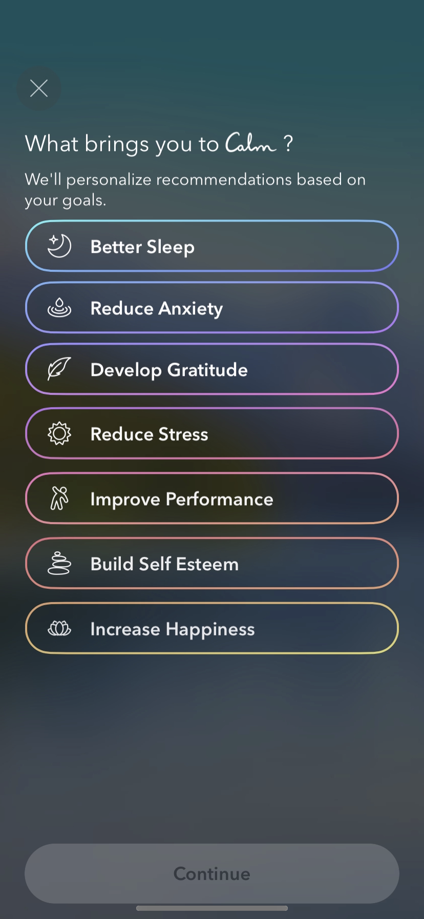
Example: Calm
Calm leads with outcomes: better sleep, less stress, daily focus. Instead of diving into the features, it frames the experience around what users want to achieve.
This style shines when:
The product solves emotional or wellness problems
You want to align with user intent
You need to differentiate with outcomes over features
Progressive onboarding
Example: TikTok
TikTok doesn’t teach everything upfront. Instead, it introduces features as users naturally engage with the app—showing just enough, just in time.
Progressive onboarding is perfect for:
Products with lots of depth or complexity
Mobile apps where space is limited
Teams focused on long-term engagement, not just first-session success
Feature-focused tours
Example: Grammarly
Grammarly walks users through its real-time editing tools in a guided, clickable tour. It doesn’t overwhelm—just highlights the features users will rely on most.
Feature tours are best when:
You need to teach functionality that’s not obvious
Your product relies on a core workflow
You want users to try before they forget
Step-by-step guide to designing an effective onboarding flow
Before sketching out tooltips or writing microcopy, teams need to get aligned on what onboarding actually means in the context of their product. Design a user experience with a defined outcome: helping users succeed.
Step 1: Understand your users
No onboarding strategy works without this step. Research is the groundwork. If you skip it, you’re designing in the dark.
User onboarding only works when it reflects real user behavior—not internal assumptions. Before choosing patterns or writing flows, teams should clarify what users need, what they’re confused by, and what success looks like from the user’s point of view.
The best onboarding flows aren’t built on UX trends. They’re built on user truths.
That’s why this step isn’t just about surveys or analytics dashboards. It’s about learning how people think, what frustrates them, and what actually drives them to keep using your product.
Start with:
Customer interviews
Friction point audits
Heatmaps and session replays
Support ticket analysis
In-app surveys
Segment-level research
JTBD-based interviews
Every insight you gather here makes the rest of the onboarding flow sharper, leaner, and more aligned to what your users actually need. Without it, you’re just guessing.
Step 2: Define success metrics
A good onboarding flow can’t improve if you don’t know what “working” looks like. Clear, measurable success metrics help product and growth teams track performance, spot friction, and prioritize updates based on real behavior—not gut feelings.
This isn’t about stuffing a dashboard with vanity metrics. It’s about focusing on the numbers that reflect true user activation and long-term product fit.
Start with these key onboarding metrics:
Activation Rate: Percentage of users who reach a defined milestone—usually their first real “aha” moment.
Time to Value (TTV): How long it takes for a new user to realize the core value of your product.
Completion Rate: Tracks whether users finish the onboarding steps or abandon the process midway.
Retention Rate: Measures how many users stick around over a specific period (7, 14, 30 days).
Feature Adoption Rate: Indicates how many users engage with key features post-onboarding.
Drop-off Points: Identifies where users exit during onboarding flows (and where you’re losing them).
If you’re not measuring retention by segment and by milestone, you’re not actually measuring onboarding.
Product benchmarking metrics like these reveal exactly where users are getting lost, stuck, or simply losing interest. And that gives you something to fix.
Step 3: Map the user journey
Before building tooltips or writing welcome copy, take a step back and map the user’s path. A journey map helps teams visualize what users are trying to do, how they’re feeling at each step, and where they might run into trouble.
This step is about sequencing—not just actions, but motivations. What’s happening before they sign up? What triggers their interest? What tasks are they trying to complete? Understanding that timeline gives onboarding real context.
Mapping the journey also exposes gaps. Maybe users land on the dashboard before they understand what it does. Maybe they skip over a key feature because nothing points them to it. A clear journey map helps you anticipate these missteps—and fix them early.
Include the essentials:
Persona
Use case or scenario
Key journey phases
User actions
Emotions and pain points
Friction moments
Opportunities to educate or delight
A user journey map isn’t a formality—it’s a tool that turns assumptions into shared understanding.
Use it to align product, marketing, and design around one goal: helping users succeed with as little friction as possible.
Step 4: Build in contextual onboarding tools
Contextual onboarding tools guide users as they interact with your product, helping them succeed without pulling them out of the flow. The goal is to provide just enough direction at the right moment—nothing more, nothing less.
Tooltips: subtle, embedded guidance
Tooltips appear alongside interface elements to explain what something does or how to use it. They’re brief, low-pressure, and keep users moving.
Pros & cons: Tooltips are minimal and non-intrusive, making them perfect for clarifying small but important elements like buttons or icons. However, they can be easy to miss and don’t offer much space for deeper guidance.
Best use cases:
Highlighting advanced or secondary features
Explaining icons or less-obvious elements
Offering bite-sized instructions in real time
Checklists: visual progress, clear direction
Onboarding checklists show users what they need to do to get started—and make them feel accomplished as they go. They give structure to what might otherwise feel like wandering.
Pros & cons: Checklists encourage completion and help users understand onboarding milestones, which builds momentum. On the flip side, they can feel rigid if not scoped well and might overwhelm users when overloaded with steps.
Best use cases:
New user onboarding with multiple activation tasks
Onboarding for complex or multi-featured products
Encouraging users to complete their setup
Slideouts & popups: timely, attention-grabbing nudges
These overlays grab the user’s focus to call attention to something important. They’re best when behavior-triggered and not overused.
Pros & cons: Slideouts and popups are excellent for high-impact messages like new features or offers, especially when personalized to user behavior. But when mistimed or overused, they risk being disruptive or ignored.
Best use cases:
Announcing a new feature or pricing update
Nudging users back to a step they skipped
Sharing a limited-time offer or alert
Choose intentionally. Each format solves a different onboarding problem.
Step 5: Measure, test, iterate
Onboarding isn’t a one-time setup—it’s a product feature in itself. And like any good feature, it needs to be measured, tested, and improved continuously. The only way to know if your onboarding flow is working is to look at the data and adjust based on what you learn.
Start with measurement
Track key metrics like activation rate, time to value, feature adoption, and early retention. Identify where users drop off in your onboarding funnel and segment that data by persona, device, or traffic source. You’re not just looking for how many people complete onboarding—you’re looking for who doesn’t, and why.
Without tracking user behavior during onboarding, you’re just guessing at what’s broken.
Run smart experiments
Once you know where the leaks are, test solutions intentionally. Try adjusting the copy on a tooltip, changing the order of checklist items, or adding a popup at a friction point. A/B test different versions and track which one leads to better engagement or faster activation.
Build a feedback loop
Don’t wait for complaints. Trigger micro-surveys when users drop off or finish onboarding. Ask what made sense and what didn’t. This feedback closes the loop between assumption and reality.
The best teams treat onboarding like a living system—measured often, updated regularly, and always aligned with what users actually need.
App onboarding best practices
Here are the most effective app onboarding best practices to increase activation, reduce drop-offs, and create a smoother path to long-term retention:
1. Keep it short and optional
Most users don’t want a five-minute product tour before they can click a single button. The longer the flow, the higher the drop-off. Instead of forcing users through a set sequence, surface only what’s essential to getting value fast—then let them explore on their terms. Add skip buttons. Break up steps. Use triggered tooltips instead of bloated walkthroughs. Optional onboarding respects different learning styles and speeds, which leads to higher engagement, less frustration, and a faster path to activation. Simplicity isn’t lazy—it’s strategic.
2. Use engaging UI patterns
Users don’t remember onboarding flows—they remember how the product made them feel during those first interactions. Engaging UI patterns elevate the experience from functional to delightful, and they do more than just “look good.” Patterns like progressive disclosure, inline education, and empty state messaging tap into behavioral psychology frameworks like cognitive load theory and Fogg’s Behavior Model. These patterns reduce friction, guide attention, and encourage interaction in ways that static tours simply can’t.
Let’s get practical.
The best UI patterns for onboarding often combine interaction and discovery. Think:
Progressive tooltips that appear only when needed
Gamified progress bars with visual rewards
Smart checklists that update based on user behavior
Empty states that double as feature education
Great UI patterns don’t just decorate onboarding—they shape it. They give users tiny wins, reinforce intent, and anchor product education to actual behavior. Want to stand out? Pair UI patterns with thoughtful copy and subtle animation. Small touches create momentum, and momentum increases retention.
If your onboarding feels like a presentation, rethink it. Replace passive tours with dynamic elements that respond to user input. That’s where engagement begins—and churn starts to fall.
3. Highlight progress indicators and achievements
Progress visuals drive completion. When users see how far they’ve come, they’re more likely to keep going. Progress bars, step counters, and checklist completion markers give users a sense of control and forward motion.
This taps into cognitive momentum—users feel like they’re making real progress, not just clicking around.
Micro-celebrations matter. A “Nice work” after a completed task or a visual reward after hitting a milestone reinforces the behavior you want to see.
Good onboarding shows users what to do next and reminds them they’re on the right track. Every step should feel like a win. Every win should feel like progress.
Guide visually. Reinforce action. Build momentum.
4. Personalize onboarding based on user behavior
One-size-fits-all onboarding misses the mark. Users arrive with different goals, roles, and levels of experience. Personalization tailors the experience to what actually matters for that individual user—and it’s one of the fastest ways to boost activation and reduce drop-off. When the product adapts to user behavior, it feels smarter, more helpful, and more relevant.
Behavioral triggers are the engine behind this. Segment by persona, usage pattern, or feature interest—then show the right prompts, tooltips, or content at the right moment.
Let’s look at what that can include:
Conditional checklists that adapt based on completed actions
Popups tailored to skipped steps or delayed activity
Product tours that branch depending on role or plan type
Personalized welcome messages based on referral source or signup intent
Personalization creates clarity. It removes noise. It helps users get to their version of “value” faster. And faster value means better retention.
The goal isn’t to customize everything—it’s to make key interactions feel intentional. Track behavior. Respond accordingly. Guide people to what they care about, not just what you want to show.
5. Use microcopy, visuals, and gamification
Small details create big moments. Microcopy—the short, helpful text inside buttons, tooltips, and empty states—guides users through uncertainty and makes your product feel human. It turns friction into clarity with just a few well-placed words.
Visuals do the same, but faster. Icons, illustrations, and UI cues reduce cognitive load and communicate more than text alone ever could. They show users where to go, what to do, and what matters most.
Then there’s gamification—progress bars, streaks, badges, and celebration states. These elements don’t just look fun. They trigger motivation loops, encourage completion, and make onboarding feel more like play than work.
When used together, these three tools reinforce behavior, reduce confusion, and create delight. They keep users moving without overwhelming them, helping your product teach itself.
Think of every tooltip, button, or success message as an opportunity: not just to inform, but to inspire progress. That’s good onboarding.
6. Let users do instead of just read
Interaction beats instruction. Users learn faster when they take action—not when they’re stuck reading slides about features they haven’t touched. Onboarding should feel like using the product, not watching someone else use it.
This is where interactive onboarding shines. Let users explore a feature with guided steps instead of just explaining it in a modal. Highlight actions, trigger tooltips after specific clicks, and walk users through their first win as soon as possible.
Here’s a great example. Grammarly doesn’t just explain how suggestions work—it invites new users to write a sentence and immediately interact with correction tools. They learn by doing, not watching.
That kind of hands-on experience builds confidence and sticks longer than any static explanation ever could.
Skip the lecture. Hand them the controls. Let users experience the product for themselves, step by step, and they’ll connect the dots much faster.
7. Reinforce “aha!” moments early
The faster a user experiences the core value of your product, the higher the chance they’ll stick around. That first moment when something clicks—the “aha!” moment—is your most powerful retention lever. Good onboarding doesn’t just lead to that moment; it reinforces it.
To make it count, you need to surface value early and often. Remove distractions. Get users to action fast. Then, when they reach that key outcome, don’t let it go unnoticed.
Here’s how to reinforce it:
Highlight the result with a celebratory message or animation
Follow up with a suggestion for the next logical step
Show progress (e.g. “You’ve completed 1 of 3 setup tasks”)
Use subtle gamification to keep the momentum going
The goal is to build a feedback loop. One win leads to the next. And those early wins create the emotional payoff that transforms a new user into an invested one.
Common app onboarding mistakes to avoid
Even well-designed products can fall flat if the onboarding experience creates confusion, frustration, or unnecessary friction. These are the most common pitfalls to watch for—and fix.
1. Information overload
Trying to explain everything at once overwhelms users and dilutes your message. Instead of listing every feature, focus on one or two actions that drive early value.
Onboarding isn’t your user manual—it’s your product’s highlight reel. Prioritize clarity, sequence, and simplicity.
2. Long or mandatory sign-ups before showing value
Users lose interest fast when forced to fill out long forms before seeing what your product can do. Delay friction until after they’ve seen the benefit.
Instead, try:
Delayed or minimal sign-up (email only)
Guest access or product previews
Value-first tours before account creation
Show value early—then ask for commitment.
3. No feedback loop
Without a feedback loop, you’re building in the dark. If users hit friction and have no way to report it—or worse, if no one’s listening—onboarding fails silently. You lose users, but never learn why.
This creates a dangerous cycle: poor experience leads to churn, churn leads to assumptions, and assumptions lead to more bad onboarding.
Break the loop with:
In-app microsurveys
Feedback prompts after key actions
Live chat or support access during onboarding
Collect insights, analyze patterns, and iterate. Listening is your growth engine.
4. Too many permissions upfront
Asking for everything—location, notifications, contacts—before showing value signals the wrong priorities. Users get suspicious, feel pressured, and often abandon the flow before giving the product a chance.
Each request creates psychological friction. Without context or timing, it feels invasive rather than helpful.
Instead, earn trust first. Introduce permissions gradually and explain why they matter at that specific moment. For example, ask for notification access after a user completes a key action that would benefit from alerts.
Timing builds credibility. Relevance increases acceptance. Lead with value, not requests.
5. Lack of contextual help
When users get stuck and there’s no guidance, they bounce. Generic help centers or buried documentation won’t save them in the moment they need clarity. Contextual help fills that gap—right place, right time, right message.
To solve this, layer support into the product experience with:
Tooltips on hover or click
Smart popups triggered by inactivity
Embedded links to relevant docs
Chat widgets or guided prompts during setup
Contextual help reduces confusion, shortens the learning curve, and keeps users moving forward without frustration.
6. One-size-fits-all flows
Treating every user the same ignores their goals, experience level, and intent—and that’s a fast track to disengagement. A technical admin doesn’t need the same onboarding as a first-time freelancer.
Instead, personalize the flow based on:
Role or use case selected at sign-up
In-app behavior or skipped steps
Plan type or feature access
Tailored onboarding feels relevant, useful, and worth finishing.
How to measure onboarding success
Success isn’t about how many users start onboarding—it’s about how many finish and stick. The right metrics give you a clear view of what’s working and what needs to change.
Completion rate
This tracks the percentage of users who finish your onboarding flow. It helps you understand whether your process is too long, too complex, or simply not engaging enough.
How to calculate it:
Completion Rate = ( Users who started onboarding /Users who finished onboarding) × 100
A low rate usually points to friction, confusion, or unnecessary steps blocking progress.
Time to complete onboarding
This measures how long it takes users to finish the onboarding flow from start to finish. Faster completion often means clearer guidance and less friction. Track average time by user segment to identify where delays or confusion occur.
Feature adoption rate
This shows how many users engage with a specific feature after onboarding. It helps identify which features drive value and which ones are being overlooked.
How to calculate it:
Feature Adoption Rate = (Users who used the feature / Total active users) × 100
Retention rate
Retention rate measures how many users continue using your product over time, revealing the long-term impact of your onboarding experience.
How to calculate it:
Retention Rate = (Users at start of period / Users at end of period−New users acquired) × 100
Drop-off points
Drop-off points reveal where users abandon the onboarding flow. Identifying these moments helps teams fix friction, confusing UX, or poor timing. Use funnel analysis to track user progress through each step and flag where engagement falls off. The earlier the drop, the more urgent the redesign.
Session frequency
Session frequency tracks how often users return to your app within a set period. It’s a strong indicator of habit formation and early engagement. Frequent sessions suggest that onboarding successfully hooked users into regular use. To analyze it, measure the average number of sessions per user over a week or month. Pair this with retention metrics to understand both how often and how long users stick with your product.
User feedback and satisfaction
Direct input from users highlights what's working—and what’s not. Collect feedback through in-app surveys, post-onboarding ratings, or open-ended questions. Track satisfaction using metrics like CSAT or NPS. Combine quantitative scores with qualitative responses to uncover patterns, friction points, and unmet expectations that data alone might miss. Feedback fuels smarter iterations.
How to improve your onboarding flow continuously
Onboarding is never “done.” It’s a living system that requires ongoing attention, regular feedback, and smart experimentation. If you're not measuring, you're guessing. If you're not iterating, you're falling behind.
1. Gather user feedback
You don’t need to wait for a drop in retention to know something’s off. Your users will tell you—if you ask the right way, at the right time.
Microsurveys are a good start. Trigger them after a user completes onboarding or abandons halfway through. Ask simple, targeted questions like:
What confused you most?
Was anything missing?
How helpful was the guidance?
Open-ended questions can uncover friction points you didn’t know existed.
Live chat is another powerful tool. If users reach out with setup questions, that’s gold. Every question they ask is a gap you can fill.
Now here’s the key: don’t collect feedback and sit on it.
Synthesize the patterns. Prioritize the changes. And test fixes fast.
Think of onboarding as an ongoing dialogue between you and your users. Every piece of feedback is an opportunity to tighten that loop.
2. A/B test different onboarding flows
You don’t need to guess which onboarding experience works best. You can test it.
A/B testing gives you real data on what actually drives activation, retention, and engagement—not just what feels right in a team meeting. It’s one of the simplest ways to stop debating and start learning.
Here’s how to approach it:
Start with a hypothesis. Something like: “Users who see a checklist will complete onboarding at a higher rate than those who don’t.”
Then build two versions:
Version A: Standard onboarding flow
Version B: Same flow + onboarding checklist
Split your traffic evenly. Track your key metrics (completion rate, time to value, feature adoption). Run the test long enough to reach statistical significance.
And here’s where people get it wrong: they test the wrong things.
Don’t waste a test on button color. Test different formats. Different step orders. Skippable vs. non-skippable flows. One feature vs. another.
Your onboarding flow isn’t sacred. It’s a draft—one that can always be sharpened.
A/B testing helps you cut what doesn’t work and double down on what does. It removes ego from the equation and replaces it with evidence.
3. Use behavioral analytics
If feedback tells you what users are saying, behavioral analytics shows you what they’re actually doing. And those two things don’t always line up.
Tools like heatmaps, session replays, and journey tracking let you watch onboarding through your users’ eyes. You’ll see where they pause, where they rage-click, where they skip—and where they drop off completely.
Start with heatmaps. They reveal where users hover, scroll, and click (or don’t click). If no one’s clicking your “Start Tour” button, maybe it’s in the wrong spot. Or maybe the copy isn’t doing its job.
Next, layer in session replays. Watch real onboarding sessions. Are users getting stuck on one step? Repeating an action? Ignoring your tooltip entirely? This kind of insight is hard to unsee—and even harder to ignore.
Then there’s journey tracking. It shows you the paths users actually take, not just the one you intended. You might think onboarding follows Step 1 → Step 2 → Step 3. In reality, users go Step 1 → Home page → Pricing → Exit.
Use that insight to fix flow logic, adjust timing, and guide users more effectively.
The best onboarding feels intuitive. Behavioral analytics helps you see where it’s not—and gives you the data to do something about it.
4. Iterate based on feature usage
Not every feature needs to be part of onboarding. Only the ones that matter.
By tracking which features users adopt early—and which they ignore—you’ll know what to spotlight, what to simplify, and what to leave out entirely.
Start by identifying your “sticky” features. These are the ones most correlated with long-term retention. Then ask:
Are users reaching these features during onboarding?
If not, what’s blocking them?
Are low-adoption features getting too much attention early on?
This insight tells you what to promote and what to remove. If 80% of retained users engage with Feature A but only 15% of new users ever find it, your onboarding isn’t doing its job.
Here’s the play: Move critical features earlier. Trim low-impact steps. Use tooltips, slideouts, or checklist prompts to guide attention.
Don’t assume you need more onboarding. You might just need better focus. Feature usage tells you where that focus should go.
5. Segment new users vs. returning users
New users need orientation. Returning users need efficiency.
Lumping them into the same onboarding flow creates friction for both—and leaves value on the table. Segmentation fixes that.
When a new user signs up, show them a guided experience: tooltips, checklists, maybe a short tour. They’re exploring. They need to see the value fast.
When a returning user logs in, skip the basics. Prioritize quick access, recent activity, or newly unlocked features. They’ve already made a decision—they just want to get things done.
Here’s how to segment effectively:
Track login counts or last activity date
Identify returning users via cookies or account metadata
Customize flows dynamically with conditions inside your onboarding tool
You wouldn’t send a welcome email to someone who’s been with you for six months. Onboarding should follow the same logic.
Segmented experiences respect user context. And respecting context leads to better activation, faster adoption, and fewer frustrated sessions.
6. Leverage tools like Flook to test rapidly without dev involvement
Fast iteration dies in the backlog. The more you rely on engineering to tweak onboarding flows, the slower you move—and the longer broken experiences stay live.
Flook removes that bottleneck.
It gives product, growth, and marketing teams the power to build, test, and deploy onboarding elements like tooltips, checklists, popups, banners, and slideouts—no devs required. You can run A/B tests, adjust messaging, change trigger logic, and personalize flows on the fly.
Here’s what that looks like in practice:
Launch a tooltip experiment tied to a feature rollout
Swap a checklist item based on feedback—same day
Trigger a slideout when a user skips a key step
Test different onboarding paths for new users vs. returners
All without writing code or waiting for the next sprint.
“The best thing about Flook is that now the product team have stopped bothering me for tooltips and onboarding tweaks!” — Matt Stone, Co-Founder at Juuno
Speed matters. Flook helps you act on insights immediately, not weeks later. That’s how you stay ahead of churn—and your competitors.
Best app onboarding experiences to learn from
If you want to truly understand great onboarding, don’t just read about it—experience it. Some of the most valuable lessons come from signing up for top-tier apps and walking through their flows yourself. Pay attention to what they highlight, how they sequence steps, and how each interaction is designed to keep you moving forward.
Here are three standout onboarding journeys worth studying up close:
Slack
Slack’s onboarding is a masterclass in reducing complexity. The platform has a lot going on—channels, threads, integrations—but it never dumps that on new users. Instead, it starts by guiding you to set up your workspace and send your first message. It uses empty states, contextual tooltips, and light prompts to help you discover features naturally.
Watch how Slack balances clarity with momentum. Note how each step is framed as a next move, not a requirement.
Pinterest gets personalization right. From the start, it asks what topics you care about—home décor, fitness, travel—and builds your feed accordingly. You don’t just get a generic tour; you get an experience tailored to your interests within seconds.
Pay attention to how Pinterest asks for input and then immediately reflects it back. That instant feedback loop makes the product feel “yours” right away.
Canva
Canva leads with action. Rather than giving a walkthrough, it drops you into the editor and nudges you to start creating. Smart use of tooltips and template suggestions guide you through the first project without slowing you down.
Notice how Canva gets out of the way but still supports you. Its onboarding is designed to let users do, not just learn.
Spend 10–15 minutes with each product. Go through the motions. Break things on purpose. See how they recover. Ask yourself:
What made this feel intuitive?
Where did I feel stuck—or motivated to continue?
What did they show me, and when?
Treat these onboarding flows like training material. Because they are.
FAQs about app onboarding
Get answers to important questions.
What’s the difference between mobile and web onboarding?
Mobile onboarding needs to be faster, lighter, and more gesture-friendly. Screen space is limited, attention spans are shorter, and taps replace clicks. Web onboarding allows for more depth and multi-step flows. Both should feel native to the platform and reflect how users naturally interact.
How long should onboarding last?
As short as possible—without sacrificing clarity. Aim to get users to their first win within the first session, ideally under three minutes. Complex products may need more time, but each step should earn its place. Track where users drop off to trim unnecessary steps. Length matters, but momentum and relevance matter more.
Should I let users skip onboarding?
Yes. Giving users the option to skip or come back later respects their time and experience level. Power users want to explore; new users might just want to poke around first. Forcing everyone through a fixed flow often leads to frustration. Optional onboarding increases completion and reduces abandonment.
What’s the best onboarding pattern for SaaS?
There’s no single best pattern—but for SaaS, progressive onboarding works especially well. It introduces features as users need them, instead of all at once. Combine this with contextual tooltips, smart defaults, and behavior-triggered prompts. Use checklists to show progress and reinforce next steps. The goal: guide without overwhelming.
Can onboarding improve retention and revenue?
Absolutely. A clear, effective onboarding flow reduces churn, boosts activation, and helps users see value faster. When users succeed early, they’re more likely to stick around, upgrade, and refer others. Better onboarding increases product adoption—and that translates directly to lifetime value and customer satisfaction.
Why a good onboarding flow is product growth fuel
First impressions shape everything. A thoughtful onboarding flow sets the tone for retention, reduces support volume, and turns new users into active ones—faster. The right tools make all the difference. Flook helps teams launch and iterate onboarding flows without relying on developers. Want to move fast and boost product adoption? Try the Flook Beta today—just $49 for lifetime access.
How Flook makes app onboarding easy
Flook helps SaaS teams build powerful onboarding flows—without writing a single line of code. Whether you're guiding users through setup or announcing a new feature, Flook makes the process fast, flexible, and actually enjoyable.
No-code setup for busy teams
Flook was built for product and marketing teams—not developers. With its visual builder and Chrome plugin, you can create tooltips, tours, checklists, popups, banners, and slideouts in minutes.
What you can build with Flook
Flook gives you everything you need to onboard and engage users at every step:
Tooltips & tours: Guide users across multiple pages and teach them how to use key features—without overwhelming them.
Popups & banners: Share offers, announcements, or maintenance alerts triggered by events, URLs, or APIs.
Checklists: Help users reach activation with simple, actionable to-dos that visually track progress.
Slideouts: Perfect for rolling out new features or nudging users to explore more—right when it matters.
Built for SaaS, designed for speed
Flook is lightweight, fast to load, and styled to match your app seamlessly. Everything can be customized to fit your brand and deployed without engineering support.
Setup takes three steps:
Install the free Chrome extension
Create your first widget
Add a single code snippet to your app
From there, you're ready to publish. Onboarding just got a whole lot easier.