How to Design Tooltips with Figma & Launch Them Code-Free
Last updated on Tue May 27 2025
In the world of SaaS, clarity and guidance are everything. That’s where tooltips come in, those small, contextual UI elements that appear when users hover or focus on a feature, offering helpful explanations without disrupting the experience. When thoughtfully designed, tooltips improve onboarding, reduce support tickets, and increase feature adoption.
This guide is your complete walkthrough for creating Figma tooltips that look great and actually get used. You’ll learn how to design reusable tooltip components in Figma, using best practices for responsiveness, consistency, and scalability. Then, we’ll show you how to bridge the gap between design and production (without relying on your dev team) by implementing your tooltips using Flook, a no-code UX layer built for SaaS products.
Whether you're designing simple instructional pop-ups or a full onboarding flow stitched together with interactive tooltips, this article will help you go from prototype to live deployment faster, with fewer bottlenecks. Let’s get started.
Why tooltips matter in modern SaaS UX
In modern SaaS UX, microinteractions like tooltips play a vital role in guiding users without overwhelming them. These small, contextual cues offer just-in-time information, helping users understand features, complete tasks, and build confidence within your product.
Tooltips are especially useful during onboarding, where they can highlight key steps in a workflow. They also shine in feature discovery, surfacing lesser-known capabilities at the right moment, and in accessibility, offering additional detail without cluttering the UI.
When implemented well, tooltips lead to faster user activation, fewer support requests, and higher retention. They meet users where they are, reducing friction and driving long-term engagement, making them a must-have in any well-optimized SaaS experience.
Step 1. Planning your tooltip design
Start by defining the purpose of each tooltip. Is it instructional, helping users complete a task? Or informational, offering more detail about a feature? Clear intent helps you design tooltips that support the user at the right moment.
Follow these best practices:
Keep it short. Use one or two sentences max.
Make it easy to read. Use high contrast between text and background.
Align tooltips clearly. Make sure they’re visually tied to the element they explain.
Place them where they make sense. They should feel connected to the action or feature.
Plan for responsive behavior from the start. On desktop, tooltips often appear on hover. But on mobile and tablet, there’s no hover—use tap or long press instead. Tooltips on small screens should adjust in size and position so they don’t block key content.
Good tooltips improve the product experience. They give users just enough help, at just the right time. Thinking through the design early on will help you build tooltips that are clear, useful, and work well across all devices.
Step 2. Creating a tooltip component set in Figma
Build your tooltip components with reuse and flexibility in mind. Start with a base tooltip component using Auto Layout. This ensures consistent padding and spacing as the text length changes. Enable Constraints so your tooltips resize properly in different containers and screen sizes.
Use absolute positioning for elements like arrow pointers. This keeps them locked in place while the main tooltip content adjusts dynamically.
Next, set up component variants. These allow you to quickly switch between styles like:
Info
Warning
Transparent
Success
Use consistent naming for properties so the team can find and apply them easily.
Draw inspiration from top Figma Community resources. Look at popular files like:
“Tooltip – 100% Auto Layout”
“Simple Tooltip, Stroke Tooltip”
These examples show how to structure tooltips with scalable layouts and easy-to-swap styles. You can also explore plugins like Variants, Auto Layout Visualizer, or Themer to speed up your setup.
A well-built tooltip set saves time and keeps design consistent. Once the components are ready, your team can quickly apply them across the product without starting from scratch. This step ensures your tooltips are easy to maintain and easy to use.
Step 3. Making tooltips interactive in prototypes
To simulate tooltip behavior in Figma, use the “On Hover” and “Open Overlay” interactions. This helps your team preview how tooltips will appear in context, especially useful during design reviews and usability testing.
Start by creating an Interactive Tooltips component. Connect the tooltip to the relevant UI element using Open Overlay. Set the overlay to manual positioning for better control over placement. Use On Hover for desktop flows, and On Click or Tap for mobile interactions.
There are clear advantages:
Stakeholders can see how tooltips behave in real workflows.
UX issues can be caught earlier.
It improves communication during engineering handoff.
However, there are limitations:
Figma interactions are static. Tooltips won’t follow the cursor or respond dynamically.
Prototypes can get cluttered with too many overlays, especially in complex UIs.
Figma is great for testing and refining the user experience, but it’s not a production tool. You’ll still need a way to implement live tooltips in your app. That’s where Flook comes in, but we’ll get to that in the next step.
Here's an example of a Figma prototype with a hover tooltip, one of the most popular types of tooltips. In this example, the cursor is hovering over the date of a listing. In the card it shows "6 months ago," but when you hover over it, you get more details, including the date and time the listing was created.
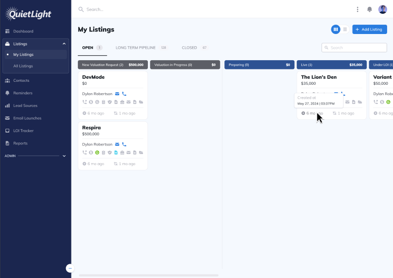
This is a great way to showcase the tooltips in your UX design. You shouldn't have too many tooltips, and there shouldn't be a tooltip on every UX flow, so just add the most important ones and showcase them in your Figma design.
Step 4. Transitioning from design to live with a no-code builder (180 words)
Designing tooltips in Figma is only half the job. The real challenge begins when you need to implement those designs in your live product, especially without slowing down your dev team. This is where most teams hit a wall. Design files get approved, but actually building tooltips into the app takes time, engineering resources, and constant back-and-forth.
Flook solves this problem. It’s a no-code UX layer built specifically for SaaS teams. With Flook, product managers and designers can take tooltips live, without writing code or waiting on developers.
You simply install the free Chrome extension, build your tooltips visually on top of your product, and publish them in minutes. You can choose from pre-built templates, save your own library, and fully match your tooltip styles to your product’s design system.
If you’re ready to bridge the gap between design and production, start by trying Flook with the Chrome extension. Alternatively, you can also build your tooltips with JavaScript.
Step 5: Match the visual style of your app
Your tooltip should look like it belongs, same font, same colors, same attention to detail. If it feels like an afterthought, users will ignore it.
With Flook, you can match your tooltip’s design to your product’s UI without writing a line of code. Start with the basics:
Font family
Background and text color
Border radius and shadow
Padding and spacing
Use the built-in theme editor or style each tooltip individually. Stick to high-contrast combinations for readability and keep the overall look subtle. A good tooltip doesn’t scream—it blends in and supports.
This step is all about trust. When your tooltip feels native to the product, it’s more likely to be read, understood, and acted on. Think of it as an extension of your design system—not an add-on.
Before you move on, check how your tooltip looks on different screen sizes. Visual consistency builds confidence across the user journey.
Step 6: Set the right tooltip behavior
Now that it looks right, it’s time to make sure your tooltip behaves the way users expect.
In Flook, you control exactly how and when your tooltips appear. Choose the trigger based on the context of the interaction:
Hover: Great for desktop UIs where users expect microinteractions.
Click: Ideal for mobile, or when the message needs to stick until dismissed.
Focus: Useful for form fields or keyboard navigation.
Each option changes the user experience. For quick tips, hover often feels best. For onboarding flows, click-to-open tooltips provide more space to explain without vanishing too soon.
You can test each behavior live. If a tooltip shows up too fast or disappears too soon, it’s not helping—it’s distracting. Spend a few minutes dialing this in. Good timing is just as important as good copy.
Together with design, behavior is what makes tooltips feel smooth and intentional.
Step 7. Scale and maintain your tooltips over time
As your product grows, so will the number of tooltips you need to support new features, UI changes, and user behaviors. Without a system in place, tooltip sprawl becomes inevitable—leading to inconsistencies, duplicated work, and unnecessary developer involvement. To avoid that, it’s essential to build a scalable workflow that spans both design and implementation.
Start with design scalability in Figma. Create a base tooltip component set using Auto Layout and variants for size, type, and placement. This makes it easier for your team to maintain visual consistency while accelerating the design process. A shared tooltip system integrated into your UI library ensures every designer builds on the same foundation.
On the implementation side, Flook provides a centralized library of live tooltip widgets. From one dashboard, you can manage content, styling, and positioning without writing code or creating new dev tickets. This central source of truth reduces confusion and ensures that changes roll out quickly and consistently across your app.
Equally important is ongoing content management and iteration. With Flook’s real-time editing and A/B testing capabilities, you can refine tooltip performance over time. Whether you're adjusting copy based on support feedback or optimizing placement through user testing, continuous improvement becomes part of your process.
Frequently asked questions
Get answers to important questions.
How can I structure my Figma tooltip components to support long-term scalability?
Use a base component with variants for style (e.g., light, dark, warning), size (small, medium, large), and position (top, bottom, left, right). Combine Auto Layout and Constraints to handle responsiveness. This approach makes it easy to maintain consistency and update multiple tooltips without duplicating design effort.
How do I ensure pixel-perfect alignment between my Figma tooltip designs and what users see in production?
After designing your tooltip system in Figma, use Flook’s Chrome extension to manually match spacing, padding, and placement directly in the live UI. You can inspect and replicate Figma values (such as typography, shadows, and radius) to ensure visual accuracy. Flook’s theme editor allows global styling that mirrors your design tokens for brand consistency.
What’s the best way to handle tooltips across responsive layouts?
In Figma, test your tooltip components in both desktop and mobile frames. Use Auto Layout and constraints so elements adjust with container size. In Flook, preview your tooltips across breakpoints and adjust positions manually to avoid overlaps or hidden content. Responsive fine-tuning is essential for usability on all devices.
How do I manage tooltip updates as product features evolve post-launch?
Keep a shared tooltip component set in Figma, and document intended use cases. In Flook, store all deployed tooltips in a single library. When a feature changes, update the corresponding tooltip from the dashboard—no need to touch code. Version history and real-time editing let you iterate quickly while maintaining control across teams.
Thoughtfully designed tooltips are one of the simplest, most effective ways to guide users and improve product engagement. By combining a structured design system in Figma with a flexible no-code deployment layer like Flook, you can create tooltips that are easy to scale, update, and optimize—without waiting on dev cycles. Whether you’re supporting onboarding, driving feature adoption, or reducing user confusion, tooltips can make a measurable impact.
Ready to go from prototype to production? Install the Flook Chrome extension and start building tooltips right on top of your app today.