Mastering Tooltip Placement: A Complete No-Code Guide
Last updated on Thu Jun 26 2025
Tooltip placement might sound like a small detail, but it can make or break your user experience.
Place a tooltip too far from its trigger element, and users miss it. Cover key UI content, and now you’ve created more confusion than clarity.
That’s why tooltip placement deserves more attention than it gets. This guide walks through the ins and outs of positioning tooltips the right way, based on UX best practices, real-world scenarios, and no-code implementation tools like Flook.
Whether you’re onboarding new users, guiding workflows, or just trying to be helpful, placement isn’t just about where the tooltip goes. It’s about when, why, and how. And in SaaS, those choices impact activation, conversion, and retention more than most think.
What is tooltip placement and why it matters
Tooltip placement refers to the specific position of a tooltip relative to the element it’s meant to explain, like a button, icon, or form field. Tooltips provide brief, helpful context or instructions without cluttering the UI. But their effectiveness depends on precise placement. When tooltips appear in the wrong spot—too far from the trigger, overlapping important content, or offscreen—they stop being helpful and start getting ignored or dismissed. Good tooltip placement keeps guidance visible, intuitive, and accessible. It reduces friction, supports task completion, and improves overall usability. In SaaS, it’s often the difference between a smooth onboarding experience and a frustrating first impression.
Core principles of effective tooltip placement
Effective tooltip placement means that you're creating an experience that’s helpful without being disruptive. Here are the core principles every tooltip should follow:
Visibility and accessibility: Tooltips should be clearly visible without blocking essential content. If users have to move their mouse or guess where to look, it’s already a fail. Placement should also respect screen boundaries and be accessible to screen readers when possible.
Contextual relevance: A tooltip needs to appear close to the UI element it’s explaining. If it floats too far away or appears in a visually disconnected area, users may not associate it with the right action or content.
Timing and triggers: How and when a tooltip appears matters. Hover-triggered tips feel natural on desktop, while click or focus triggers are better for mobile or accessibility. Choose a trigger based on device, context, and the importance of the message.
Placement strategies by HTML element
When it comes to tooltip placement, context is everything. Different HTML elements call for different strategies. What works for a button might not make sense for a text input or navigation link. Here’s a breakdown of common UI elements and how to place tooltips around them effectively:
Buttons
Place the tooltip above or beside the button to avoid overlap during interaction. Use short, action-oriented text to clarify what happens next (e.g., “Saves your progress”).
Text inputs and form fields
Tooltips should appear to the right or below the field. Avoid covering the label or typed content. These tooltips are great for explaining formatting rules or why certain info is needed.
Icons (info, help, settings)
Since icons are small, tooltips should be centered above or below. Keep them tight and contextual—users expect fast clarification, not a paragraph.
Navigation links
Tooltips in nav menus should be used sparingly. If needed, place them below or to the right, depending on menu orientation. They’re helpful for abbreviations or unfamiliar terms.
Onboarding modals and walkthroughs
Tooltips in a sequence should be anchored to the most relevant UI element and follow a logical visual flow (e.g., top to bottom or left to right). Avoid placing tooltips in static positions, they should adapt as the user moves through the app.
This element-by-element approach ensures every tooltip feels intentional, not random. It’s all about clarity, proximity, and respect for the layout.
Trigger elements and their impact on placement
Trigger type affects not only when a tooltip appears, but also where and how it should be placed. Here's how placement strategy shifts based on common tooltip triggers:
Hover trigger: Best for desktop interfaces where users have a mouse. Tooltips should appear immediately and near the pointer, without obscuring nearby UI. Avoid placing hover tooltips where they disappear if the pointer moves slightly off the trigger element.
Click trigger: Ideal for tooltips with more detailed content or interactive elements. Since users initiate the action intentionally, tooltips can be larger and placed beside or below the element. Placement should consider where a user’s focus will naturally go post-click.
Focus trigger: Useful for keyboard navigation and accessibility. Tooltip should appear adjacent to the element, typically above or below. Placement must not interfere with typing or field visibility, especially in form-heavy interfaces.
Touch trigger (tap or long-press): For mobile devices, tooltips triggered by taps should be centered above or below the element. Avoid side placement that might be cut off by screen edges. Timing and visibility are especially critical here.
Good vs. bad tooltip placement with triggers
Good placement works with the trigger. A hover-triggered tooltip shouldn’t force the user to move the mouse far or risk losing the message. A click-triggered tooltip shouldn’t appear somewhere that requires additional scrolling or eye movement. Bad placement breaks flow or adds effort. Good placement feels instant, logical, and smooth. The tooltip should support the user’s next move, not interrupt it.
Types of tooltip placement
Tooltip placement types are typically defined by direction—top, bottom, left, right, center, or automatic. Each option has its own use case depending on layout, screen space, and interaction style. Here's a breakdown of each:
Top
Pros: Keeps tooltip out of the way of most interactions. Works well for buttons and icons.
Cons: Can be cut off on smaller screens or when near the top edge.
Bottom
Pros: Natural for tooltips related to form fields or dropdowns. Supports readable flow (top to bottom).
Cons: Might overlap with content below or get hidden on short screens.
Left
Pros: Useful for tooltips on the far right side of a UI. Keeps content aligned visually.
Cons: Can feel awkward in left-to-right reading environments. May overlap content if not spaced carefully.
Right
Pros: Feels intuitive in left-to-right interfaces. Common for onboarding tooltips pointing to inputs or settings.
Cons: Easily clipped near screen edges.
Center
Pros: Best for attention-grabbing tips or tooltips tied to modals. Works well for guidance that applies to the whole screen.
Cons: Interruptive. Not ideal for passive help or subtle cues.
Auto
Pros: Lets the system decide based on available space—reduces risk of tooltips being clipped or misplaced.
Cons: May feel inconsistent across screens. Can confuse users if the tooltip jumps around too much.
Choosing placement isn’t about aesthetics, it’s about giving users clear, immediate help without disrupting their flow. Start with best practices, but always test in context.
Using the mouse pointer to inform placement
Using the mouse pointer to inform tooltip placement adds a layer of responsiveness to your UI. Instead of placing tooltips in a fixed position, the tooltip follows or responds to the user's cursor location. This technique can be helpful—or harmful—depending on how it's implemented.
When pointer-based placement helps UX
Data-heavy dashboards: In charts or analytics tools, placing a tooltip near the pointer helps users quickly understand data without breaking their visual flow.
Tight UI elements: If there’s limited space near the trigger element, aligning to the pointer gives more flexibility.
Interactive maps or visualizations: Pointer-following tooltips make contextual insights feel fast and fluid.
When pointer-based placement hurts UX
Tooltip flickering: If the tooltip follows the pointer too closely, it can obscure the element or jitter as the mouse moves.
Mobile incompatibility: This technique doesn’t translate to touch devices, which lack hover states.
Inconsistent behavior: If placement changes with every slight movement, users may struggle to read the tooltip or understand where it’s coming from.
Use pointer-based positioning sparingly and with strong UI rules. For best results, anchor tooltips near—but not on—the pointer and avoid positioning them directly under the cursor where they can interfere with clicks or readability.
Tooltip container best practices
Following these best practices will really keep your tooltips in line.
Keep containers within layout bounds
Tooltips should never break the layout or overflow the visible viewport. Make sure containers are constrained by parent elements or positioned using fixed or absolute settings that respect screen size. Responsive design is key—tooltips should adapt to different screen widths without causing horizontal scroll or clipping.
Manage z-index and layering carefully
Tooltips need to appear above all other UI elements, but not at the cost of hiding modals, menus, or other important content. Use a consistent z-index strategy across your app to ensure tooltips sit atop the right elements without creating stacking conflicts or disappearing behind components.
Tooltip text considerations
Tooltip text should be concise but clear, and its placement needs to account for the length of the content. Longer text blocks can break the visual flow if not positioned properly—especially near screen edges. Directionality matters too. In left-to-right (LTR) layouts, tooltips typically open to the right or below; in right-to-left (RTL) environments, they should mirror this behavior for consistency. For accessibility, tooltips must be readable by screen readers. This means avoiding purely visual cues and ensuring that tooltip content is linked via aria-describedby or similar attributes, so assistive tech can announce it properly when users focus on the trigger element.
Common tooltip placement mistakes (and fixes)
One of the most common tooltip placement mistakes is covering important content or input fields. When a tooltip obscures the very thing it’s meant to clarify, it frustrates users and defeats the purpose. The fix: always test placement in real user flows, and default to positioning tooltips above or beside elements, not on top of them.
Another issue is misalignment on responsive layouts. A tooltip that looks great on desktop can end up floating awkwardly—or completely offscreen—on mobile or tablets. To avoid this, tooltips should be built with responsiveness in mind. Use relative positioning and breakpoints to ensure they stay connected to their trigger elements, no matter the device. Consistency matters more than clever animation.
Designing tooltip placement for mobile vs desktop
Tooltip placement is different on mobile versus desktop. Consider following these tips.
Prioritize mobile-friendly placement
On mobile, screen real estate is limited, and tooltips can easily interfere with content. Opt for placement above or below the element, and ensure they’re large enough to read but small enough not to dominate the screen. Avoid fixed-width containers that won’t scale down properly.
Use responsive techniques
Tooltip placement should adjust based on screen size and orientation. Use media queries or flexible positioning logic to keep tooltips visible and aligned on all devices. Test on multiple viewports to catch overflow issues or misalignments early.
Account for taps, not clicks
Unlike desktop, mobile interfaces rely on taps or long-presses. This changes how and when tooltips should appear. Avoid hover-based triggers and ensure that tapped tooltips are dismissible with another tap or swipe. Placement should feel intentional, not surprising or invasive.
Title attribute vs custom tooltip: Placement limitations
When to use native browser tooltips vs. styled pop-up boxes.
Constraints of the title attribute on placement and customization.
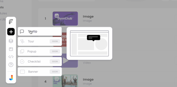
How to place tooltips without coding using a Chrome extension
Placing tooltips used to mean wrangling code or bugging developers for the smallest tweak. Not anymore. With Flook’s Chrome extension, anyone—designer, marketer, PM—can add and position tooltips directly on a live site. It’s built for precision without the pain. You get drag-and-drop editing, real-time previews, and total control over where tooltips appear. Placement isn’t a guessing game—it’s a visual process, tailored to your exact UI. With ready-made templates and custom options for every kind of element, tooltips can be placed exactly where they make sense. Add in real-time publishing and no developer bottlenecks, and you’ve got tooltips that are fast, accurate, and on-brand every time.
Step 1. Choose the right button
Not every button deserves a tooltip. Focus on moments where users hesitate: “Start Free Trial,” “Submit,” “Invite Teammates.” These are action points tied to friction or confusion. Tooltips here can nudge users forward or prevent mistakes. Also consider new features or flows with high drop-off—those are prime tooltip opportunities.
Step 2. Open your app and launch Flook
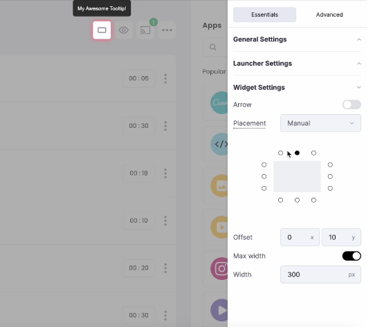
With Flook installed, open your app in Chrome and activate the extension. Navigate to the page and find the button. Click “Add Tooltip” and hover over the button. Flook highlights it in real-time. Once selected, drag the tooltip box into place: above, below, or beside the element. Placement is live and visible, so there’s no guesswork.
Step 3. Attach the tooltip to the button
Click to confirm your selected button. Flook anchors the tooltip to that element, and you can fine-tune its position from there. Placement should feel natural. Usually just above or to the side, depending on space. Toggle off the launcher icon if it’s visually distracting. Preview on both desktop and mobile to make sure it still aligns.
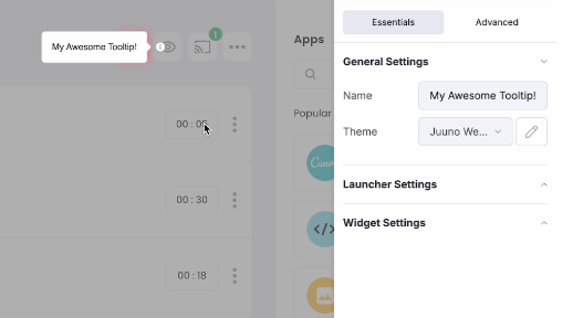
Step 4. Write clear, action-focused copy
Inside Flook, edit the tooltip text right where it appears. Keep it short—one sentence, tops. Use verbs that guide the user, not fluff. This is about clarity, not persuasion. Your tooltip should help someone click with confidence, not pause to read a pitch.
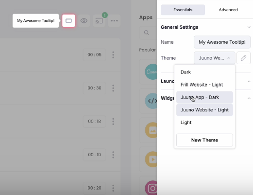
Step 5. Match your UI
Flook lets you style tooltips to match your brand without touching CSS. Adjust fonts, colors, spacing, and shadows to fit seamlessly into your UI. A tooltip that blends in builds trust—a tooltip that feels foreign gets ignored. Keep it clean and familiar.
Step 6. Set the trigger behavior
Choose how the tooltip shows up: hover, click, or focus. Hover works great for desktop. Focus is better for forms and keyboard users. Click is ideal when the tooltip includes more detail. Pick the one that fits your flow, and test it to make sure the timing feels right.
Step 7. Test and tweak
Once it’s live, use your product like a user. Does the tooltip appear at the right time? Is the placement clean across devices? If anything feels off, adjust it. Rewatch user sessions or ask for feedback. The goal isn’t to ship a tooltip—it’s to improve a moment. Small placement shifts can make a big difference.
Optimizing tooltip placement for user onboarding
Effective onboarding relies on clarity, timing, and thoughtful guidance—and tooltip placement plays a central role. When placed well, tooltips help new users navigate unfamiliar interfaces without relying on guesswork or external help. Here’s how placement supports a smoother onboarding experience:
Interactive walkthroughs and sequential tooltip flows
Onboarding tooltips highlight key steps in a user journey. When creating multi-step flows, each tooltip needs to be precisely placed near its corresponding UI element. Consistent placement helps users stay oriented, while dynamic alignment ensures tooltips stay in place even if the user scrolls or resizes the screen. This reduces cognitive load and supports learning by keeping the focus exactly where it belongs.
Improving onboarding completion rates with good placement
Strategically placed tooltips improve engagement by making the next step visually obvious. Misplaced or floating tooltips can create confusion, especially during critical first-use moments. Clear, stable placement helps guide users without overwhelming them, encouraging steady progression through the onboarding sequence. For best results, placement should be tested on multiple screen sizes and interaction patterns to ensure tooltips support—not interrupt—the user’s workflow.
Enhancing UX with thoughtful tooltip placement
Thoughtful tooltip placement is one of the quiet drivers of great user experience. When done right, tooltips reduce friction and help users complete tasks with more confidence, without disrupting the flow or adding visual noise. It’s a subtle but powerful way to support interaction.
Reducing friction without disrupting flow Tooltips should act like supportive nudges, not pop-ups in disguise. Their job is to clarify, not distract. When placed close to the element they reference, and triggered at the right moment, they provide just enough context to help users move forward. This is especially effective for microinteractions like form entries, hover states, or onboarding steps, where a full modal or alert would feel excessive.
Pop-up box vs. tooltip: Placement considerations Tooltips and pop-ups serve different purposes, and their placement logic reflects that. Pop-up boxes are more appropriate for announcements, decisions, or multi-step interactions. Tooltips are best for brief, contextual guidance tied to a specific element.
Use a tooltip when:
The message is tied to a single UI element
You’re offering passive help, not demanding attention
The guidance can be delivered in a sentence or two
Tooltips are also less intrusive than pop-up boxes, making them ideal for lightweight prompts and interface-level support. Placement should reinforce that intent, staying close to the relevant element and disappearing when no longer needed. This keeps the interaction smooth, allowing the tooltip to assist without taking center stage.
Strategic tooltip placement turns small UI moments into clear, confident user actions. It’s a detail that drives better onboarding, cleaner interfaces, and smoother workflows. With Flook, anyone can place tooltips with precision, and absolutely no coding required.
Try Flook to simplify your UX and make every click more intuitive.