Mastering User Experience: How Travel Sites Boost Engagement with Smart UI Patterns
Last updated on Mon Dec 02 2024
Few industries cater to as diverse a set of needs as the travel industry. The travel industry usually caters to a wide range of customers and their needs. Unlike other industries that may cater to more uniform customer expectations, the travel industry gets to serve diverse kinds of people with different types of expectations based on their backgrounds, budgets, and reasons for travel.
Because of this peculiarity with diverse people traveling, the travel industry has to be prepared to meet diverse preferences while also personalizing the experience for each user to keep their attention. For instance, a backpacker who is on a tight budget would have different travel requirements as opposed to a couple planning a romantic getaway or an entrepreneur traveling for business.
Hence, these travel industries would need to be able to meet up with the needs of their users without overwhelming them with too many choices.
How Travel Sites Use UI Patterns To Nudge Customers
The best travel websites usually know how to incorporate a few essential UI patterns into their website to encourage immediate action and lay the foundation for good customer relationships. These UI patterns help travel sites accomplish several goals and some of them have been listed below:
Drive Urgency
As we noted earlier, many travel customers are unsure and often not set on specific plans, hence, they often browse multiple sites to explore their options. This usually leads to customers spending more time than necessary on several travel sites instead of focusing on one.
Therefore, travel sites help to encourage customers to make decisions faster through the use of UI elements like countdown timers, and phrases like "limited availability" or "last few rooms". These elements usually go a long way in making their offers sound more enticing and creating a sense of scarcity in the minds of users. This helps to nudge the customers into making a decision quickly and reduces the likelihood of them leaving to browse elsewhere.
Provide Contextual Recommendations
With a high number of choices available, it is easy for a customer to feel overwhelmed. Travel sites make use of contextual recommendations to tailor relevant recommendations to each customer's behavior, budget, or destination. This will not only help users maximize their budgets and make informed choices but will also help them make quicker decisions.
Allow Customization
Planning a trip involves numerous details from the destination, to the amenities, even down to the price. To help streamline the search for customers, most travel sites allow users to use the filter option that will them narrow down their choices based on their preferences. Hence, they can find exactly what they want.
This option also gives customers a feeling of control over their own experiences because they get to customize how they want their experience to be like, to suit their taste and their needs.
Encourage Repeat Usage
While immediate bookings are essential, customer retention is also an important goal. Travel sites prompt account creation to ensure that they have access to lifecycle marketing. Through this, they get to send their customers personalized offers, reminders, or seasonal deals that can bring their customers back for their travel needs in the future.
Repeat usage also helps travel sites build brand loyalty and sets a solid foundation for long-term engagements with their customers.
Let us take a look at six travel sites that make effective use of these UI strategies.
Six Popular Travel Sites That Effectively Use UI Patterns To Achieve Their Goals
Take a look at how these six popular travel sites use smart UI patterns to make booking easier, engage users, and create a smooth experience that keeps travelers coming back.
1. Kayak

Kayak is a very popular travel site that is known for its streamlined and user-friendly interface which prioritizes easy navigation and fast booking decisions.
Here is what we like about Kayak’s user experience:
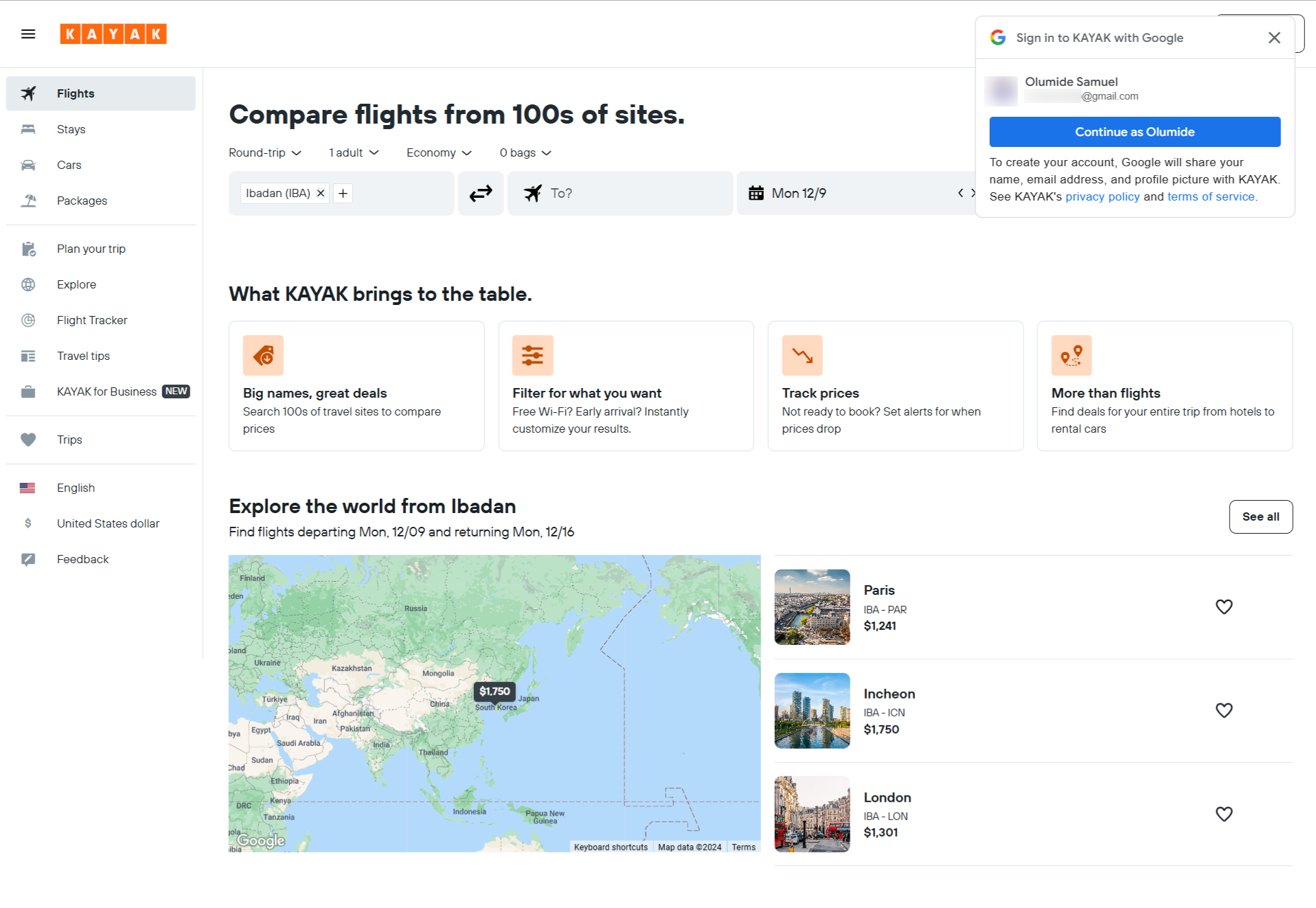
Kayak uses a clear, eye-catching modal window to create an engaging onboarding experience. They put their users through, using a personalized onboarding process that makes them feel supported from the beginning and helps them find what they are searching for very quickly.
They also have a modal window that encourages account creation. This helps to support user retention as it sets up a foundation for future interactions, notifications, and customized deals.
Kayak combines modals with subtle embedded elements that help to enhance customers’ engagement with their site. With these embedded elements, they are able to gently nudge their users to explore more without feeling pressured.
Kayak creates a sense of urgency using recommendations and microcopy such as "book easily" in bright orange. The color choice and the language are designed to make users feel prompted to act fast.
Kayak's payment page is designed to reassure users about their purchases and help them feel secure about their bookings.
2. Hotwire

Hotwire is another popular travel site that is well-known for discount travel.
Here is what we like about Hotwire’s user experience:
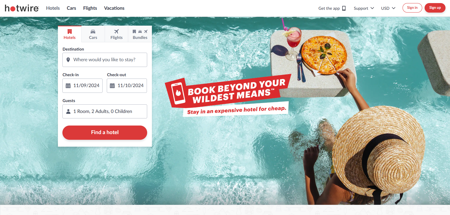
Hotwire prioritizes retention through a top banner. This banner immediately captures users’ attention and aims to keep them engaged from the beginning.
This transition is usually very subtle, as they start to make use of language and design elements that emphasize the limited availability of certain offers. This transition allows Hotwire to move users from casual browsing to serious consideration and, eventually, to booking.
Hotwire gathers user feedback on the homepage but not until these users have spent more time on the site to ensure more accurate insights.
Hotwire strategically prompts users to take sequential actions that encourage cross-selling, such as adding a hotel after booking a flight. This helps them to maximize the value each user brings to the platform.
3. Priceline

Here is what we like about Priceline’s user experience:
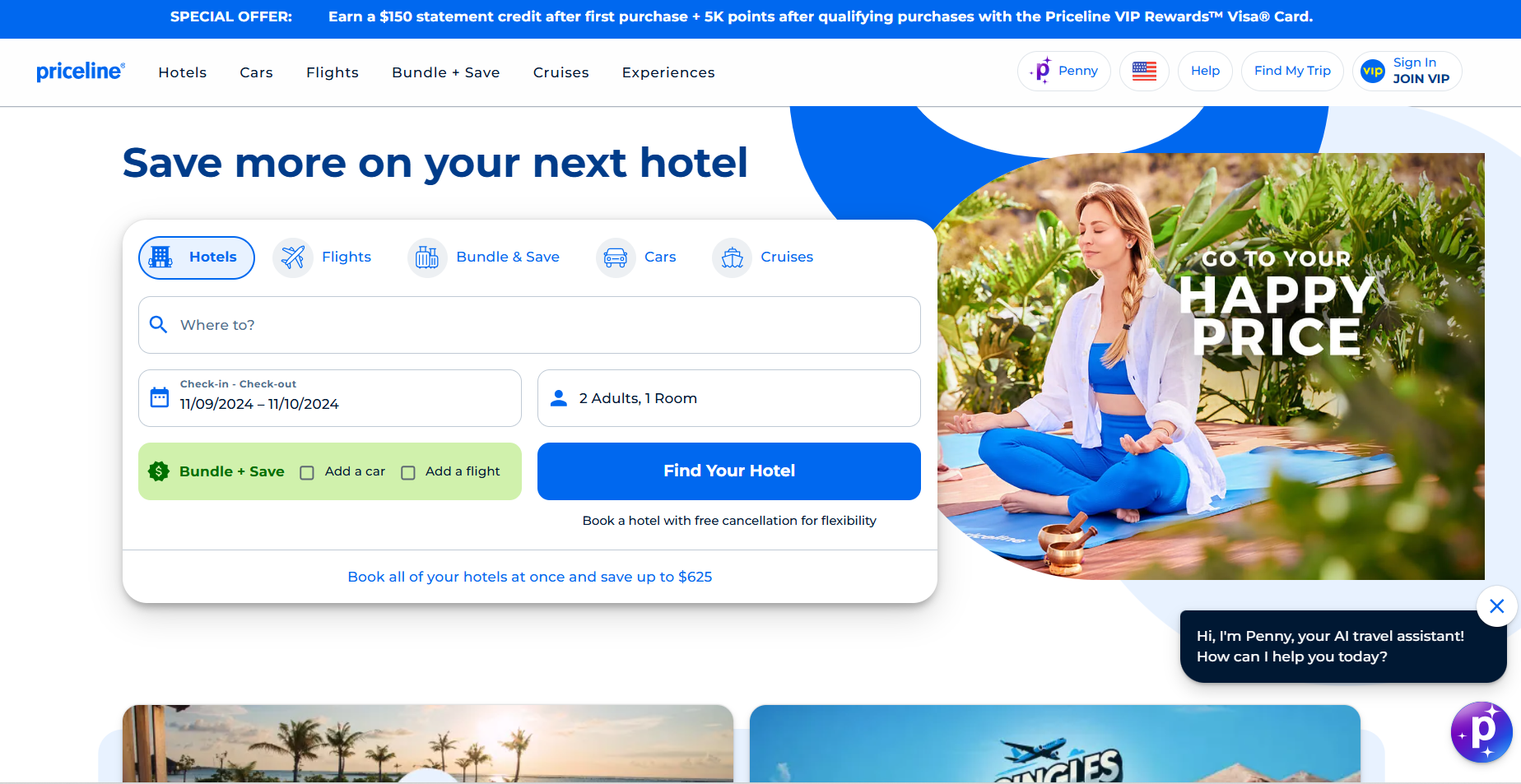
Priceline emphasizes microcopy over UI-driven urgency. Priceline uses good microscopy instead of depending on visual components, or pop-ups, to generate urgency.
Usually including an animated jet, their loading page gives the user's booking experience some entertaining value. While the sites load, this minute feature keeps users occupied.
Customizing choices include tooltips to assist in better feature discovery by the user across the site. Using filters for budget, location, or amenities, for example, lets customers customize their experience and enable them to locate exactly what they need without feeling overburdened with too many choices.
Priceline breaks out their forms into several pages with a progress indicator to enable consumers to quickly find their way and track their distance traveled. The progress bar lets consumers clearly know where they are in their booking process, therefore enabling them to feel in charge of the process.
Priceline breaks up the process to make it less daunting for their users. This will reduce form abandonment and will help users move confidently from start to finish.
4. Expedia

Here is what we like about Expedia’s user experience:
The homepage is broadly appealing but risks feeling cluttered. They aim to cater to diverse travelers, however, having a wide range of options could lead to their users feeling overwhelmed. Expedia tackles this by organizing elements in a structured layout to prevent users from feeling lost, though the wide variety of options can still be visually heavy.
Expedia encourages account creation through banners and in-app messages. Like other travel sites, this helps to lay a foundation for long-term engagement through recommendations and targeted offers.
Urgency and cross-selling are driven through slideouts and modals, with social proof elements like "4550 people booked a flight to LON on Expedia today." through this, Expedia leverages the fear of missing out (FOMO) to encourage users towards immediate action.
Contextual recommendations are consistently provided to streamline decision-making, thereby making it easier for users to find relevant options quickly.
5. Google Flights

What we like about Google Flights’ user experience:
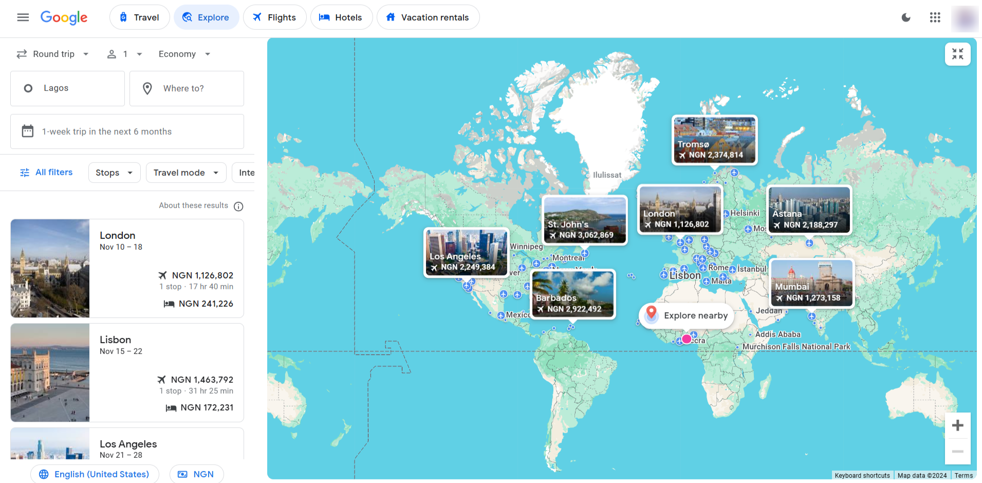
Google presents choices one at a time, to reduce cognitive overload on their users. They guide users through each decision step-by-step, rather than presenting multiple options (such as hotels, flights, and car rentals) all at once.
Google Flights has designed its flow so that users can first decide on a destination before they continue browsing for further options like hotels or flights. This structure helps to give users a clear direction on what they are doing.
Connection to Google accounts allows easy flight tracking. This integration by Google provides a personalized, consistent experience across devices, where users can access their saved flights, track prices, and receive alerts for changes.
Subtle tooltips and hotspots reveal more about recommendations and ads. They add an informative layer to Google Flights which enables their users to learn more about specific recommendations, promotions, or ads without disrupting their journey.
6. Airbnb

Here is what we like about Airbnb’s user experience:
Airbnb makes use of prompts, modals, and tooltips to nudge users toward quicker bookings. It helps to reduce friction in their decision-making.
Airbnb makes use of personalized touches to make tasks like account creation feel more seamless for their users. They make the task ahead feel more like a natural part of the experience and less like an obligatory step.
Airbnb sometimes delay prompts to allow users to explore the sites by themselves. This approach helps to build trust in their users and allows them space to find options that suit their needs.
A Balancing Act
In the travel industry, user engagement and retention are usually quite challenging because of the diversity of their customer needs. Travel sites turn to UI patterns to help them achieve the feat of balancing immediate conversions with long-term customer relationships.