How to Implement jQuery Tooltips [With Code Examples]
Last updated on Wed Jun 25 2025
Tooltips are one of the simplest and most effective ways to enhance user experience on the web. These compact, hover-triggered UI elements deliver bite-sized information right where it’s needed, whether that’s guiding users through a complex dashboard, clarifying a button’s purpose, or providing inline help for form fields. They keep interfaces clean while delivering clarity, making them indispensable for modern SaaS teams focused on reducing friction and boosting feature adoption.
For years, jQuery tooltips, especially via the jQuery UI Tooltip widget, have been a go-to solution for developers. Easy to implement, relatively customizable, and widely supported, they’ve served their purpose well.
But web development has evolved, and jQuery—once the default library for interactive elements—is no longer the most efficient or scalable option for many modern teams. As frameworks shift and products become more dynamic, the limitations of traditional jQuery tooltips become more apparent: styling requires extra effort, managing tooltips across large apps becomes cumbersome, and maintaining consistent behavior demands custom logic.
For SaaS companies, especially, these challenges can slow down onboarding improvements and hinder product agility.
This shift has led to the rise of no-code solutions built specifically to address those gaps. These tools allow teams to create, manage, and update tooltips visually, without touching code, offering a faster, more scalable approach for modern product environments.
What are jQuery tooltips?
jQuery tooltips are small, interactive popups that appear when a user hovers over or focuses on an element, providing contextual information without overwhelming the interface. They’re commonly used to offer extra guidance, explain features, or clarify form fields, all without requiring users to leave the current screen. By delivering just-in-time information, tooltips help users navigate interfaces more confidently and complete tasks with fewer errors.
The most widely used implementation is the jQuery UI Tooltip widget, part of the jQuery UI library. It replaces the browser’s default tooltip behavior with a more customizable alternative. Developers can define content, control positioning, add animations, and apply custom styling using classes like tooltipClass. Events such as tooltipcreate and tooltipopen offer hooks for deeper interactivity, while options like track and disabled fine-tune behavior for advanced use cases.
Typical use cases include explaining icons or abbreviations, showing help text for form inputs, and providing onboarding hints during feature tours. Because tooltips appear only when needed, they preserve screen real estate and reduce visual clutter, which is especially valuable in dense UI environments. In short, jQuery tooltips improve UX by making support content accessible, without making it intrusive.
Anatomy of the jQuery tooltip widget
What makes the jQuery UI Tooltip tick? It’s all in the config:
🛠 Key options
content: Define what shows in the tooltipposition: Control where it appearstooltipClass: Add custom stylesdisabled,track: Manage behavior and movement
⚙️ Core methods
enable(),disable()— Turn tooltips on/offopen(),destroy()— Manually show or removeoption()— Get/set configuration on the fly
🎯 Events
tooltipcreate: Fires when initializedtooltipopen: Triggers when shown
Together, these features offer full control over behavior, appearance, and timing.
How to implement jQuery UI tooltips (with code examples)
Implementing jQuery UI tooltips is fairly straightforward, especially if you're already familiar with jQuery. The basic syntax is:
JavaScript:
CopyEdit$(selector).tooltip(options);
This attaches a tooltip to the selected HTML element and allows you to configure its behavior with various options.
Start with a simple HTML element, like a button or input field:
HTML:
<button title="Click to save your changes">Save</button>
By default, jQuery UI will pull content from the title attribute. To activate the tooltip, initialize it with jQuery:
JavaScript:
$(function() { $("button").tooltip(); });
You can go further by customizing the content, position, and styling. For example:
JavaScript:
$(function() { $("button").tooltip({ content: "Custom tooltip text", position: { my: "left top", at: "right+5 top-5" }, tooltipClass: "custom-tooltip" }); });
In this case, content overrides the default title, position defines where the tooltip appears relative to the element, and tooltipClass allows you to style the tooltip via CSS. For instance:
CSS:
.custom-tooltip { background-color: #333; color: #fff; padding: 8px; border-radius: 4px; }
This gives you complete control over tooltip appearance and placement.
Limitations of jQuery tooltips
Like anything, jQuery tooltips aren't perfect. Here's where they can fall flat.
Accessibility limitations on disabled elements
One of the key issues with the jQuery UI Tooltip is accessibility, especially when used with disabled elements. Native tooltips triggered by the title attribute don't display for disabled form elements like buttons or inputs. While jQuery UI tries to overcome this, workarounds are often required, such as wrapping disabled elements in <span> tags, which can introduce further complexity and inconsistency in your markup.
Clunky animation and styling customization
While jQuery UI Tooltip does offer an animation effect option, it's limited in flexibility. Developers can configure basic show/hide transitions, but customizing the animation beyond fade or slide requires deeper JavaScript overrides. Likewise, styling tooltips involves applying a custom tooltipClass, but the CSS structure is dated and can be difficult to override cleanly, especially when compared to more modern CSS-in-JS or utility-first frameworks.
Lack of support for modern JavaScript frameworks
Another major limitation is the lack of out-of-the-box compatibility with modern frameworks like React, Vue, or Svelte. Since jQuery modifies the DOM directly, it conflicts with the virtual DOM principles used in these libraries. This makes integrating jQuery UI Tooltip into component-based applications more difficult and often not worth the trouble, especially when modern alternatives are more performant and developer-friendly.
Comparing tooltip plugins and JavaScript tooltip libraries
What works best? Let's explore your options.
Bootstrap tooltips: simple and integrated
Bootstrap’s tooltip widget is built on Popper.js and designed for ease of use within the Bootstrap framework. It’s ideal for teams already using Bootstrap, offering out-of-the-box styling and functionality. Customization is possible through data attributes and limited JavaScript methods. However, the content option is typically restricted to plain text or simple HTML, making it less flexible than other libraries.
Popper.js: precision positioning engine
Popper.js isn’t a tooltip library on its own, but it powers many tooltip solutions by handling placement logic. It offers high-precision positioning and flipping logic for complex UI needs. Developers who want complete control over tooltip behavior and integration with their own tooltip widget will appreciate Popper.js, though it requires manual setup and doesn’t handle content or animation out of the box.
Tippy.js: modern and flexible
Tippy.js builds on Popper.js and adds rich functionality for JavaScript tooltips. It supports interactive tooltips, advanced animation effects, and theming. The content option allows for plain text, HTML, or even virtual DOM nodes. Tippy is highly customizable and well-documented, making it a top choice for modern front-end stacks.
jQuery UI Tooltip: aging but functional
While still functional, the jQuery UI Tooltip lacks the flexibility and performance optimizations of modern libraries. Its integration with legacy systems is useful, but it falls short in dynamic content handling, styling, and performance.
UX debt: the hidden cost of DIY tooltips
As SaaS apps grow, what starts as a few helpful tooltips can quickly spiral into a web of maintenance headaches. DIY tooltip systems—especially those built with jQuery or vanilla JavaScript—introduce long-term friction for both teams and users. This hidden cost is known as UX debt: small compromises in usability that accumulate over time and eventually hinder product quality.
Here’s how DIY tooltips can turn into UX debt:
Inconsistent design: Multiple developers writing tooltips from scratch can lead to mismatched styles, fonts, and placements—creating a disjointed user experience.
Hard-coded logic: Tooltips often get tied directly to HTML elements, making them fragile. One class name change or layout tweak can silently break tooltip behavior.
Dev bottlenecks: Every change—text updates, position tweaks, style revisions—requires engineering time, slowing down product and marketing teams.
Lack of version control or visibility: With no centralized management, it’s easy to lose track of what tooltips exist, where they live, and whether they’re still relevant.
Scalability issues: As tooltips multiply, managing them across product areas without a central system becomes unsustainable.
Poor accessibility: Manually implemented tooltips often lack ARIA roles or screen reader support, making them unusable for some users.
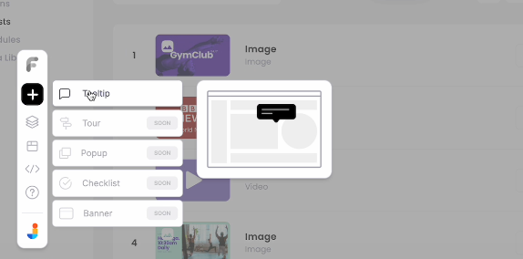
Building tooltips with Flook (zero code needed)
Flook is a modern tooltip plugin that lets teams create and manage in-app tooltips visually—without touching a single line of code. Unlike jQuery, which requires manual scripting and styling, Flook is built for dynamic products and fast-moving SaaS teams. It works with any HTML element, including disabled inputs, and is already trusted by teams at Frill and Juuno for onboarding and user education at scale.
Here’s how to build and deploy a tooltip using Flook:
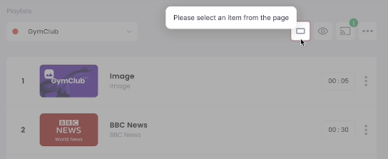
Step 1: Open your product and launch Flook
First, install the Flook Chrome extension. Once it’s active, open your web app and launch the extension. You’ll see an overlay appear, giving you real-time access to the live interface. Navigate to the specific page where the tooltip will go, such as a signup form, pricing page, or feature dashboard.
Click "Add Tooltip" from the extension panel. Hover over the desired HTML element—Flook highlights it as you move. This ensures you're attaching the tooltip to the correct target, whether it's a call-to-action button or a help icon.
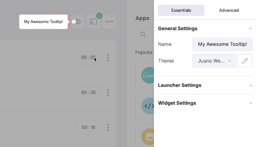
Step 2: Attach and position the tooltip
Once you select your element, Flook lets you drag a tooltip box directly onto the interface. Position it above, beside, or below the element—whatever makes the most sense visually and functionally. Avoid blocking key UI components and aim for clean, consistent spacing.
Need to attach a tooltip to a disabled button? No problem. Unlike many traditional libraries, Flook handles disabled elements without awkward workarounds or markup hacks.
Step 3: Write clear, useful tooltip text
The tooltip content should be concise, actionable, and helpful. Write your message directly in the Flook editor. Aim for one sentence that clarifies what the button or element does.
Avoid filler like “Click here” or vague phrases. Instead, use strong verbs and direct benefits:
“Save changes”
“Start free trial”
“Invite teammates”
“Download report”
This copy should eliminate hesitation, not introduce more of it. Test your tooltip in place to make sure it fits naturally with the flow.
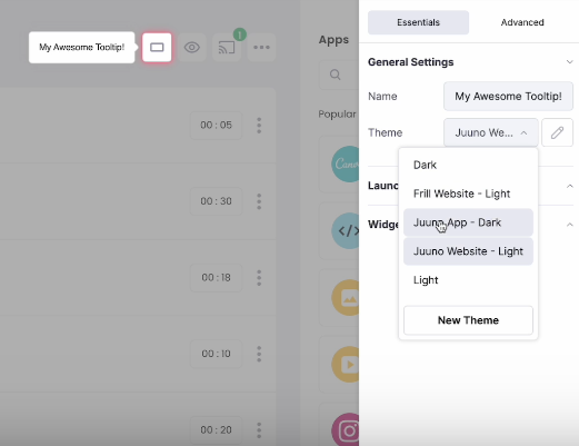
Step 4: Match your brand and control behavior
Use Flook’s visual editor to customize font, background, border radius, and shadow—so your tooltips blend seamlessly into your app’s UI. Stick to your product’s color palette and typography to maintain trust and visual consistency.
Then, define how and when the tooltip appears. Choose from:
Hover: Standard for desktop tooltips
Click: Ideal for mobile or persistent messages
Focus: Useful for form guidance and keyboard navigation
Preview on different screen sizes, then publish instantly—no deploys, no dev handoff, no delays.
This no-code workflow means anyone on your team can launch, test, and iterate on tooltips without engineering support. It's faster, more flexible, and more scalable than managing tooltips with jQuery or hardcoded scripts.
When to use jQuery tooltips vs. Flook
Use jQuery tooltips when working with legacy systems or handling basic tooltip needs where direct DOM access is available. It’s a familiar choice for traditional web projects. However, for modern SaaS products that prioritize speed, scalability, and non-technical collaboration, Flook is a better fit. It allows tooltips to be created visually—even on dynamic or disabled elements—making it ideal for product-led teams who need to iterate quickly without engineering bottlenecks. Choose based on your tech stack and growth needs.
Tooltips remain essential for UX, but how they’re built has evolved. No-code solutions like Flook offer speed, control, and scalability, without the dev overhead. Ditch the outdated methods and simplify your workflow.
Try Flook today and start delivering tooltips without the tech debt.