HTML Tooltips Made Easy: Your Step-By-Step Guide to Better UX
Last updated on Tue Jan 28 2025
If you’ve spent any time designing a website or building a web application, you’ve probably encountered the need for tooltips. These small, interactive pop-ups appear when users hover over or focus on an element, offering additional information or context without overwhelming your interface. Tooltips are invaluable for improving user experiences, especially when explaining complex features, clarifying ambiguous elements, or guiding users through new workflows.
In the world of minimalist, clean design, tooltips strike a balance between functionality and aesthetics. They allow you to provide just-in-time information without cluttering the UI with excessive text or labels. From onboarding tours to form field explanations, tooltips enhance clarity, reduce confusion, and streamline interfaces—all while keeping users engaged.
For developers, creating tooltips can be a tedious process involving HTML, CSS, and sometimes JavaScript. But with the rise of no-code solutions, building tooltips has become simpler than ever. In this blog, we’ll explore what tooltips are, why they’re essential, and how no-code tools let you create and customize them without writing a single line of code. Plus, we’ll share a step-by-step guide to implementing tooltips without needing HTML.
What Are HTML tooltips?
At their core, HTML tooltips are dynamic content elements (typically text, visuals, or both) that enhance your interface by providing contextual information. They’re designed to appear when a user interacts with or hovers over an element, delivering helpful insights without overwhelming your layout. Think of them as the Swiss Army knife of user guidance: compact, versatile, and highly effective.
Tooltips shine in simplifying user experiences by offering just-in-time information. Whether you're explaining a button’s functionality, clarifying an icon’s purpose, or guiding users through complex features, tooltips help bridge gaps in understanding without cluttering the interface. Their unobtrusive nature makes them an essential tool for modern UI/UX design.
What’s more, tooltips can adapt to diverse use cases, from onboarding new users and showcasing fresh features to improving accessibility. They enhance clarity and engagement while reducing friction for users navigating your app or site. Done well, HTML tooltips elevate the user experience by striking the perfect balance between aesthetics and utility.
In the era of clean, minimalist design, tooltips are a go-to solution for developers and designers alike. They don’t just complement interfaces, they empower users to interact with them intuitively, making every click or hover more meaningful.
Why tooltips are essential
Tooltips play a critical role in improving user experience (UX) by delivering information exactly when and where users need it. By providing contextual help without overwhelming the interface, tooltips reduce cognitive load and make applications easier to navigate. Instead of cluttering your design with excessive labels, instructions, or static explanations, tooltips allow you to keep the UI clean while still offering detailed guidance when users signal interest, such as by hovering over an element or clicking on it.
This context-sensitive approach not only enhances usability but also empowers users to explore features with confidence. Whether you’re explaining a complex workflow, clarifying the purpose of an icon, or offering additional product details, tooltips provide a seamless way to improve clarity while maintaining a sleek, professional design.
Here’s how tooltips help improve UX:
Enhance Clarity: Tooltips deliver on-demand contextual information, ensuring users understand what each element does.
Reduce Confusion: They offer quick explanations for interface elements that may not be intuitive, reducing the learning curve.
Streamline Interfaces: By hiding detailed information in tooltips, your design stays clean and visually appealing without sacrificing usability.
Key use cases
Tooltips are incredibly versatile and can enhance user experience across a wide range of scenarios. They are particularly effective when users need additional context to interact with features, navigate workflows, or make informed decisions without interrupting their journey. By providing just-in-time information, tooltips help reduce confusion and empower users to understand complex interfaces more intuitively.
From simplifying data-heavy dashboards to guiding users through new features, tooltips are a flexible solution that can adapt to almost any digital experience. Whether you’re onboarding new users, explaining product details, or enhancing accessibility, tooltips make it easy to deliver relevant information while keeping your design sleek and functional.
Here are some of the key use cases for tooltips:
UX Explanations: Clarify important steps in a user workflow.
Form Field Explanations: Guide users on what to input in specific fields, reducing errors and frustration.
Interactive Product Tours: Walk users through new features or workflows step-by-step to ensure smooth onboarding.
E-commerce Experiences: Offer additional product details, like material, dimensions, or care instructions, when hovering over images.
Analytics Dashboards: Simplify the presentation of complex metrics or charts by explaining values and data points in context.
How to create HTML tooltips
Creating tooltips manually requires a mix of HTML, CSS, and sometimes JavaScript. Here’s a breakdown of different approaches to building them.
Using the title Attribute
The simplest way to add a tooltip is by leveraging the HTML title attribute:
<button title="Click to submit">Submit</button>
When a user hovers over the button, the browser automatically displays the tooltip.
Limitations:
Lack of customization: You can’t change the design or behavior.
Limited functionality: No animations or advanced styling.
Accessibility issues: Some screen readers ignore
titleattributes.
Tooltips with CSS hover effects
For more control, you can use CSS to create custom tooltips. Here’s how:
Example:
HTML:
<div class="tooltip">Hover over me <span class="tooltiptext">Tooltip text</span> </div>
CSS:
.tooltip { position: relative; display: inline-block; cursor: pointer; }
.tooltiptext { visibility: hidden; width: 120px; background-color: black; color: #fff; text-align: center; border-radius: 5px; padding: 5px; position: absolute; z-index: 1; bottom: 125%; left: 50%; margin-left: -60px; opacity: 0; transition: opacity 0.3s; }
.tooltip:hover .tooltiptext { visibility: visible; opacity: 1; }
This approach provides significant styling flexibility but requires meticulous CSS management for different screen sizes and positioning.
Adding animations:
You can enhance the UX by using CSS transitions for fade-in or slide effects. For example, add this to the .tooltiptext class:
transition: opacity 0.3s ease-in-out;
Advanced tooltips using CSS pseudo-elements
CSS pseudo-elements like ::before and ::after allow for more complex tooltip designs. You can create custom arrows or other decorative elements. Here’s an example:
.tooltiptext::after { content: ''; position: absolute; top: 100%; left: 50%; margin-left: -5px; border-width: 5px; border-style: solid; border-color: black transparent transparent transparent; }
JavaScript for dynamic tooltips
For highly interactive tooltips, JavaScript is the go-to option. You can dynamically display tooltips based on user actions like clicking or hovering.
Example:
<div id="dynamicTooltip">Hover over me</div> <script> const tooltip = document.createElement('div'); tooltip.innerText = 'Dynamic Tooltip Text'; tooltip.style.cssText = 'position: absolute; background: black; color: white; padding: 5px; border-radius: 5px;';
document.getElementById('dynamicTooltip').addEventListener('mouseover', (e) => { tooltip.style.top = `${e.clientY + 10}px`; tooltip.style.left = `${e.clientX + 10}px`; document.body.appendChild(tooltip); });
document.getElementById('dynamicTooltip').addEventListener('mouseout', () => { document.body.removeChild(tooltip); }); </script>
Challenges of coding tooltips
Adding tooltips to your application might seem straightforward, but as requirements become more sophisticated, coding them can quickly turn into a complex and time-consuming task. Here are some of the major challenges developers face when building tooltips from scratch:
Complexity of advanced tooltips
Basic tooltips might only require a few lines of HTML and CSS, but creating robust, dynamic tooltips is a different story. Features like animations, responsiveness, and accessibility demand significant effort. Ensuring tooltips are keyboard-navigable and screen reader-friendly can involve intricate coding, especially if you’re aiming for compliance with accessibility standards.
Maintaining consistency in design
Ensuring tooltips match your brand’s design language across a growing application can become a headache. As your app evolves, updating tooltip styles and behavior consistently across different components often leads to technical debt, requiring developers to revisit and rewrite code.
Effort for advanced features
For features like multi-step onboarding tours or interactive tooltips triggered by user actions, you’ll need more than just basic coding. These use cases often require integrating JavaScript, event listeners, and dynamic content updates, making the tooltip development process both time-intensive and error-prone.
Cross-browser compatibility
What works perfectly in Chrome may break in other browsers like Safari or Firefox. Differences in rendering engines can cause positioning issues, broken animations, or inconsistent behavior, leading to a significant debugging and testing workload.
Why a no-code tooltip solution is better
No-code platforms are transforming how businesses enhance user experiences, and tooltips are no exception. Traditional methods of creating tooltips often require developer resources, coding expertise, and time-consuming iterations. No-code solutions, however, empower teams to design and deploy tooltips seamlessly—eliminating the need for technical know-how.
With no-code tools, building tooltips becomes as simple as point-and-click. Features like drag-and-drop editors and ready-made templates allow non-developers to create visually appealing, functional tooltips in minutes. These solutions also offer customization options, making it easy to align tooltips with your brand’s design without writing a single line of CSS or HTML.
No-code tooltips shine in use cases like onboarding tours, product guides, and user notifications. They help teams highlight new features, guide users through complex workflows, or communicate updates effectively. Moreover, these solutions are scalable, making it easy to iterate and adjust as your app evolves.
Ultimately, no-code tooltip tools don’t just save time—they give non-technical teams the power to take ownership of the user experience. Whether you're a startup or an enterprise, they provide a faster, more flexible way to engage users without relying on developer bandwidth. It’s efficiency and innovation rolled into one.
Example
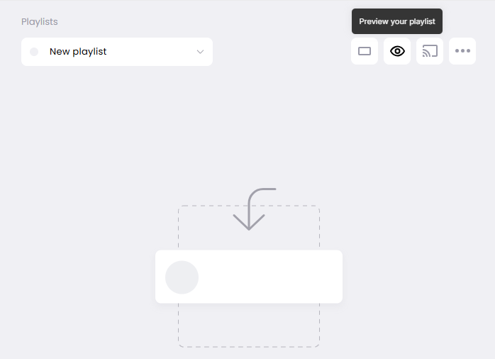
Here's an example of a tooltip built with Flook. Juuno is a digital signage app that turns any smart TV into a digital screen or menu. Juuno utilizes Flook to create all of their tooltips. In this example, we see a tooltip explaining to the user that they can preview their content playlist to see what their digital sign will look like before they deploy it to their smart TV.
How to add tooltips to your website without HTML
When you use our no-code builder, you don't have to fuss with HTML. Just add your Chrome extension to easily create tooltips from your browser.
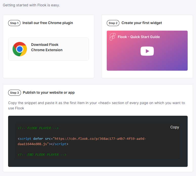
Step 1. Install Flook's Chrome extension
First things first, grab the Flook Chrome extension from the Chrome Web Store and add it to your browser. Once it’s installed, drop a lightweight script into your website’s header tag. Don’t worry—it’s quick, painless, and ensures your tooltips show up right where they need to be. Now, you're all set to bring tooltips to life.
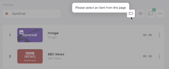
Step 2. Add a tooltip to your website or web app
Head over to the site or app you want to deck out with tooltips. Open the Flook extension, make sure you're working in the correct project (we see you, multi-tasking pros), and click "Add Tooltip." Select the element on your page that needs some context—whether it’s a shiny new button, an underused feature, or a hidden gem that deserves attention. Boom, your tooltip is ready to roll.
Step 3. Edit the text
Nobody likes boring tooltips. Add your own text to explain, guide, or nudge your users in the right direction. Keep it snappy, helpful, and on-brand. This is your chance to give users the context they need to fall in love with your product (or just finally figure out what that button does).
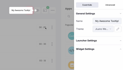
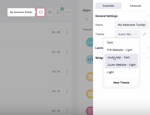
Step 4. Choose the color scheme
Let’s be real: design matters. Flook gives you full control to style your tooltips like a pro. Use one of our pre-built themes, or create a custom color scheme to perfectly match your brand’s vibe. Whether you’re rocking a sleek dark mode or bold colors, your tooltips will look like they’ve been handcrafted by your design team.
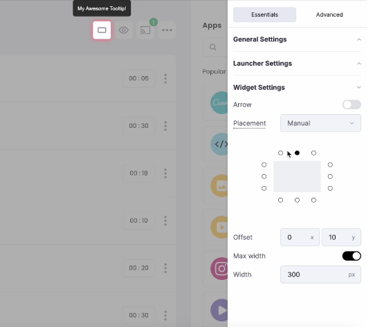
Step 5. Adjust the placement
Good tooltips aren’t just about the message—they need to be in the right spot. Flook’s manual placement options let you fine-tune the tooltip position until it’s pixel-perfect. Above, below, to the side—you choose. You can even tweak the offset and decide whether to show an arrow or not. Trust us, your users will thank you.
Preview your tooltip, hit save, and you’re done. No dev time, no downtime, no nonsense.
While coding tooltips from scratch can be rewarding, the challenges of ensuring accessibility, maintaining consistency, and achieving cross-browser compatibility often make it a daunting task.
For teams looking to save time and focus on delivering a polished user experience, no-code solutions like Flook provide an effortless way to create beautiful, functional tooltips without the technical overhead.
Ready to simplify your workflow? Try Flook today and see how easy it is to create tooltips, onboarding tours, and more—no coding required.