CSS Tooltips: How to Create and Customize Them
Last updated on Mon Mar 24 2025
Tooltips are one of the fastest ways to improve UX without overhauling your product. A well-placed tooltip gives users the context they need to take action, complete a task, or understand what they’re looking at. No modal. No tour. No delay.
Most teams default to CSS tooltips because they’re quick and lightweight. You get basic functionality with no libraries, no JavaScript, and no build step. Just raw HTML and a few lines of CSS. They work until you try scaling them across a complex product. That’s when you hit the ceiling.
You can’t run real onboarding flows with CSS tooltips. You can’t track engagement. You can’t A/B test copy or placement. And unless you’re hardcoding styles on every screen, you won’t be shipping updates fast enough.
This post covers how CSS tooltips work, where they shine, and where they break. We’ll walk through code examples, positioning logic, styling tips, and common pitfalls. Then we’ll show you a better option: combining CSS-level control with a no-code interface using Flook. If you want fast deployment, clean UX, and full control, this is how you build tooltips that scale.
What are CSS tooltips?
Tooltips are those sleek little UI helpers that show up when you hover, click, or focus on an element—usually a short line of text that tells you what something does. Think of them as micro-moments of clarity: lightweight, non-intrusive, and incredibly effective when used right.
CSS tooltips are tooltips built purely with HTML and CSS—no JavaScript needed. That’s their main appeal. They’re fast, simple, and browser-native. You don’t need a third-party library or bloated codebase to get something useful on the screen. Just a few lines of CSS, maybe a ::before or ::after pseudo-element, and boom—you’ve got a tooltip.
They’re a favorite among devs who want quick wins without spinning up an entire frontend framework just to display a sentence. Want a hover-based tooltip on a button? CSS has you covered. Need to show a quick description above an icon? Again, CSS handles it, no problem.
Use cases? Plenty.
UX enhancements: Explain what an icon means without adding extra text to the layout.
Inline help: Give users guidance exactly where and when they need it—without opening modals or sidebars.
Onboarding hints: Nudge new users toward that "aha" moment by layering helpful tooltips on key actions.
Now, compare that to JS or jQuery tooltips: more control, sure, but also more complexity. You’ll need event listeners, DOM manipulation, and sometimes even entire plugins just to get clean positioning or behavior. For simple needs, CSS wins. Hands down.
But—and this is a big but—CSS tooltips hit a wall fast. They’re not interactive. You can’t add buttons or links inside. They break on mobile. And managing them across a complex product with multiple pages? Forget it.
That’s where tools like Flook come in. You get all the flexibility of visual editing with the speed of CSS under the hood—no dev bottlenecks, no messy codebase. Just fast, scalable UX.
CSS tooltip examples
Let’s break down a simple CSS tooltip example and look at how other companies use them in the wild.
Here’s a basic tooltip using just HTML and CSS:
HTML:
<div class="tooltip"> Hover over me <span class="tooltip-text">Tooltip message</span> </div>
CSS:
.tooltip { position: relative; cursor: pointer; } .tooltip-text { visibility: hidden; position: absolute; bottom: 125%; background: black; color: white; padding: 6px; border-radius: 4px; white-space: nowrap; } .tooltip:hover .tooltip-text { visibility: visible; }
This uses :hover to show the tooltip and position: absolute to place it. No JS, no libraries—just fast and clean.
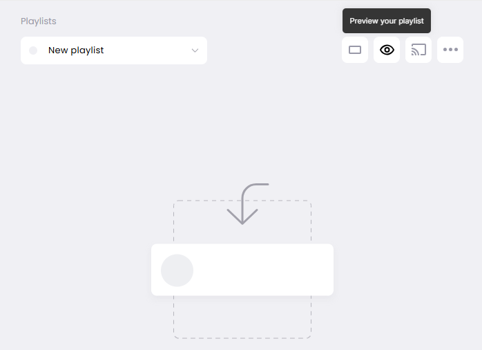
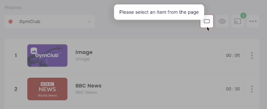
Juuno example
In Juuno, a platform for managing playlists for digital signage, you’ll see this in action. Hover over the eye icon beside a playlist and a tooltip pops up: “Preview your playlist.” Super intuitive. It tells the user exactly what to expect, right when they need it.
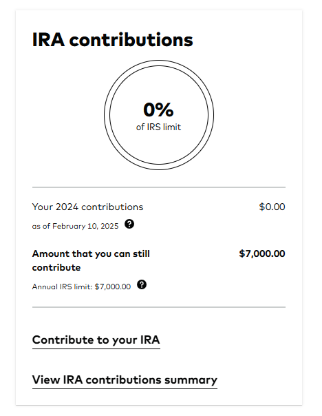
Vanguard example
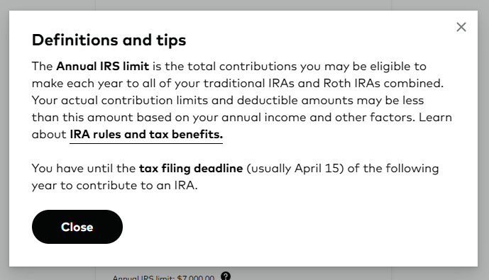
Vanguard uses a similar concept, but for finance. Next to “Contributions,” there’s a little question mark icon. Click it, and a tooltip explains Roth IRA limits for the current year. It’s just enough context to keep users informed—without derailing the flow.
Tooltips like these make interfaces feel polished, helpful, and smart.
Tooltip positioning in CSS
You can write the cleanest tooltip content in the world, but if it’s covering the wrong element—or floating halfway offscreen—you’ve already lost. Tooltip positioning is one of the most overlooked parts of UI polish, and in CSS, it’s all about smart use of position: absolute and knowing your offsets.
Let’s break it down.
🧠 Positioning logic 101
The parent (tooltip trigger) should be
position: relativeThe tooltip itself should be
position: absoluteYou control where it appears using
top,right,bottom, andleftvalues
That’s it. Now let’s talk positioning strategies.
⬆️ Top tooltip
.tooltip-text { bottom: 125%; left: 50%; transform: translateX(-50%); }
Pros: Keeps the flow below clean. Cons: Risk of clipping near top of viewport.
➡️ Right tooltip
.tooltip-text { left: 105%; top: 50%; transform: translateY(-50%); }
Pros: Great for vertical lists or side menus. Cons: Can get cut off on small screens.
⬇️ Bottom tooltip
.tooltip-text { top: 125%; left: 50%; transform: translateX(-50%); }
Pros: Most common pattern. Natural reading direction. Cons: Might overlap other content.
⬅️ Left tooltip
.tooltip-text { right: 105%; top: 50%; transform: translateY(-50%); }
Pros: Good for side-by-side layouts. Cons: Can get cramped if space is limited.
💥 Avoiding Clipping and Layout Fails
Tooltips live dangerously close to the edge—literally. If your parent container has overflow: hidden, you’re in trouble. Here’s how to stay safe:
Use a higher
z-indexto make sure it layers properlyAvoid nesting tooltips inside elements with restricted overflow
Add media queries for small screens and adjust placement dynamically
Test at all viewport sizes—what works on desktop might be trash on mobile
Bonus move: build in fallbacks. If there's no space on the left, auto-swap to right. Flook handles this logic out of the box. Raw CSS? You’ll need JavaScript for that level of intelligence.
Tooltips aren’t just decoration—they’re functional UI. If they’re in the wrong place, they’re not just unhelpful—they’re in the way. Position smarter. Test harder. Or skip the headache and let Flook do the heavy lifting.
The easiest way to create tooltips combining no-code software and CSS
Combining no-code platforms like Flook with traditional CSS gives you the best of both worlds: full control when needed, and rapid deployment when time matters. This hybrid approach is ideal for teams who want to launch clean, effective tooltips—without waiting on developers.
Below are seven simple steps to create, style, and refine tooltips using CSS and no-code software.
Step 1. Map out your tooltips strategically
Before writing a line of code or opening any tool, figure out where and why you need tooltips. Think user-first: where do people tend to get stuck or hesitate? Your tooltips should serve a purpose—whether it's clarifying a feature, encouraging a key action, or nudging users forward during onboarding.
Don’t clutter every element. Prioritize tooltips that align with your product’s goals and provide meaningful value. Tip: Start with buttons or new features that drive quick wins.
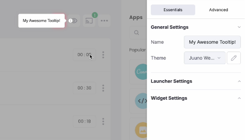
Step 2. Create your first tooltip
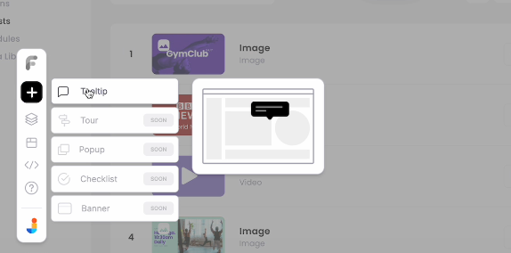
Once you’ve installed the Flook Chrome extension and added the embed script to your site, launch your app or webpage and open the extension. Click “Add Tooltip”, then visually select the element you want to attach it to—like a signup button or feature label.
After selecting the element, Flook allows you to drag and position the tooltip precisely. Toggle off any launcher icon if it feels redundant for the element type.
Step 3. Write helpful, on-brand text
The message inside your tooltip should be clear, actionable, and brief. Focus on what the user needs to know to take the next step. Something like: “Start your free trial with one click—no credit card needed.”
Flook makes it easy to type directly into the tooltip and edit your copy in place. Review your text for tone and consistency with your brand voice.
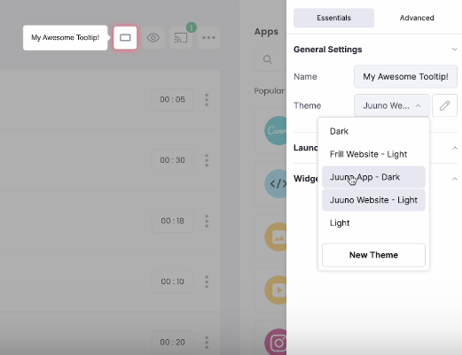
Step 4. Match the visual style with your product
Your tooltip should look like it belongs. Flook gives you the ability to apply themes or customize each tooltip’s appearance—background color, text color, font, border radius, shadows, etc.
Use contrast to ensure readability, and don’t overdesign. A clean, minimal tooltip usually performs better than one overloaded with style.
Step 5. Fine-tune the position and behavior
Next, dial in exactly where the tooltip appears and how it behaves. Flook lets you adjust placement so the tooltip hovers neatly above, below, or beside the element without obstructing other content.
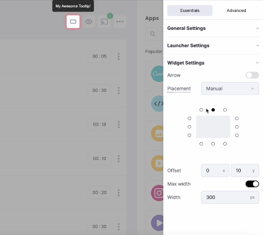
Set when the tooltip appears—on hover, click, or focus. You can even keep it persistent for onboarding flows. For accessibility and clarity, consider adding a directional arrow to visually anchor the tooltip to its trigger.
Step 6. Go deep with element targeting (advanced CSS)
Want even more precision? Flook lets you directly edit the CSS selector used to target an element. This is where no-code meets pro-level control.
Element targeting means selecting exactly which HTML element your tooltip should attach to—whether it's a button nested inside multiple divs or a uniquely styled component.
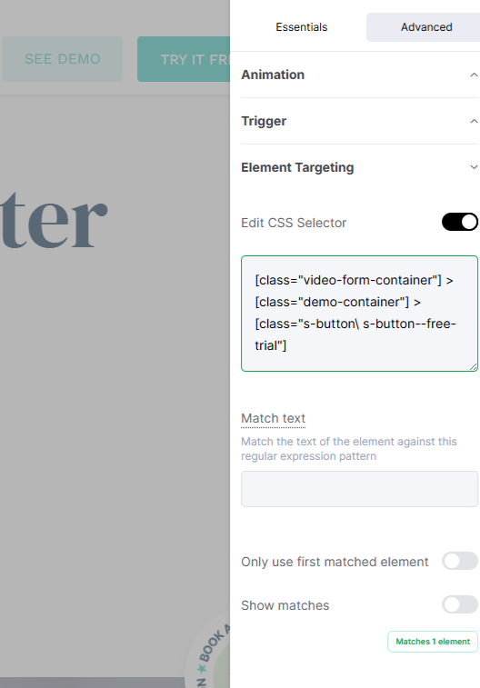
In the Advanced tab, toggle Edit CSS Selector and input your custom selector string. You can even preview matches to make sure it’s working (see screenshot below). This level of control is perfect when visual selection isn’t enough—especially for deeply nested or dynamic components.
Step 7. Test, gather feedback, and refine
Finally, go back through each step and review your tooltips from the user’s perspective. Are they helpful? Are they timed right? Are they easy to read?
Use Flook’s preview tools and in-product testing to see how tooltips behave live. Better yet—get user feedback and iterate. Small tweaks to wording, placement, or timing can dramatically improve engagement.
Tooltips aren’t set-and-forget—they’re part of an evolving experience. As your product grows, continue testing and refining them based on actual user behavior.
Styling and customizing tooltips
You’ve got your tooltip in place. Now it’s time to make it look like it belongs in your product. Design is the difference between something that feels native and something that feels hacked together. Let’s style like we mean it.
🎯 Tooltip arrows with ::before or ::after
Want that little triangle that connects the tooltip to its target? You’re making a tooltip arrow.
.tooltip-text::after { content: ''; position: absolute; top: 100%; left: 50%; margin-left: -5px; border-width: 5px; border-style: solid; border-color: black transparent transparent transparent; }
This creates a downward-pointing arrow. Adjust top, left, and border-color to match the tooltip's direction and style.
🎬 Animations: fade, slide, bounce
Don’t just show a tooltip—reveal it.
.tooltip-text { opacity: 0; transition: opacity 0.3s ease; } .tooltip:hover .tooltip-text { opacity: 1; }
Want it to bounce in or slide? Use @keyframes with transform. Bonus points for timing curves like ease-in-out or cubic-bezier.
🧊 Rounded corners, themes, and color control
Styling is all about fitting your product’s visual language. Use:
border-radius: 6px; background-color: #111; color: #fff;
Make sure your tooltips contrast well with the background. Light theme? Go soft gray with dark text. Dark mode? Invert it. Flook lets you theme globally so you don’t have to tweak every tooltip individually.
🎨 Gradients + drop shadows = extra polish
background: linear-gradient(135deg, #2a2a2a, #1a1a1a); box-shadow: 0 4px 12px rgba(0, 0, 0, 0.25);
This is where you take it from “MVP tooltip” to “damn, that’s clean.” Subtle shadows help separate the tooltip from the background. Gradients add texture. Don’t overdo it—just enough to say “we care about UX.”
♿ Accessibility: don’t skip it
Tooltips are for humans. Some of those humans use screen readers. Respect that.
Add
role="tooltip"to your tooltip elementUse
aria-describedbyon the trigger to link it to the tooltipMake sure it’s reachable with keyboard (hover + focus support)
Flook handles this under the hood. But if you’re writing raw CSS, build with accessibility from day one.
Common pitfalls of CSS tooltips
CSS tooltips are great—until they’re not. If you’re building anything more complex than a static landing page, these limitations start showing up fast. Here’s where they fall apart:
Hard to maintain across multiple pages: CSS tooltips are static by nature. You define them per element, per page. That means if you’re rolling out tooltips across an app or multi-step onboarding flow, you’re duplicating styles, tweaking offsets individually, and hoping nothing breaks on different screen sizes. No global control. No versioning. And every tiny update becomes a manual fix. For fast-moving teams, it’s a nightmare.
Limited interactivity: Pure CSS tooltips can’t handle rich content. You can’t add links, buttons, or forms. They disappear the moment you move your cursor, which makes any interaction inside the tooltip basically impossible. If you need anything beyond static text—like dismiss logic, click events, or analytics—you’re out of luck. You’ll need JavaScript anyway, so why not just use a smarter tool?
Poor mobile support: Hover doesn’t exist on touch devices. And without JavaScript, CSS tooltips have no idea what to do with a tap or swipe. They either don’t show up, show up at the wrong time, or break your layout. There's no built-in responsiveness or gesture handling. If mobile is even part of your roadmap, CSS alone won't cut it.
Locked behind dev workflows: Every time product or UX wants to tweak a tooltip, it’s another ticket in the backlog. Want to change the copy? Test new timing? Move the position by 10px? That means editing HTML and CSS manually. For non-technical teams, CSS tooltips are a black box. You end up waiting on dev cycles for tiny UI tweaks—which kills speed and experimentation.
How to get started with Flook in 3 simple steps
Install the Chrome extension: Head to the Chrome Web Store and install the free Flook extension. This gives you instant access to the visual builder inside your own product or website.
Create a tooltip using the visual builder: Open your app, click “Add Tooltip” in the extension, and visually select the element you want to target. Customize the text, design, placement, and behavior—no coding required.
Add one code snippet to your site: Copy and paste the lightweight Flook script into your site’s header. That’s it—your tooltips are live.
Sign up for Flook and start making no-code tooltips. Use our advanced settings and CSS inputs as needed.