5 Ways to Make Tooltips Truly Contextual & Why Context Counts
Last updated on Wed Jun 25 2025
There’s a critical moment in every SaaS experience: when a user has a goal but can’t quite figure out how to achieve it. That’s the gap between user intention and product understanding, and it’s where contextual tooltips shine.
Unlike generic hover hints, contextual tooltips are targeted, behavior-triggered, and surface help precisely when and where it’s needed. They offer real-time guidance without interrupting the flow.
Other forms of in-app help—modals, product tours, popups—can feel like overkill. They demand attention when the user just wants to move forward. And let’s be honest, no one’s diving into the help menu mid-task.
Contextual tooltips deliver help in the moment. They clarify, support, and drive adoption without overwhelming the user.
In this guide, we’ll break down what makes contextual tooltips so powerful, where they outperform other methods, and how to build them, no devs required. Because the best help isn’t just helpful. It’s contextual.
What are contextual tooltips?
Contextual tooltips are dynamic, targeted bits of guidance that appear exactly where and when a user needs help. Unlike generic tooltips, which simply show up when you hover over an icon, contextual tooltips are tied to user behavior, specific pages, or actions. Think of them as the smarter, more strategic cousin of the classic hover hint.
A generic tooltip might say, “Click to edit,” when you hover over a pencil icon. A contextual tooltip says, “Edit your team’s details here,” only after the user adds their first team member, making the tip both relevant and timely.
You’ll see contextual tooltips in high-performing SaaS platforms: highlighting pricing page terms, explaining dashboard metrics, or guiding users through complex settings. These pop-up tips act as lightweight, embedded context-sensitive help without requiring the user to dig into docs or leave the screen.
When done right, contextual tooltips reduce support tickets, speed up onboarding, and smooth out the user experience. They’re quick, helpful, and non-intrusive, everything a tooltip should be, but rarely is.
Context matters. And contextual tooltips prove that even the smallest messages can have a massive impact when delivered at the right moment.
Why context matters: the psychology of contextual help
To understand why contextual tooltips are so effective, you have to look at how the brain processes information. Enter: cognitive load theory. This principle suggests that people can only handle a limited amount of information at once—especially when learning something new.
Dump too much info too early (like in a modal) and users tune out. Bury critical guidance in a help menu, and they won’t find it when they need it. That’s where contextual help comes in. We're talking tooltips, inline instructions, and embedded help. These tools reduce mental friction by offering just-in-time support, precisely where the user’s attention already is.
Microcopy, when delivered in context, acts like a quiet coach. Instead of forcing users to figure things out or guess what comes next, you guide them gently. It’s faster, less stressful, and far more intuitive.
Contrast that with modal overload, the all-too-common scenario where users are bombarded with popups the moment they land in your app. It’s overwhelming, often irrelevant, and rarely helpful. Even well-written onboarding flows can feel off when they don’t match the user’s current task or intent.
With contextual tooltips and inline instructions, you give users exactly what they need, when they need it, no more, no less. It’s UX psychology 101: guidance works best when it’s in the flow, not forced.
Contextual tooltips vs. other help methods
There’s no shortage of ways to support users. But not all help is created equal, and definitely not all of it is contextual. Let’s break it down.
🧱 Modal windows
When to use: Product announcements, major onboarding steps.
Downside: Intrusive. Often dismissed. High risk of “close and forget.”
Verdict: Use sparingly. Never for micro-tasks.
📖 Help menus
When to use: Index of user guides or access to a knowledge centre.
Downside: Breaks the user’s flow. They have to stop, search, and read.
Verdict: Great for self-serve support, not in-the-moment clarity.
🧠 Knowledge center
When to use: Deep dives, complex documentation, long-form content.
Downside: Requires leaving the UI. Not ideal for fast answers.
Verdict: Essential but still secondary to real-time help.
🧩 Embedded help
When to use: Tooltips, popups, and inline copy built directly into the product.
Downside: Can clutter the UI if overdone.
Verdict: Excellent when tightly scoped and contextual.
✏️ Inline instructions
When to use: Form fields, settings panels, in-line guidance.
Downside: Static. Doesn’t respond to behavior or timing.
Verdict: Effective for predictable steps, but not reactive.
💬 Popup tips
When to use: Highlighting new features, guiding quick tasks.
Downside: Timing matters, and misfired popups feel annoying.
Verdict: Useful when tied to specific actions or events.
🎬 Product tours
When to use: First-time onboarding or showcasing new workflows.
Downside: Easy to forget. Poor retention if too long or too early.
Verdict: Valuable, but best paired with ongoing contextual tips.
🧭 Interactive walkthroughs
When to use: Complex onboarding or feature discovery.
Downside: Time-intensive to build. High user drop-off.
Verdict: Great for demos or training, not for everyday support.
For fast, task-based help, nothing beats contextual tooltips. They’re light, smart, and right where the user needs them. Instead of replacing deeper resources like user guides or a knowledge centre, they complement them, offering clarity without interruption.
5 ways to make tooltips truly contextual
You’ve got the tooltips. But are they actually contextual, or just decorative hints glued onto random parts of your UI?
A truly contextual tooltip isn’t just well-timed, it’s strategic. It’s based on real user behavior, aligned with intent, and crafted with purpose. Here’s how to get there.
1. Identify the right moment and the right place
Contextual tooltips are only effective when they are anchored in the right moment and appear in the right place. This means understanding not only the sequence of user interactions but also the mental state behind those actions.
Use behavioral analytics, funnel reports, and task completion rates to locate pain points. Ask yourself: Where are users stalling? What causes repeated back-and-forth actions? Where does frustration accumulate?
Some high-leverage moments for contextual tooltips:
First time using a complex feature
Reaching a key milestone (e.g., publishing a post, adding a user)
Entering error-prone flows (like integrations or billing setup)
Hovering or pausing on a confusing UI element
Good tooltips don’t just appear, they anticipate.
2. Map the user journey and behavior first
Before writing copy, map out the key stages of the user journey. This journey map does not need to be complicated or formatted in a 20-page doc. A clear, visual flow outlining onboarding, feature exploration, and daily use will provide the framework needed for tooltips that add value.
Once you have your stages, go deeper:
What tasks are users trying to complete at each step?
What questions are they likely to have in the moment?
What emotional responses might arise: hesitation, stress, relief?
Session replays, heatmaps, and exit surveys help confirm assumptions and highlight previously unseen gaps. The result is a data-informed content strategy for tooltips, not guesswork.
Add lightweight feedback mechanisms to your tooltips so users can rate or comment on their usefulness. This creates a feedback loop that makes your tooltips and product smarter over time.
3. Triggering tooltips like a pro
Timing can make or break a tooltip. If it fires too early or out of sync with the user’s intent, it becomes noise. Tooltips tied to behavior feel relevant and timely, increasing the likelihood of interaction.
There are three smart ways to trigger them:
Event-based: When a user completes an action (e.g., connects a tool), trigger a tip to explain the next step.
URL-based: Display tooltips on specific URLs only, ideal for segmented onboarding or multi-page flows.
Action-based: Trigger on hover, scroll, click, or pause. Especially useful for dense dashboards or dropdown-heavy UIs.
The key? Avoid generic, passive triggers. Contextual means reactive. It’s what separates a tooltip that gets clicked from one that gets closed.
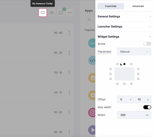
Here's an example using Frill's no-code tools to get the triggering and placement perfect:
4. Write explanatory copy that’s actually helpful
Copy makes or breaks a tooltip. The most beautifully designed tooltip means nothing if the message feels irrelevant, too vague, or overly technical.
Explanatory copy must be ultra-clear, benefit-driven, and in sync with the user’s mindset. Use verbs that point to action. Avoid feature jargon. And always frame the message around the user’s outcome, not just the feature itself.
Here’s a simple template: [Action prompt] + [Outcome] Example: “Add your first teammate to start collaborating.”
Writing tips for killer contextual copy:
Use second-person (“you”) to speak directly to the user
Be specific: “Create your first board” > “Get started”
Keep it short, but not vague
Test emotional tone (reassuring, encouraging, direct) based on context
Great microcopy isn’t just clear. It’s empathetic and relevant.
For example, Mailchimp's onboarding uses direct, action-oriented, and super-short copy that users can instantly understand:
5. Design for clarity, not decoration
Tooltip design is not an art contest. It is a user support tool, and clarity must lead the way. Tooltips that look flashy but confuse users fail at their primary job.
Keep design clean:
Avoid giant balloons or overly branded styles. The tooltip should be readable at a glance.
Position with intent, ideally close to the element or action it refers to.
Use subtle animations to draw attention without hijacking focus.
Stick to one message per tooltip, no multitasking allowed.
Cross-device testing is non-negotiable. A tooltip that displays perfectly on desktop but overlaps or disappears on mobile introduces frustration and undermines trust. Consistency in design and layout helps users form a mental model, reducing learning time and increasing confidence.
Design is there to deliver the message, not compete with it.
Building contextual tooltips without devs
Let’s be honest: waiting on your dev team to implement tooltips is slow, inefficient, and unnecessary. Contextual help shouldn’t be a backlogged ticket in your sprint. That’s why no-code and low-code tools like Flook exist: to give product teams full control over when, where, and how help appears, without writing a single line of code.
Here’s how to build contextual tooltips that actually work, no developer required.
Start with the right tools
There's no need to code your contextual tooltips from scratch.
Flook was built specifically for SaaS teams who need agility. Instead of wrangling engineering resources, you use:
Flook’s Chrome Extension to visually place tooltips down to the pixel
A simple code snippet to embed Flook into your app
A no-code builder to handle logic, triggers, and messaging
This combo gives you precision control, without slowing your roadmap.
Create an onboarding tooltip in 3 simple steps
You don’t need a dev sprint to launch helpful guidance. Here’s a fast, repeatable workflow for adding your first onboarding tooltip:
Choose the moment: Use your user journey map to identify a key milestone (e.g., after account creation or during a setup step).
Place the tooltip: Open your app with the Flook Chrome Extension and visually drop the tooltip where it’s needed. Adjust pixel-perfect placement in seconds.
Set the trigger: Choose from URL, user event (like a click or scroll), or custom trigger conditions. Publish. Done.
You’ve now deployed a contextual, action-triggered tooltip without touching the codebase. (And your developers thank you.)
Best practices for no-code contextual tooltips
To make sure your tooltips don’t just exist but actually perform, follow these Flook-approved best practices:
Pinpoint placement: Use the Chrome extension to place tooltips exactly where they’re needed—no guessing, no drift.
Trigger with intent: Don’t rely on page load alone. Trigger tooltips based on real actions or user context (like reaching a setup step).
Bundle into interactive walkthroughs: Combine multiple contextual tooltips into short, targeted flows. This builds momentum and reinforces learning without overwhelming users.
Test and iterate: A/B test your explanatory copy and trigger logic to optimize engagement. Small tweaks = big wins.
Coordinate across channels: Pair tooltips with your other in-app communication channels like banners and slideouts. Avoid duplication and keep your message strategy consistent.
When implemented thoughtfully, contextual help becomes an integral part of your product’s user experience, not a last-minute addition or temporary patch. It’s a lightweight, flexible way to support users without relying on dev resources for every change.
A well-placed contextual tooltip isn’t just UI decoration. It’s a timely, task-specific nudge that keeps users moving forward. When triggered by real behavior, anchored in the right location, and written with clear, outcome-focused explanatory copy, it can quietly but powerfully support onboarding, feature adoption, and long-term retention.
Contextual tooltips as part of a broader strategy
Contextual tooltips are incredibly effective, but they shouldn’t stand alone. To create a seamless, supportive user experience, tooltips need to work alongside your broader help and onboarding strategy. This means integrating them with other in-app communication channels, supporting long-form resources like user guides, and knowing when it’s time to hand off from a tooltip to something more in-depth.
For example, a tooltip might explain a single button’s function in a settings panel. But if the user needs to configure a multi-step integration, that same tooltip can link out to a full guide or open a product tour. Think of tooltips as the starting point: quick nudges that surface just enough information in the moment, while offering a path to explore further if needed.
To build a cohesive help experience, consider layering your support like this:
Contextual tooltips
Banners and slideouts
Interactive walkthroughs
User guides and documentation
Each layer addresses a different level of complexity and urgency. Tooltips support immediate tasks. Banners can announce changes. Walkthroughs guide complex workflows. And documentation handles edge cases and deep dives.
The key is recognizing when a tooltip is enough and when to escalate. If a user hovers on the same area multiple times, fails to complete an action, or triggers a known pain point, that’s a signal. The system can offer deeper help through embedded links, chat prompts, or opening a product tour.
Done right, this layered approach ensures that help is always within reach, but never overwhelming. Users feel supported, not smothered. Contextual tooltips start the conversation, and when they’re connected to a broader ecosystem of support, they become even more powerful.
Contextual tooltips are one of the simplest, smartest ways to improve user experience, without overwhelming your audience. When timed well and tied to real user behavior, they provide guidance exactly when it’s needed, reducing confusion and accelerating adoption. But tooltips are only powerful when they’re truly contextual. That means strategy, not guesswork. If your current onboarding or in-app help feels disjointed, it’s time to rethink how and where you offer support.
Ready to level up your UX? Try building contextual tooltips and onboarding flows with Flook—no devs required.