How to Add Tooltip to a Button Without Coding [In 5 Minutes]
Last updated on Tue Mar 25 2025
Tooltips are one of the simplest ways to improve clarity and boost conversions, especially on high-impact buttons. Whether it’s a signup, delete, or submit action, users often pause before clicking.
A well-placed tooltip can remove doubt, explain context, or guide the next step without cluttering your interface. The good news? You don’t need to code anything to make it happen. With modern no-code UX tools, adding tooltips to buttons takes minutes, not days.
In this guide, we’ll walk through how to plan, create, and fine-tune button tooltips that feel native, stay useful, and actually get clicked. Let’s get started.
How to add a tooltip to any button (without coding)
When using a no-code UX platform, it only takes a few minutes to add tooltips to your product. Here are the steps to follow.
Step 1. Choose the right button
Not every button needs a tooltip. Start with high-impact actions that drive user behavior—things like “Start Free Trial,” “Submit,” or “Invite Teammates.” These are moments where users might pause or hesitate, and a well-placed tooltip can give them the extra clarity or confidence to take action. Look for areas where drop-off happens or where users frequently ask questions. If you’re launching a new feature, tooltips on related buttons can also help with discovery. The goal is to guide, not overwhelm—so be selective. Prioritize buttons that move users forward and connect directly to key outcomes in your product.
Step 2. Open your app and launch Flook
Once you’ve got Flook installed, it’s go time. Open your product in a browser and fire up the Flook Chrome extension. You’ll see the overlay load right on top of your live app. Navigate to the page where the button lives.
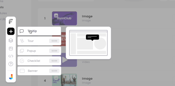
Click “Add Tooltip” in the extension panel, then hover over the button you want to tag. Flook will highlight the element in real time so you know exactly what you're selecting. Once selected, you’ll get a draggable tooltip box that you can position wherever it makes the most sense—above, below, or next to the button. Keep it tight and out of the way.
If the default launcher icon feels extra, turn it off. For most buttons, you want the tooltip to feel invisible until it’s needed. The key here is fast setup without giving up control. You’re live-editing tooltips directly on your product without touching code. It doesn't get cleaner than that.
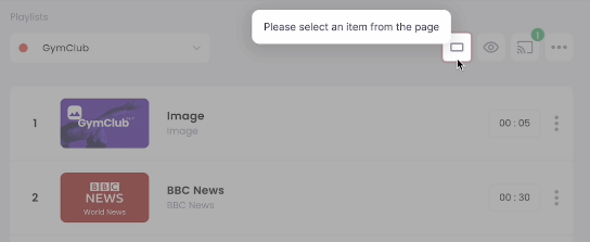
Step 3. Attach a tooltip to the button
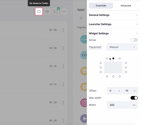
Now that Flook is running and your button is selected, it’s time to lock in your tooltip. Click the button to confirm the element, then Flook will anchor the tooltip directly to it. Drag the tooltip to the ideal spot (usually above or beside the button so it stays visible but doesn’t block anything important).
If the default positioning looks off, tweak it until it feels clean. Keep your spacing tight and consistent. You want the tooltip to feel native to your UI, not slapped on top. Turn off the launcher icon if it feels unnecessary.
Most buttons already look clickable, so you don’t need the extra noise. Once it’s positioned, double-check that it lines up on both desktop and mobile. One wrong placement can throw the whole thing off. This step is where your tooltip starts looking real.
Step 4. Write clear, action-focused copy
Your tooltip copy should do one thing: get the user to take action. Skip the filler. No one wants to read a paragraph when they’re hovering over a button. Write like a human, not a UI robot. One sentence max.
Focus on what the button actually does, not vague promises. Use strong verbs and keep the tone aligned with your product. If it sounds like marketing copy, you’ve gone too far. Keep it crisp, helpful, and direct.
Good examples:
Save changes
Start free trial
Invite teammates
Preview design
Download report
You can write and edit your copy right inside Flook. Test it in context to make sure it makes sense. If your tooltip text makes the button clearer and easier to click, you’re on the right track. If it makes the experience more confusing, delete it and try again. Clarity wins every time.
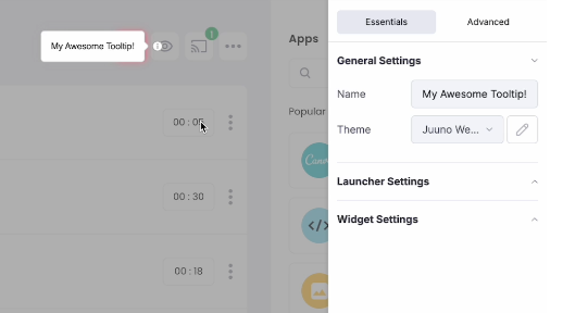
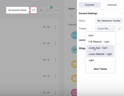
Step 5. Match the visual style of your app
Your tooltip should look like it belongs. If it feels like a random overlay, users will ignore it. Flook gives you full control to match your tooltip to your brand without touching code. Use your product’s font, align colors with your palette, and keep the design consistent with your overall UI.
This keeps the experience seamless and trustworthy. You want tooltips to feel like part of the product, not some bolt-on widget from another planet. Stick with simple, high-contrast styles that are easy to scan.
Dial in the basics:
Font family
Background color
Text color
Border radius
Shadow and padding
Use the theme editor in Flook or customize each tooltip individually. Either way, keep it clean and aligned with your interface. A good tooltip does not need to shout. It just needs to fit.
Step 6. Set behavior: hover, click, or focus
Tooltips are only useful if they show up at the right moment. Flook gives you full control over how and when they appear. Choose the trigger that makes sense for the button’s context.
If users are expected to hover, that works great on desktop. If it's a form or mobile UI, focus or click is usually the better move. You can also set tooltips to stay visible until dismissed, which works well for onboarding steps or key actions.
Here are your main trigger options:
Hover: Appears when the user moves their mouse over the button
Click: Shows on click and stays until dismissed
Focus: Activates when a user tabs to or clicks the button
Test each behavior to see which feels natural. Bad timing kills UX.
Step 7. Test in context and optimize
Getting a tooltip live is just the start. Interact with it like your users would. Click the button, trigger the tooltip, and see if it fits naturally into the flow. If anything feels off (timing, placement, or wording) fix it. Check heatmaps or session replays to see if people are actually engaging. If they’re skipping past it or closing it right away, that’s your signal to improve. Ask your team or a few users for quick feedback.
You’ll catch stuff you missed. Tooltips are not a one-and-done deal. Keep tweaking. Tightening the copy or shifting the position a few pixels can make a big impact. As your product evolves, your tooltips should too.
Best types of tooltips for buttons
When it comes to buttons, the right tooltip can boost clarity, reduce hesitation, and drive more clicks. Here are the best tooltip types to use across different button scenarios.
Instructional tooltips: Offer quick guidance on what the button does or when to use it, helping users take the right action without needing a full walkthrough.
Contextual tooltips: Show up based on where the user is or what they’re doing, giving relevant info tied directly to the button and its function.
Click-to-open tooltips: Triggered by a click, these tooltips stay open longer, giving users time to read or interact—perfect for touch interfaces or deeper explanations.
Hover tooltips: Display on mouse hover, giving fast, lightweight context for buttons without breaking flow. Best used for desktop UIs and quick clarifications.
Sticky tooltips: Stay visible until dismissed, which works great for buttons tied to multi-step actions or critical decisions that need more time to digest.
Confirmation tooltips: Used before irreversible actions like deleting or submitting, these tooltips double-check intent and reduce mistakes with a short message like “Are you sure?”
Smart tooltips: Adapt to the user’s behavior or role, showing different messages based on what they’ve done or what they need to do next.
Mobile-optimized tooltips: Built for touchscreens, these tooltips are easy to tap, well-positioned, and don’t crowd small screens. A must for mobile-first product teams.
Accessibility-focused tooltips: Work seamlessly with screen readers, keyboard navigation, and ARIA roles so everyone can understand what the button does, not just mouse users.
Animated tooltips: Use motion to grab attention without being annoying. Subtle fades or slides help users notice the tooltip without overwhelming the interface.
Tooltip callouts: Include visuals like images, GIFs, or video alongside text for deeper explanation. Useful when a button’s action isn’t self-explanatory or needs a quick demo.
Custom-styled tooltips: Match your brand’s look and feel with full control over fonts, colors, and layout so tooltips feel native to your product—not like add-ons.
You just saw how easy it is to add clean, effective tooltips to any button—without writing code or waiting on devs. Flook gives you full control to build, style, and ship tooltips fast.
Try Flook for free and see how much smoother your UX can be.